
Pinched Counters
Let's get pinchy! For ages, the mark of a 'quality' typeface has been in how it handles/draws its curves. Big, open counterforms exemplified mastery of craft and modern type technique, pretty much universally. However, there are those who have been defying this idea by intentionally putting a 'kink' in the counter, or, what we call a pinch. For some this move is aesthetic, for others it's a product of the letterform's construction. However you get there, the pinch is becoming an identifying trait unto its own.
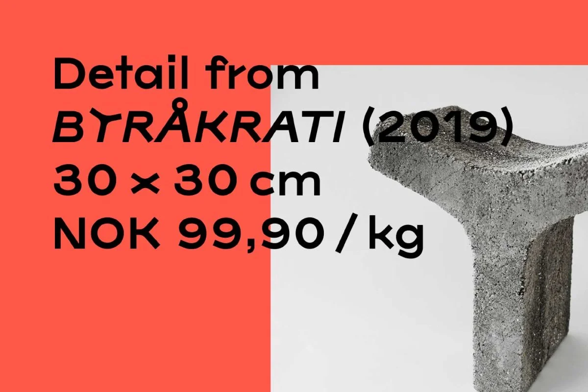
Viksjø
Ping

Details:
Foundry: Typotheque
Designed by: Peter Biľak, Nikola Djurek
Release Date: March 25, 2019
Family: 18 Fonts, 9 weights of romans and italics.
Price: 72 EUR per font, 464 EUR for the family.
New Farm

Details:
Foundry: Newlyn
Designed by: Miles Newlyn, Ben Mitchell
Release Date: - -
Family: 5 Fonts
Price: Starting at 135 USD for annual family rental, 472 USD for perpetual use license.
PDF Specimen: - -
Try & Buy: ☞
Unbounded

Details:
Foundry: Polkadot Network
Designed by: Koto, NaN, Parity Technologies, and Web3 Foundation for Polkadot Network
Release Date: Week 36, 2022
Family: 6 Fonts — weights from Extra Light to Black
Price: 0 USD, released as a free font.
PDF Specimen: - -
Try & Buy: ☞
Know of any other fonts or typefaces that are popping up in this bubble?
Send your suggestion our way on Twitter!