
The New Clarendons
So, what is it about Clarendons that’s so interesting anyway? I’m not quite sure what it is about them, but for starters, they’re so many things wrapped into one. They’re the mixed breed of type design, and thus have so much room for subtlety and unique expression. They’re serifs, but slabs, have soft rounded curves and corners yet rely on some kind of engineered precision.
They seem to have one foot in the old world of type while another firmly planted in the new, like a cicada molting its exoskeleton. Maybe that’s it, Clarendons are the Cicadas of the type world — emerging every 20 years or so to have their day in the sun, then fade back into memory and myth. By that account, Clarendons should be due for a new wave here very soon, which is why I think this list is so great. The types listed here are the stewards of the Clarendon legacy, incubating the genre for the time when they’re called up to swarm and take over again.
Perhaps I just like the way they’ve been used in the past. They’ve been able to convey such a wide range of emotion just in their application. They’ve embodied some incredible roles — from exemplifying music and art on jazz record covers and Rauschenberg & Indiana Paintings, to putting on a suit and going to work to sell coffee on a global scale or bespoke furniture and homewares. Clarendons are iconoclastic, rocking the chucks and the couture gowns, the monocles of high society and the grunge textures of artistic underworlds, the tailored taste hipsters crave and the no-frills everyman-ness that boomers prefer. Clarendons present a style that’s all possibility with very little downside: a low-risk bet, and a high-reward hero.
I believe Clarendons deserve a second look, and very designer (whether freelance or in-house) should have at least one Clarendon in their back pocket for those ultra discerning clients and those moments where you “just need something different.” It’s been said that the design world has been sleeping on Clarendons over the last 20 years, but i like to think of it as them just laying dormant, waiting for that sign to emerge again.


From the Foundry:
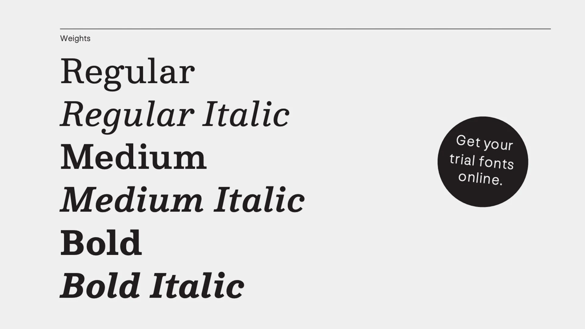
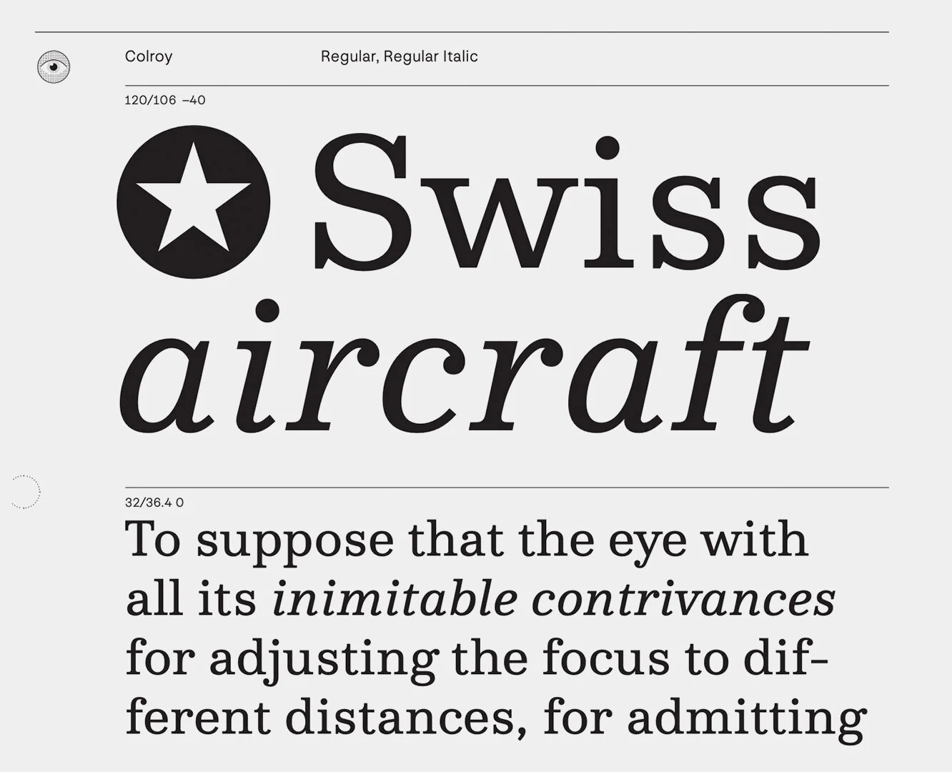
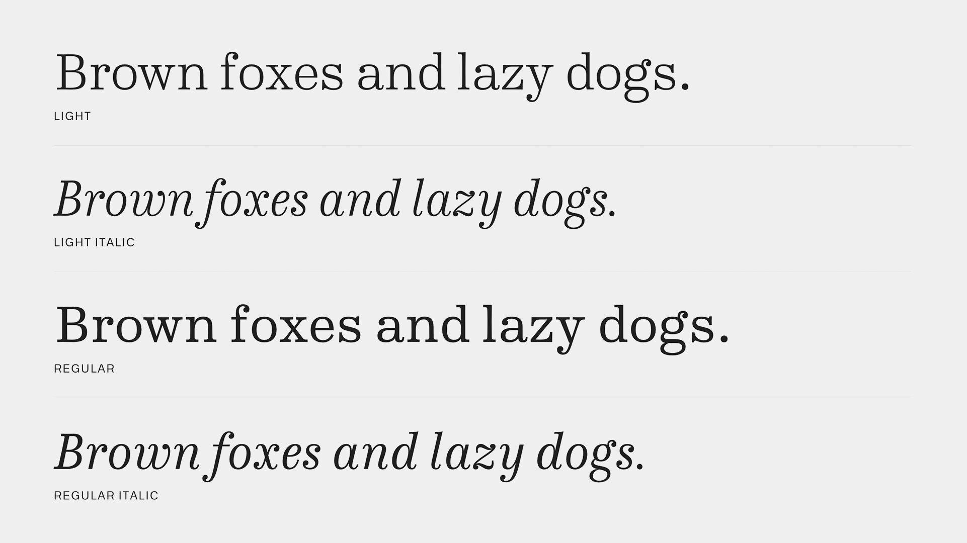
“Colroy is a superbly crafted contemporary Clarendon-like typeface. His most remarkable advantage is its perfect suitability for body text, equipped with remarkable Italics and covers up to 86 languages. Furthermore, it supports Small Caps and various OpenType features. Compared to existing Clarendon-like typefaces, Colroy is slightly more geometricized but still has the vividness which you will appreciate in traditional Clarendon typefaces.”
Notes:
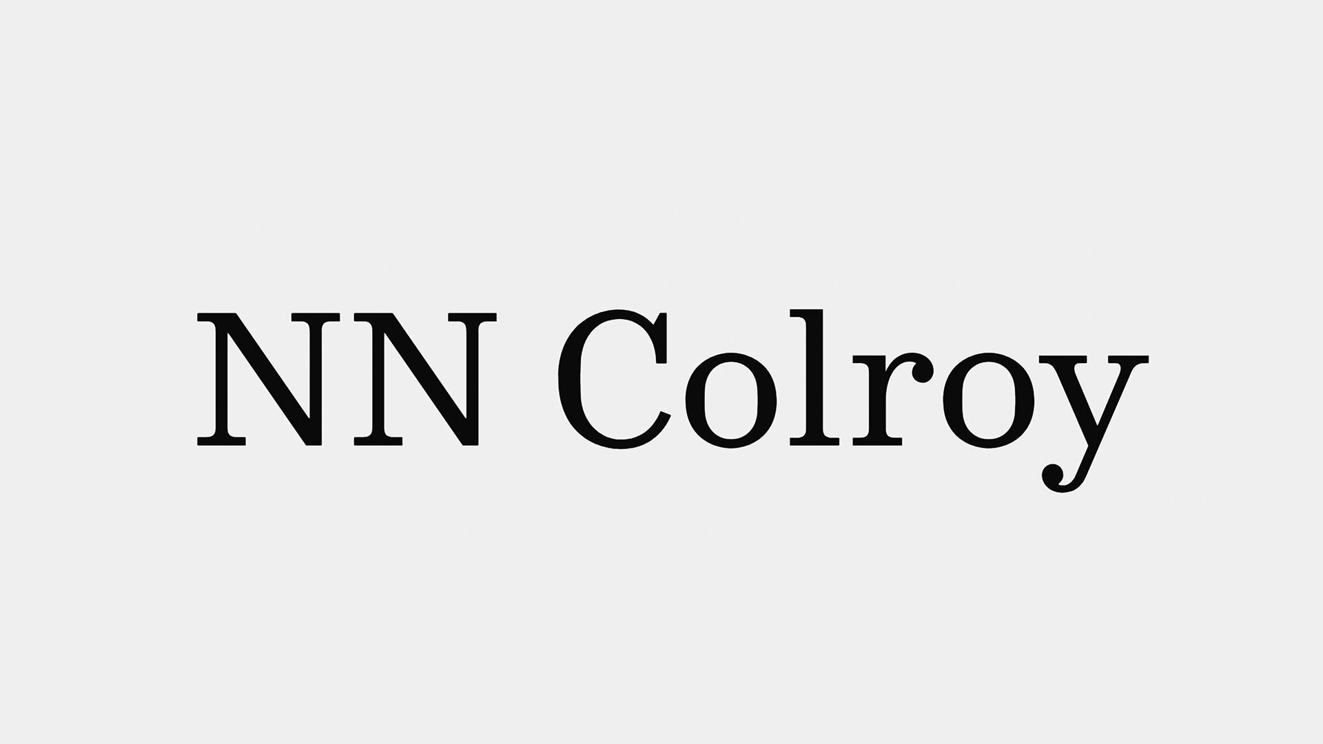
Colroy is a Clarendon’s Clarendon, if that makes any sense, There’s something about hte unapologetic nature of the letterforms, the way the serifs stem out just far enough, the way the ball terminals aren’t mincing any words, and the way the horizontal stress feels both mathematically and optically correct. The additional symbols and signage glyphs seems to hint at a desired use, which I don’t mind. And the alternates are where the veil of propriety drops a little bit to be almost coy.
Colroy is a well dressed party goer who impresses with charm and a sharp cuff at first impression, then lets the hair down after a little conversation and gives the whole room a little permission to have fun.


From the Foundry:
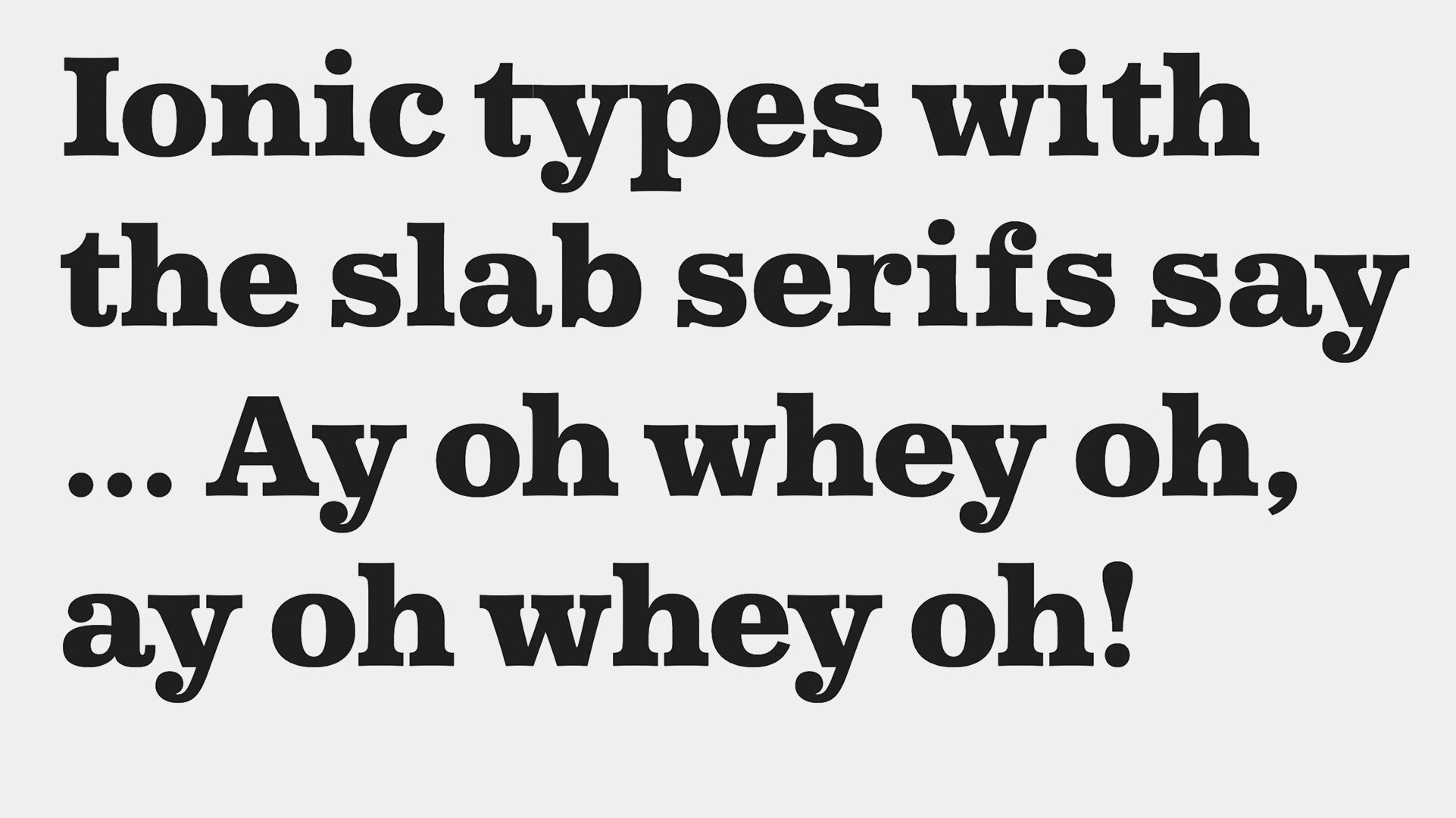
“Bolder and more robust than the modern, yet lighter and more refined than the Egyptian, the Ionic with its bracketed serif was another innovation of the nineteenth century. Perfect for both text and display, with its large x-height and wide capitals, it is a characterful face perfect for screen and print.
The Ionic was a stylistic development of the modern and Egyptian forms, but also a typeface that dealt with the technical problems of the time. At text sizes, poor printing exposed the weakness of the thinned modern, and the clumsiness of the slab. The Ionic was a response to this, a perfect blend of the two, creating a timeless economical text face, perfect for both print and now, screen.“
Notes:
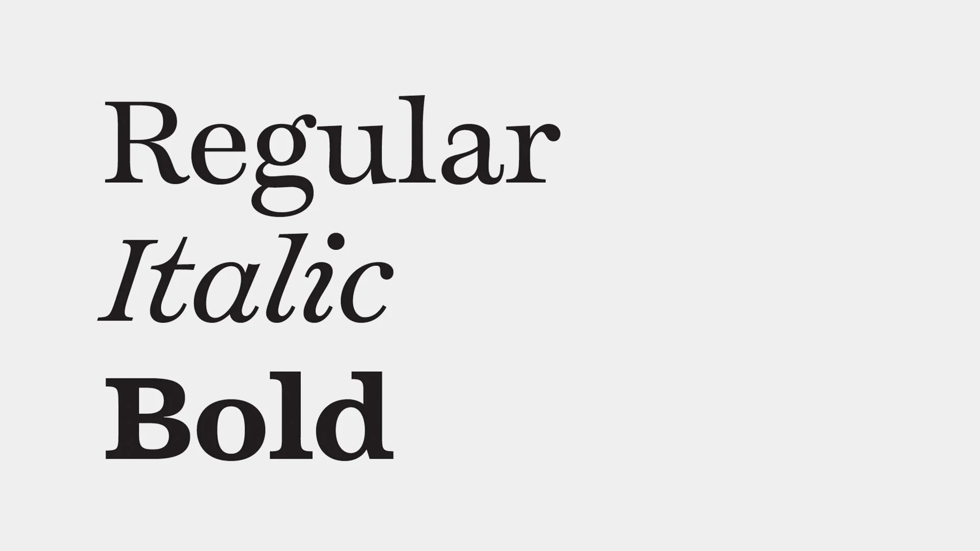
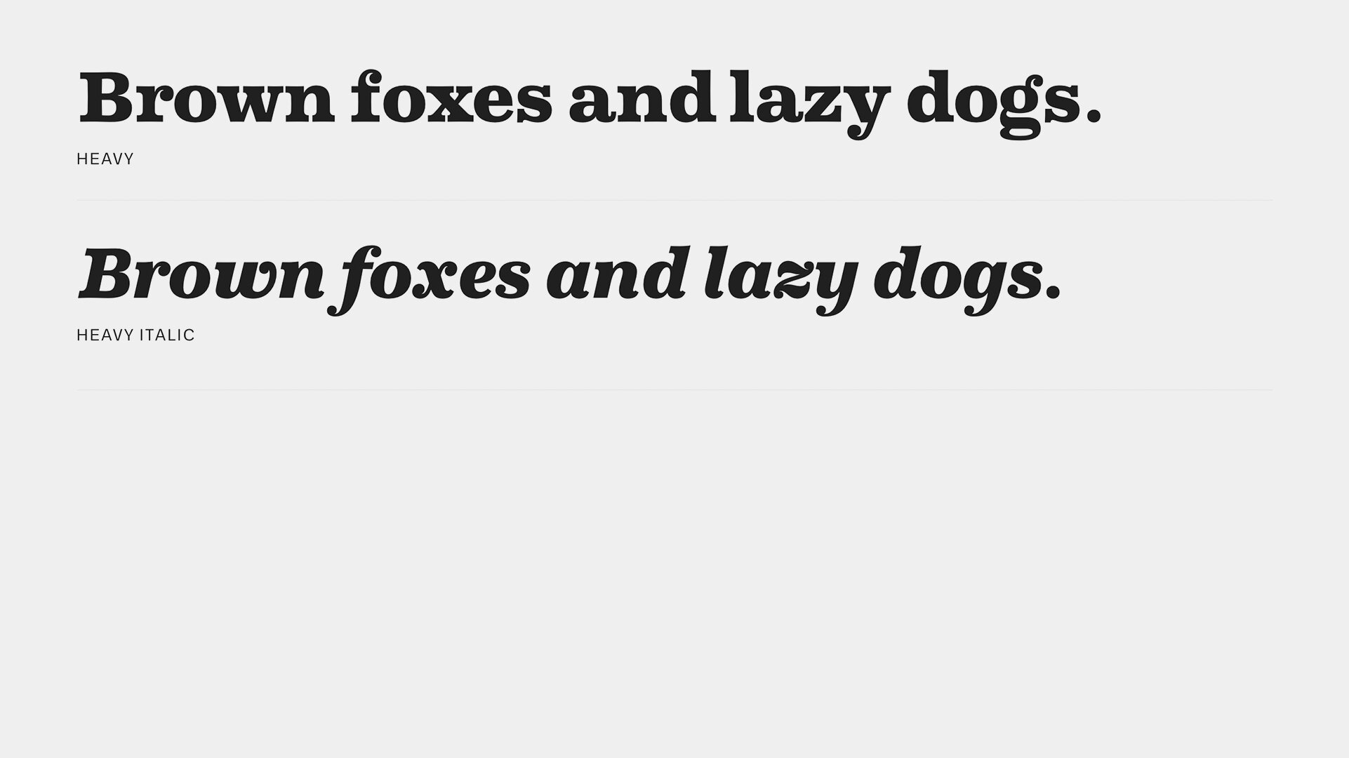
Caslon Ionic is perhaps the most true-to-form Clarendon in this list. It’s a perfect example of a historically inspired, down-to-basics, no-frills Clreandon face. Its four weights and matching italics provide all the expression you’d need, but in case you were looking for some additional slabbiness, Commercial has packaged Antique No. 6 alongside the family — a proto-clarendon, if you will.
Personally, I love how straight ahead Caslon Ionic is. It’s the Clarendon I’d design if I were into it all.
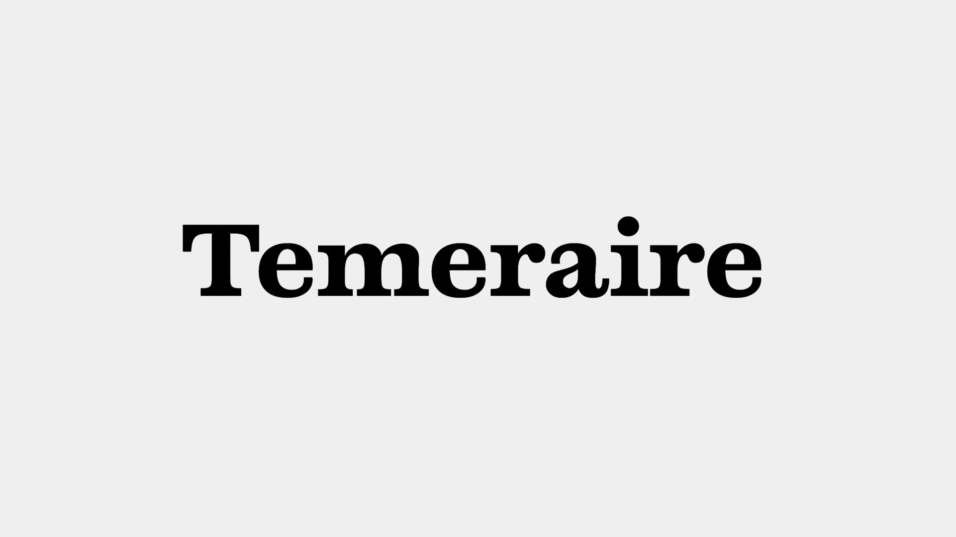


Temeraire
Details:
Foundry: Type Together ☞
Designed by: Quentin Schmerber
Release Date: 2018
PDF Specimen ☞
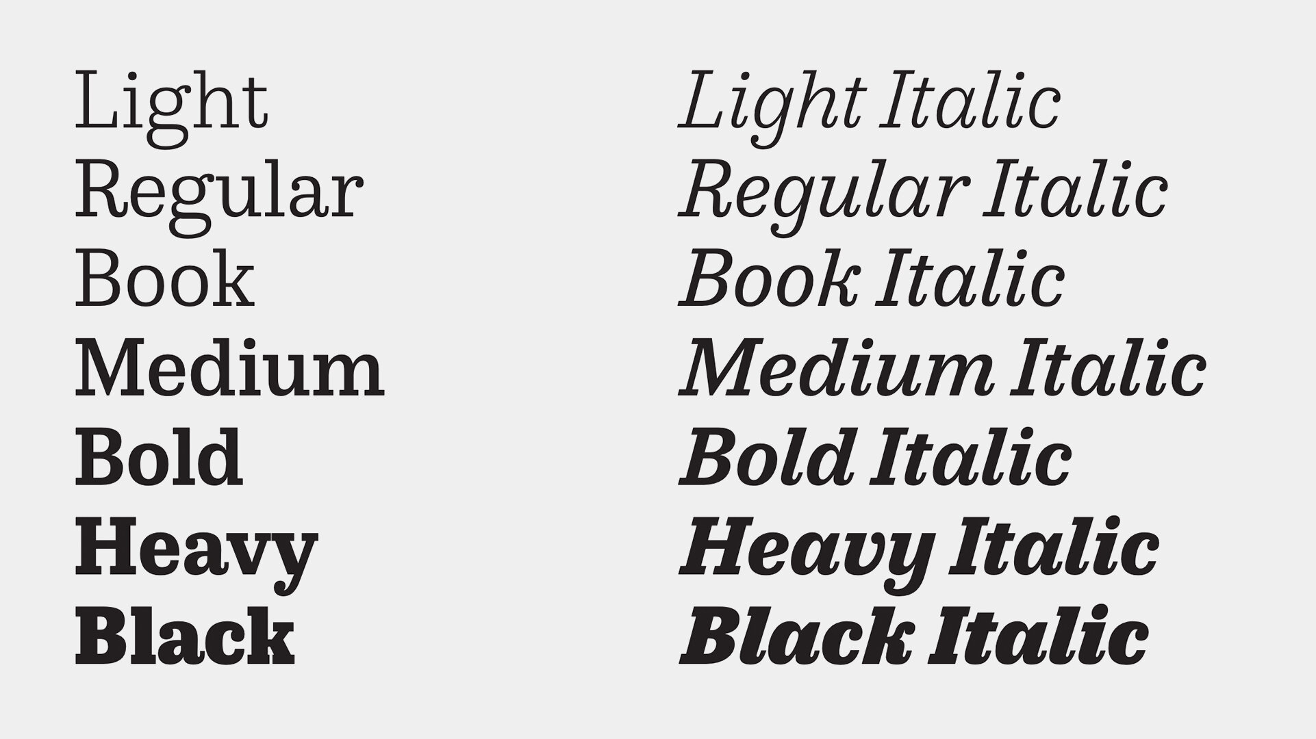
Family: We’re including Temeraire’s Regular, italic, and Bold fonts to our list. Temeraire does include other styles, but they fall outside of the Clarendon-style specification. (And quite beautifully, too.)
Price: Individual Styles come in around €31.50.
Try & Buy TEMERAIRE ☞
From the Foundry:
“While some fonts aim to be as easily ignored as possible, Temeraire is offered as a gift to wide-eyed readers with its anything-but-boring character and its conspicuous inconsistency in styles.
Temeraire’s Regular style is a contrast-loving Transitional Serif with vertical stress, making it great for period and classic works, ironic pieces, and modern throwbacks. The weight of the Bold squares off the ends of each glyph to give it stability, and the italic style rings true: flowing, contrasting, and purposefully inconsistent.“
Notes:
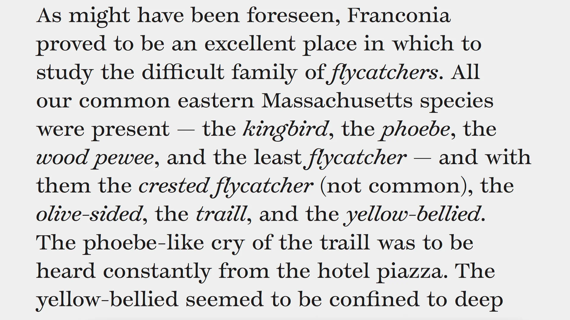
I think Temeraire makes this list because it walks like a Clarendon, and it talks like a clarendon, so it must be a clarendon right? Well,after hours of looking at it, I’m still not sure. Perhaps that’s part of its charm though, it’s a slab that got into the Clarendon club with a fake ID, and who doesn’t want to hang with that person?
Temeraire’s weight contrast makes it feel like something from a past decade. It’s deep valleys where stems split and arms spin off give it an interesting quirk. It’s horizontally chamfered terminals and squared off proportions again make it feel like it’s older than it is. But, the regular weight has such swashy swagger, the curved sides to letters like l, I, and H give it a younger, more groovy appearance. Temeraire is hard to place, but I think that’s an advantage.


From the Foundry:
“The LD Moderne Slab type family is a classic slab serif typeface based of the founding thoughts of the LD Moderne Antiqua. It’s designed to complete the LD Moderne Type System with a slab variant matching the classic approach of the LD Moderne Antiqua Typeface. The LD Moderne Slab family is designed as a group of five weights, each with a dedicated italic version. The LD Moderne Slab Family offers Pan-European language support, three figure sets, small caps, fractions and many more little goodies for the typographic enthusiast.“
Notes:
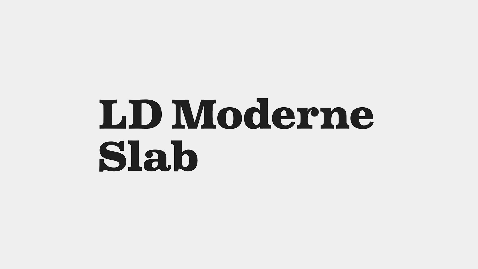
There’s a smartness to LF Moderne Slab that makes me look back it again and again, as if it’ll reveal the source of its power if I stare at it long enough. LD Moderne Slab is a tidy and classic take on the Clarendon style, with its more square proportions, Its proud and definitive features, and its well heeled serifs. It’s clean, its neat, its rather nicely put together… in other words, its a serious study in subtlety.
If you set a line of it in open white space, stand back and let the letters breathe, it suddenly takes on a prestigious and stately vibe, and that’s a result of the million tiny little things going on in its design that you wouldn’t otherwise note but are working hard to express a modern refinement. I like LD Moderne Slab because its an unexpectedly elevated and quiet offering in a field of louder personalities.


From the Foundry:
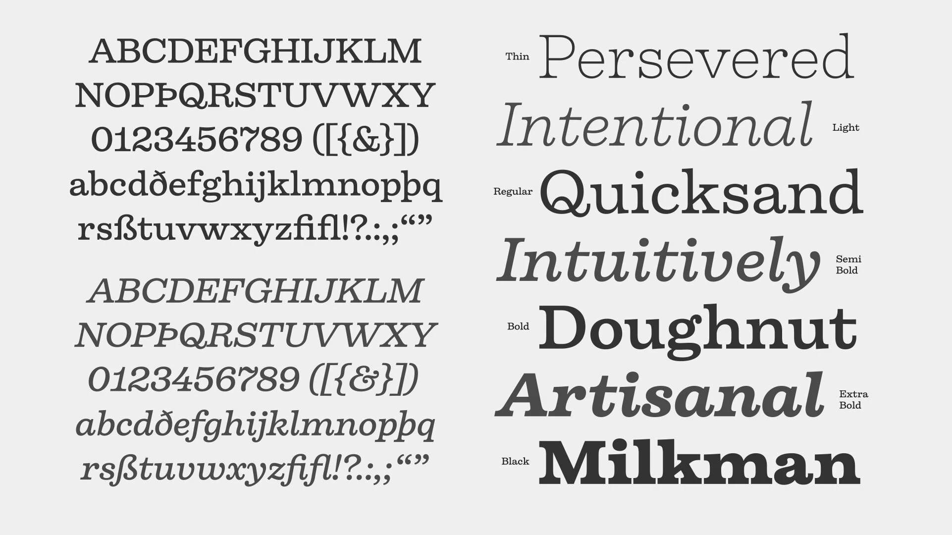
“Firelli is an original family of 14 styles including 7 weights and Italics. Delighting from thin to black, Italic swash caps, ligatures, and neat alternate characters. Big headlines will love Firelli’s incorruptible details. Longer texts will benefit from a wide-ranging family with its solid posture. Go, use everything Firelli has to offer, to design your contentful magazines, powerful annual reports, or even bedtime stories and fairy tales.“
Notes:
Ok, I’m normally not a huge fan of personifying typefaces, but Firelli seems like it’s got the kind of personality I’d take out for a Negroni in the park and then head back to their place and listen to cool records for a while.
Firelli is hip and well dressed but with a more casual style. It’s friendly, its unassuming, its got good taste. I’m not sure what in the design is speaking into that impression, but perhaps it has something to do with the un-geometric joins, un-anxious descenders and ball terminals, and un-complicated simplicity of form. It’s self aware, it knows what it’s about and doesn’t project a need to live up to any historical or cultural expectations, it’s its own type.


From the Foundry:
“ Pulpo is a Clarendon style typeface with the skeleton of Century Schoolbook. Longer extenders give text a bit more air to breathe and improve legibility in small text sizes. Serifs are subtly bracketed, as are selected inner corners. Despite the strength and sturdiness of the design, each letter shape carries warmth and an echo of the human hand. The familiarity of the letterforms also conceals some nostalgia.“
Notes:
…


From the Foundry:
“David Berlow’s family is based on Aldo Novarese’s Egizio, designed in 1955 for Nebiolo. It was first prompted by the popularity of Haas Clarendon, designed by Hoffmann and Eidenbenz, an impeccably Swiss revival of the traditional English letterform. Aldo Novarese was among the first to investigate a true italic designed in the Clarendon style; FB 1987–98“
Notes:
…


Eames Century Modern
Details:
Foundry: House Industries ☞
Designed by: Erik van Blokland & House Industries
Release Date: —
PDF Specimen: None Available
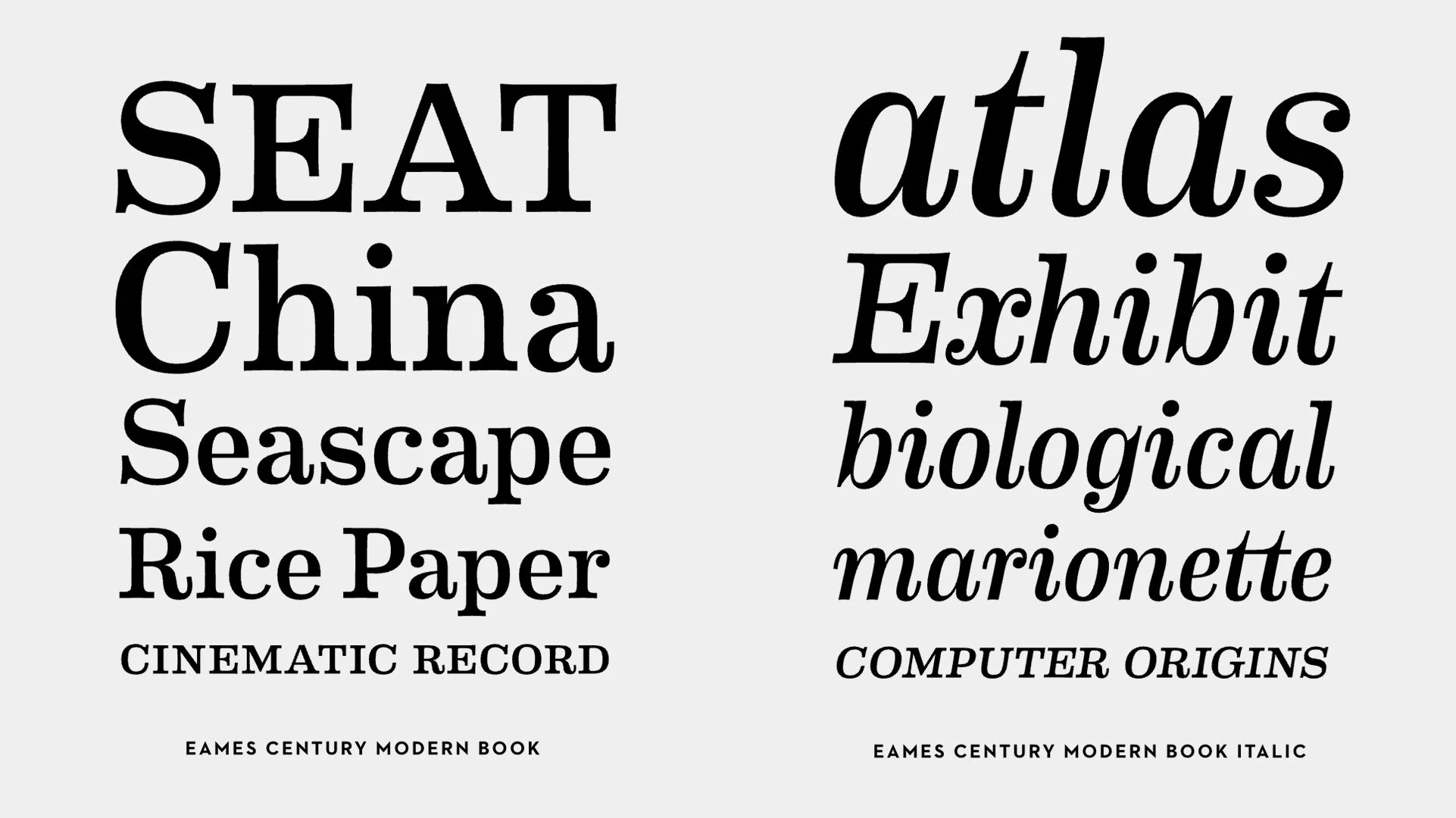
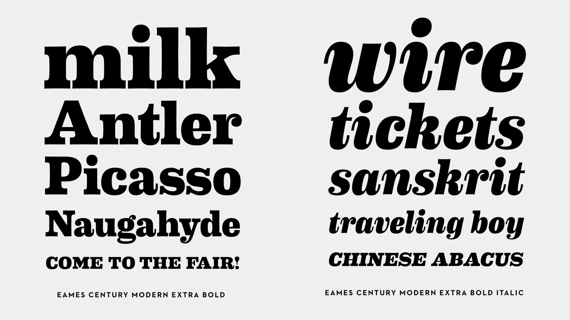
Family: A family of 16 fonts across 8 weights of roman and italics. The family also includes stencil, numeral, and dingbat styles.
Price: $75 per font, $299 for the full family.
Try & Buy Eames century modern ☞
From the Foundry:
“Eames Century Modern is a typographic workhorse that honors the Eames aesthetic while offering unprecedented functionality. An eighteen-style serif typeface family strikes an unprecedented balance between distinctive idiosyncrasies, readability and space economy. Its 18 styles include gracefully complementary italics and a virtually endless supply of deep text handling features. Carefully-weighted small caps, nine different figure styles, ligatures, contextual alternate forms and thousands of lines of computer code give Eames Century Modern a significant edge in contemporary design environments.“
Notes:
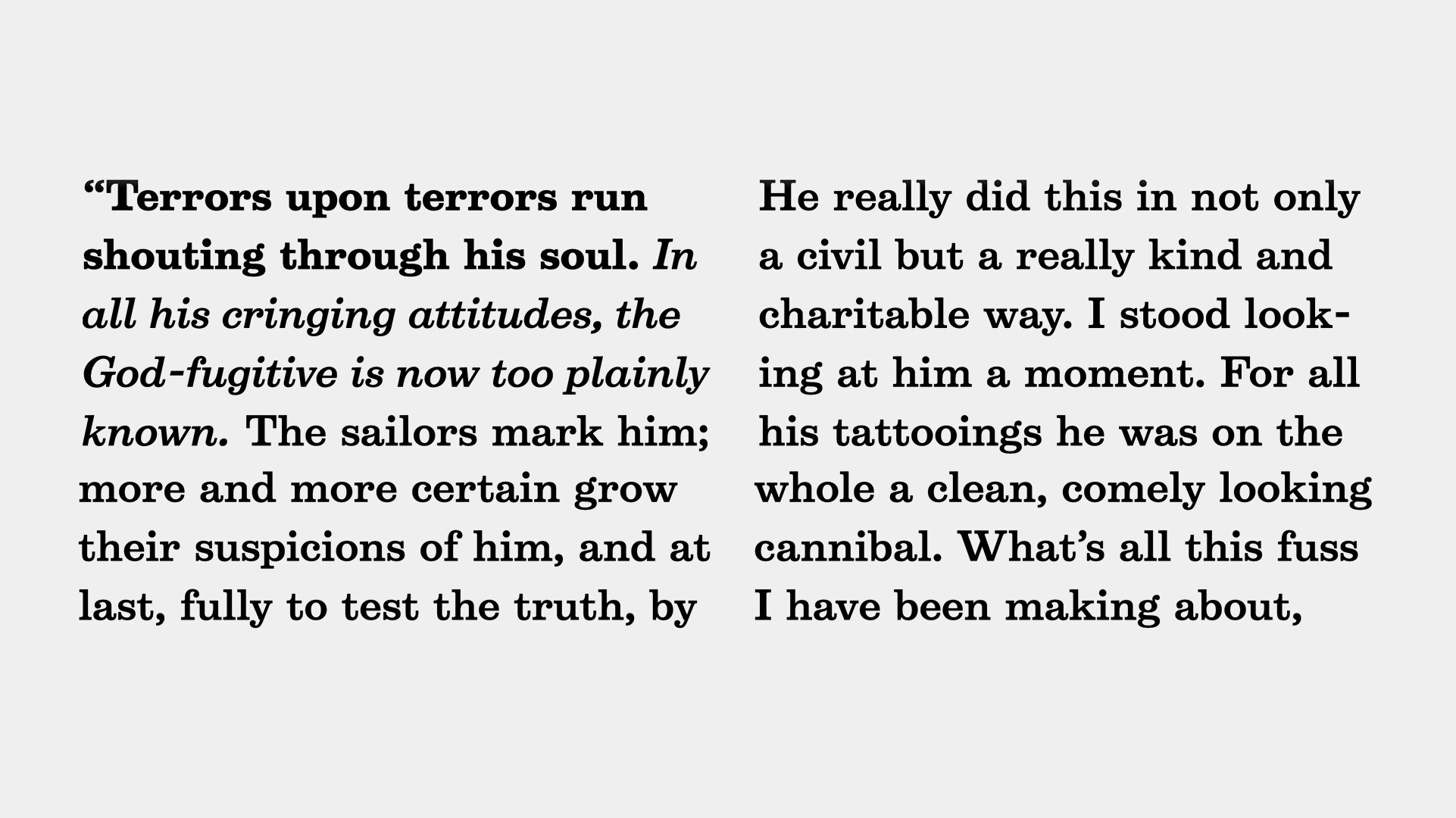
Eames Century Modern is an evocative, expressive, and endearing expression of the Clarendon spirit. Its fun flippy terminals in the a and R, the way it carries its weight with brazen high-contrast gusto, and the way the corners energetically pierce outwards give Eames a charm and life unlike any other. It’s got big counters and strong opinions. It can be beautiful and Elegant, or wacky and performative. Name me another typeface with such range, I’ll wait.
If its historical whimsy you’re looking for, look no further. If its “a little something extra” for a buttoned-down client, Eames is your choice. If its straight-ahead, no nonsense corporate communications you’re looking for, keep scrolling because Eames is here to have a good time.


From the Foundry:
“CoFo Robert is a modern twist of a classic. Named after Robert Beasley, the author of the first Clarendon typefaces, Robert takes inspiration from the chunky mechanical letters, created for the first time at the beginning of the 20th century for large display use. But take a closer look at the sharpness and carefully crafted curves and you’ll see that this stands far from a historical revival. The expressive nature and the spirit of the Industrial Revolution are mixed with a hint of new technology and a powerful human touch, to turn Robert into a rational multifunctional type family with authoritative Romans and expressive Italics in 7 weights. Robert is also packed with all the extras that designers dream of: several sets of decorative numbers, arrows, hands, bullets, small caps, supplying even more tools for creative freedom and making the possibilities of its usage limitless.“
NOTES:
…


From the Foundry:
“Sentinel was designed to address the many shortcomings of the classical slab serif. Unbound by traditions that deny italics, by technologies that limit its design, or by ornamental details that restrict its range of weights, Sentinel is a fresh take on this useful and lovely style, offering for the first time a complete family that’s serviceable for both text and display.“
NOtes:
“ “
More Resources on Clarendons
Clarendon Fonts In Use ☞
Know of another typeface that should be on this list? Shoot us an email with links!
We’ll consider and evaluate it for addition to the list.
✌️