
Week 26, 2024
Releases:
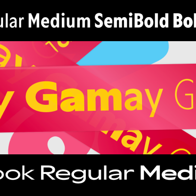
Gamay
Darden Studio
→ Gamay is a new geometric sans typeface family comprised of an extensive collection of weights and widths — 108 fonts to be exact. Darden says "Gamay embraces both full-bodied and affable characteristics. At first glance, Gamay’s construction appears strict and geometric; yet the typeface appreciates calligraphic gestures." The boldest weights do feel contemporary an almost humanist at times, while the lighter weights carry the geometric torch proudly. The Gamay collection features 9 weights of both roman and italic styles across six widths.

Lumbrance Sans
Sudtipos
→ Lumbrance Sans is a new typeface release from Sudtipos making bold decisions and trying new things in almost every single character. Designer Andrés Felipe Ramírez says "We have incorporated distinctive elements such as pronounced corners and slightly elevated horizontal strokes, blending irreverence with formality and simplicity. The result is a typeface that combines personality and balance between traditional and contemporary styles." Lumbrance Sans is a family of 9 weights across 3 weights each without italics for a total of 27 fonts.
Adelia
Letters from Sweden
→ "Adelia is a flare serif influenced by Nordic arts and culture of the early 1900s. With romantic and organic yet straightforward characteristics it pays homage to the final decades of classicism." Designed by Fredrik Gruber, Göran Söderström, and Léo Guibert, Adelia feels classically European while injecting a few suprising notes like the overarching m and n strokes that earn it its descriptor of "Elegant and robust by default, powered with unusual and quirky alternates and ligatures." Adelia is a family of three roman weights: Light, Regular, and Bold.
Control
Commercial Type
→ Control, a gothic sans typeface family designed by Christian Schwartz and Miguel Reyes, is built on a system of axes for weight, contrast, and apertures. The family of 30 fonts is loosely held together by a 70's editorial style developed for Interview Magazine (although never fully used for the publication). Because of this, users are meant to find the right combination of these for any application. There is no “correct” version—the typeface is meant to be fine-tuned for each situation. There are two stand-out highlights about Control: The angular and unexpected Cursive style and the Tight-but-Not-Touching versions of each font. The Cursive is loosely inspired by Van Dijk, drawn by Jan van Dijk for Letraset in 1982, and "leavens the serious modernism of the upright with strip-mall hair-salon vibes." The TNT options for each font is a masterstroke, and provides tangible and useable edge. Read the full write up about Control here.

Aktuell Display
Type By
→ Aktuell Display is, of course, a contemporary editorial display serif cut of Type By's Aktuell Text Family, designed by Thomas Thiemich. "Aktuell Display is not a mere extension of the Aktuell text family – it's a masterful exercise of nurturing elegance, drawing expressive but highly functional strokes and outlines, and bringing the finest of contrasts into the mix." Aktuell Display is available in 5 weights of roman and italic designs: Blond, Normal, Medium, SemiBold, and Bold.
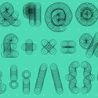
Scatterplot
CAST Foundry
→ "Scatterplot is a variable slabserif made out of dots and recommended for animation, headlines, titles, posters and other display purposes. Its lighter weights also work nicely at text sizes, producing the effect of an old matrix printer. Scatterplot was studiously designed with an underlying geometric structure and dots arranged on a modular grid. The result is a variable font with a double axis: Weight and Random. It also comes as distinct static fonts with four preset weights (Light, Regular, Bold and Heavy) and four levels of randomness (Mild, Borderline, Wild and UltraWild)."
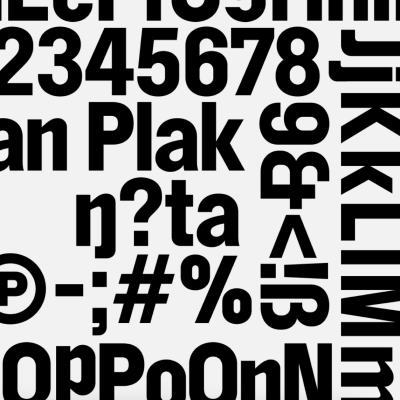
SB Prophan Plakat
Sascha Bente Type
→ Prophan Plakat is a display typeface that plays with systematic inconsistencies. It is based on Etrusco Nero Moderno, published by Società Augusta (Turin) – taken over by Nebiolo Foundry in 1878. The Etrusco family features a variety of sans serif references, with its black weight resembling Fette Steinschrift and its light weights echoing Akzidenz Grotesk. The Nero Moderno cut combines triangular and rectangular curves, which Prophan translates into digital realm. It also features slightly unusual widths—some letters appear condensed, while others follow a regular proportion.
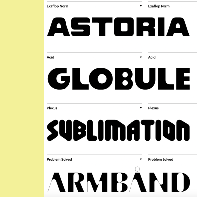
The Doss Collection
Sharp Type
→ Inspired by the logotypes of construction and hi-fi audio brands, DOSS is a collection of four display-oriented typefaces that also reference the aesthetics of ‘90s rave culture and ‘80s sci-fi tropes. Available all together or as individual styles, the DOSS collection includes Exaflop, Acid, Plexus, and Problem. While each has its own unique flavor, the styles within the Doss collection are unified by their exaggerated geometric structures, unexpectedly round counterforms, and unicase character sets. A set of display fonts like this is a new move for Sharp Type, with their library now in its second Act.

2023 Annual Report — Out Now!
Packed with stats, insights, and analysis, the 2023 Annual Report is the most comprehensive look into the economics and storylines from the world of independent type.

Full Season of Typecraft is now Free!
All six episodes of the podcast miniseries focused on the stories behind Custom Typography are available now, for free, wherever you listen to podcasts.