
Gradient Comic
From the Foundry:
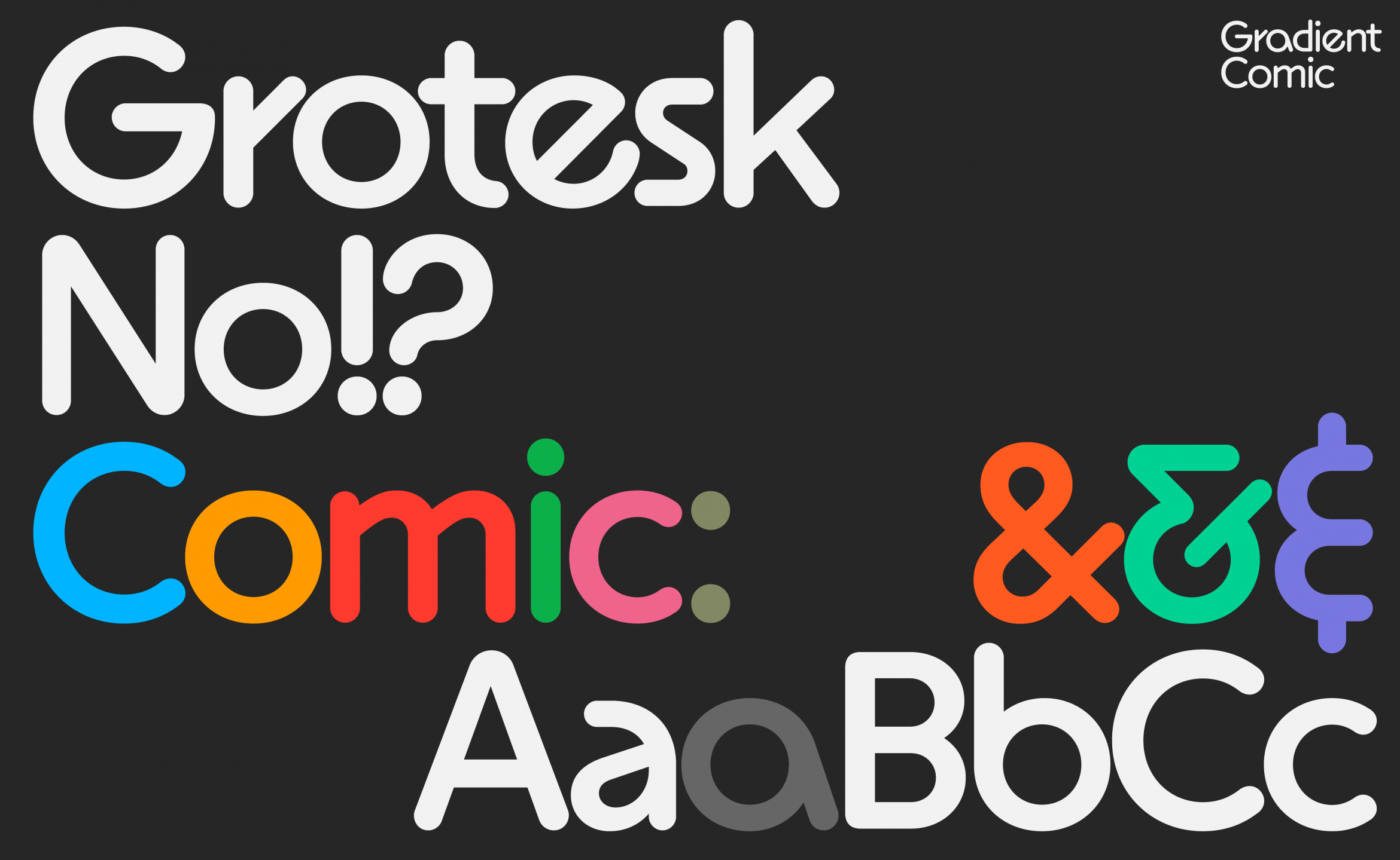
“Round ends of the strokes give the font a softer expression and allow for playful designs or, on the contrary, maintain minimalism. Gradient is intended as a transitional typeface, connecting the constructed features in sans-serif styles with playful handwriting. The primary design approach was to lean towards diversity of individual letters and away from unification. The only connecting element happens to be a diagonal line, which is also a nod towards many historical design styles and periods from the 20th century.
Gradient Rounded is now available in eight styles (Hairline, Thin, Light, Regular, Medium, Semibold, Bold, Black) with five stylistic sets (lowercase a, e, g, t and &). Character sets include lowercase ligatures, many decorative elements, circled numbers and roman numerals.
Gradient Rounded is also available with tiny serifs as Gradient Gothic and in sans-serif variant as Gradient.”

NOTES:
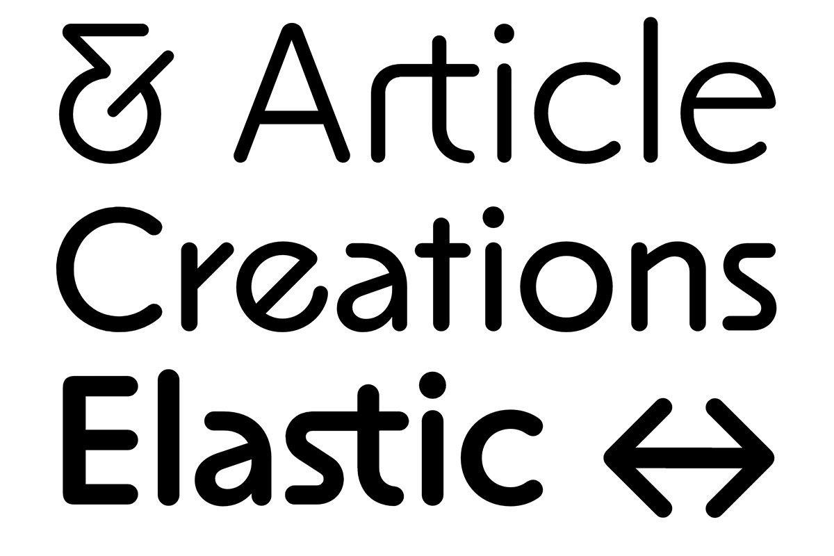
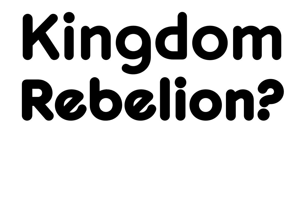
Gradient Comic is a rounded sans iteration belonging to the foundry's Gradient Collection. With a name clearly nodding to a certain legendary typeface, Gradient Comic makes a statement that is both homage and projection. The family of 8 weights boasts plasticine forms, striking diagonal strokes, and a delightfully naive feeling sensibility. The foundry says that "round ends of the strokes give the font a softer expression and allow for playful designs or, on the contrary, maintain minimalism."
Perhaps it’s just those rounded terminals, but this typeface is thoroughly enjoyable. I really enjoy how the diagonal strokes break things up on the reading line, additionally making it a good candidate for a display face with something a little different to offer. The coathanger descender of the g, the stick figure r, and the way the n and m branch out at that same consistent angle as the e and x… there is clear planning and intention behind the overall feeling and demeanor of this typeface. It’s not just another sans that got its terminals cut off, this feels like its supposed to be this way, and I’m here for it.