A faithful take on the 19th century Egyptian from Commercial Classics amalgamating the style of the genre’s pioneers.
Read More
A faithful take on the 19th century Egyptian from Commercial Classics amalgamating the style of the genre’s pioneers.
Read MoreA rounded sans iteration of Superior Type’s larger Gradient Collection boasting plasticine forms, striking diagonal strokes, and a delightful sensibility.
Read MoreA contemporary translation of the Times New Roman model from La Bolde Vita across three unique subfamilies.
Read MoreA nod to Morris Fuller Benton’s Clearface, but with more tension and edge across three optical sizes from DSType.
Read MoreAn elegant and sharp editorial display family from Nova Type Foundry bringing fresh air and smart dimension to the digital type landscape.
Read MoreA gorgeous and swarthy script type family from Simonson Studio referencing baseball scripts and script styles popular during the first few decades of the 20th century.
Read MoreA modern interpretation of Paul Renner’s Futura from Studio Rene Bieder, drawn with grace and tact.
Read MoreA sturdy "quirkhorse" sans from Fort Foundry inspired by gothic wood type of the 19th century.
Read MoreA stencil typeface family from Typotheque that follows the logical contrast principles of letter construction until the shape is fractured at its narrowest point.
Read MoreAn elegant and sharp high-contrast display serif family from Pangram Pangram, inspired by the work of Eiko Ishioka and supporting Latin and Japanese writing systems.
Read MoreA Dwiggins-inspired editorial serif design in text and display styles from DSType Foundry.
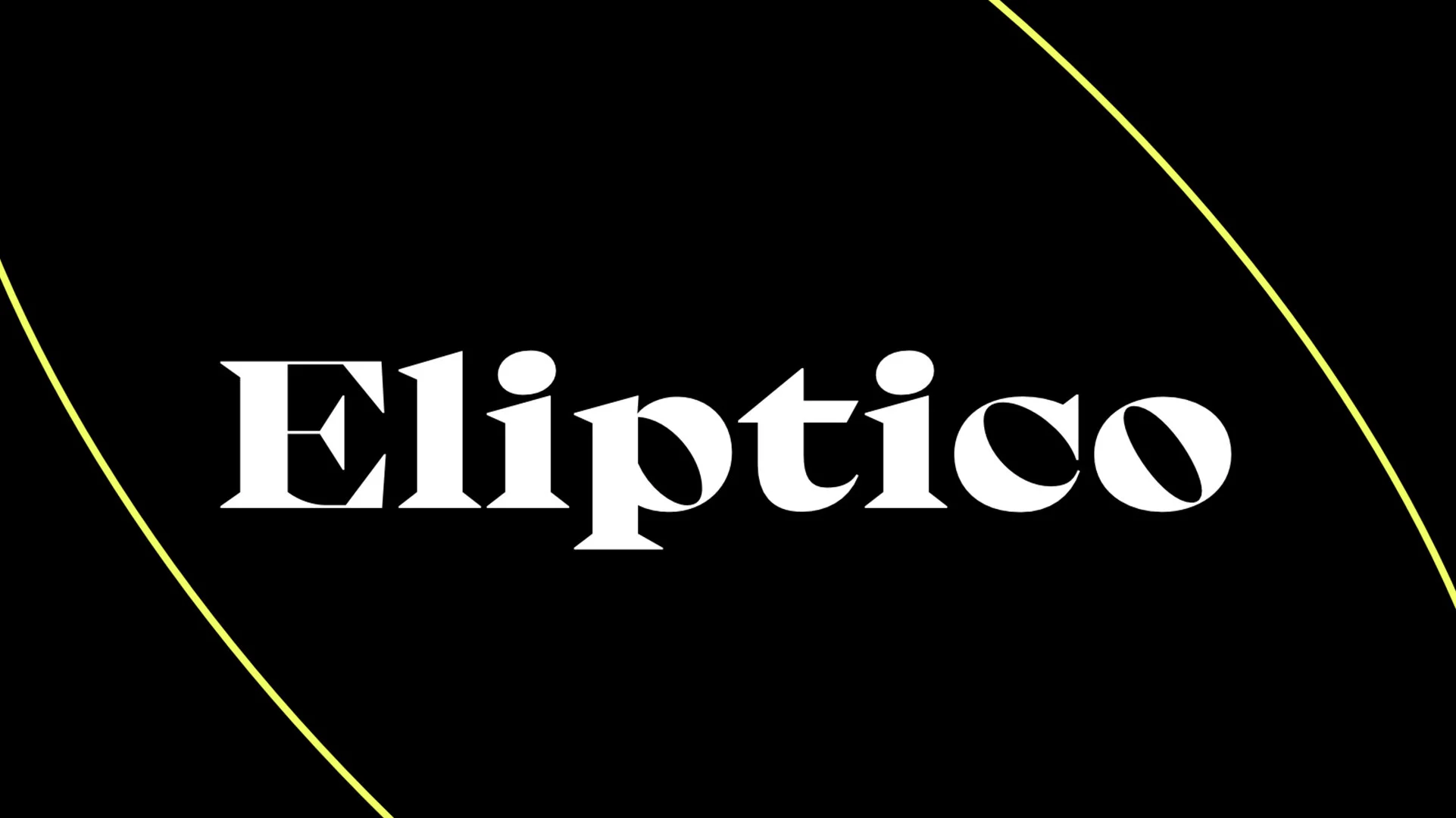
Read MoreA high-contrast serif with intense diagonal stress and big, round elliptical counters from Typeji, released through Future Fonts.
Read MoreMidnight Sans is a "warm, but idiosyncratic" flavored display sans from Colophon Foundry of several widths and sharp or rounded expressions.
Read MoreA modernist sans serif family from 205TF, out to prove that functionalism doesn’t have to be cold and neutral, but can be “warm and softly effective.”
Read MoreA display sans collection from Coppers and Brasses that “tries to bridge the gap between the expressive humanist sans typefaces of the ’60s and the modern geometric superfamilies of today.”
Read MoreA neo-grotesk type system from W Type Foundry exploring the relations between contrast, functionality, and graphic character.
Read MoreA semi-condensed, pseudo-geometric sans with plenty of personality from Hoodzpah Design.
Read MoreA sturdy, robust, and well balanced workhorse text serif from Monokrom.
Read More