
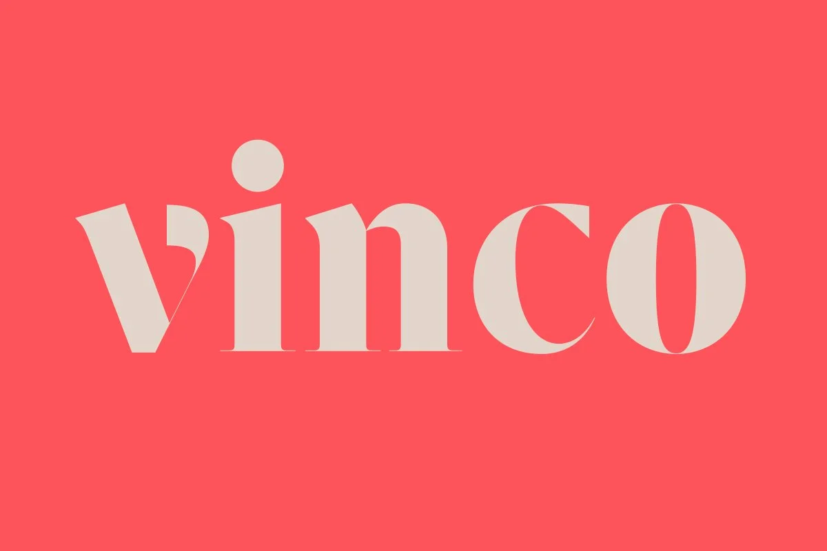
Vinco
RELEASED BY:
DSType ☞
DESIGNERS:
Pedro Leal
Dino Dos Santos
RELEASE DATE:
Week 01, 2023
DETAILS:
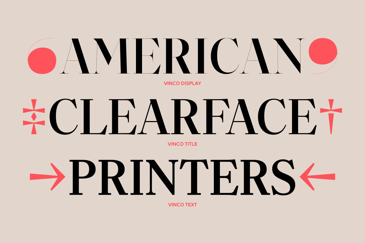
• A nod to Morris Fuller Benton’s Clearface, but with more tension and edge across three optical sizes.
• Available as a family of 42 fonts.
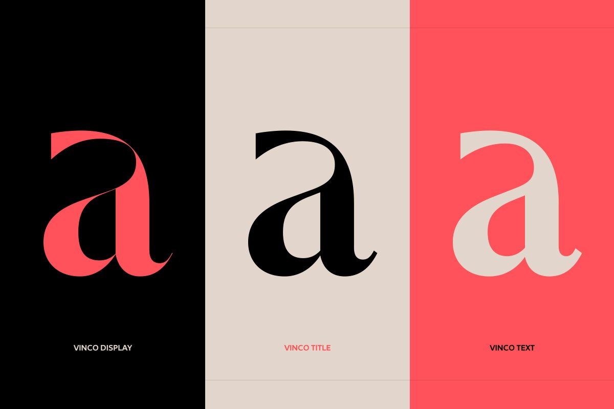
• The family includes three subfamilies: Display, Title, and Text.
LINKS:
From the Foundry:
“Inspired by Clearface, Vinco shouldn't be considered a revival of the typefaces designed by Morris Fuller Benton in the early 20th century. We decided to keep the fascination with the mixture of cursive and vertical elements in the design. We overpassed the warmth and shapely figure of the original characters by making it much tenser, with vertical-formed endings in the lowercase letters.”
Foundry Images:


NOTES:
Vinco is a high contrast editorial serif with clarity and style at its core. The foundry notes that Vinco is inspired by, but not a revival of, Clearface, stating "We overpassed the warmth and shapely figure of the original characters by making it much tenser, with vertical-formed endings in the lowercase letters." The family is split into three subfamilies — Display, Title, and Text, that while only subtly different in terms of thickness of contrast and proportion are obviously useful and elegantly drawn.
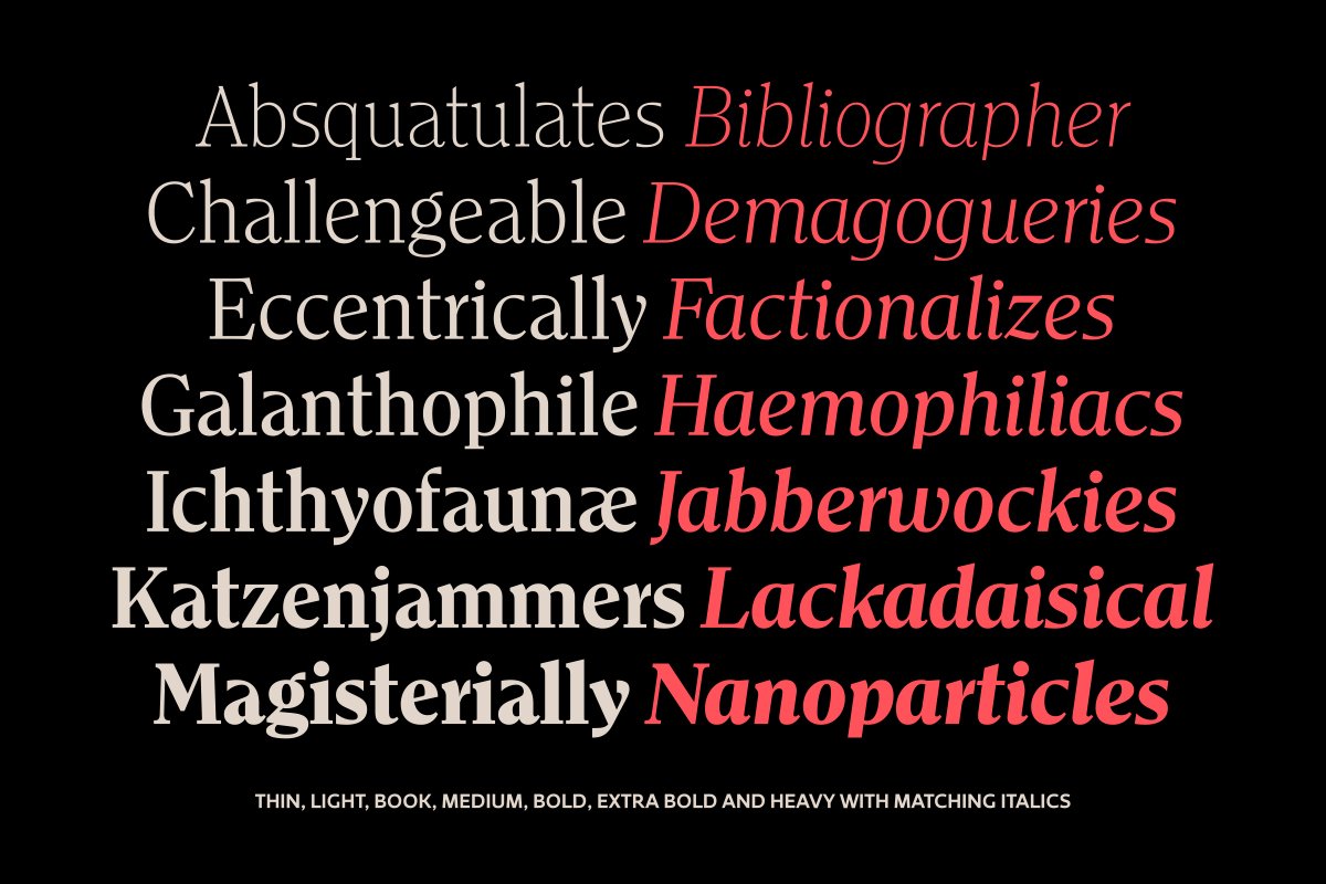
The characters are imbued with an individualism that does indeed set it apart from teh Clearface model, but doesnt entirely shake it either… all in the best way possible. The horizontal trumpeting of the a’s top storey, the waving w, and the crooked f and j forms — all special details that make this family so desireable. Vinco lands the dismount here, showing off bold style choices and brand new clothes for a stylish new emperor in a new year.