Signifier
RELEASED BY:
Klim Type Foundry ☞
Designers:
Kris Sowersby
Release Date:
August 26, 2020
Details:
1 Family of 14 Fonts
including Roman & Italic styles.
OVERVIEW:
Signifier can be classified as a “Modern Oldstyle” typeface family of 14 Fonts in Roman & Italic Styles, however it seems to break out of any district genre classification in more ways than one. Described as a “Brutalist response to 17th century typefaces”, Signifier is a mash up of sorts, bringing together seemingly disparate themes and techniques to create something entirely unexpected.
From the Foundry:
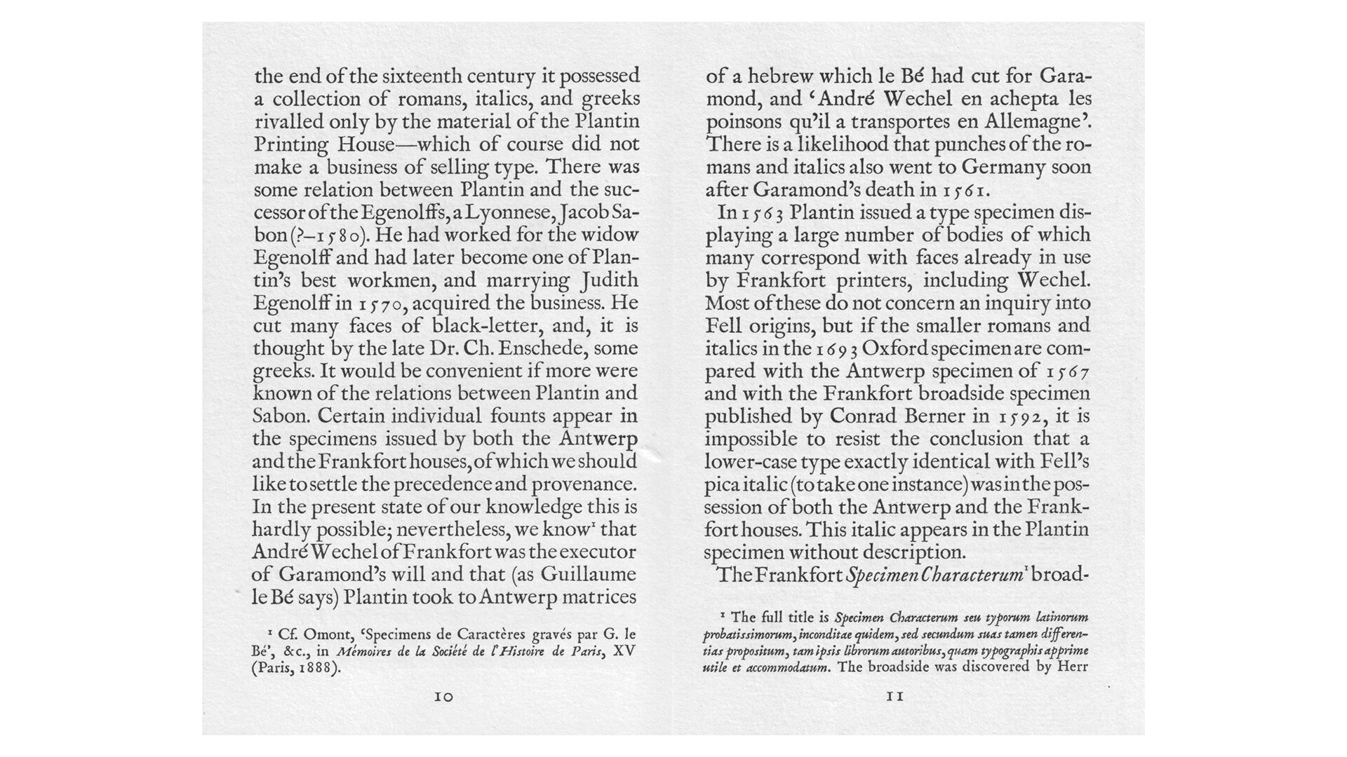
“Signifier is a Brutalist response to 17th century typefaces. Designed by Kris Sowersby, Signifier’s digital immateriality draws on a deeply material past. Acknowledging the processes and tools of digital form-making, Sowersby worked consciously with the computer to recast the lead, antimony, and tin of the 17th century Fell Types into ones and zeros. Signifier emerged from this alchemy with Bézier curves and sharp vectors determined by machine logic and a Brutalist ethos.”
Additional Credits:
Engineering: Noe Blanco
Collaborators: Bethany Heck, Dave Foster, Dean Poole, Kelvin Soh
SPECIMENS:
Highlights:
Opinion:
While it seems like the type world is salivating over ever-expressive display fonts, Signifier quietly and confidently brings a fresh focus to what typography can do for traditional text setting, something Kris Sowersby has always had an eye for. Signifier gets the most out of the tools used to make it, resulting a family that champions what it means to be a typeface in the 21st century. This is especially evident in the way the design manifests across 7 weights. The thin is elegantly and perplexingly structured at times, with the heavier weights being both deliciously chonky and exquisitely sharp at the same time.
On the surface, or at first glance, Signifier may look aggressively anti-establishment, or subversive for subversiveness’ sake. But in use on screen it is sensitive, freed, smart, clean, and feels oh-so-right. I always enjoy how Kris designs for eyes not computers. Like a fish in water, Signifier is especially well suited for the digital world we’ve grown into. It is beautiful because it is useful, because it is honest with itself, and because it manages, somehow, to transcend the harshness of the pixel to deliver something warm, fresh, and obvious.
Don't let the term brutalism scare you off. It’s worth pouring over the design information so eloquently and clearly laid out on the Klim site. The sharp corners, strangely constructed letterforms, flat out omissions in places, and seemingly deformed appendages that some of the characters in this family flaunt make for a jarring first look. However, like most groundbreaking innovations, the ideas put forth in Signifier might change how you see all other typefaces.
I love the use of the term ‘infinite sharpness’, it sums up this family so well. The harsh digital nature is merely form. Where signifier really shines is in its function. In long reading texts, and at small set sizes, all that digital-looking fancy footwork simply melts away and you’re left with a beautifully warm expression and color on the screen. Signifier offers up a delight in the form of a typographic magic trick, transforming into something different before our very eyes.
Much of the focus in the global type industry lately has been on the extravagant world of display types and what’s possible in the headline. What is the modern text typesetter to do? Doesn’t the long-form reading experience get any love? The designers creating new reading experiences online, where are their new shoes? Klim answers the call with Signifier, and may turn us all into classic typesetters yet.
Signifier might possibly be Kris’s best work to date. Signifier is a well researched, well executed, and intelligent release, packed with enormous potential for designers, especially those crafting new digital experiences online.
Competitive Set:
Chronicle from H&Co. ☞
Source Serif ☞
Additional Links:
Fonts in Use Page ☞
What do you think about Signifier?
Join the conversation and share your thoughts on Twitter.


