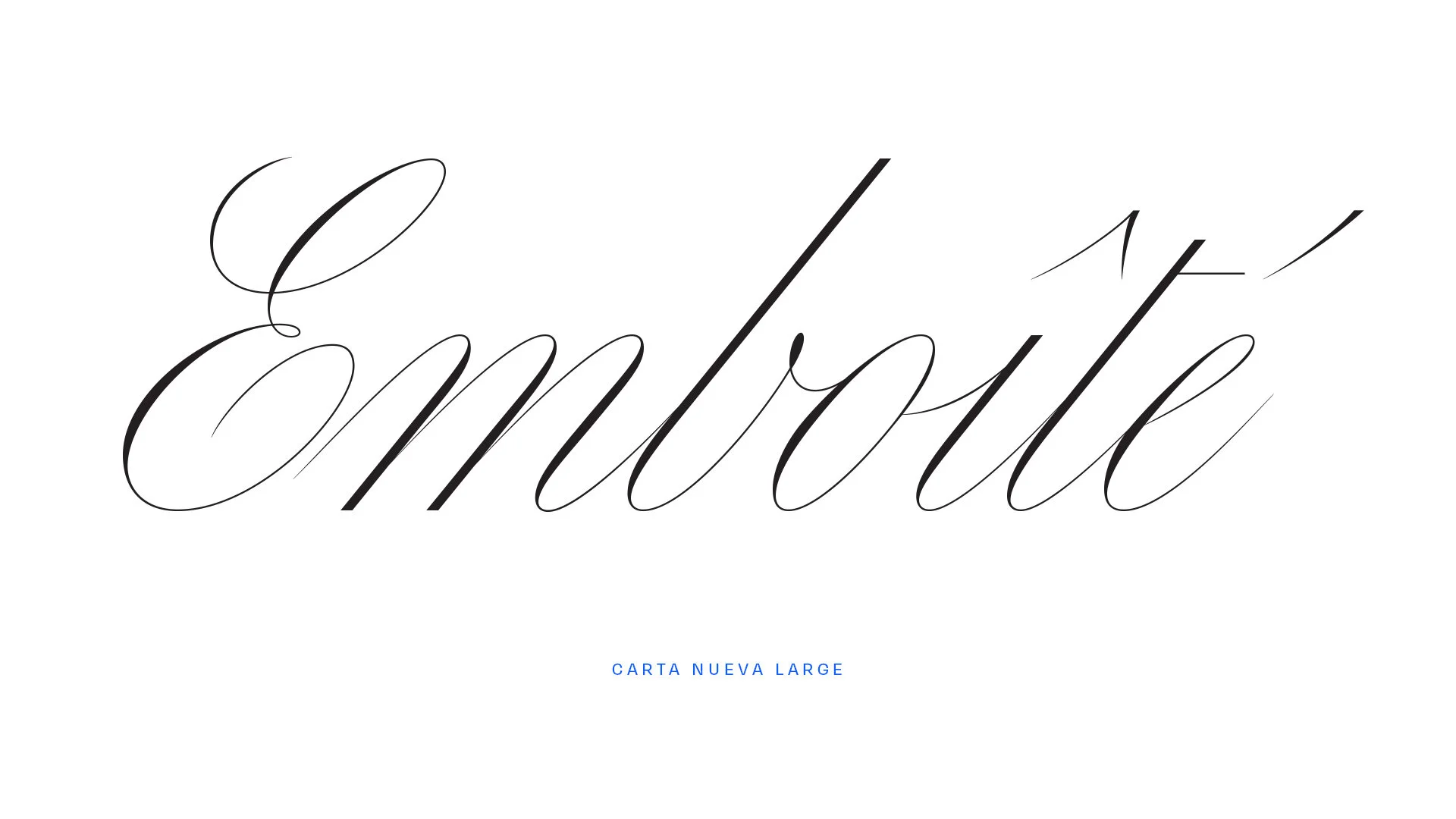
Carta Nueva
Details:
1 Family of 5 Fonts
expressed in 5 optical sizes
OVERVIEW:
Carta Nueva is a script typeface family in the pointed-pen calligraphy style. As one of the first calligraphic script releases in several years, Carta Nueva sheds light on an oft forgotten genre of the type-universe, taking it into the digital era with 5 optical sizes.
From the Foundry:
"Carta Nueva is the digital re-imagination of a pointed-nib calligraphy model from 1851 in Barcelona, Spain (designer unknown). 170 years after the original calligrapher’s penning and printing, the manual made its way into our hands at an antique fair in Madrid. When type designer My-Lan Thuong began designing Carta Nueva in 2019, she could not have anticipated just how far these letterforms would take her. Under her care and imagination, we knew the spirit of the letterforms would be treated thoughtfully and take on a new life of their own for the 21st century. Much like its designer, Carta is poised and lively, with an unbounded potential for growth and flourishment."
SPECIMENS:
Highlights:
Opinion:
Carta Nueva is one of my favorite releases of 2020, making it an obvious choice for inclusion in the inaugural set of reviews on P&Co., and there are several reasons it holds such regard. I have to agree with the Sharp Type description here of "poised and lively", but the expression goes so much further than that. Carta Nueva is smart without being elitist. It’s elegant without the pretension. It’s expressive without being excessive. It’s refined in all the ways you want when shopping for scripts like this. Carta Nueva is an expertly tailored piece of type design that still retains a few tricks up its sleeve to be sure.
It’s often difficult for digital type to capture the energy, emphasis, and quite frankly, beauty of calligraphic models, but Carta Nueva is certainly one of the best distillations I’ve seen in a while. It’s got a grace and elegance enough to keep it in the realm of typical script applications, but also enough of a simplicity and stance to open it up to all kinds of new opportunities that other scripts of this nature aren’t awarded. It’s potentially a cross-over hit. It’s got all the right stuff to take allow designers to a risk in setting it and stick the landing by upending expectations and feeling oddly right for the job—much like Rene Magritte’s famous pipe.
Carta Nueva is certainly a flex. It’s a flex of the skill needed to produce such a design, a flex of the foundry’s eye for stylish and useful designs (i.e. the commercial successes of Ogg, Beatrice Display, and the Sharp Grotesk mega-family), and a flex of the power a single, bold release has to sway the direction the type industry moves in.
The other achievement of note here is that Carta has been released into a typographic climate where expression in taking off, curves are sought after, and designers are tapping into the more expressive references of the past to see what uniqueness they can pull forward. While everyone has been obsessing over photo-lettering styles, art-deco letter drawings, pre-bauhaus gems, and far-out psychedelia, My-Lan and Sharp Type have found what they found beautiful to Zig among other’s zagging. They’ve confidently delivered an original pointed-pen calligraphic typeface set ready for the rigors of the digital age, and done it well.
Competitive Set:
Davison Spencerian — House Industries ☞
Bellisima Script from Sudtipos ☞
Tilda from Jessica Hische ☞
Additional Links:
Fonts in Use Page ☞
What do you think about Carta Nueva?
Join the conversation and share your thoughts on Twitter.


