
Tightly Spaced
Tight but not touching
Good typography is judged on how well it operates as a communicator — its legibility, readability, clarity, or texture on the page or screen — and a large part of that is about the space between characters, not just the characters themselves. It has traditionally been the model that a good typeface is one with ample spacing, but there are a few designers challenging this, capitalizing on spacing as an aesthetic opportunity. What would happen if you made the type as tightly spaced as possible? Well, it’s certainly a look. This bubble is about the types that are bringing everything just a little closer together.
Disc

Details:
Foundry: Available on Future Fonts
Designed by: Lucas Descroix
Release Date: November 09, 2022
Family: Two styles (Heavy & Text) in a v0.1 release on Future Fonts
Price: $24
From the foundry:
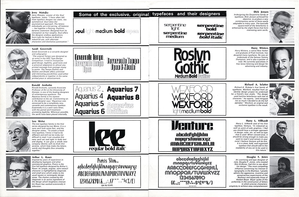
"Disc is a tightly-spaced display sans with relatively low contrast and a condensed structure. The design finds its origins in Harry Winters’ Roslyn Gothic, designed in 1972 for Visual Graphics Corporation. Or, to be more accurate, what initially sparked my interest was a spread from an Industrial Art Methods magazine from December 1972, where the name Roslyn Gothic is set with a surprising amount of negative tracking, resulting in some letters bumping into each other. This gives the typeface a sort of edgy flavor, contrasting with its otherwise rather humanistic feel."
HEX Franklin

Details:
Foundry: Hex Projects
Designed by: Nick Sherman
Release Date: April 12, 2022
Family: 28 fonts — 5 weights across 4 widths, plus an '8-instance Variable Font
Price: $200 for the collection.
from the foundry:
"HEX FRANKLIN is an homage to the classic Franklin Gothic type family and its lighter-weight siblings, News Gothic and Lightline Gothic. The design draws specifically from ATF’s original fonts for letterpress printing, and not the later adaptations from other companies. It is produced as a variable font, allowing for subtle stylistic adjustments, with the heaviest and narrowest variants tuned more for larger sizes. It also maintains consistent ‘multiplexed’ glyph widths across its weight variants, allowing for weight changes without text reflowing.The series also includes a ‘Tyght’ variable font that allows for for extremely tight phototype-style spacing without the need for manual kerning corrections by the user."
Nudge

Details:
Foundry: Very Cool Studio
Designed by: Kyle Wayne Benson
Release Date: June 22, 2021
Family: 36 fonts — 9 weights of roman & italic styles across 2 widths.
Price: $156
From the foundry:
"Here’s Nudge. I don’t have many font things to say about it. It’s a condensed gothic sans. It's a design based on a dog defecation sign composed of letters hand cut out of vinyl which I saw at Silver Lake Reservoir in LA. It stood out for having an uncharacteristically narrow n shape, and nearly closed apertures. Nudge is named after a verb I use to describe hand-kerning. Spacing/kerning is at the foundation of how most good type works and I love technologies like Letraset which threw that broom out with the dust and allowed some play.Nudge is in that vein. The contrast is low, the tapers are hardly visible. The rules feel a little broken, I'm not keeping track of which."
Forma DJR

Details:
Foundry: DJR
Designed by: David Jonathan Ross
Release Date: 2017
Family: 82 Fonts, plus 2 Variable Fonts
Price: Starting at $350 for the Full Collection, $50 per individual font
From the foundry:
"Forma DJR revives Forma, the stylish sans serif released in 1968 by the renowned type foundry Nebiolo and created by a team of Italian designers led by the inimitable Aldo Novarese. Publications designer Roger Black has admired the design for years, so he commissioned DJR to revive it for his 2O13 redesign of Hong Kong Tatler. Based on metal type found by Indra Kupferschmid, this interpretation captures the rounded corners, tapered stems, and subtle quirks that were byproducts of the printing process. With super-tight spacing in five optical sizes, this revival attempts to embody the peculiar collision of midcentury modernist precision and the smudgy realities of metal, ink, and paper."
Know of any other fonts or typefaces that are popping up in this bubble?
Send your suggestion our way on Twitter!