
Week 28, 2024
Releases:

Business Serif
Pizza Typefaces
→ Business Serif is the third and final installment of Pizza Typeface's Business Collection. Business Serif is a rather exuberant display serif of one lighter weight, described by the foundry as a "more sensual companion in relationship with Business Blooming and Business Didot typefaces." It's got large, wide open counterforms, dolloping ball terminals and oddly tweaked terminal serifs on apertures in the lowercase s, c, r, f, and j. Business Serif is a typeface that explores an attitude of whimsy, and pulls it off delightfully.

Symphony
PlayType
→ "Symphony is a crafted transitional serif typeface that embodies the sophisticated elegance of classic movie titles. With Roman capital proportions and short-carved serifs, it pays homage to the once iconic cinema titles and adds a modern twist." This styling is evident in the way it carries its weight in the heavier cuts, harking back to 70's Hollywood poster type in particular. "The family contains six different weights and their italic counterparts, as well as multiple swashes and stylistic sets that can be utilized for diverse purposes and uses."

Raïm
Lift Type
→ "Raïm is a contemporary Didone typeface designed by Valerio Monopoli. Inspired by the art of wine, Raïm features a high x-height and is available in three styles: Text, Standard, and Display, each with varying contrasts. It also features a set of ligatures, which resemble vine tendrils, adding a unique and spontaneous touch." The contomporary side of Raim comes out in the loopy, exorbitant details that pop off the reading line in the lowercases. Each glyph holds it's space nicely, and shows off the quirkier details like a full bar top serif on the l, or the grape-viney swirls of some terminal strokes.

Pivot Grotesk
Nouvelle Noire
→ Pivot Grotesk is a contemporary sans type family of 8 weights with roman and italic styles, designed by Anton Studer. "NN Pivot Grotesk draws inspiration from two key visual principles. On the one hand, there are the radial lines seen in timekeeping and visualizations of walking. On the other, there are the logarithmic spirals found in nature and the Milky Way’s rotation. Blending these elements with the unrestrained style of early grotesques resulted in a typeface that became unique and energetic, moving beyond rational geometry. Originally designed by Nouvelle Noire for Theater Basel in 2020, Pivot Grotesk has been refined and expanded for its 2024 retail release."
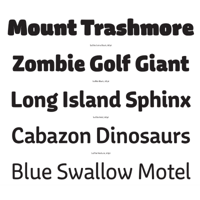
Sulfite
Lux Typo
→ Sulfite, a charmingly plump humanist sans serif typeface, "is a purposefully imperfect typeface with warmth and friendliness key to its distinction." The typeface's six weights (with matching italics) bring a lot of variance and range to the table, showing off the right way to add weight across letterforms — with tact and intelligence. "Drawing of the typeface began with an intuitive approach with its character evolving in an organic manner," says its designer Greg Lindy. The marshmallowy structures inherent to each stroke are thoroughly enjoyable in Sulfite, and are delivering a joyful sensibility without much effort.

Neue Easo
Neue Foundry
→ "neue Easo® is a contemporary interpretation and extension of the Isonorm (DIN EN ISO 3098) standard — designed by a designer for designers. Not to mention engineers and architects as well. The monolinear lines were slightly adjusted to make horizontal strokes appear optically equal to the vertical ones and for better text settings ink-traps were introduced. Furthermore the design is not limited to one stroke-width only but offers a broad variety of weights ranging from Thin to Bold." The major highlight of this type system is the 15° backslanting "Ritalics" that accompany each weight. Neue Easo comes in regularly spaced and monospaced subfamilies.

2023 Annual Report — Out Now!
Packed with stats, insights, and analysis, the 2023 Annual Report is the most comprehensive look into the economics and storylines from the world of independent type.

A New Format for The COncierge
The Concierge, our long-time subscription service to curated playlists of type, is now available as a downloadable PDF series in our new Proof&Co. shop. Collect and own your own set of lists to discover fonts from across the indie type landscape.