Almost
RELEASED BY:
Poem Editions ☞
DESIGNERS:
Jerome Knebusch
RELEASE DATE:
Week 09
DETAILS:
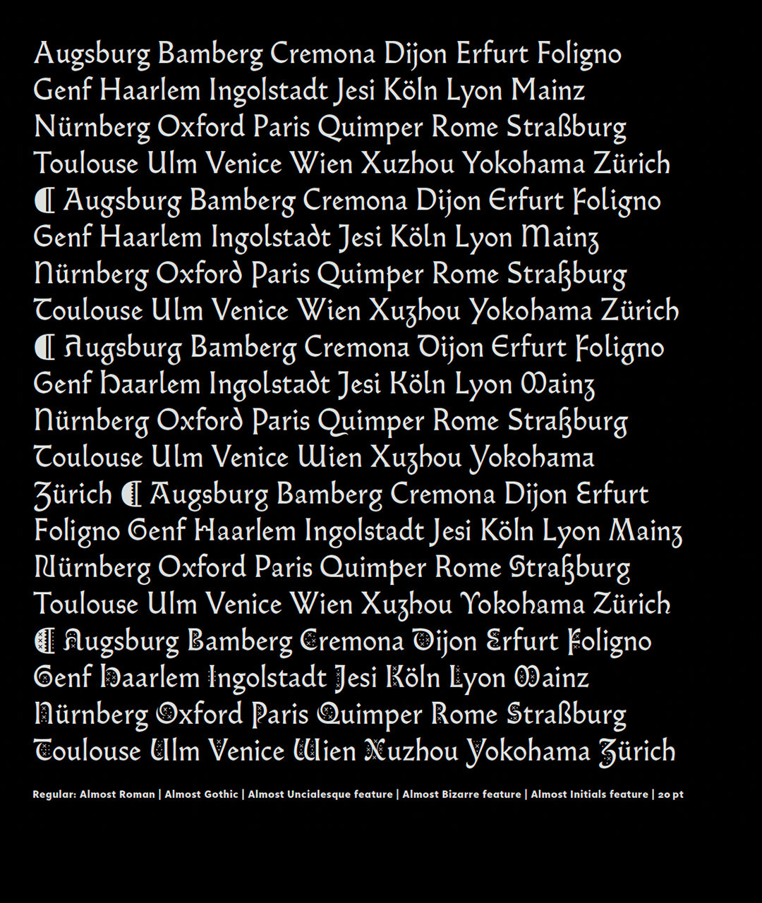
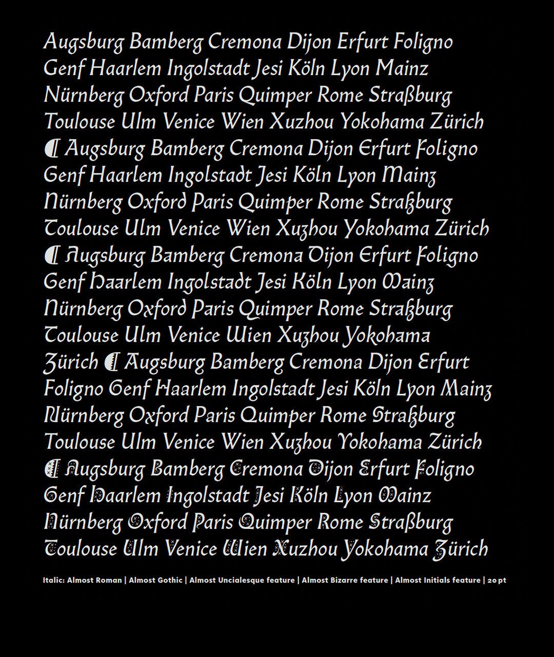
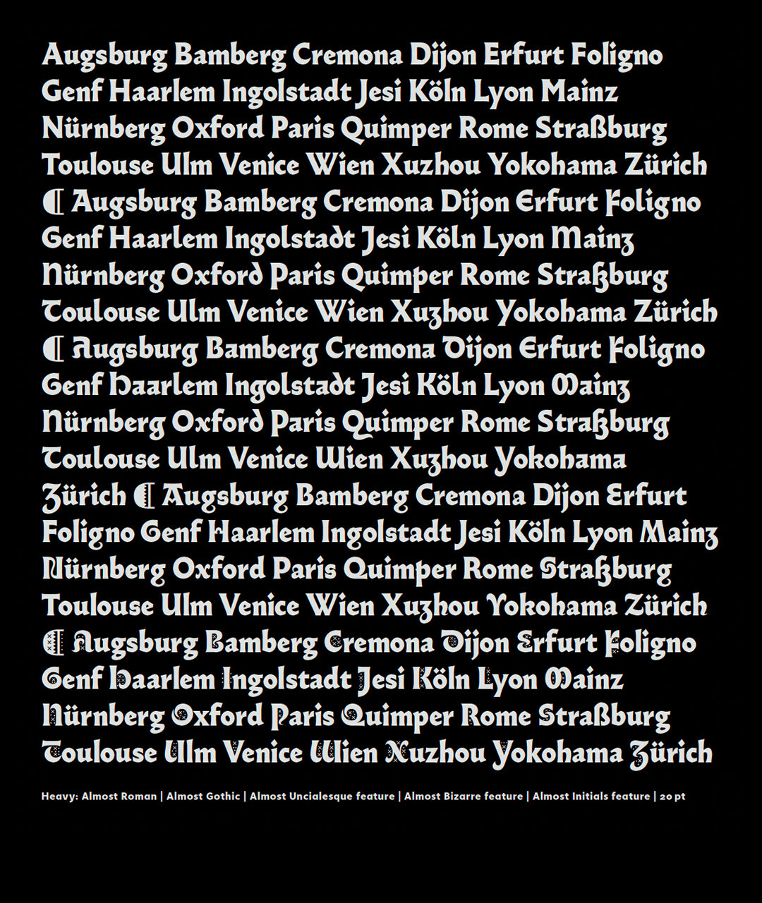
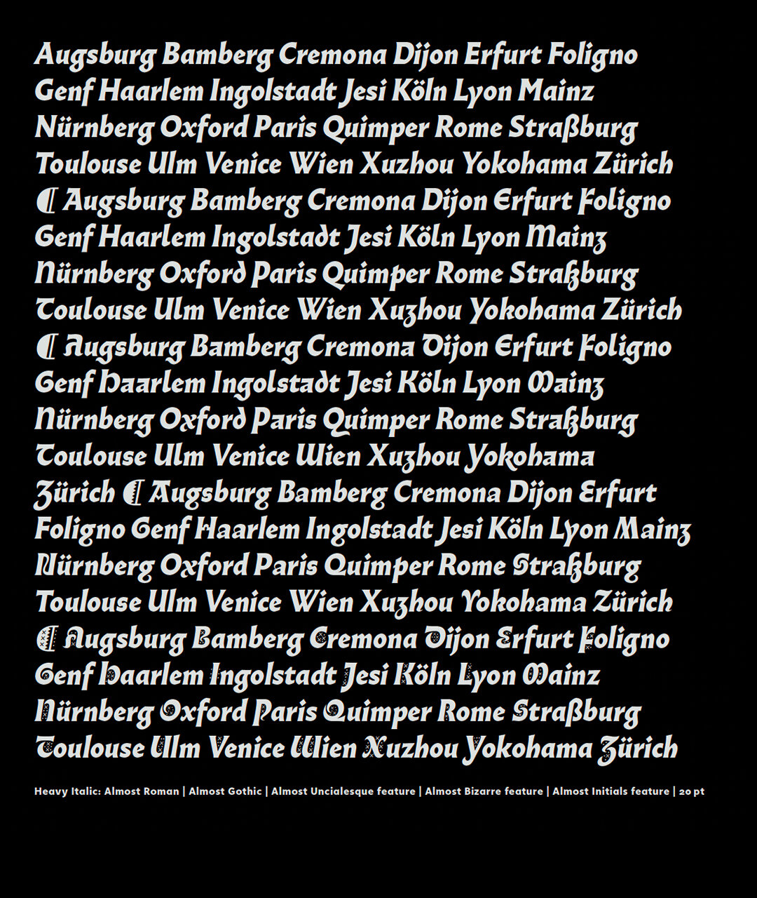
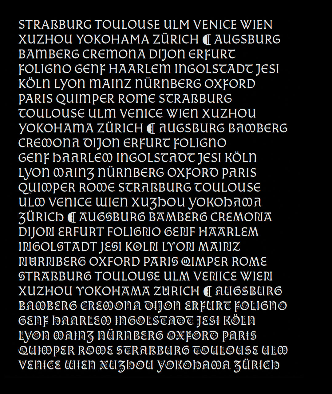
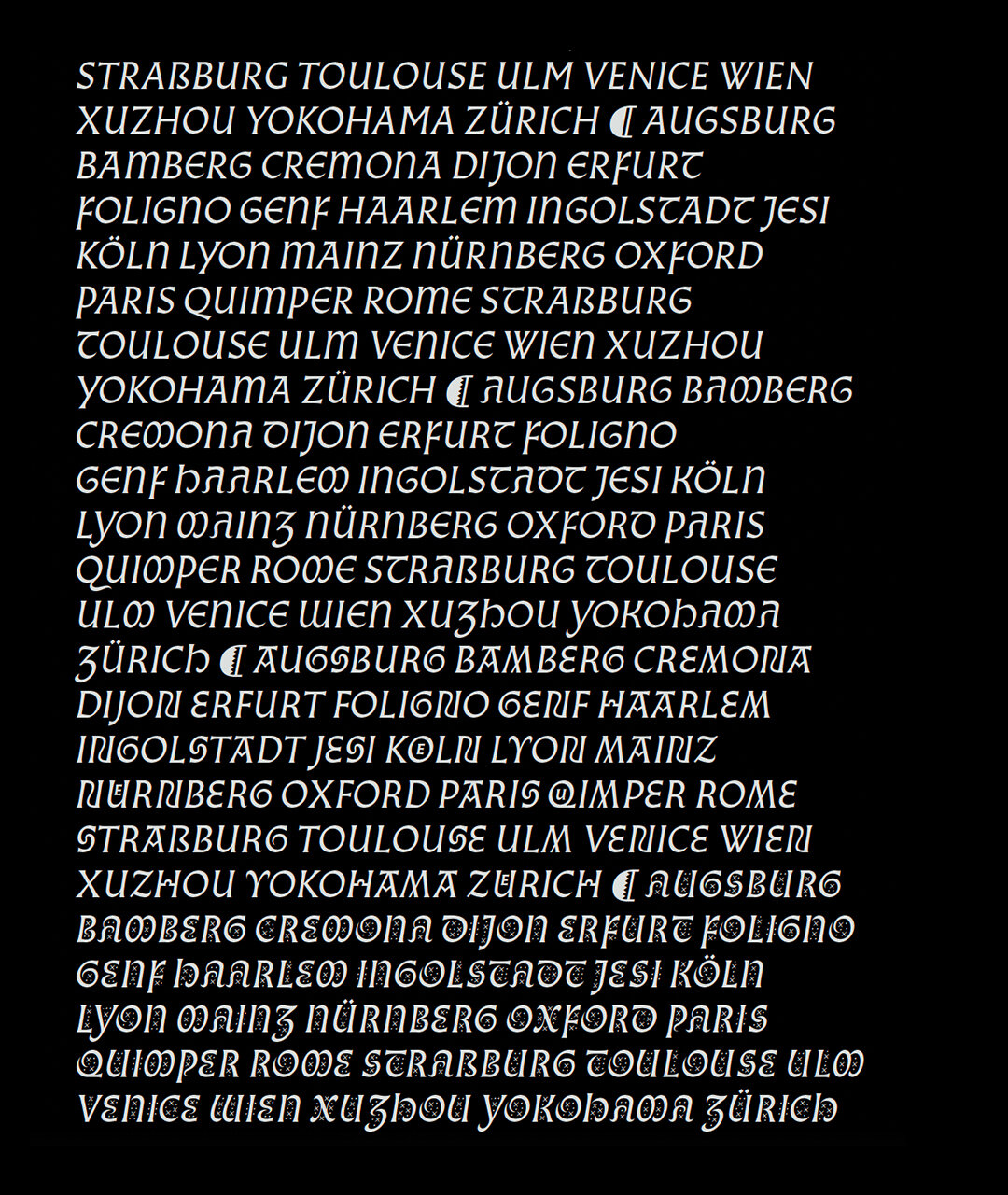
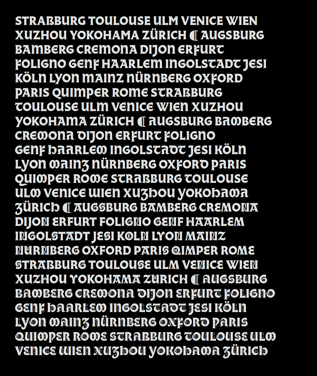
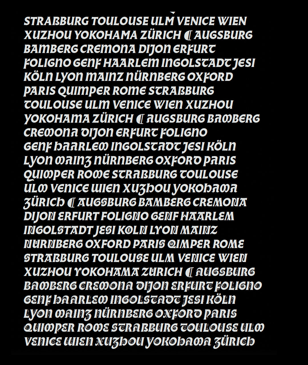
• A broad-nib pen derivate family sporting a look somewhere between gothic and roman stylings.
• In addition to Roman and Gothic styles, Almost features a deep glyph set of OpenType features, Stylistic alternates, and ornate filial characters.
• Available as a family of 20 fonts of Roman & Italic styles across 5 weights.
LINKS:
Release Information Article (In French) ☞
Try & Buy ☞
PDF Specimen ☞

From the Foundry:
“Almost is a typeface between gothic and roman. Based on in-depth research, it was designed by Jérôme Knebusch in 2012-2019 in five weights and two styles, Gothic and Roman, and completed in 2021 with respective italics. More than 1800 glyphs are present in each of the styles. They can be endlessly combined, starting either from roman or gothic ground, without falling in a strong, broken script nor becoming a ‘pure’ roman design. Above, uncial-esque and bizarre (Byzantine) letterforms and a full set of initials complete the fonts. They can be activated through stylistic features, and offer more possibilities of gothic-roman hybridisations. Almost takes its inspiration in the 15th century, in the period of the 1460s and 70s with German Gotico-Antiqua typefaces like the ‘Durandus’ of Fust & Schöffer, the first type to present a humanistic tendency, probably based on the hand of Petrarch. A few years later Sweynheim & Pannartz use in Subiaco a type which some consider to be the first roman although gothic influences remain clearly visible. Roman type was finally defined in 1469-70 in Venice by the ‘de Spira' brothers and Nicolas Jenson. But roman did not precipitate the death of gothic forms, mixtures of gothic and roman were tried out and the two co-existed for some time. Almost is a homage to these types, which represent a unique, transitory moment in history of typography.”


From the Foundry (Cont…)
“The design of Almost is destinated to the contemporary reader. They fonts can be used from expressive headlines to legible, continuous texts. All contain an extended Latin glyph set covering many languages and advanced OpenType features: initials (with separation in two layers), small capitals, several figure ranges (lining, old style, small caps, tabular and proportional), superiors & inferiors, fractions, case sensitive punctuation for capitals and small capitals, ligatures and many alternates. Most of them share identical metrics, so that texts lengths do not change when glyphs are replaced. All possible combinations between the glyphs have been carefully kerned. Almost was awarded in 2020 by the Type Directors Club, New York City, and chosen as a 2019 favorite by Typographica.”