A sturdy "quirkhorse" sans from Fort Foundry inspired by gothic wood type of the 19th century.
Read More
A sturdy "quirkhorse" sans from Fort Foundry inspired by gothic wood type of the 19th century.
Read MoreA stencil typeface family from Typotheque that follows the logical contrast principles of letter construction until the shape is fractured at its narrowest point.
Read MoreAn elegant and sharp high-contrast display serif family from Pangram Pangram, inspired by the work of Eiko Ishioka and supporting Latin and Japanese writing systems.
Read MoreA Dwiggins-inspired editorial serif design in text and display styles from DSType Foundry.
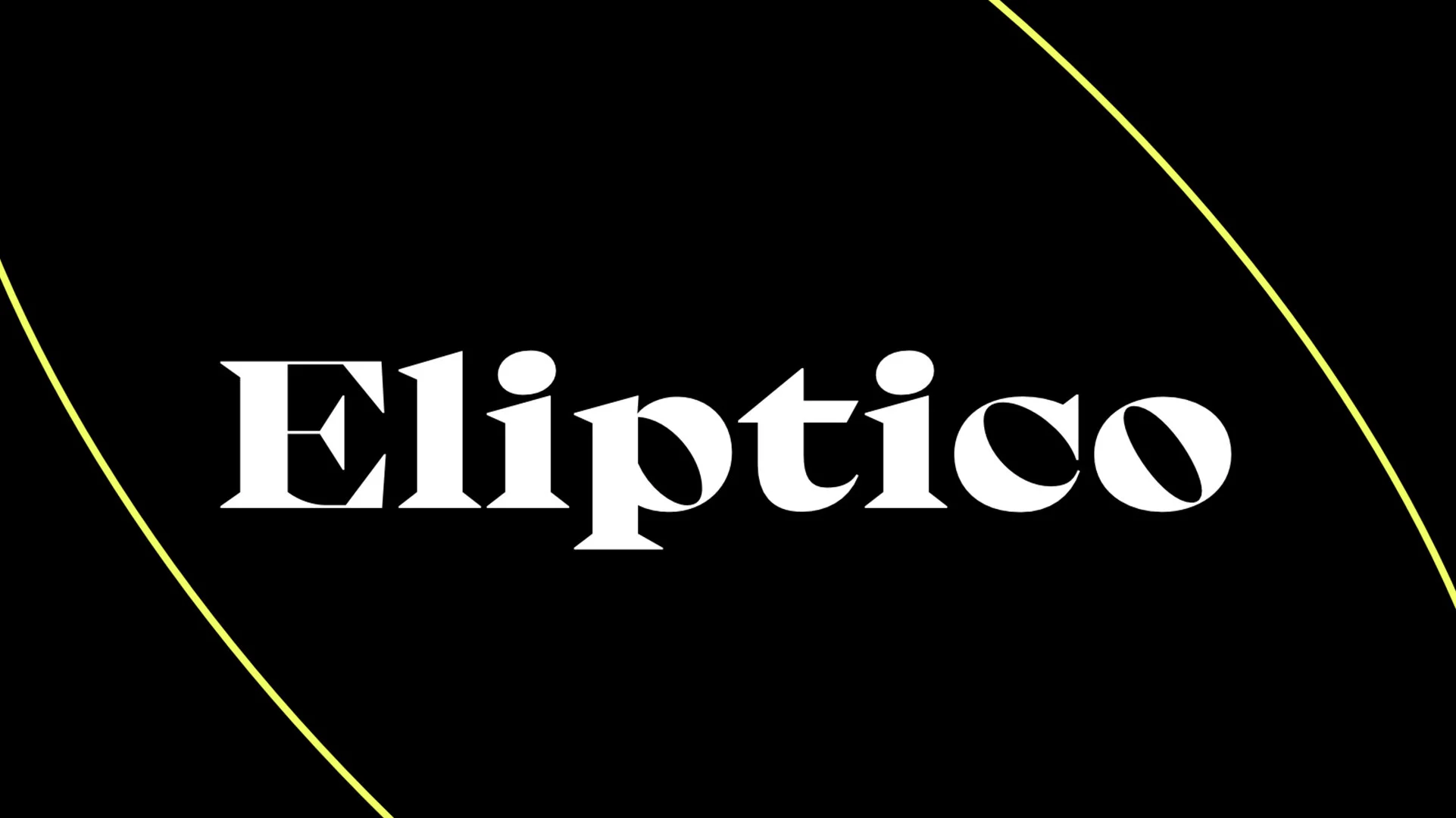
Read MoreA high-contrast serif with intense diagonal stress and big, round elliptical counters from Typeji, released through Future Fonts.
Read MoreMidnight Sans is a "warm, but idiosyncratic" flavored display sans from Colophon Foundry of several widths and sharp or rounded expressions.
Read MoreA modernist sans serif family from 205TF, out to prove that functionalism doesn’t have to be cold and neutral, but can be “warm and softly effective.”
Read MoreA display sans collection from Coppers and Brasses that “tries to bridge the gap between the expressive humanist sans typefaces of the ’60s and the modern geometric superfamilies of today.”
Read MoreA neo-grotesk type system from W Type Foundry exploring the relations between contrast, functionality, and graphic character.
Read MoreA semi-condensed, pseudo-geometric sans with plenty of personality from Hoodzpah Design.
Read MoreA sturdy, robust, and well balanced workhorse text serif from Monokrom.
Read MoreA spunky, charming sans family from Ohno Type Co. rooted in hand-drawn letterforms and expressively animated features.
Read MoreA clean grotesque sans designed for more legible text setting from R-Typography.
Read MoreA charmingly imperfect sans from Mass-Driver inspired by American and European grotesques.
Read MoreA “psychedelic scotch roman” design from Occupant Fonts that brings quirk and oddity back to a seemingly stodgy genre.
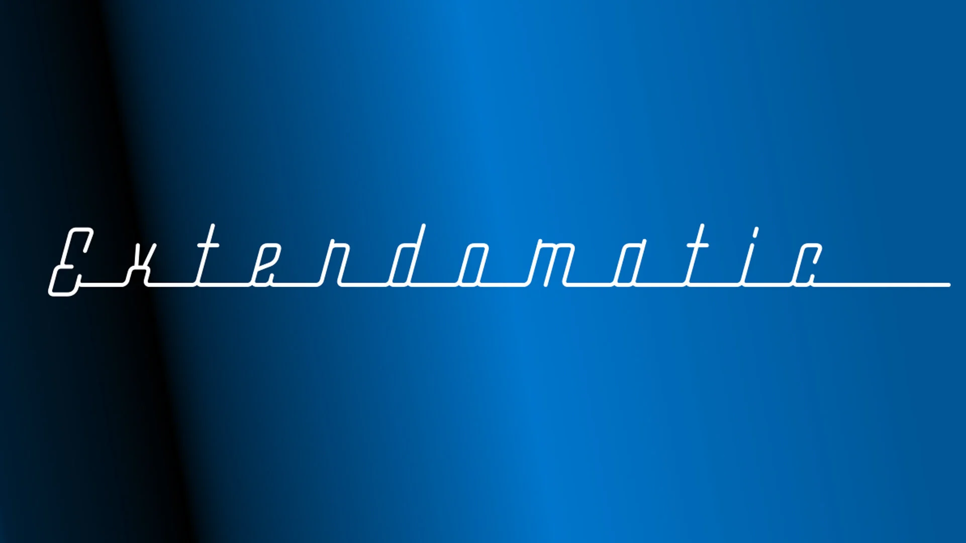
Read MoreAn extendable, variable, monolinear script from DJR’s Font of the Month Club based on ‘streamline lettering’ of the 20th century.
Read MoreA new-age variable grotesque sans family from Pizza Typefaces with inktraps, alternates, and experimental DNA.
Read MoreAn 'old-style serif design billed as a study in ligature-making from Sudtipos.
Read More