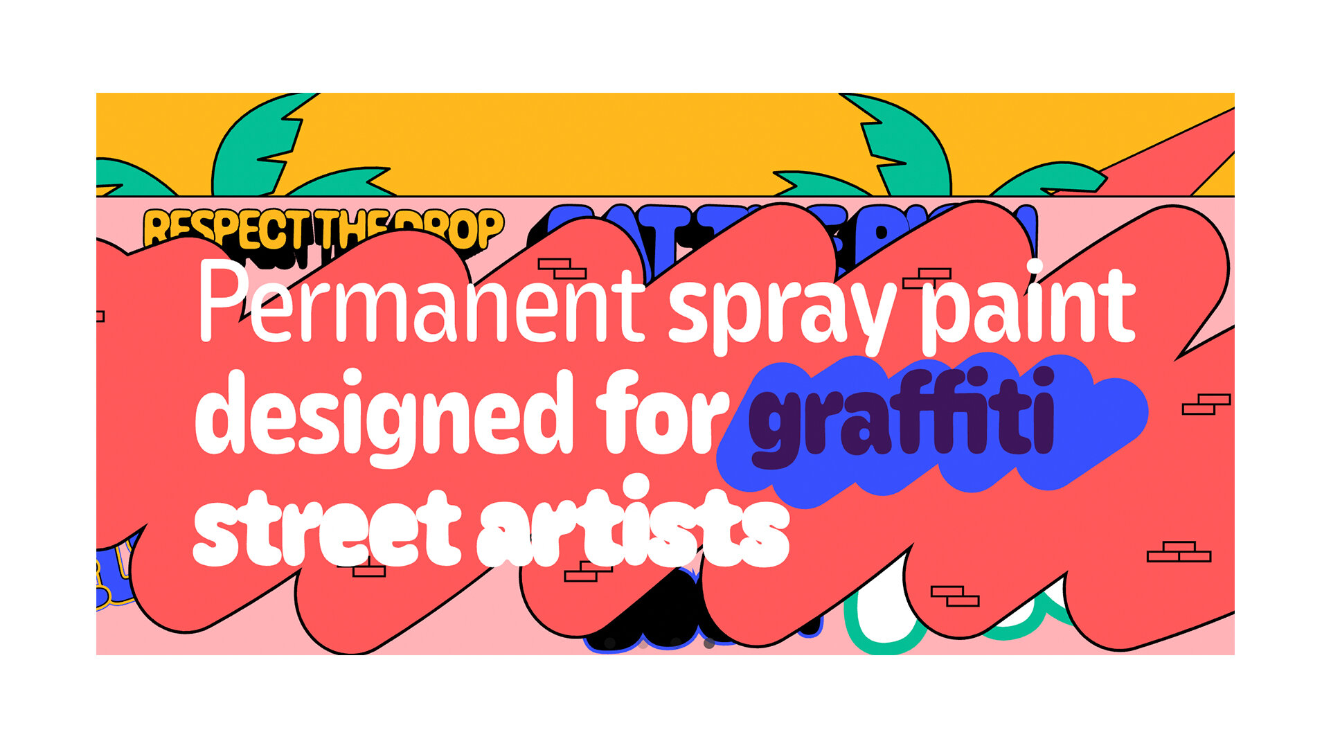
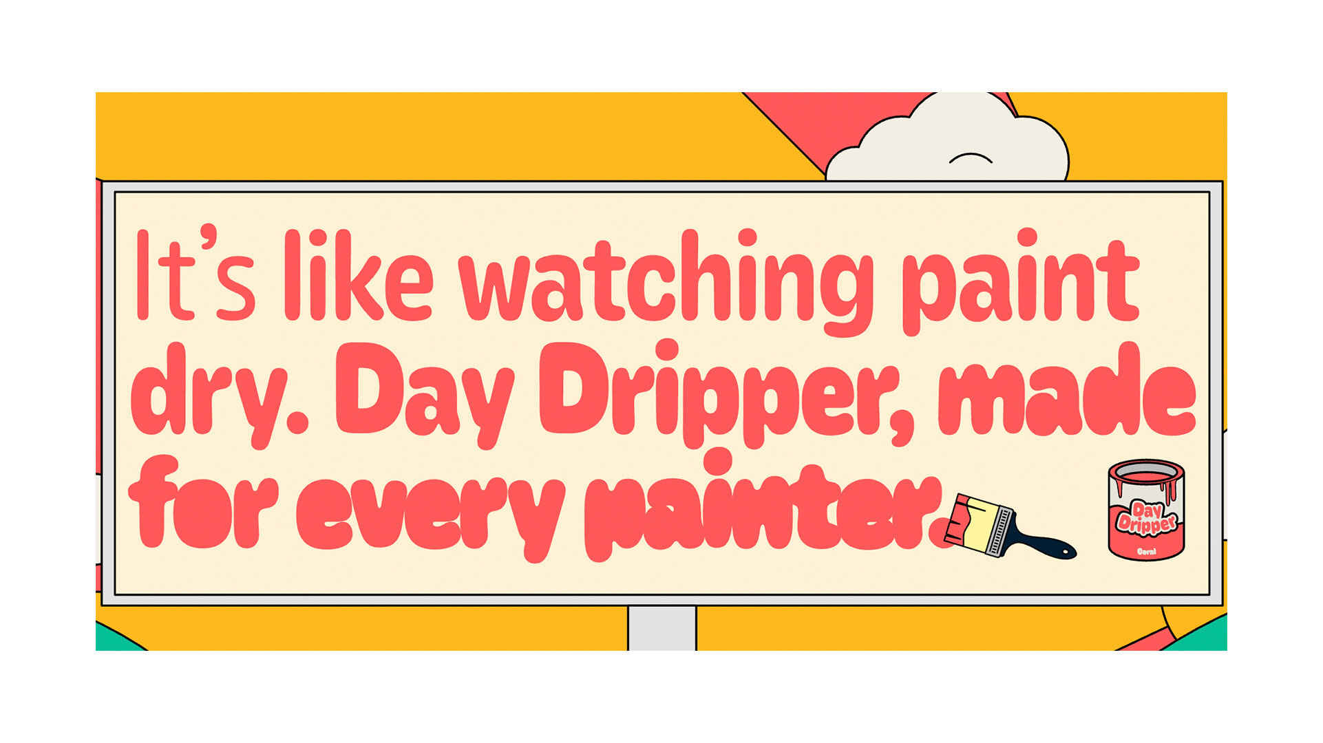
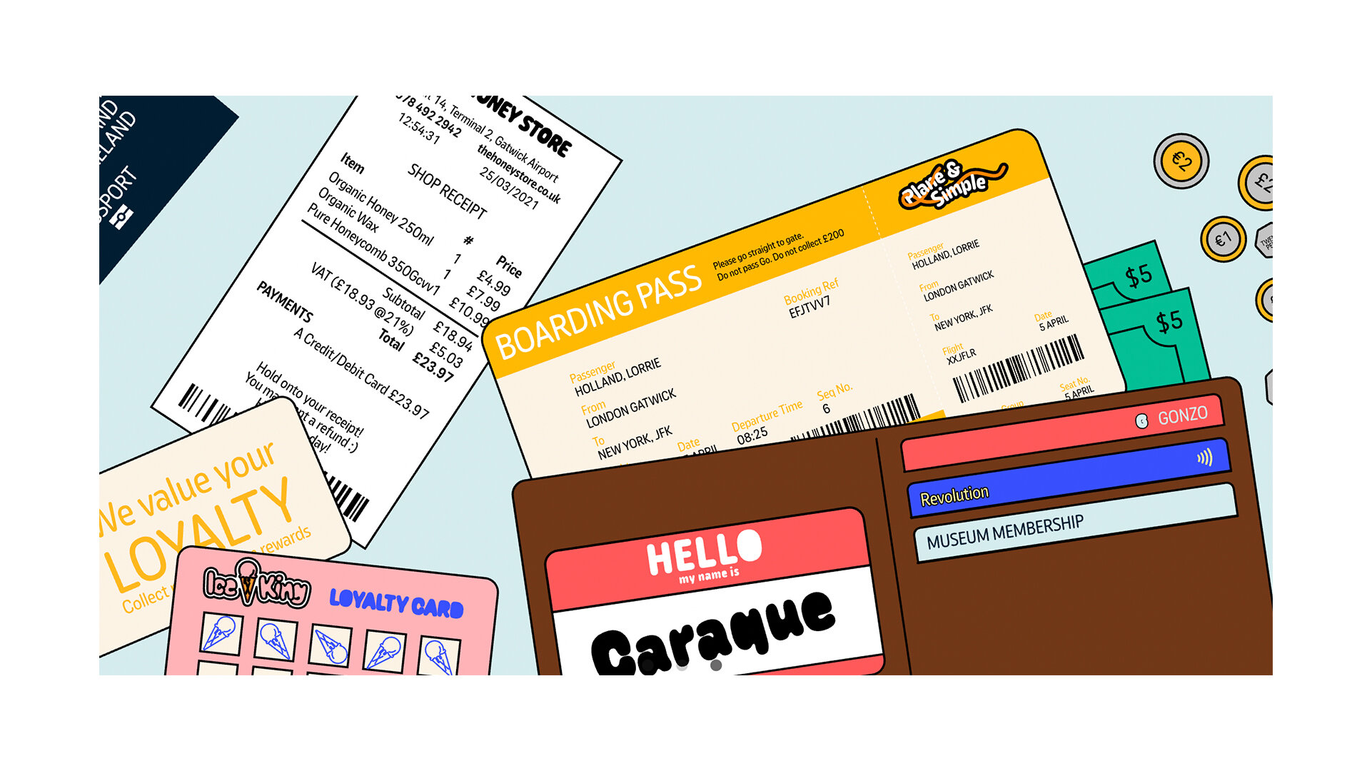
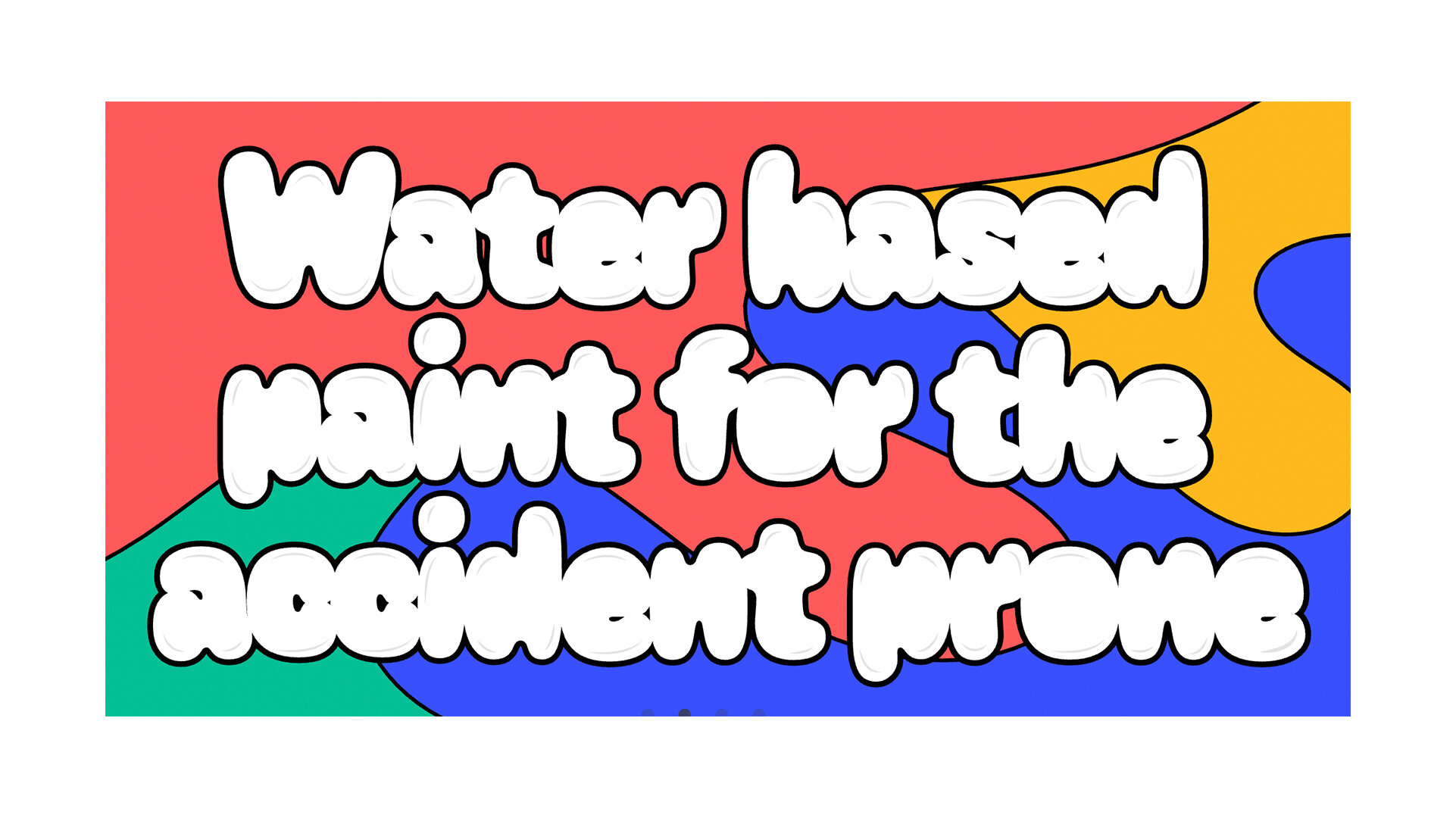
Caraque
RELEASED BY:
Dalton Maag ☞
DESIGNERS:
Pablo Gámez
RELEASE DATE:
Week 14
DETAILS:
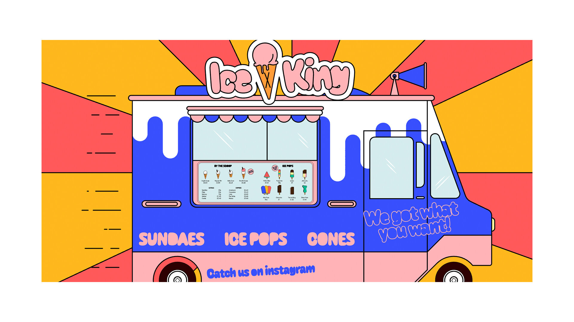
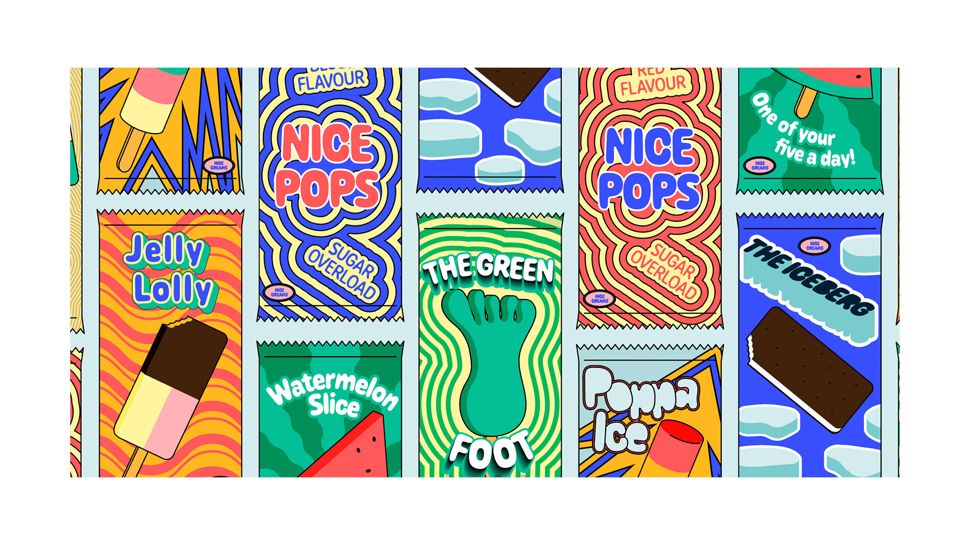
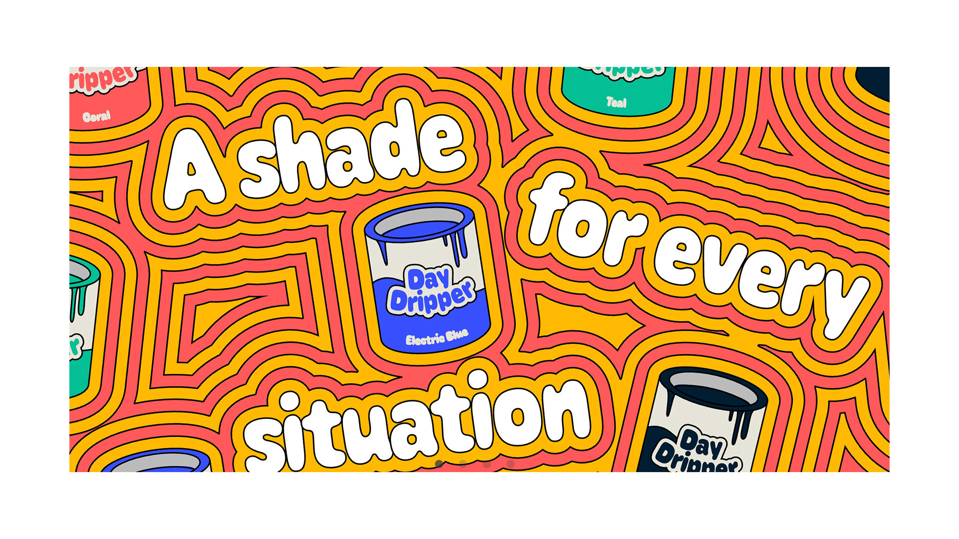
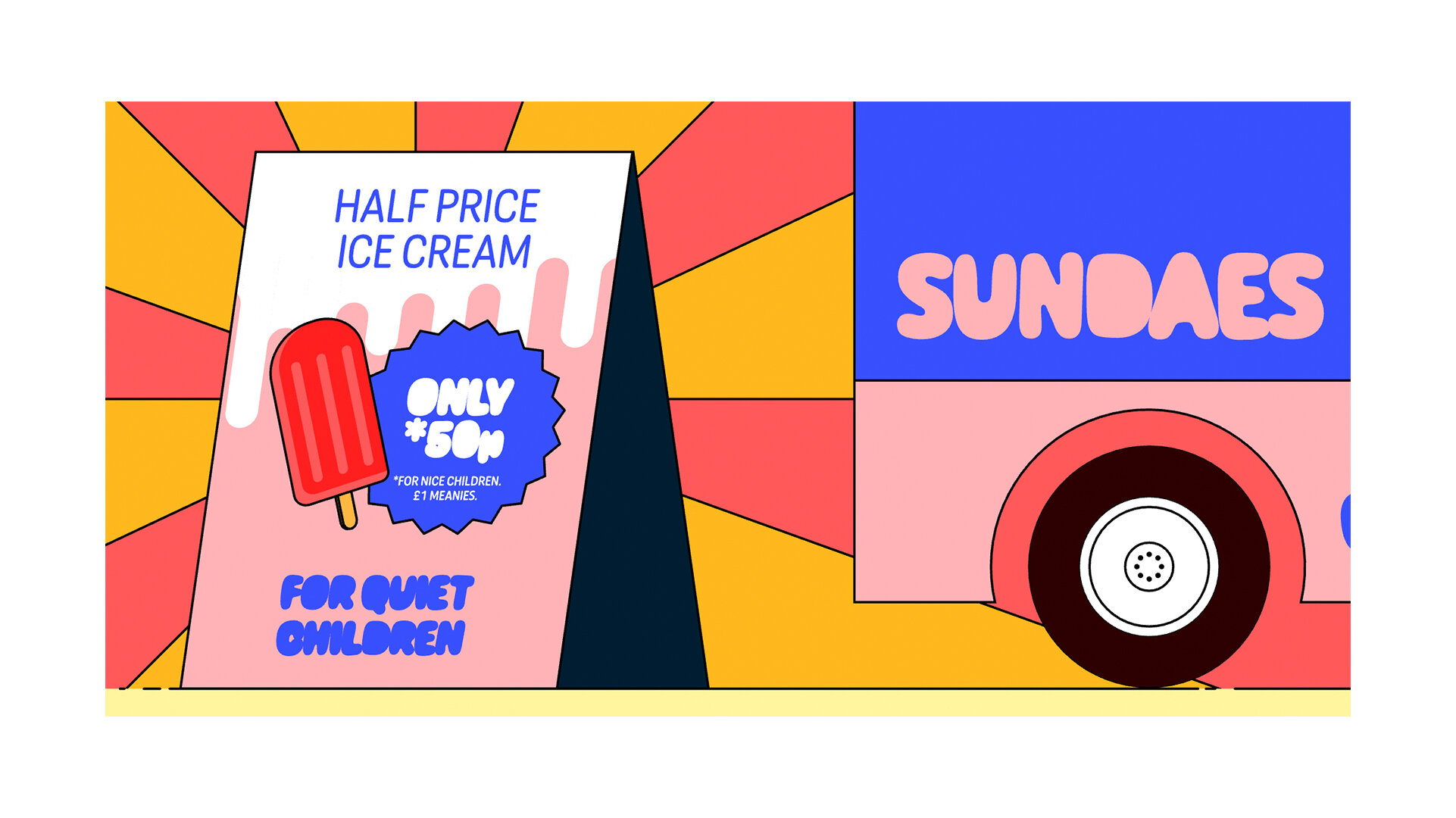
• A friendly, naive, and whimsical rounded sans family, geared towards corporate communications but with a loose, fun attitude.
• Available as a family of 5 weights, or as a variable font which includes “melt” mode.
LINKS:


From the Foundry:
“Caraque is designed for impactful advertising – it oozes personality and will give life to any brief. We can see this typeface coming to life across an array of formats, from packaging and billboards, to posters and logos. Caraque would equally feel at home when used on a plane, an ice-cream van, a cereal box, a can of soft-drink, or in the opening credits of a movie. With a friendly and rounded character, Caraque is also perfect for use in digital content for children. In its bolder weights, Caraque loses its counters and takes on a delightfully squishy form. Each weight comes with a corresponding ‘melt’ version which adds a unique dimension to the typeface.”