
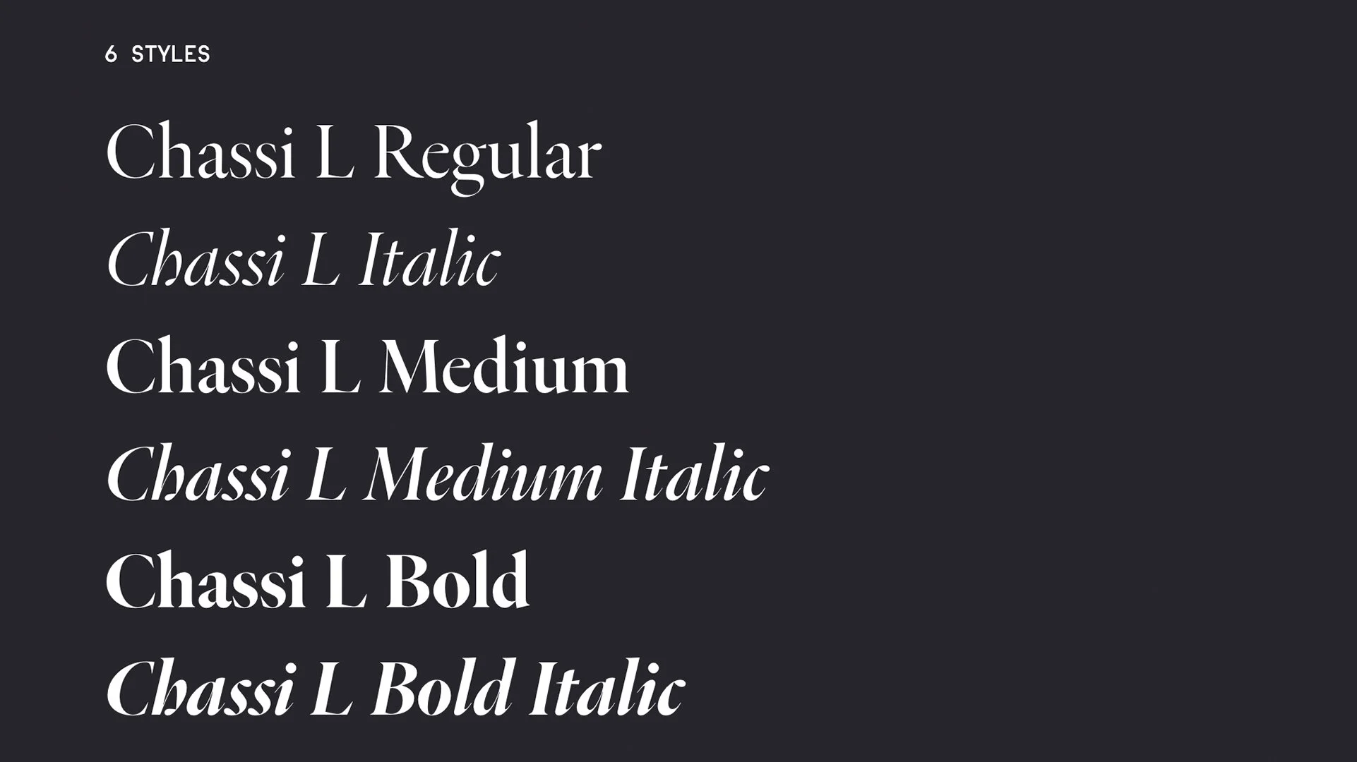
Chassi
RELEASED BY:
R-Typography ☞
DESIGNERS:
Rui Abreu
RELEASE DATE:
Week 15
DETAILS:
• A collection of editorially focused types reimagining design stylings from the likes of Garamond, Jannon, and Granjon.
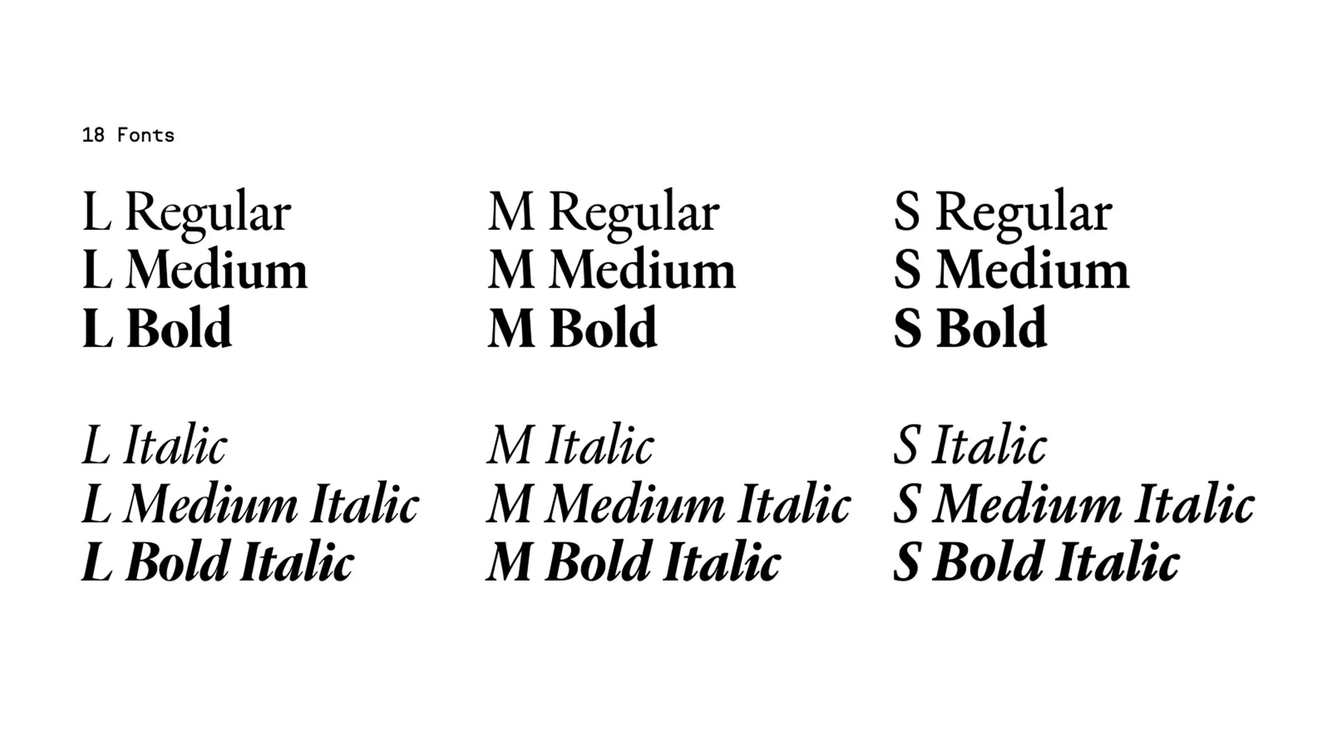
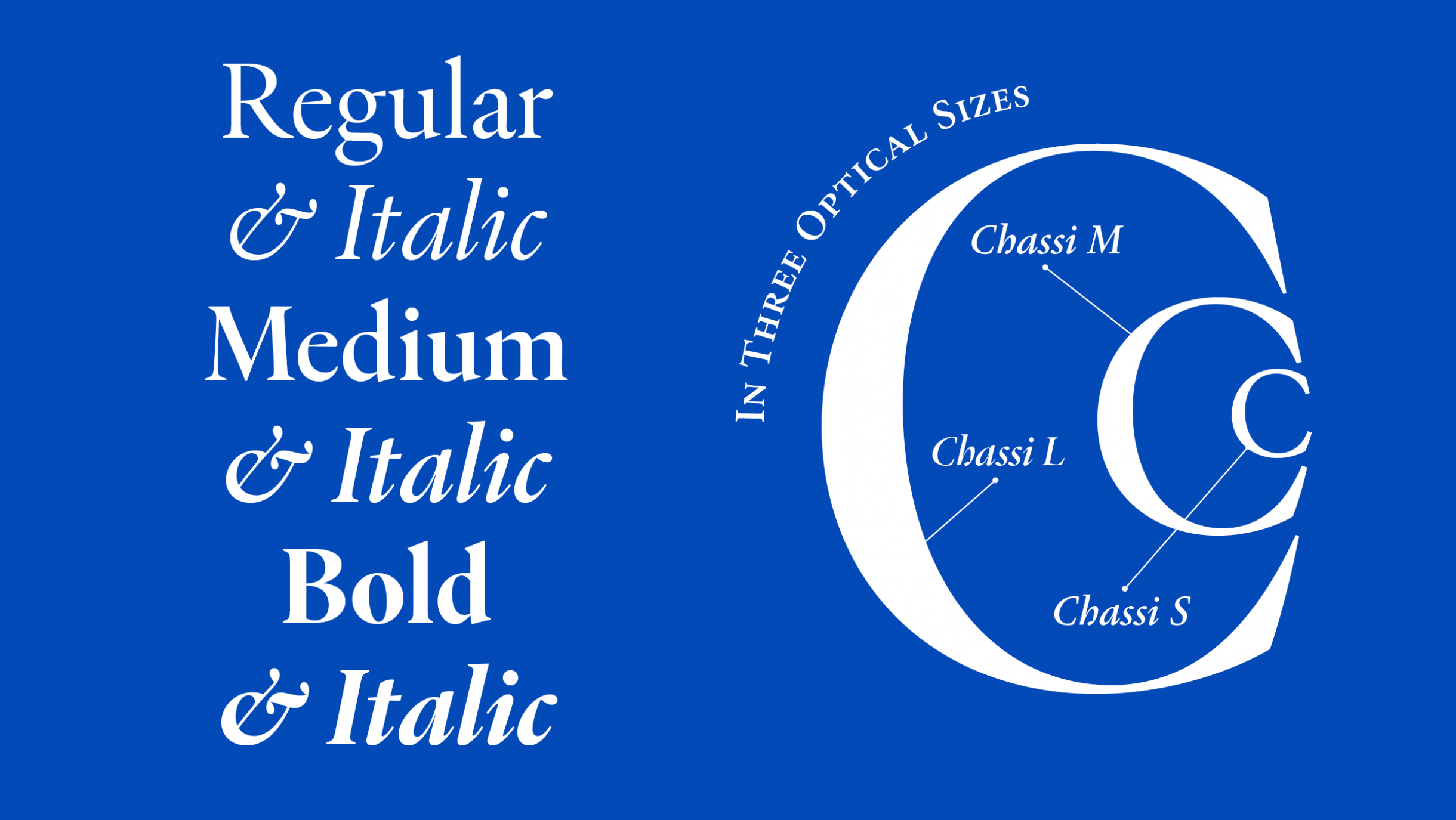
• Available as a family of 18 fonts — 3 weights of roman and italic styles across three optical styles.
LINKS:

From the Foundry:
“Chassi is an editorial type family designed for fluency in extended texts. Stylistically it focuses on the elegant roman types of Claude Garamond, but without aiming for fidelity. It also takes into account types influenced by Garamond, like those of Robert Granjon and Jean Jannon. Collectively, and through modern interpretations and misattributions, the work of these punch cutters formed one of the most enduring and popular styles in the history of typography, one that in our time is still a frequent option for book type setting. With this wider scope, Chassi is a revival of Garamond as a genre, slightly reinterpreted for our times.
Through its three series of optical variants, designed for different ranges of point sizes, Chassi is good for giving headlines and bodies of extended text an assured and confident presence. The core of the family is Chassi S, an ergonomic and unobtrusive book face with a glyph repertoire that includes the traditional small capitals, old style figures and ligatures. Chassi M and L explore more the elegance and sophistication facets of Garamond with progressively higher contrast, tighter spacing and sharper details.”


NOTES:
Chassi is a true homage to the masters. It feels old school and modern at the same time, embodying the spirit of old-fashioned printing types and the icons of type history. You really can see designer Rui Abreu’s hand in this design — pretty unmistakable across all 18 fonts in the collection.
With so much source material to serve as inspiration, the fact that Chassi is broken up into three optical variants is a great move, offering a wide range of that old-school spirit across fonts designed to be used the way we use them now. The romans are shaped just right and not afraid to get a little edgy in the contrast, and the italics aren’t as pen-oriented as more straight-ahead revivals here, which is great. I also love how there are soft, rounded corners where there need to be, and sharp, distinct corners where you want them to be. it gives it a subtly cool stylistic note. Chassi is perfect for brands looking to elevate their typographic expression, and designers who are looking to evolve out of the standards with some new toys.