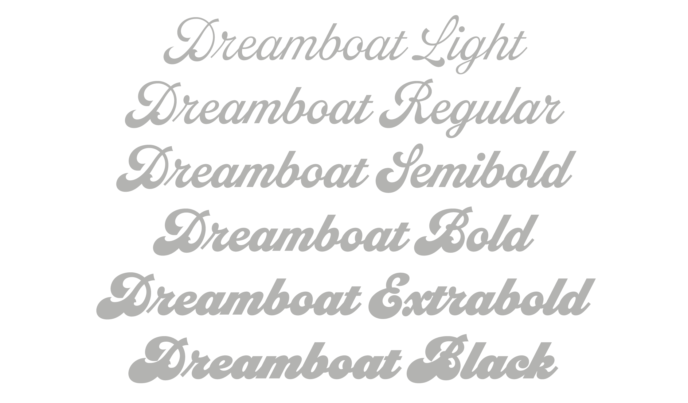
Dreamboat
Competitive Set:
- -
From the Foundry:
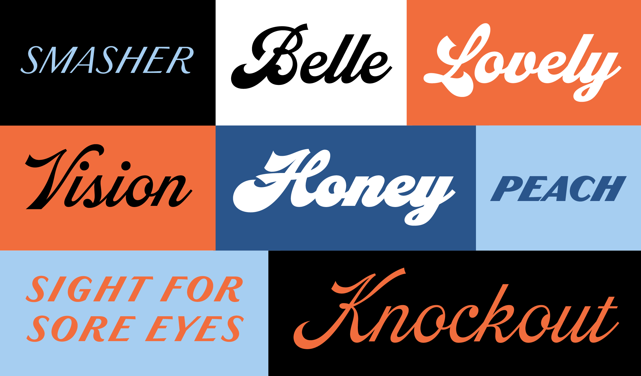
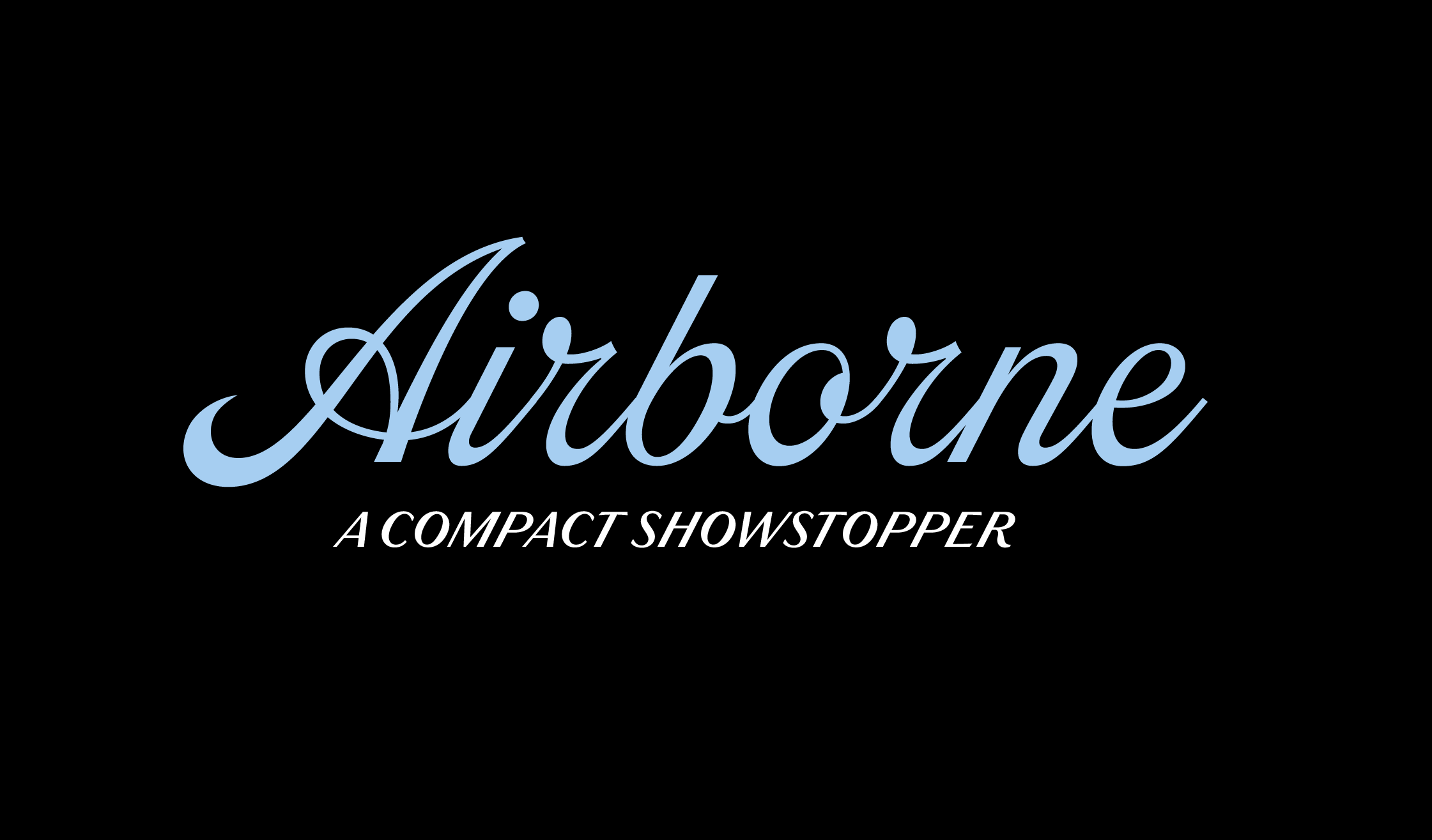
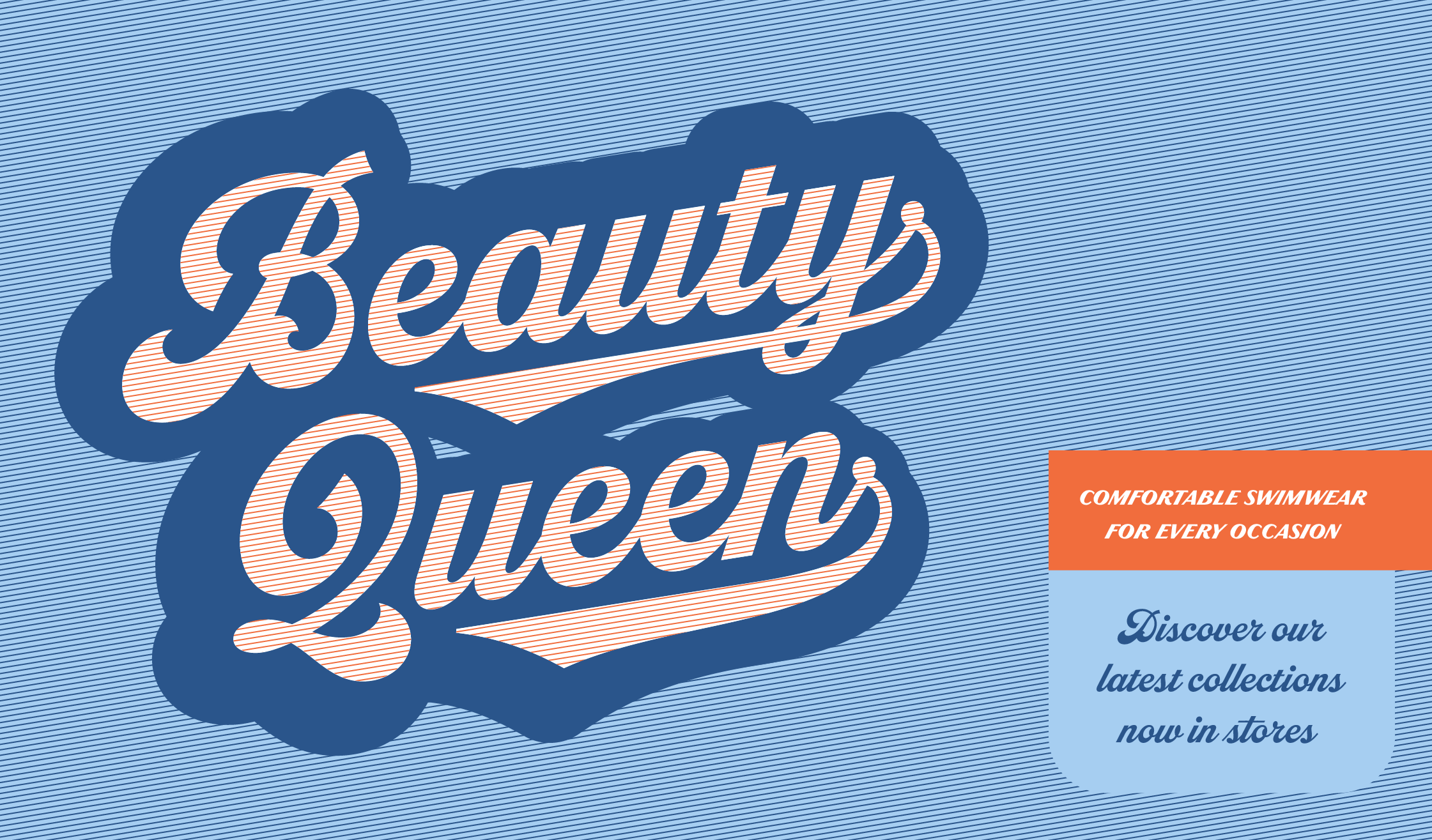
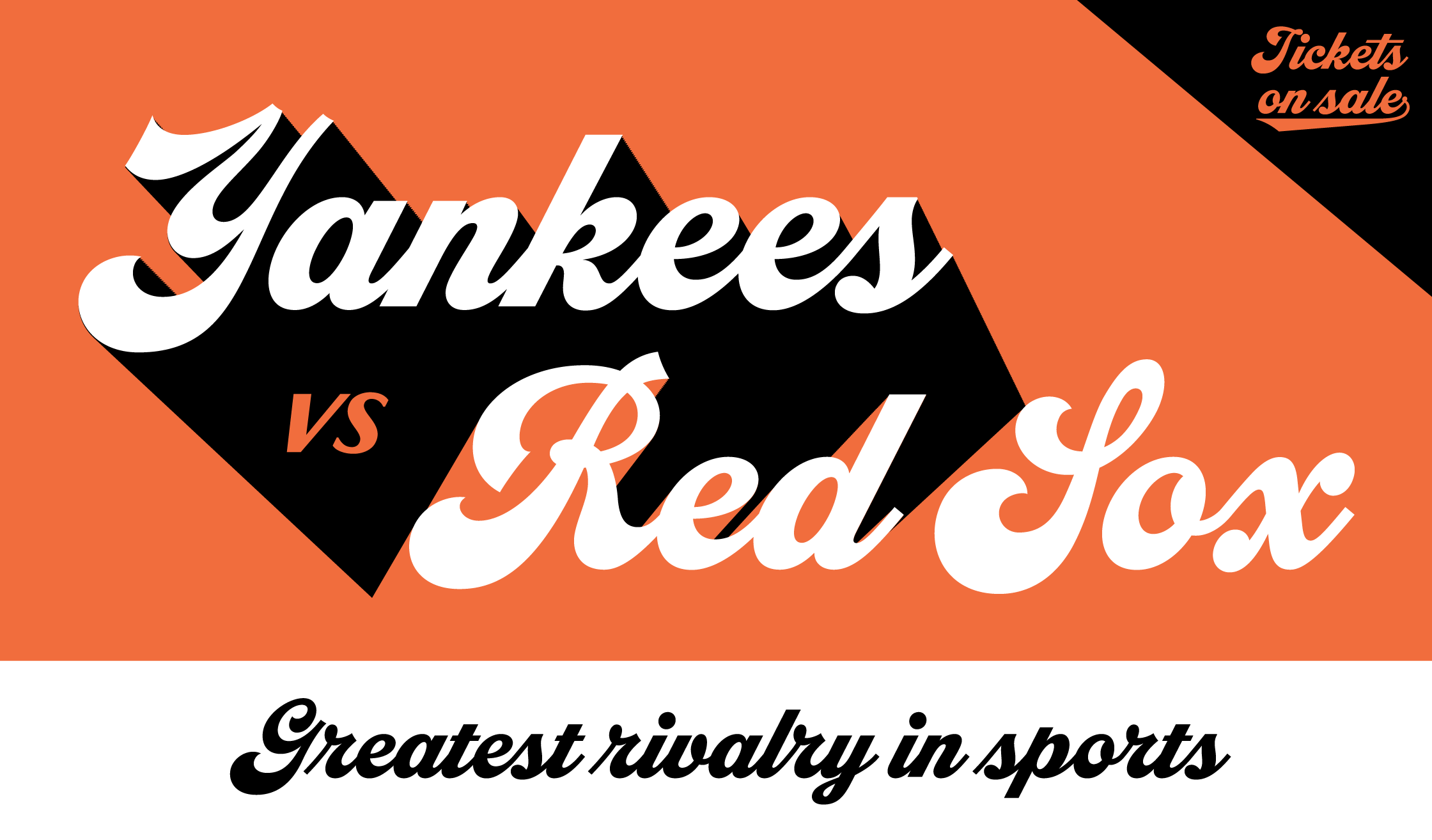
“Dreamboat is typeface nearly 20 years in the making, It’s my take on the bold script style popular during the first few decades of the 20th century and revived later in custom lettering and logos starting in the 1960s, sometimes evolving into psychedelic or pop-art forms. Numerous familiar trademarks and brands still sport this style of lettering like Ford, Coca-Cola, Schlitz and any number of baseball club logos. The original single style would become the Bold weight and the full family expanded into six weights, ranging from Light to Black. There are numerous features like small caps, tails, and an alternate lowercase t with a high crossbar. Dreamboat is ready to knock your branding out of the park.”
Foundry Images:
Foundry SPECIMENS:
NOTES:
Mark Simonson dropped a very curvy deep dive into 20th Century Script Styles with Dreamboat. Landing in the intersection of a baseball script and a 70's Disco (if such an intersection exists at all). Dreamboat fulfills all your curvy expressive script dreams and then some. It's got a bottom-heavy weight distribution in each character, prominent flag-like stroke endings, soaring swashes, and masterfully drawn connections across the family's six weights. (Dreamboat might be the only script in its genre with such a wide weight range.) The write up on Simonson's site is worth the quick read, and the inventiveness on show is worth your dollars. (...can't get enough of that Q — Wow!) This type family is packed with so many smart type design moves, namely the sans caps and that stylish tail underline to drive the authentic style home.
I love that Simonson includes a User Guide — something I think more foundries should be supplying in this age of variable fonts, stylistic alternates, and optical sizes. Super helpful. Overall, with its baseball script origins and absolutely masterful drawing, Dreamboat is an instant classic in my book, perhaps achievable by only Simonson himself.


