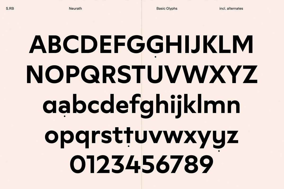
Neurath
From the Foundry:
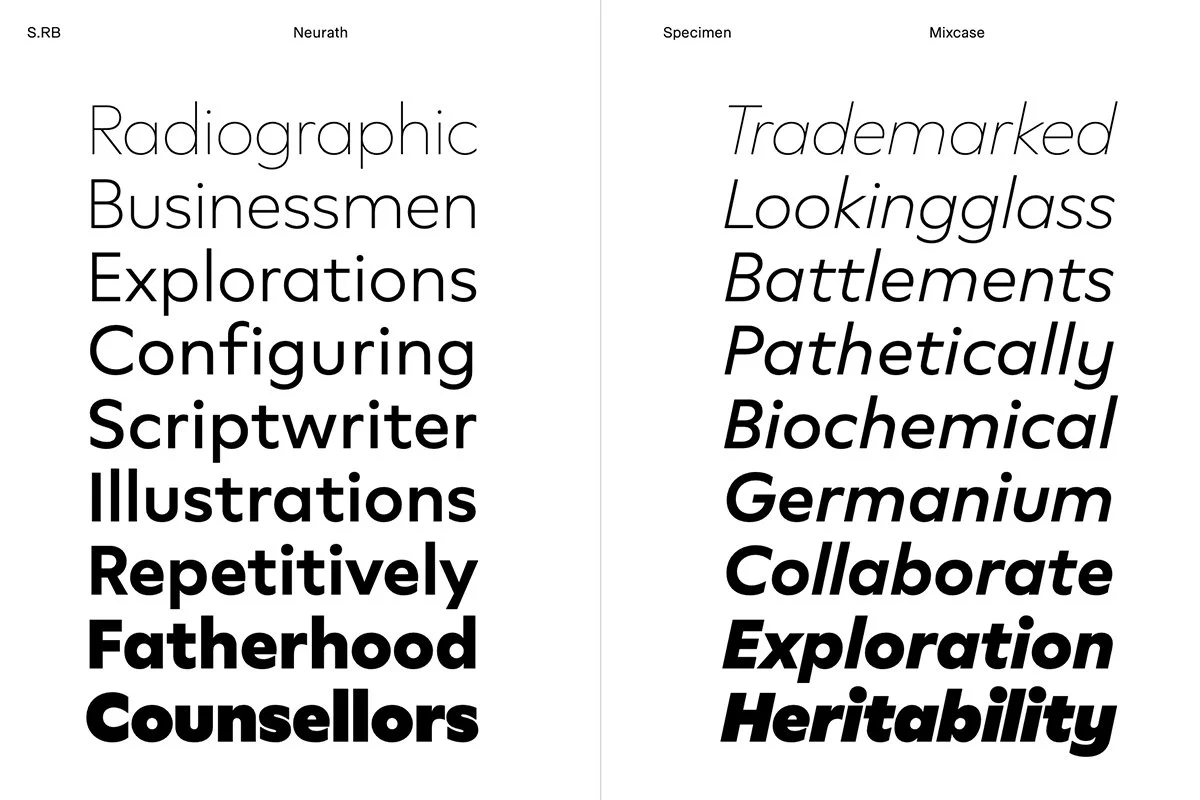
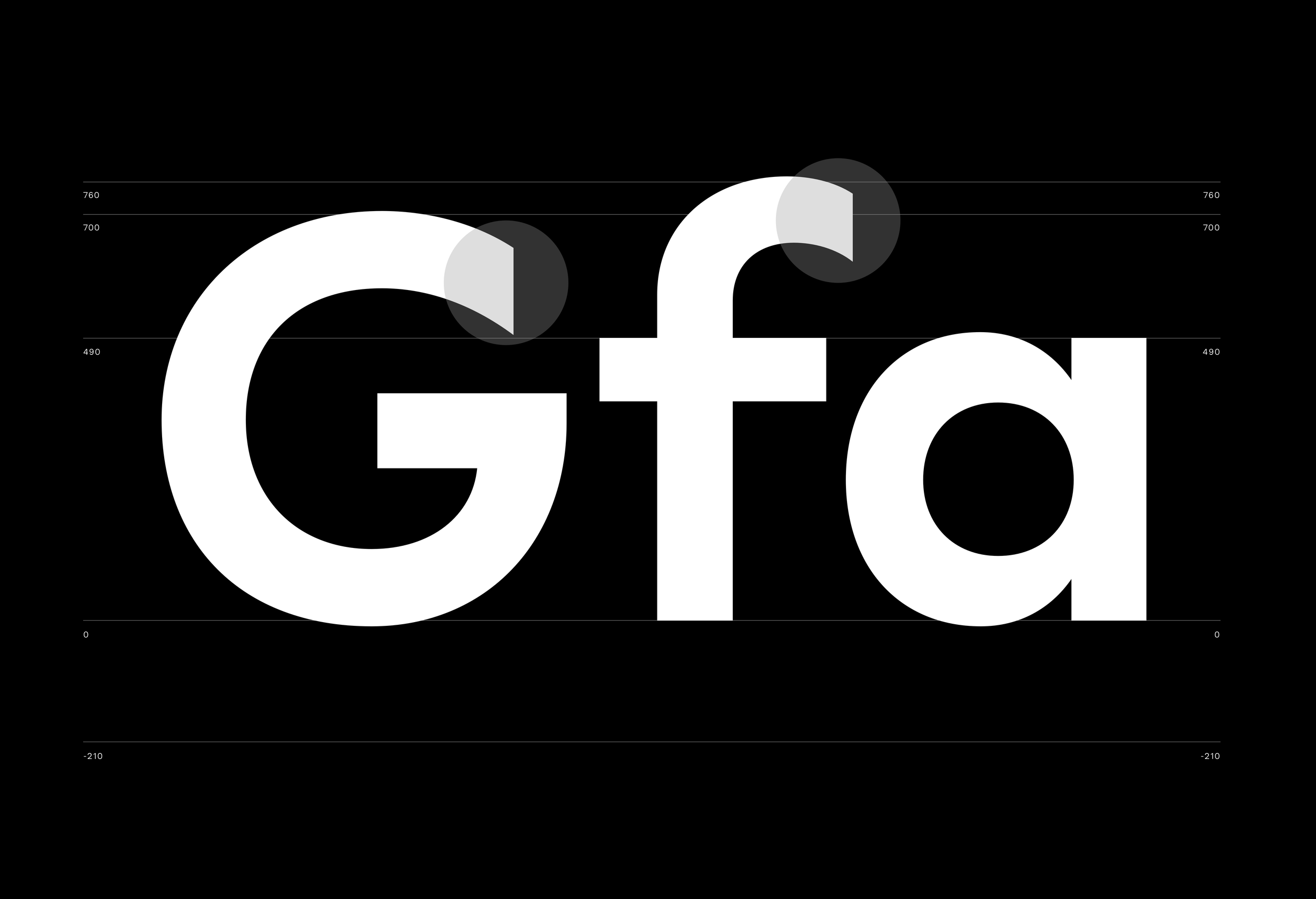
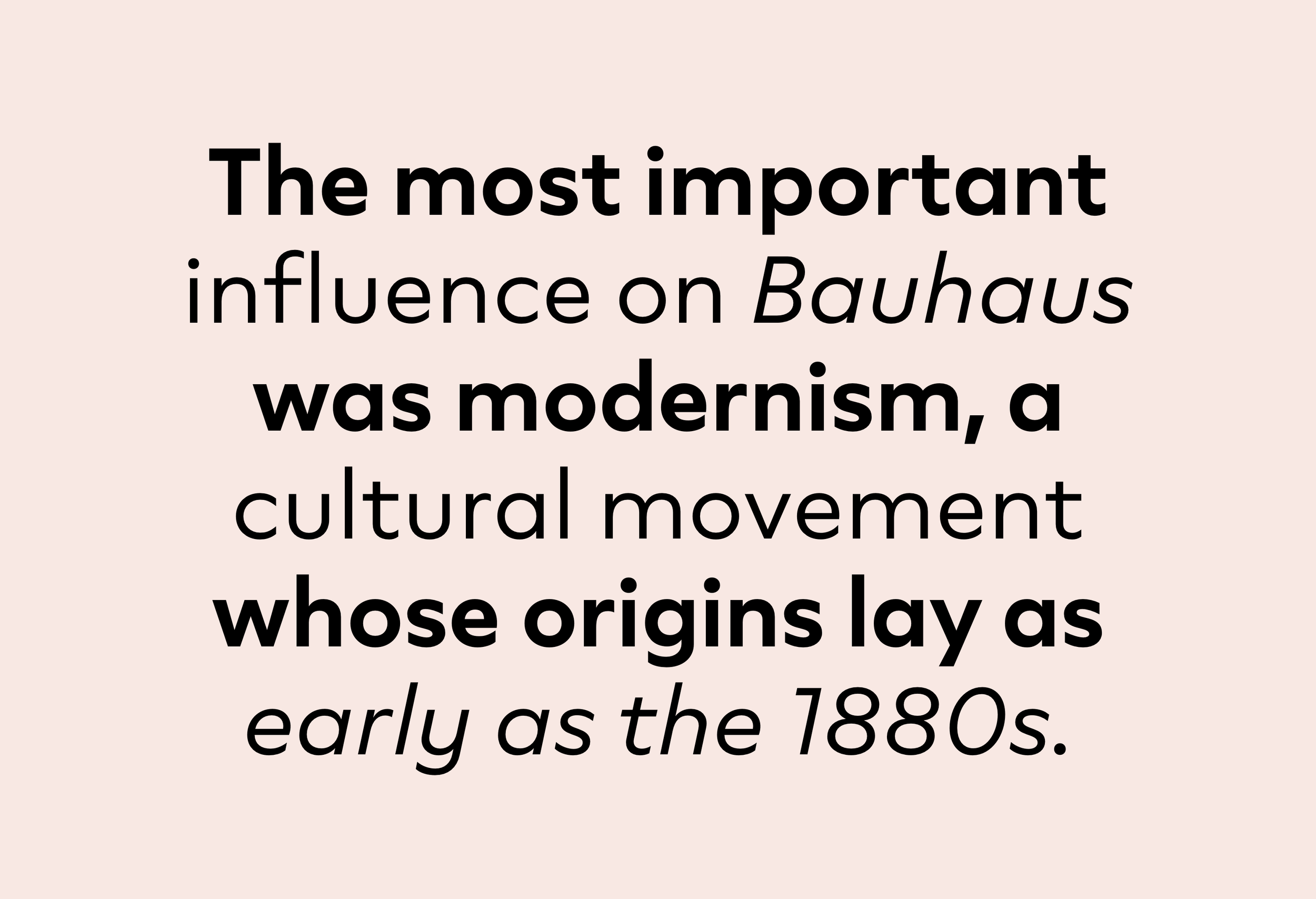
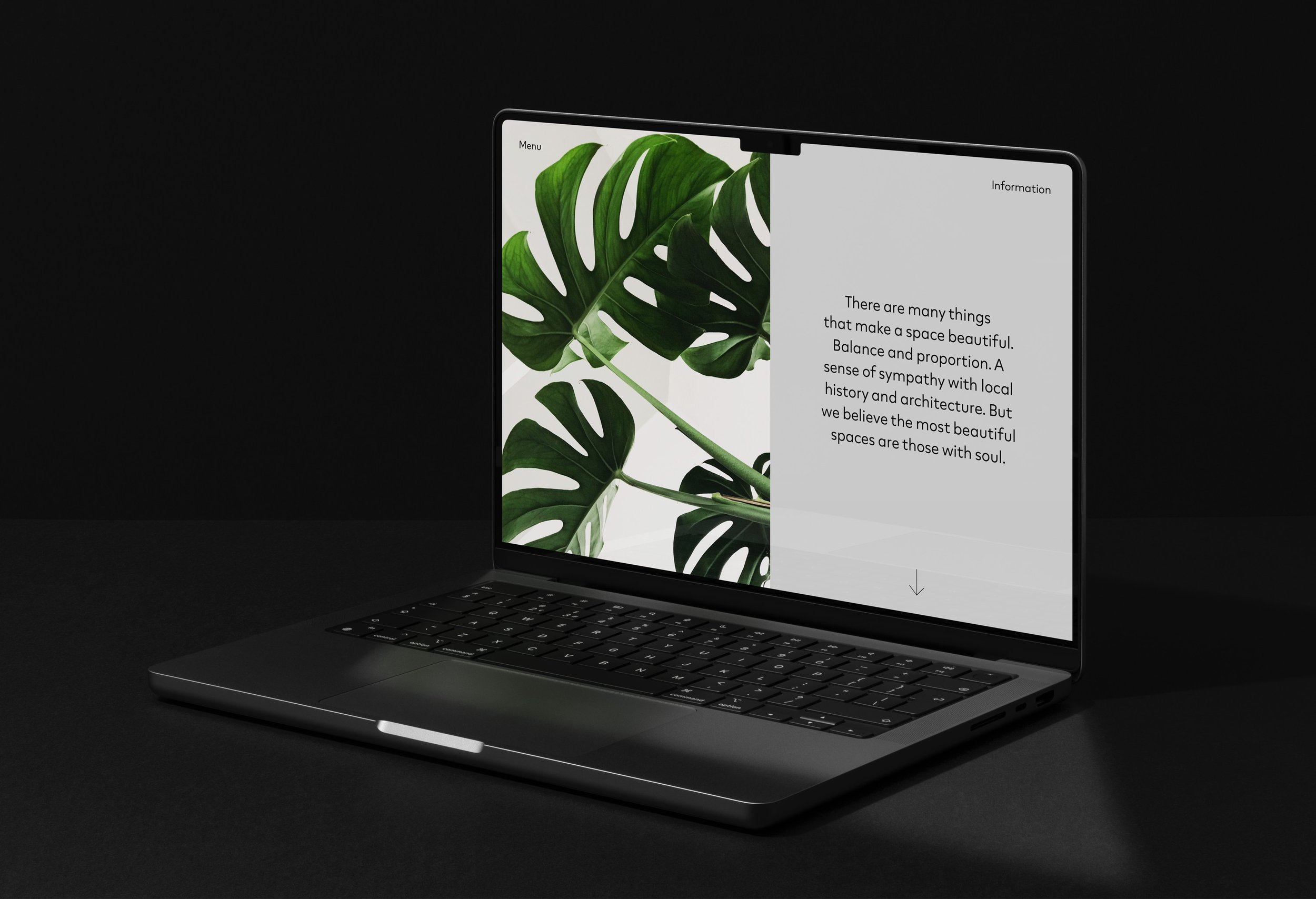
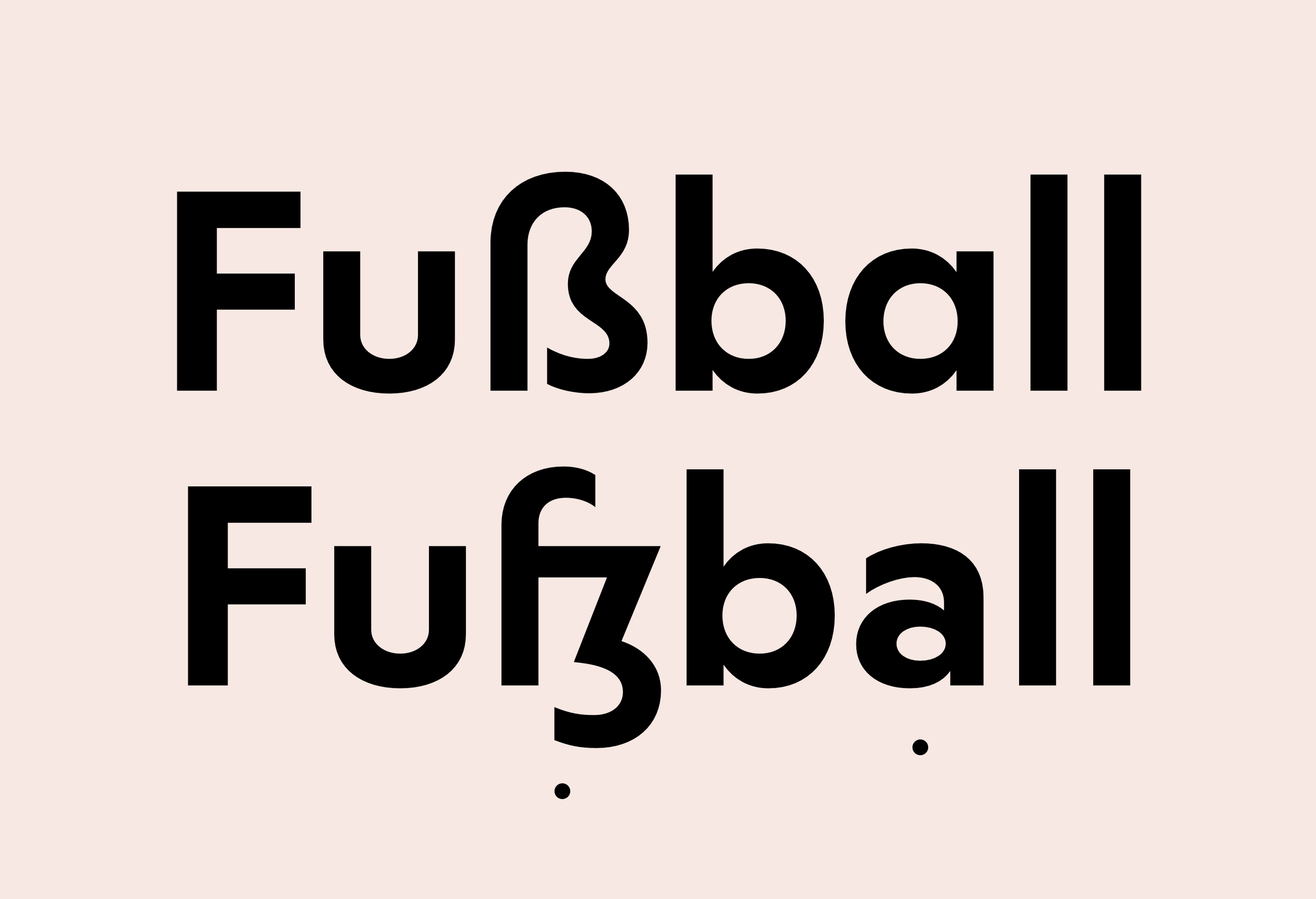
“Neurath is a modern interpretation of Paul Renner’s Futura from 1927. While Futura pursues geometry, Neurath prefers a touch of humanity. Varying terminals were unified and many opentype features integrated, to create a modern tool suitable for everyday use. With its 18 styles, the family is ready for any typographical purpose.”
Foundry Images:

NOTES:
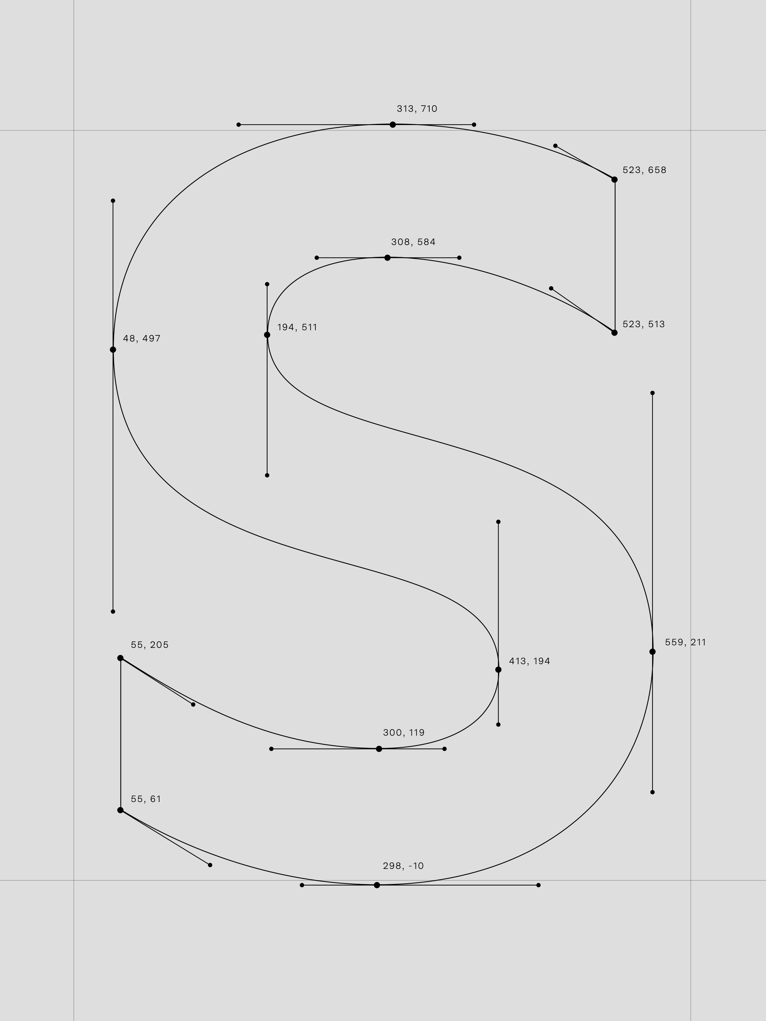
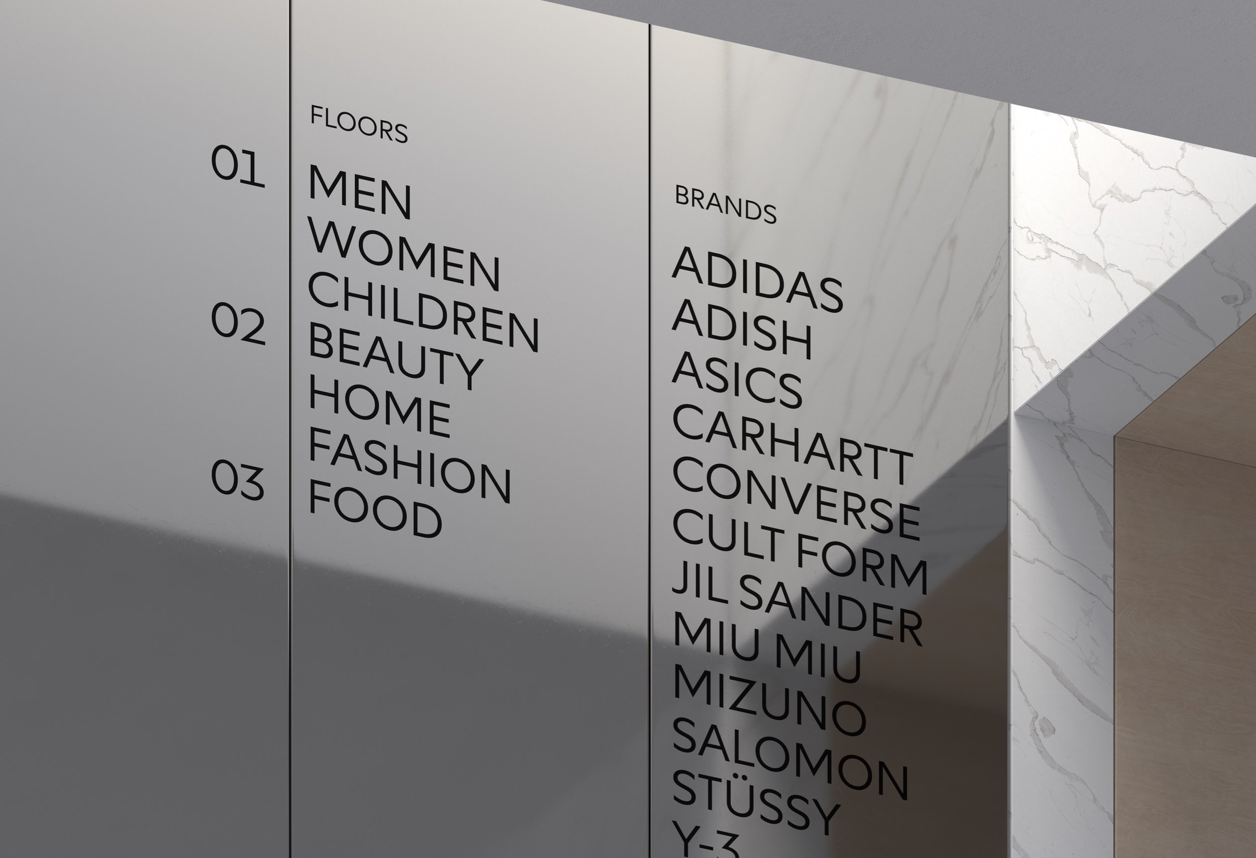
Studio Rene Bieder entered the new year strong, right out of the gate with Neurath, an interpretation of Renner's famous 1927 Futura. "While Futura pursues geometry, Neurath prefers a touch of humanity," the foundry states. The family of 18 fonts — that's 9 weights of roman and italic styles — sports a clean and modern look with vertically cut terminals and graceful tapers that help Neurath move on from the Renner mold in sophisticated ways.
Bieder takes on the extremely played out Futura genre with grace and tact with Neurath. The vertical cuts and more naive curves help the face stand out. Its a great competitor to similar typefaces released by bigger foundries, all from a small studio which is always good to see. Bieder has a way about her work that’s just pleasing, and she’s found a way to do it again with Neurath. I can see this type family doing well for brands ready to clean things up a bit this year, or class things up a bit for their growing audiences.

