
GT Maru
RELEASED BY:
Grilli Type ☞
DESIGNERS:
Thierry Blancpain
Huw Williams
Anya Danilova
RELEASE DATE:
Week 17
DETAILS:
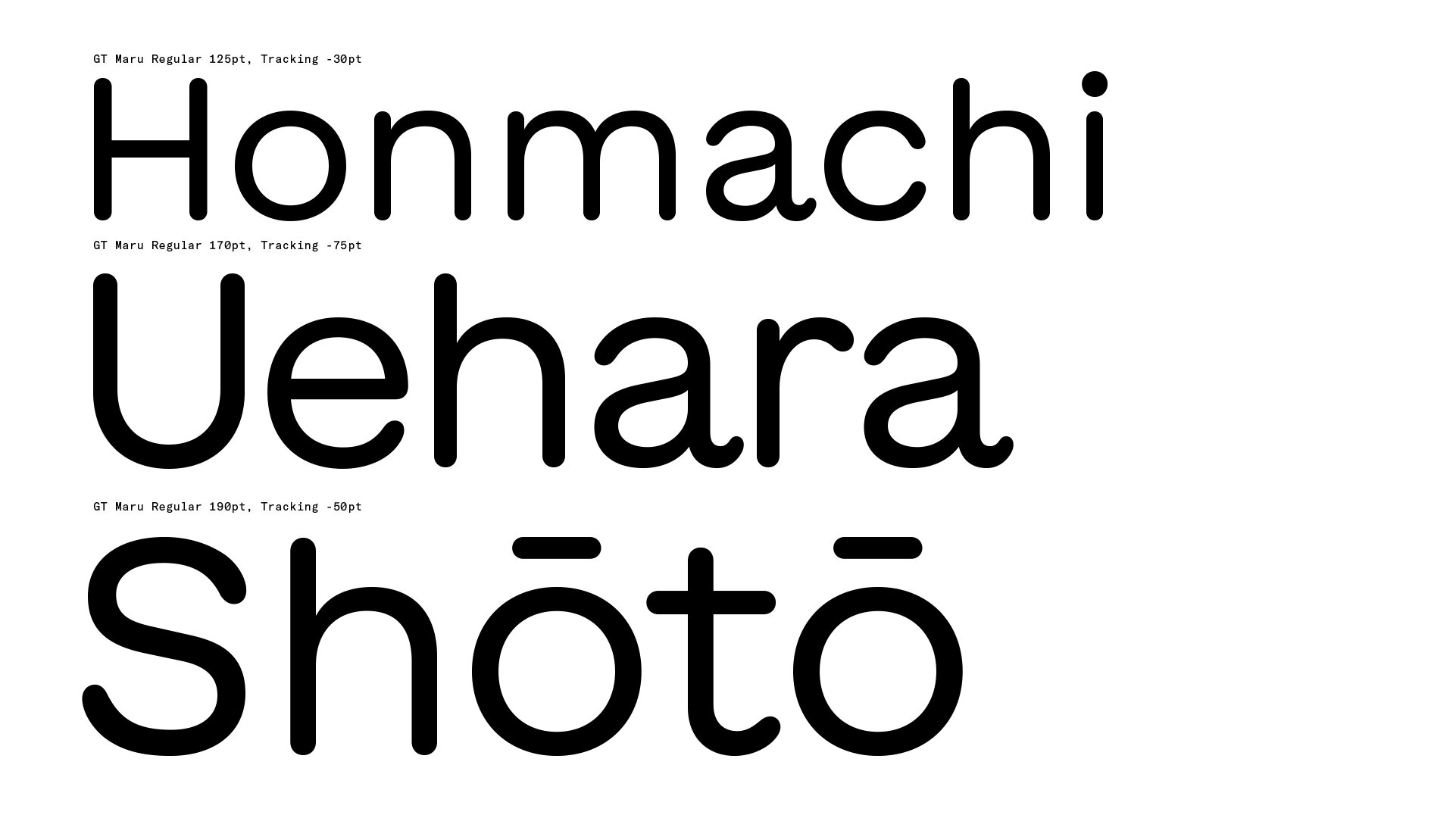
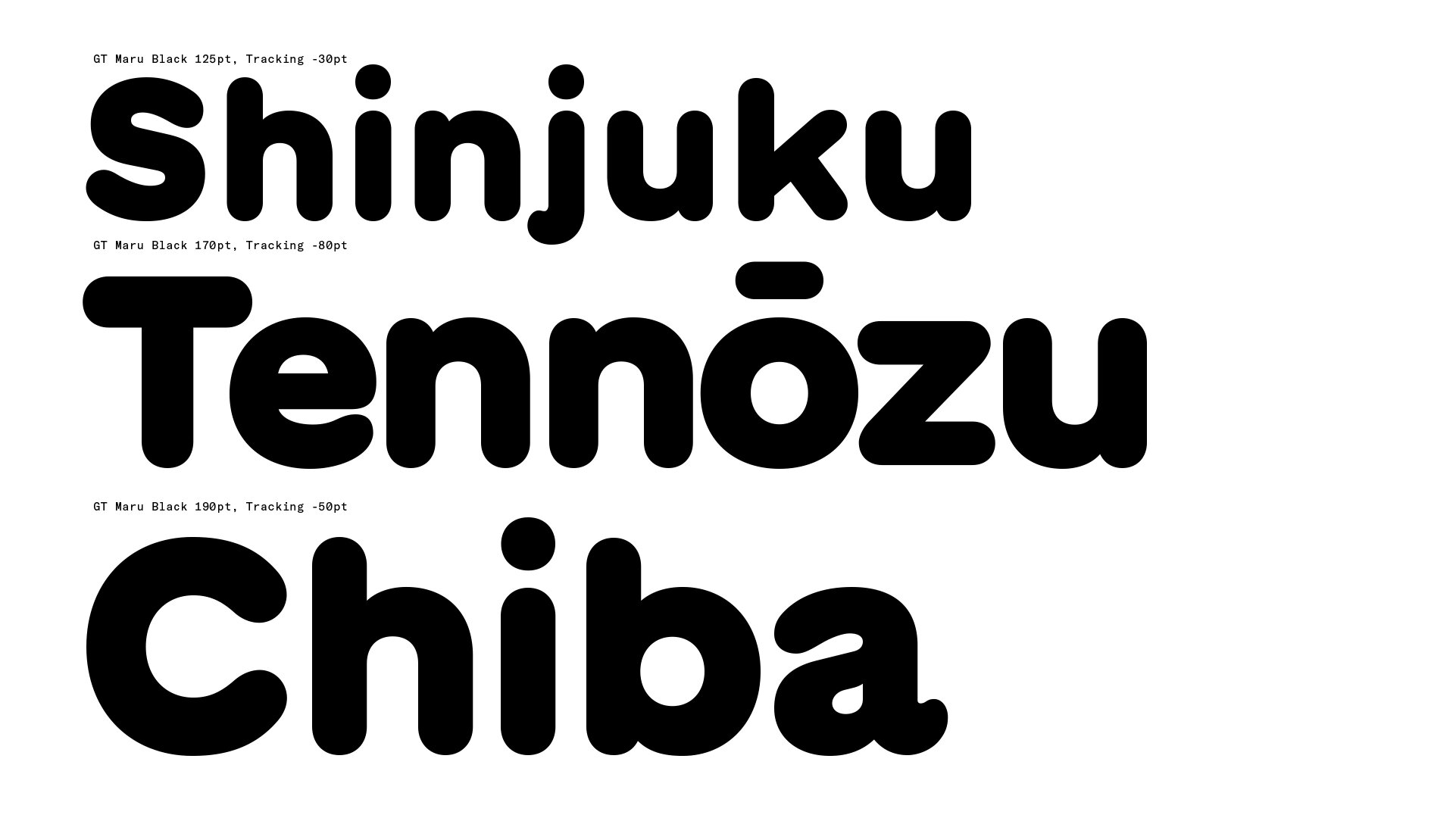
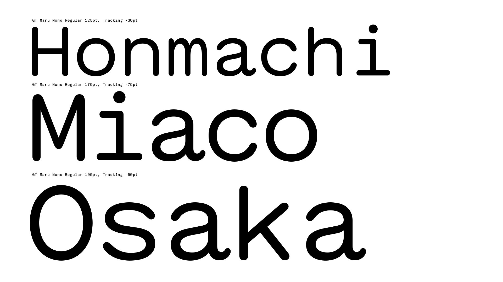
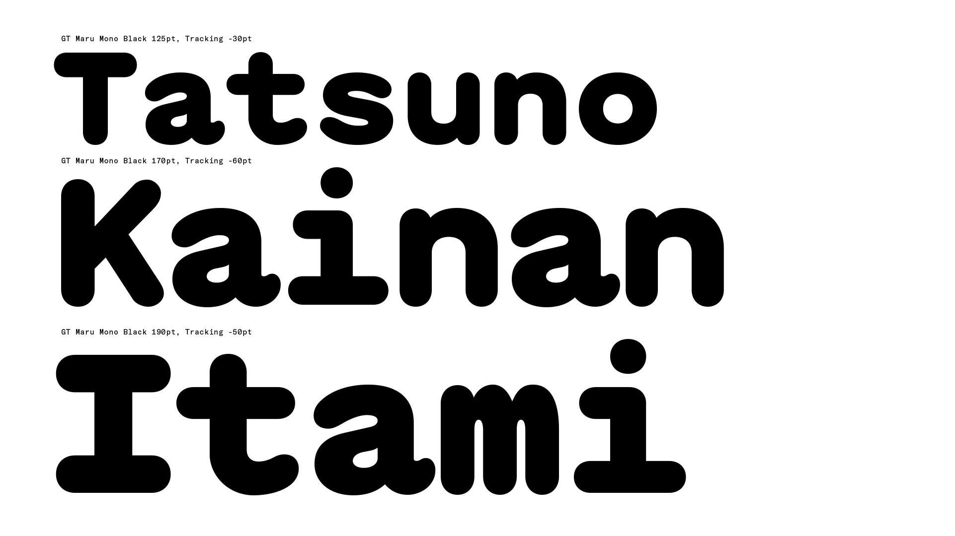
• GT Maru is a rounded sans inspired by english characters on Japanese signage.
• Maru is a Collection of 4 stylistic families: Maru, Mono, Mega, and Emoji.
• Available as a total collection of 25 fonts.
LINKS:

From the Foundry:
“GT Maru is an ode to rounded English characters found on signage across Japan. The typeface is the result of this design exploration into roundness — or maru — in the Latin alphabet. It combines the warmth and flow of sign painting with the mechanical quality of engraved letters.”
The Collection:


Mini Site Imagery:


SELECT SPECIMEN PAGES:
NOTES:
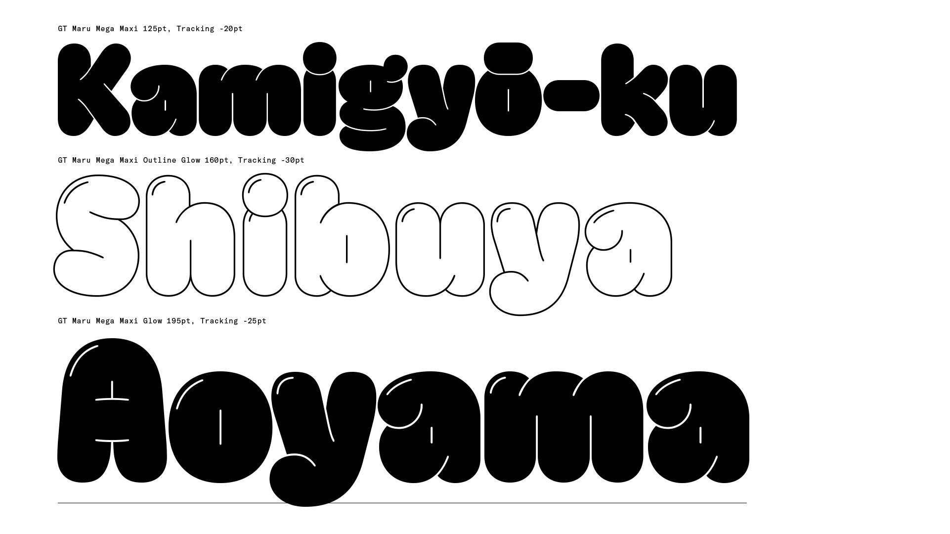
GT Maru is the result of a years-long design exploration of roundness. Inspired by construction site lettering and sign painting in Japan, and the more jovial nature that rounded sans typefaces have in his local Swiss vernacular, designer Thierry Blancpain has brought a new approach to the less-trodden typographic genre. I think this take on a rounded sans is welcome, as its derived from a clear source of original inspiration (aka not a revival) and experience (an authentic story of experience in Japan). Having ben to Japan, I can vouch for the unique personality that found latin characters in the Japanese typographic landscape are imbued with, its really fun to see that spirit adequately captured here!
The concept in this collection of fonts is further improved by the addition of the Mega and Emoji styles. Because, of course a rounded sans family inspired by Japanese lettering and signage would have emoji and a wacky ‘mascot-y’ display style. It would be a missed opportunity to not make them a part of this. With Mega, Grilli has really taken the variable sliders to eleven here — crafting a hefty, puffed up marshmallow version of the font — which is a fun and welcome expression. And the Emoji are stylistically in tune with the presentation of the rest of the font. Curious how these will pop up in places, being such a specific illustration style.