Agena Display
RELEASED BY:
Coppers and Brasses ☞
DESIGNERS:
Étienne Aubert Bonn
RELEASE DATE:
Week 22
DETAILS:
• A display sans collection that “tries to bridge the gap between the expressive humanist sans typefaces of the ’60s and the modern geometric superfamilies of today.”
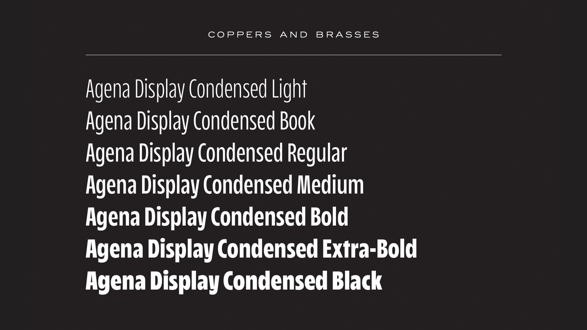
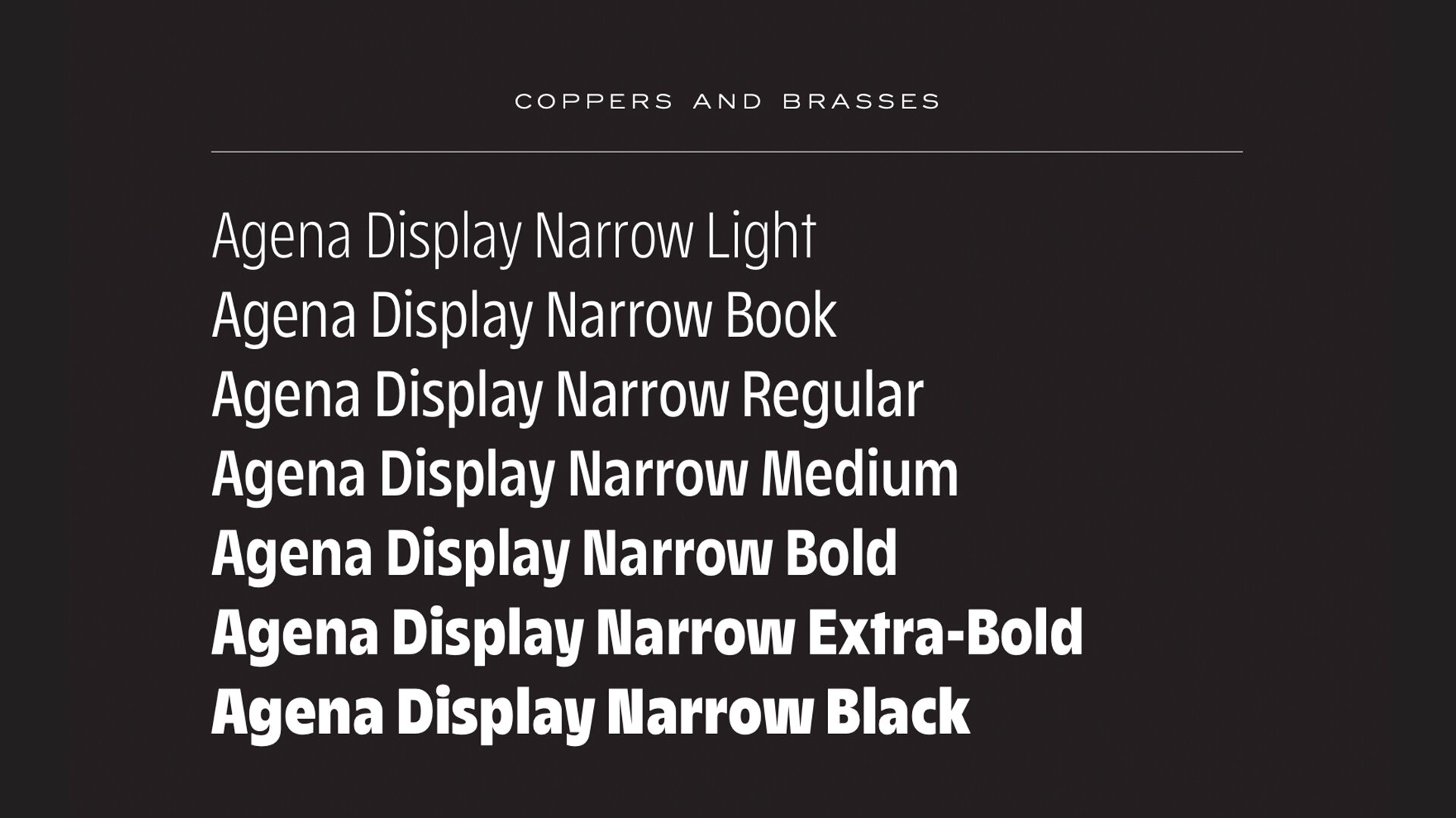
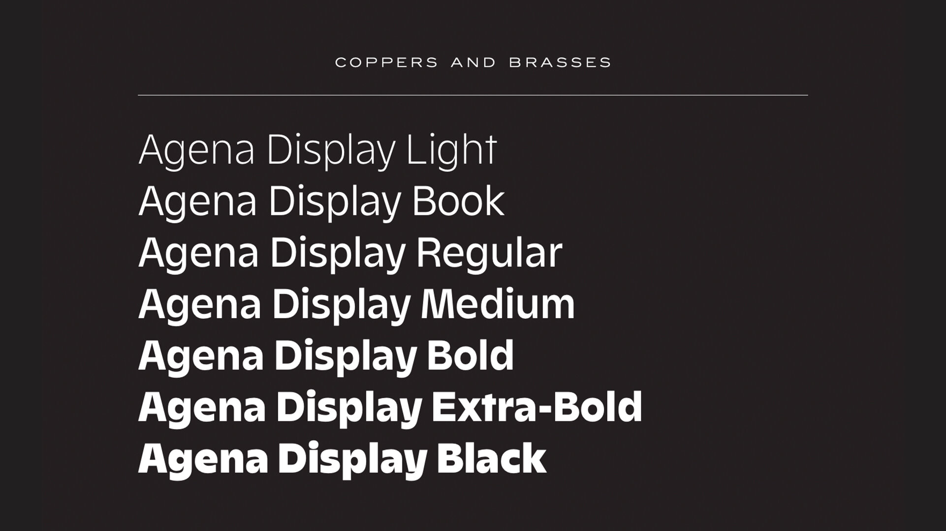
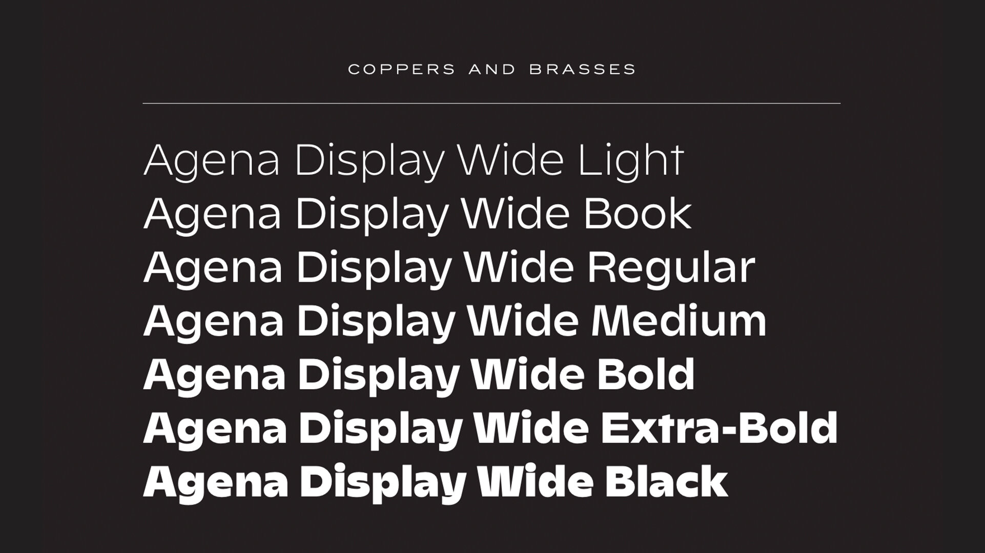
• Available as a collection of four width families, each with seven weights, and no italics.
LINKS:
Release Information ☞
Try & Buy ☞
PDF Specimens ☞
Agena Display Condensed
Agena Display Narrow
Agena Display
Agena Display Wide
Competitive Set:
Degular from Ohno Type Co. ☞
From the Foundry:
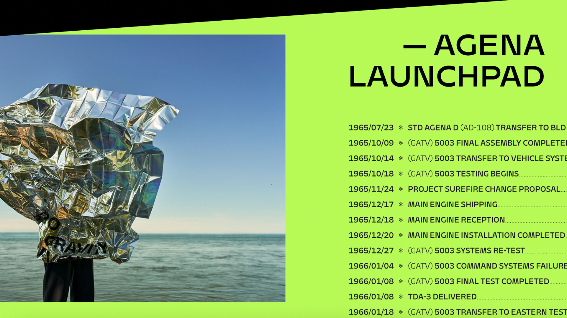
“Agena is a typeface that tries to bridge the gap between the expressive humanist sans typefaces of the ’60s and the modern geometric superfamilies of today. This display-focused family exaggerates the usual optical corrections seen in sans typefaces while maintaining a relatively low contrast between the stems themselves. It manages to be clean, predictable, and surprising all at once.
The wide range of weights and widths allows for interesting combinations of styles and opens a lot of typesetting possibilities. Mix and match as many styles as you wish for extra personality!”
FOUNDRY SPECIMENS:
Foundry Images:

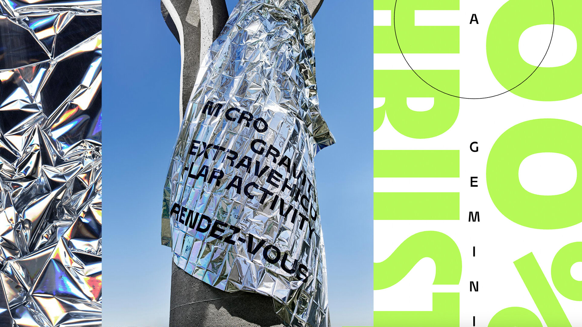


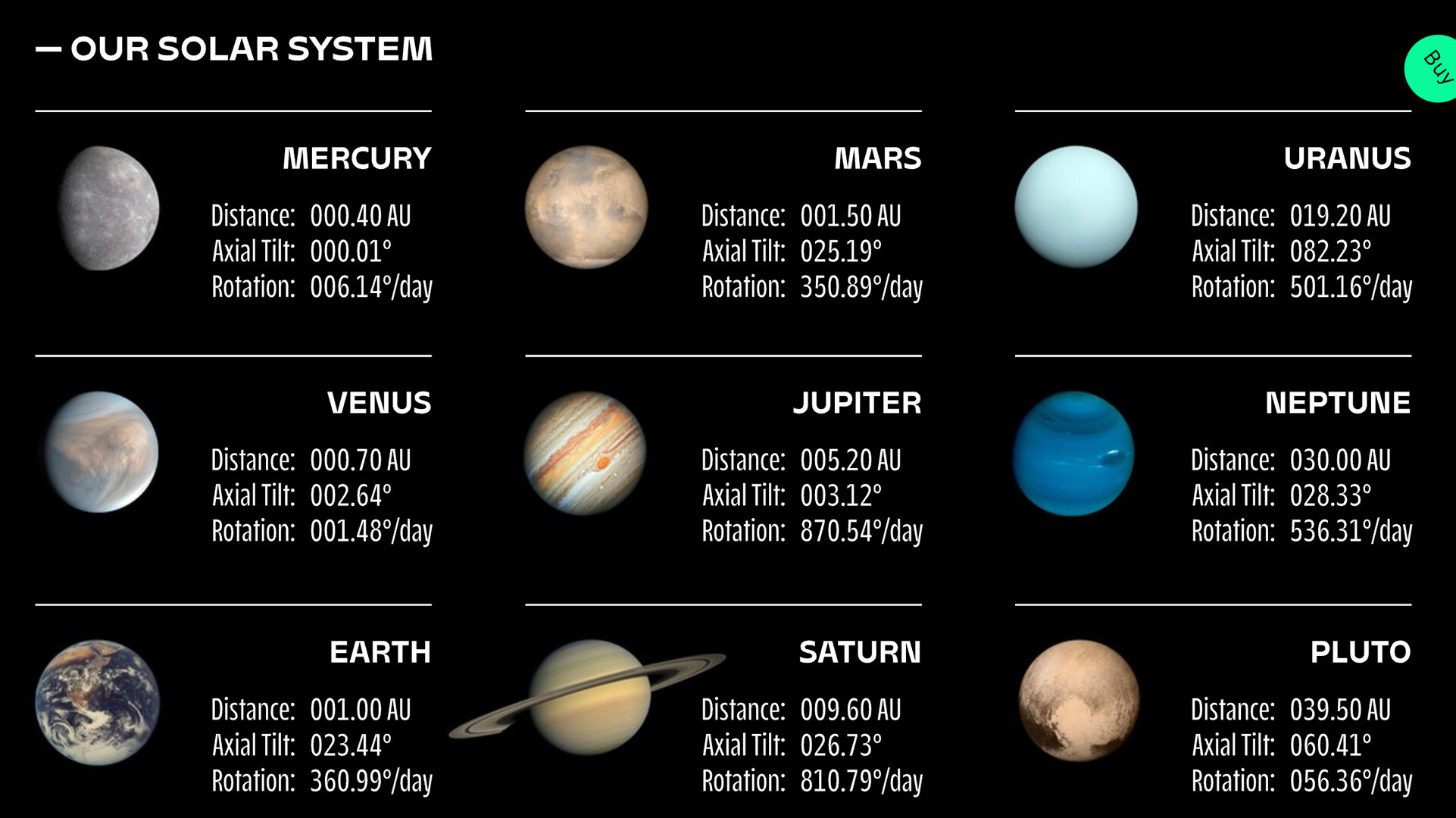
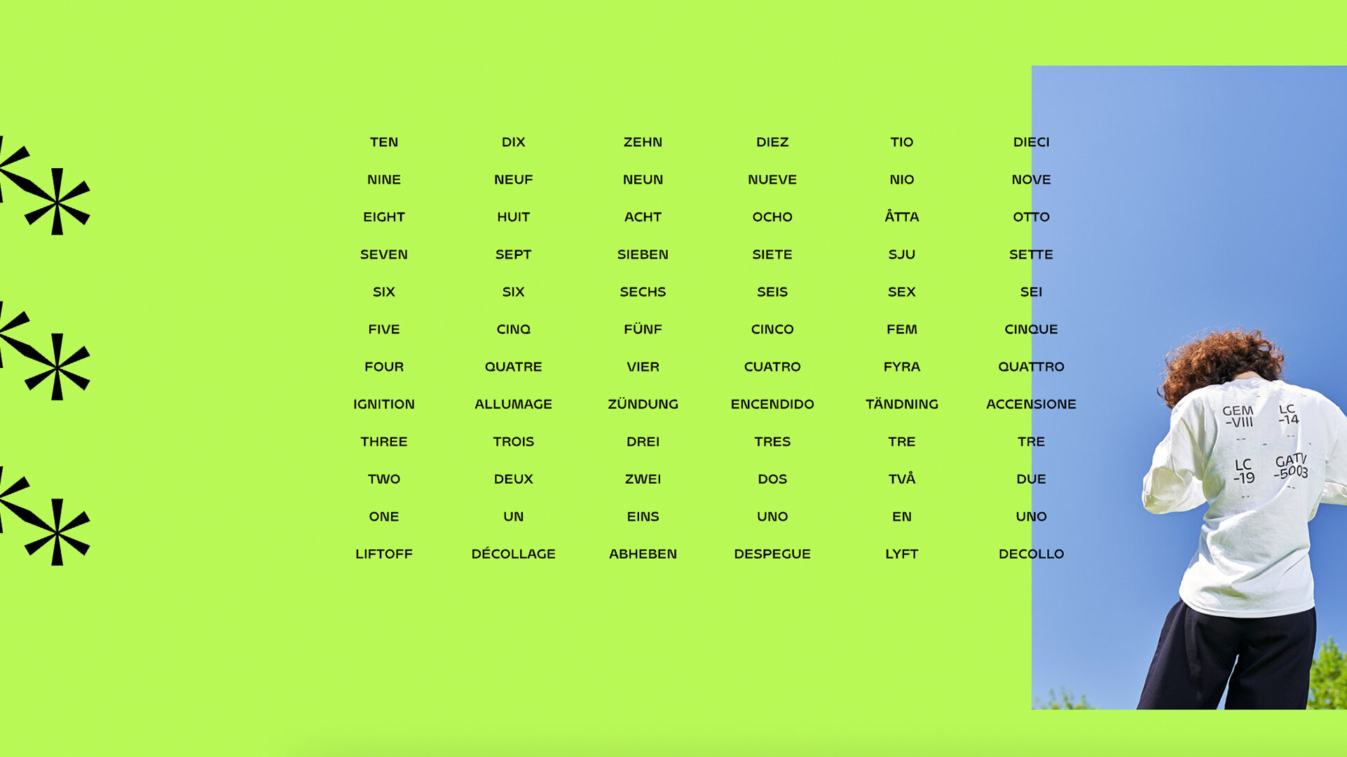
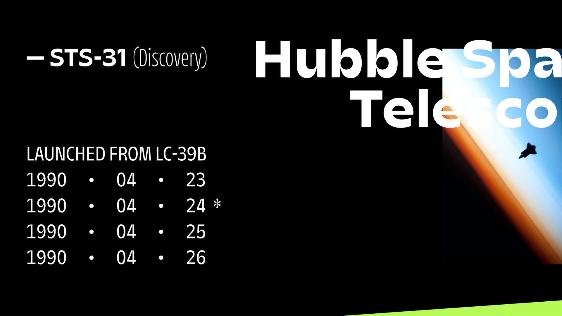
NOTES:
There’s so much to love about Agena Display. First of all, it’s pretty fresh. No doubt the result of a long period of development, the letterforms themselves are refreshingly well thought out with each detail serving a purpose in the expression of the overall face. It’s a very efficient typeface for this reason.
Secondly, it’s got an air of experience about it—a tribute to the mastery and skill of Étienne Aubert Bonn, who is certainly one of the best type designers working today. You can see iconic typefaces of the past informing the structure and weight of Agena, while Étienne takes things one step further from there. The subtle contrast shifts and letter proportions seem beamed up from the days of photolettering while the big cuts, edgy counter shapes, and tapering curves are all new flavors mixed in.
Third, I think this collection is just so versatile, arriving fully baked as 28 styles across 4 widths. The condensed and narrow widths are so well balanced and fine tuned for editorial headlines and apps. I can see them being the next darling favorite of contemporary digital designers and the like. The regular and wide widths are pleasantly reserved while not losing any edge or attitude. They seem like they’re patient letterforms, and by that I mean they seem like they are not pompous or egotistical in their stance, but they are confident enough to take their time in the spotlight, communicate all that they have to communicate, and humbly step back again. They take up the space they take up and they’re not apologizing for it. They almost dictate the way they want to be read, without any self consciousness.
Not sure if any of that made sense, but I’m really enjoying Agena, and think its a spectacular addition to the C&B catalog and the type landscape in general. Can’t wait to see this typeface set at 40,000 pts. on a Times Square billboard screen in the near future.

