
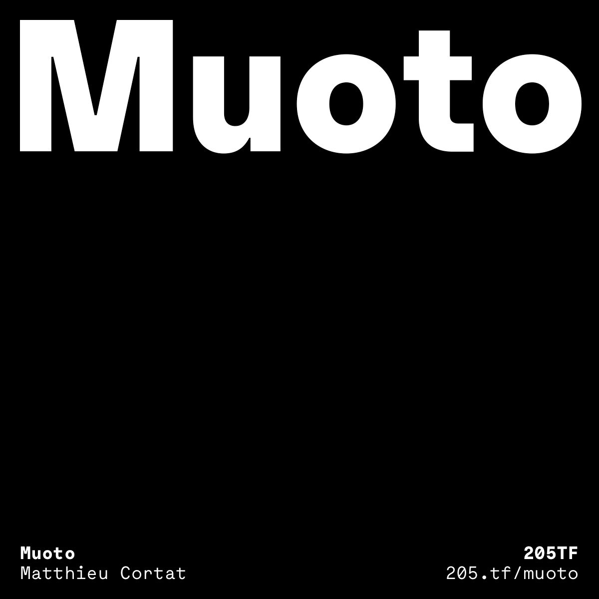
Muoto
RELEASED BY:
205TF ☞
DESIGNERS:
Matthieu Cortat
Anthony Franklin
Sander Vermeulen
RELEASE DATE:
Week 22
DETAILS:
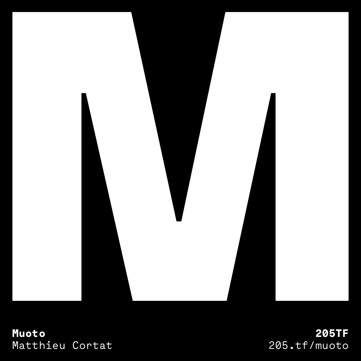
• A modernist sans serif family out to prove that functionalism doesn’t have to be cold and neutral, but can be “warm and softly effective.”
• Available as a family of 12 fonts — 6 weights of roman and italics.
LINKS:

From the Foundry:
“Muoto, designed in collaboration between Matthieu Cortat, Anthony Franklin and Sander Vermeulen (Base Design), is the synthesis of a sensitive and human approach to modernist design. This variable sans serif font combines full curves and solid stems, showing that functionalism can actually be warm and softly effective.
With its robust structure and subdued proportions, it evokes organic forms dear to Finnish architect Alvar Aalto, who in 1957 wrote: “We should work for simple, good, undecorated things, but things which are in harmony with the human being and organically suited to the little man in the street.” Muoto embodies this idea while responding to contemporary typographic requirements, with its palette of weights (from Thin to Black) and its increased on-screen legibility.”

FOUNDRY SPECIMENS:


NOTES:
We’ve seen a few strong entrants into the structured geometric sans category this year, with Muoto being another viable rising hotshot of a contender. Muoto is very much a sans family with stability, consistency, and neutrality in mind, even though the foundry language dives a little bit into keeping this style warm and effective. There’s certainly some truth in that, however, put up against some of the other sans serif families released recently, Muoto can look a little tame.
That being said, There are some pretty special moments hidden away within Muoto to be capitalized on. As is the case with all modern sans families, the differences, uniqueness, and real value lies in subtlety. Muoto is well-weighted, placing the right amount of weight in right kind of places to feel familiar yet contemporary. Muoto is well spaced, leaving a little more room around each character than some of its competitors, which in this case is a big advantage. (I feel like a lot of big name sans families come out of the box with pretty tight spacing. Muoto, whether intentional or not, has slid into the market with a different take.) Muoto is also well heeled, featuring some modern details like the pipe-bend t, or an alternate set of thin punctuation.
I can see Muoto meeting a need for designers in certain design circles, and then even going beyond. The real marker of success for a typeface like this is how easy the foundry makes it for designers to notice, buy in, and then use the unique subtleties that make it special.