Graf
From the Foundry:
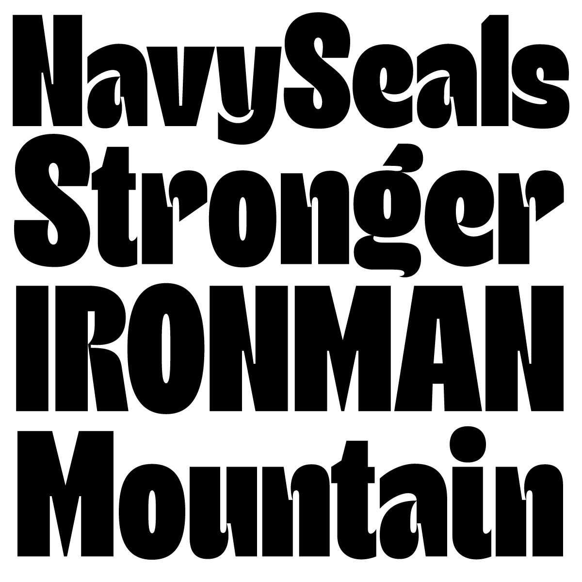
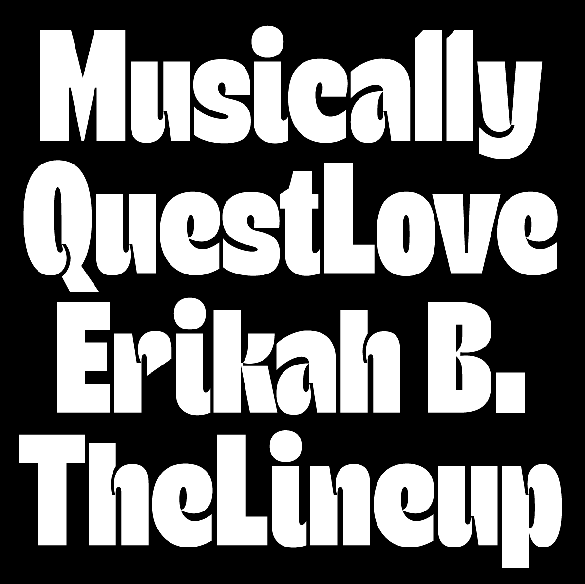
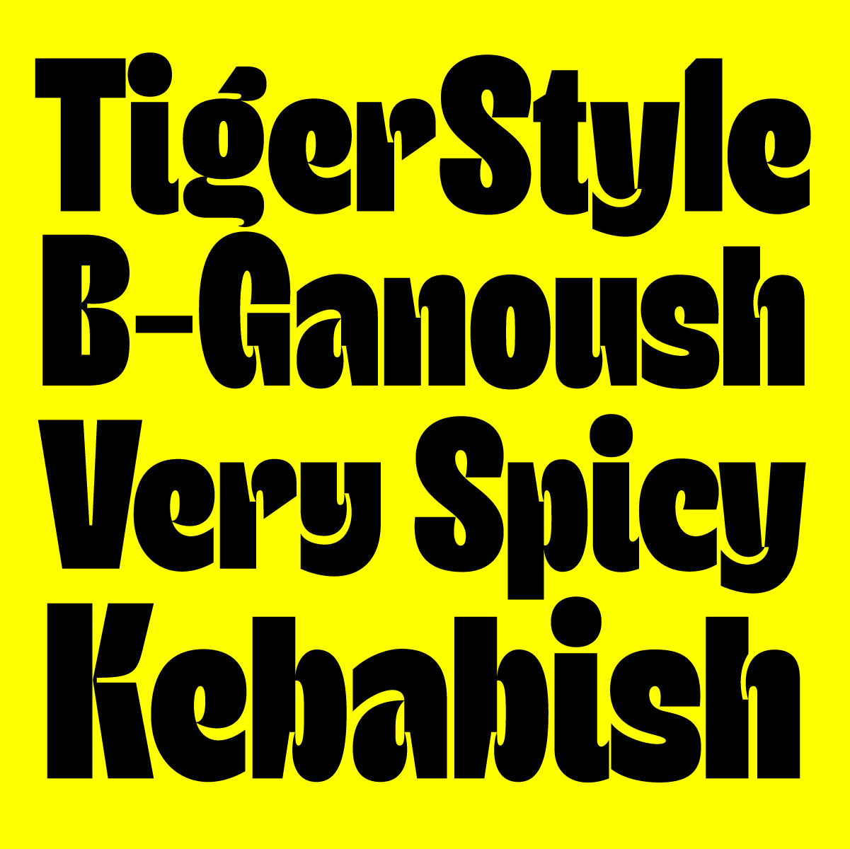
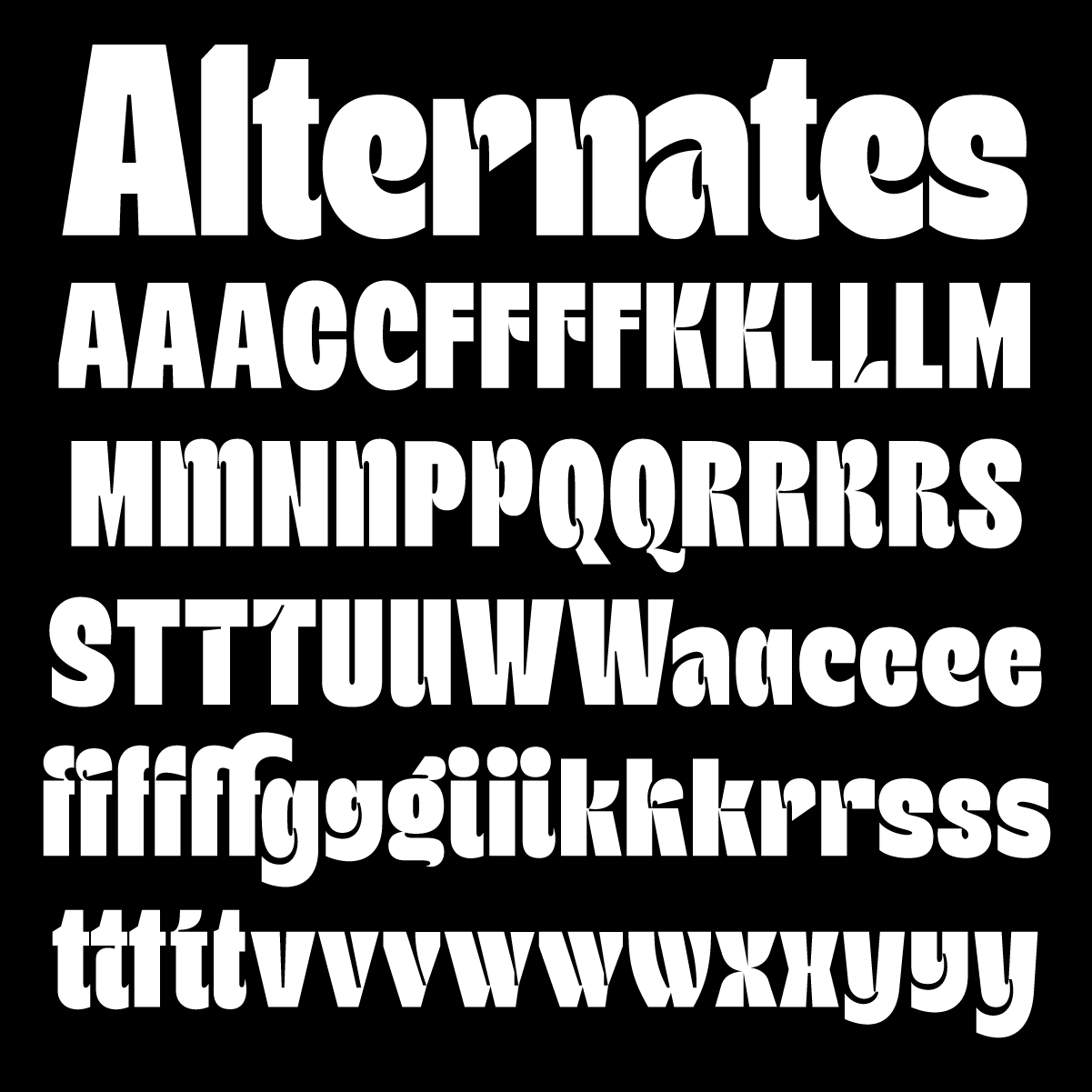
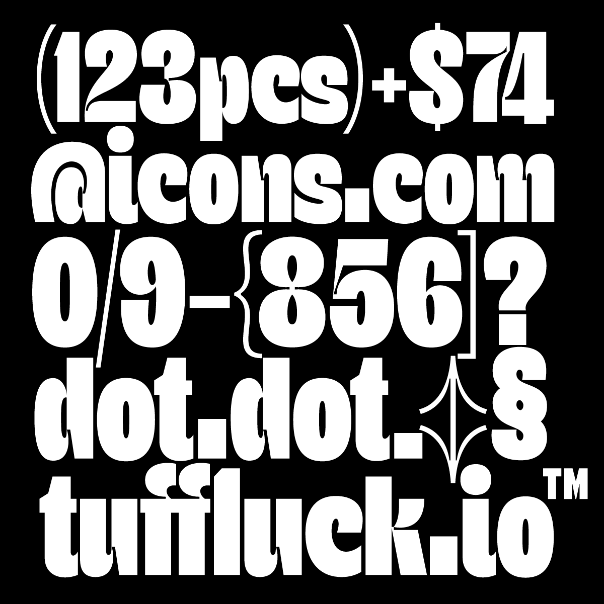
“Graf is new display typeface designed to make an impact. It has a classic look but yet it's very modern. It works for everything from Sports, Tech, Editorials to fun branding projects. The smiling ink-traps are making the font either have a strong stand or a friendly approach depending on the medium used. It comes packed with tons of alternates to help you create unique combinations.”
NOTES:
Graf is one of those fonts that is fun to see being released. It’s not a part of a huge family — released as just one font — and its not claiming to be anything more than it is — an exciting expression of a type design idea. In this case, its those smiling ink traps.
Ink traps have always been a fascination for type designers since Matthew Carter pretty much invented them with Bell Centennial. (Learn more about ink traps in Toshi Omagari’s fantastically thorough article on the subject here ☞.) Although they were created as a solution to a physical and technical problem, Ink traps have escaped that purpose in type design and have become a vehicle for aesthetic expression and experimentation which Graf embodies so well. The ink traps here are more of a visual/personality device than any kind of technical spec.
Graf does seem to include more than just ink traps, though. I love the sweeping strokes for instance in the f, alt g, and e. I love how glyphs like the &, 3, 8, and x come to a pinching pucker like it just ate a sour candy it can’t handle. The upper case is a little more tempered and subtle than the lower case, which is a good move, and in text reading, it all comes together. I also love the monolinear, thin punctuative characters like brackets, arrows, and slashes.


