
Puffin
RELEASED BY:
Bold Monday ☞
DESIGNERS:
Pieter van Rosmalen
Sabina Chipara
Jacques Le Bailly
RELEASE DATE:
Week 16
DETAILS:
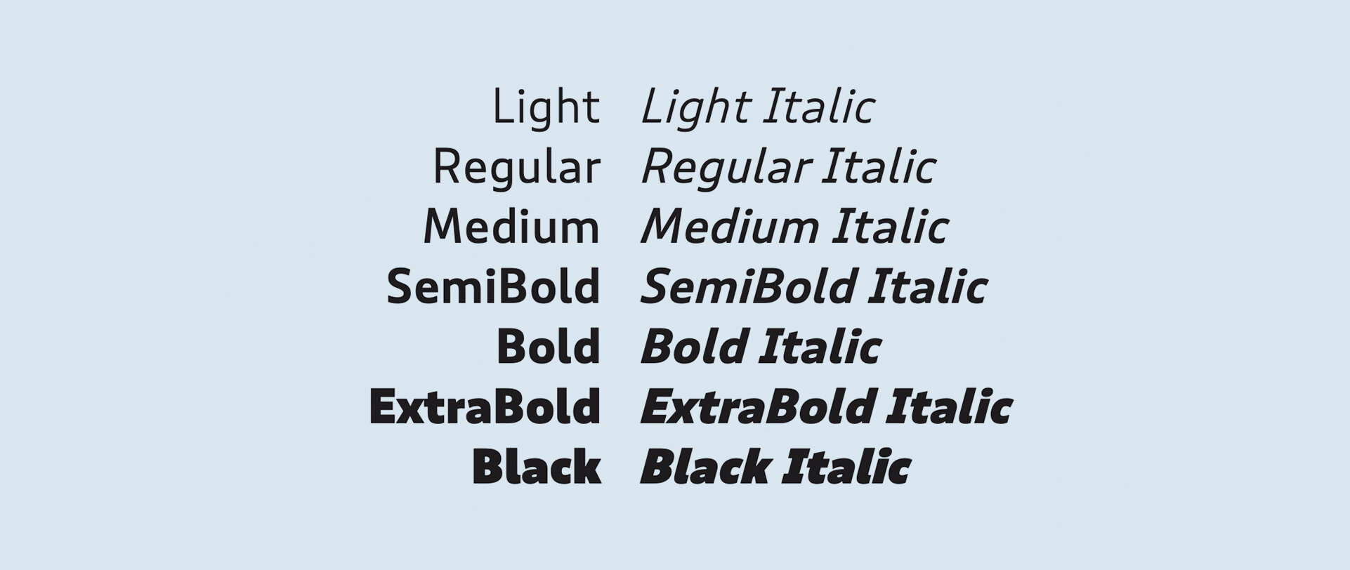
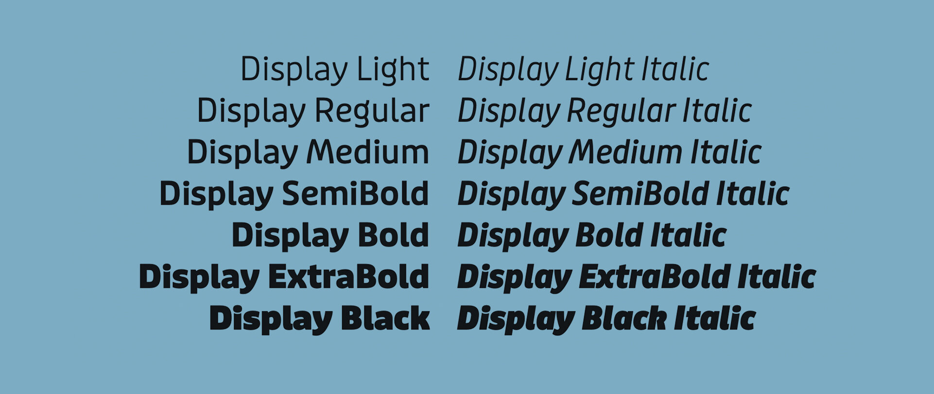
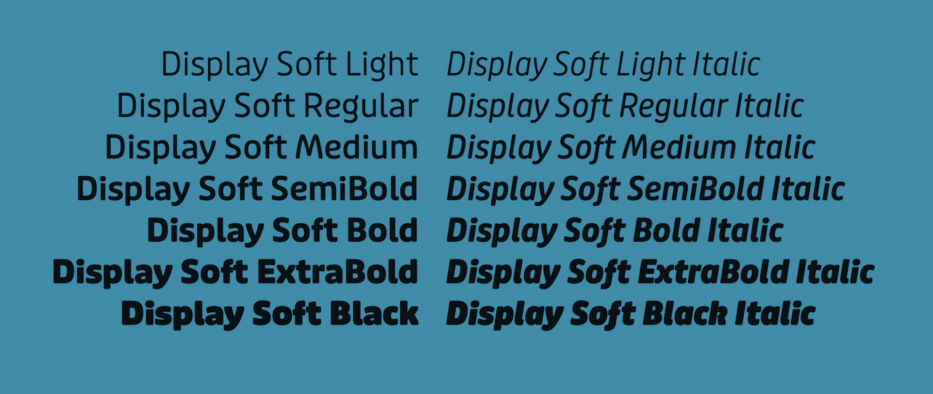
• Puffin is a collection of versatile humanist sans font families: Normal, Display, Display Soft, and Arcade
• Puffin, Puffin Display and Puffin Display Soft are each available in seven weights plus italics.
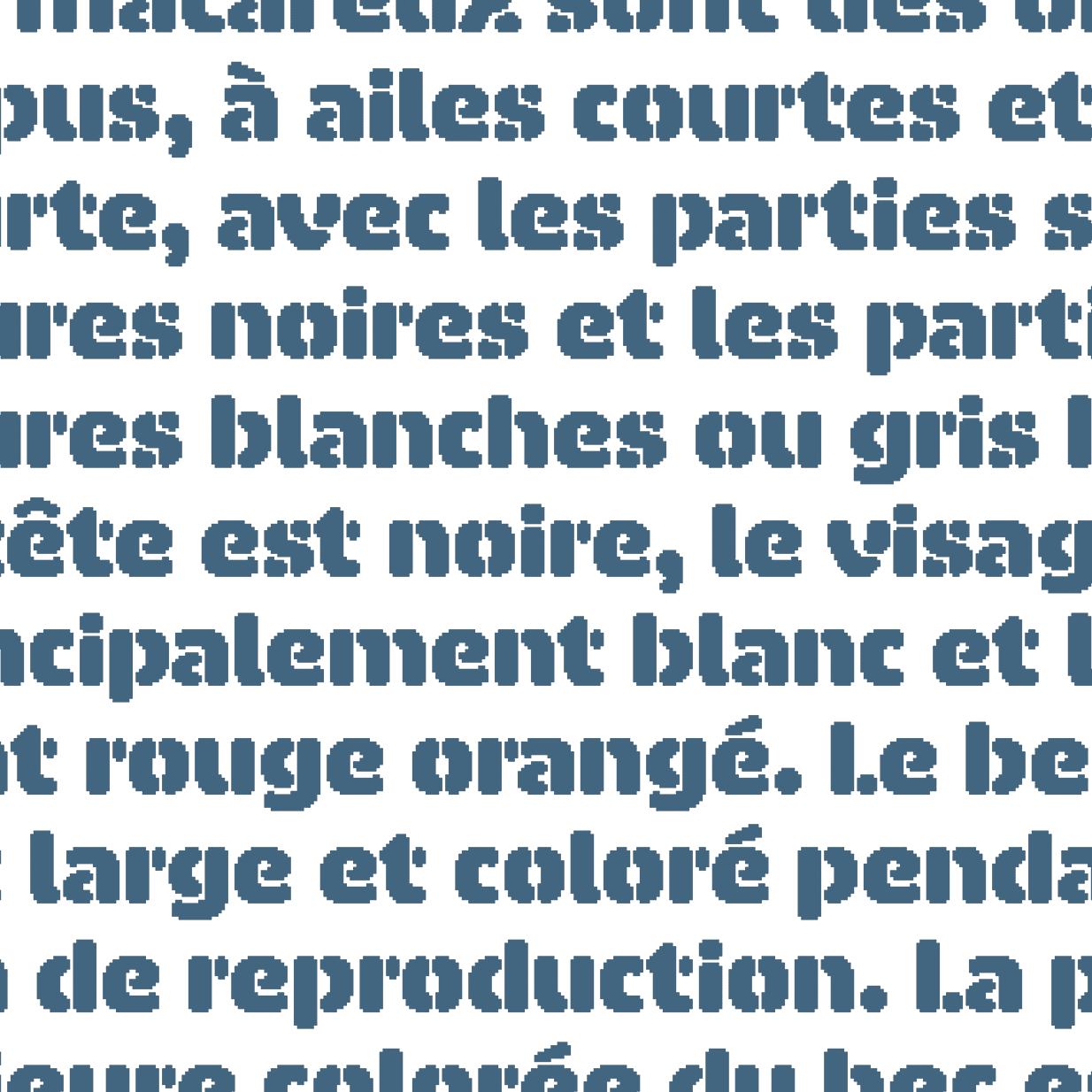
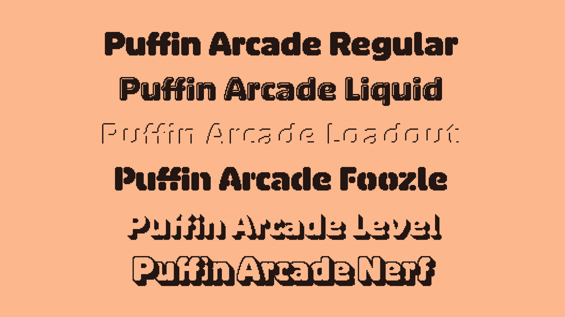
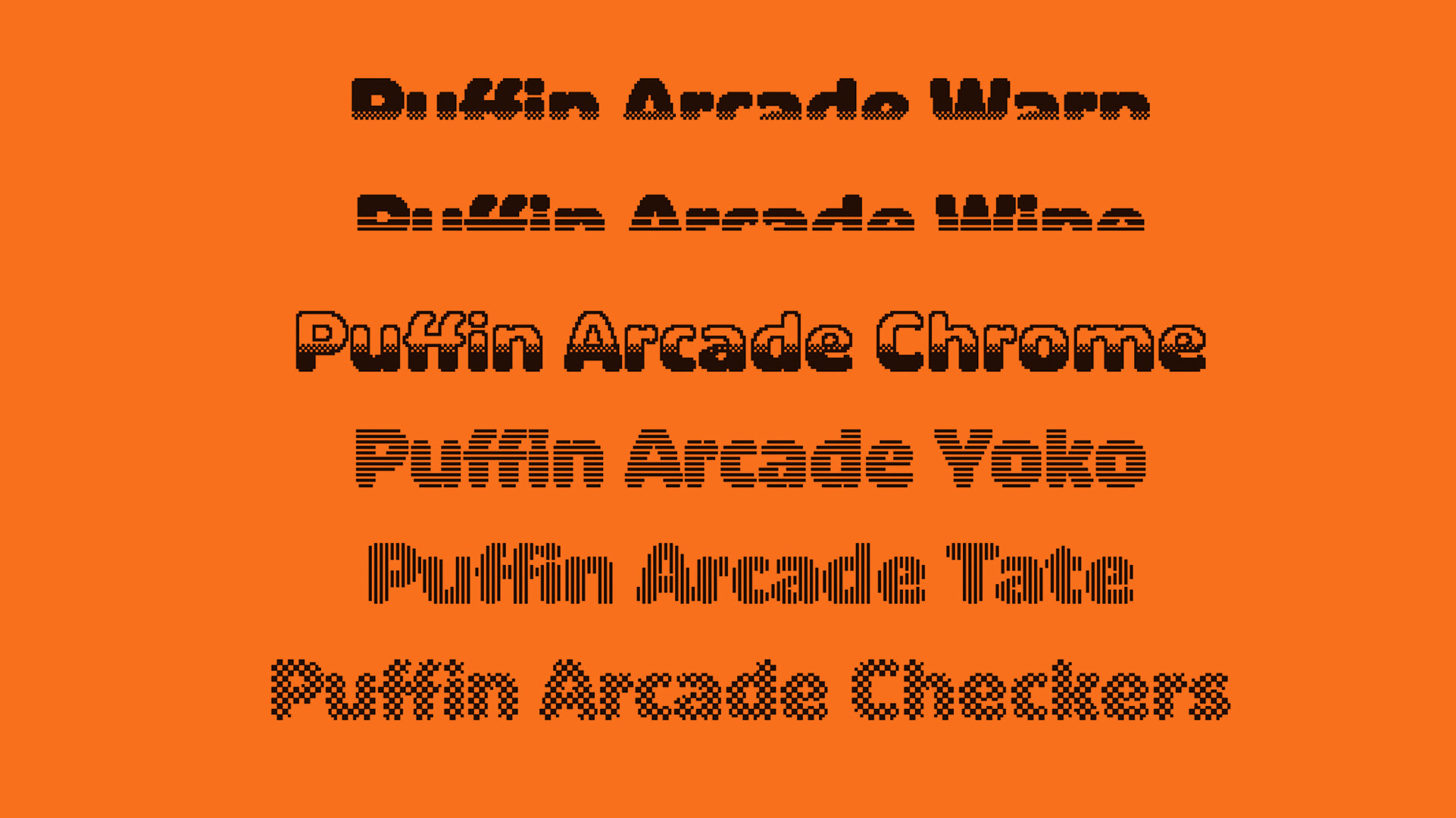
• Puffin Arcade is a family of 12 playful and layerable bitmapped fonts.
LINKS:
Release Information ☞
Try & Buy ☞
Puffin PDF Specimen ☞
Puffin Arcade PDF Specimen ☞

From the Foundry:
“You may recall a charming bold and round display sans called Pinup by Pieter van Rosmalen among the first batch of Bold Monday releases. Informal and of friendly nature, but consisting of one style only. More than 10 years later it grew into two comprehensive type series – one very practical and still fun, one very fun and still quite practical: Puffin and Puffin Arcade.
The extended “normal” family consists of Puffin, Puffin Display and Puffin Display Soft, each available in seven weights plus italics. The plain version of Puffin is the most tamed member. A versatile humanist sans with generous spacing and pronouncedly oblique italics (15°) that is well-suited for on-screen reading and user interface design. Capital I, lowercase l and the numeral 1 have unique forms so they are not easily confused.
Puffin Display and Puffin Display Soft, in comparison, are more flavorful: distinctly curved letterforms, especially in the swinging true italics, or rounded terminals in Puffin Display Soft make you feel right at home and on first-name-terms with it. The Display styles have a taller x-height and slightly tighter spacing that fit all kinds of personable applications in medium to large font sizes. And for an extra dose of playfulness – be it in posters or video games – combine them with Puffin Arcade.”
PUFFIN NORMAL, DISPLAY, & DISPLAY SOFT:


PUFFIN ARCADE:


NOTES:
Wow, Puffin and Puffin Arcade are as in-depth and well-thought-out as it gets. It was mentioned that Puffin started out as a single style back in 2008, and was slowly built over the course of the following decade. The extensiveness and usability of this collection of families is a reflection on that amount of time well spent.
Honestly, the versatility of this collection is impressive. Starting with the Normal style, Puffin is a pretty straight-ahead humanist sans that I can see any major Fortune 500 brand adopting. That’s not a bad thing, just a grounding point for how the narrative of this collection unfolds. The Display style is an edgier take, with its squircle-y proportions, wide weight range, and lc i that cradles its own dot. From there, Display soft is where Bold Monday really starts layering in the personality, and where I’m sure the name came from. With its rounded corners and more loose italic letterforms we get another realm of application with a friendlier and cuter style.
Lastly, Arcade is just so much fun. Bitmapped fonts inspired by arcade games and video game lettering are usually stuck in a few basic tropes of expression that everyone has come to expect. Puffin Arcade does a great job of expanding out of that expectation by extending the personality inherent in the Puffin family into a realm of video game vernacular. How fun is that Nerf style with the overlap? Or the Chrome style… really bringing me back. Ultimately, if you can’t find an appropriate font to use in the entire Puffin Collection — from corporate to colloquial — I don’t know what to do for you.
Additional Resources:
For more on bitmapped fonts and Arcade Game Typography, check out Toshi Omagari’s book on the subject, available here ☞ through Thames and Hudson.