Idem
RELEASED BY:
DSType Foundry ☞
DESIGNERS:
Dino dos Santos
RELEASE DATE:
Week 23
DETAILS:
• A Dwiggins-inspired editorial serif design in text and display styles.
• Available as a collection of two families of 6 weights, including roman and italic styles.
LINKS:
From the Foundry:
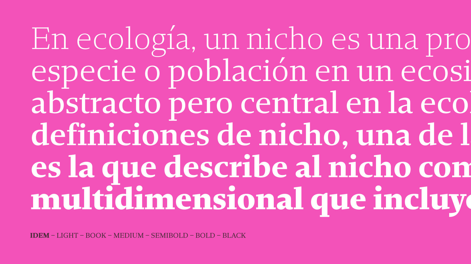
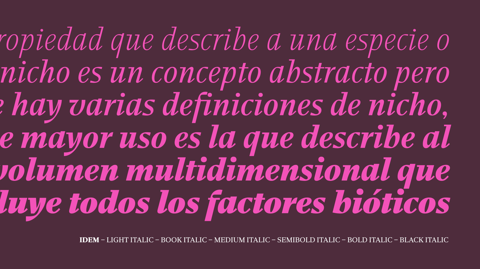
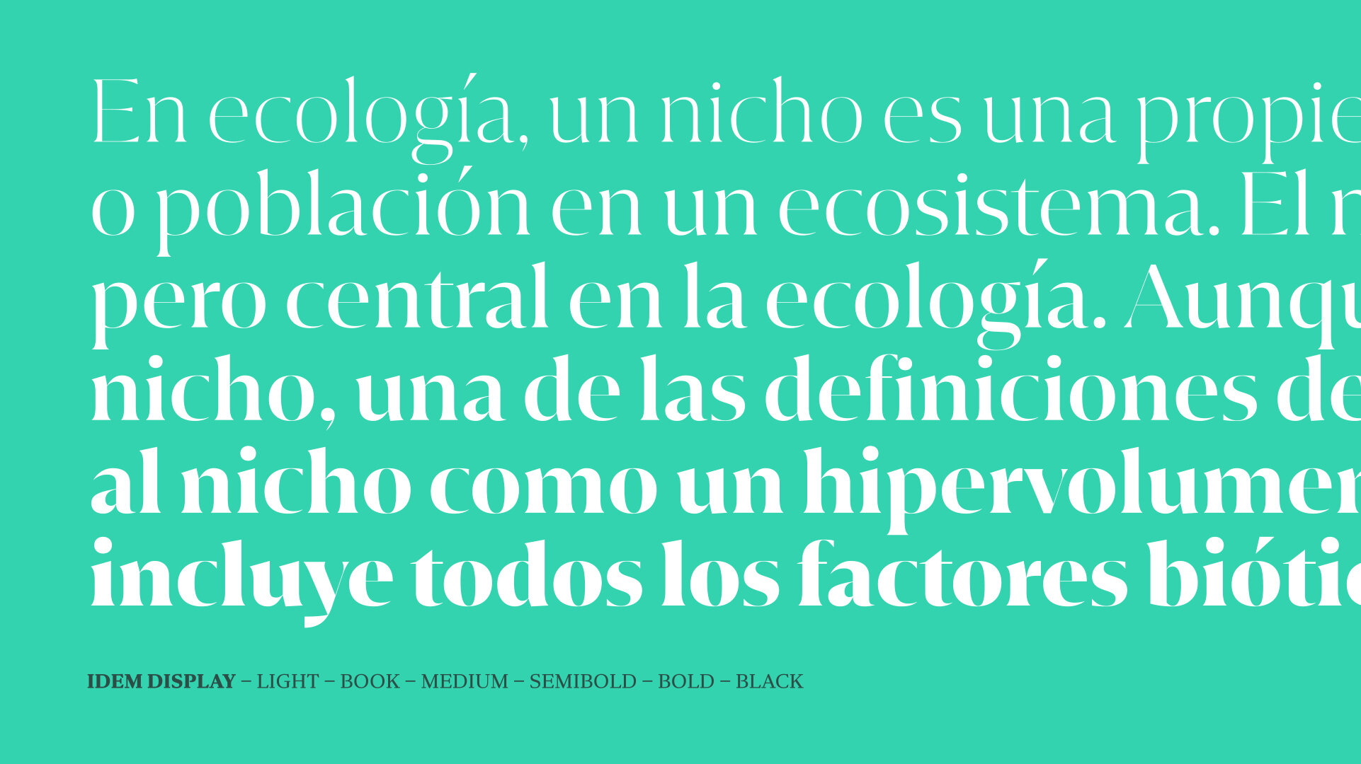
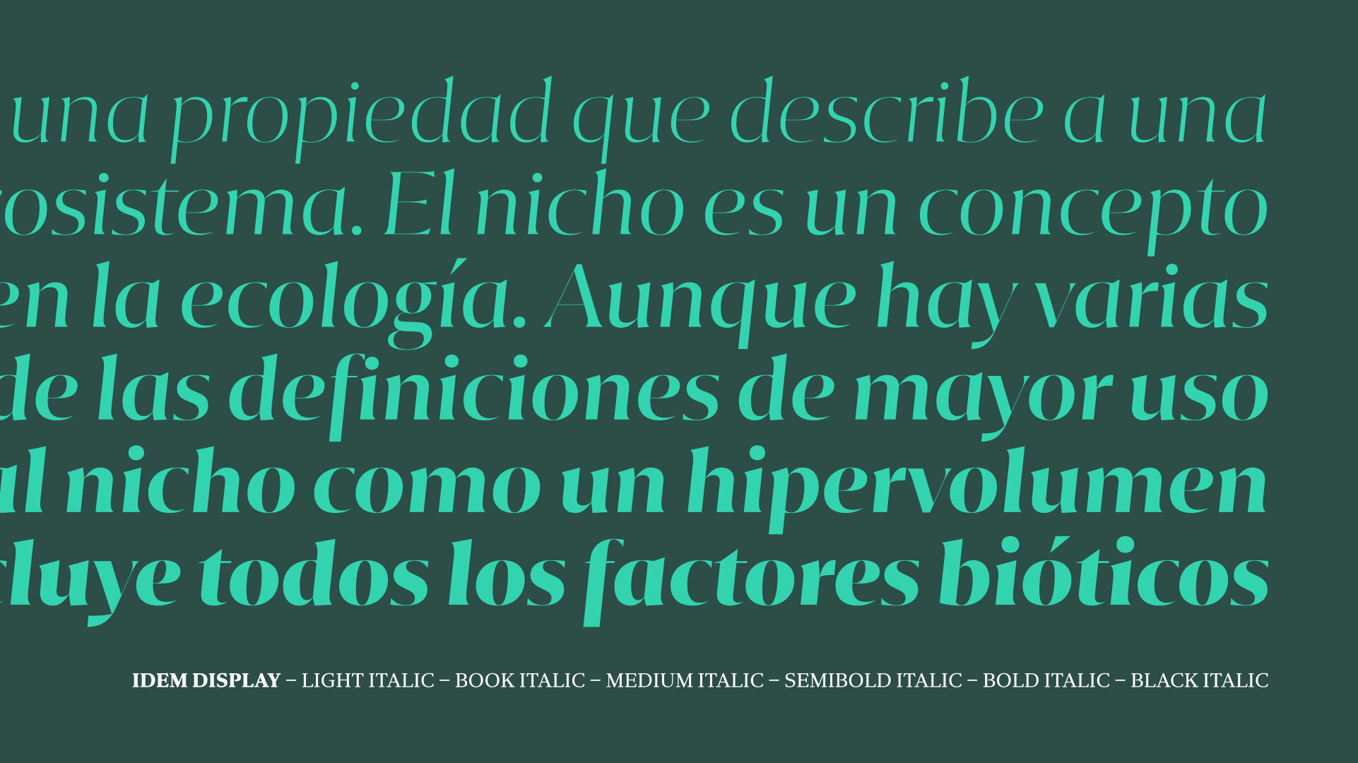
“The design of Idem was completely different from all our other typefaces, not by chance but for necessity. With Idem we started with the lowercase italics, specially focusing on the "g" and "&" clearly inspired by the work of W.A. Dwiggins. The "g" was based on "A technique for dealing with artists" and the "&" was based on the Hound & Horn lettering. This staring point lead us to a contemporary, sturdy type family for text setting and a flared display version with tight spacing, contrasted strokes and straightforward italics.”
Foundry Images:
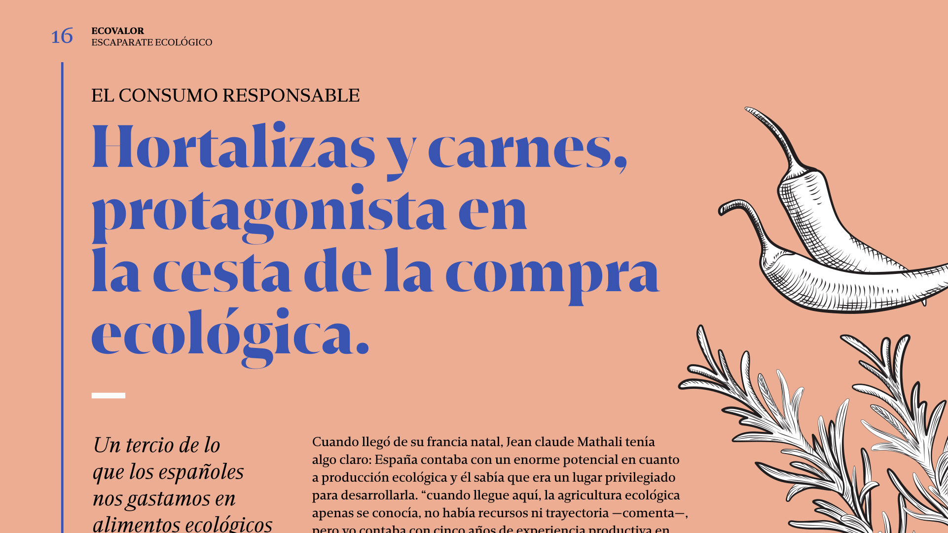
NOTES:
Idem is a fantastic go to serif family for those designers out there who are either just building a library, or looking to simplify or refresh their long-established one because its efficient — it packs so much into two families — and its stylish — it’s got a pulse on what looks good and works well for the demands of modern typesetting.
First, let’s talk about the efficiency of Idem. It’s a type system with a trimmed and tailored construction and focused concept, which I think helps it stay in its lane. In this case, thats a really good thing. It’s useable because it’s focused on doing one thing well instead of trying to do all the things with mediocrity. It’s a smart serif design that just works, plain and simple. That’s so great for the type buying public these days because there are so many families out there who just want to do it all which can be daunting to use.
Second, let’s talk about the style baked into Idem. You can see the influence of some of the most successful editorial serifs to come before Idem — Tiempos, Publico, and GT Super — mixing with some of the more stylish editorial display faces of recent years — Canela, Flecha, and even Bely — in order to streamline a highly desirable look and feel while still working well on a technical level. Design wise, I enjoy the smaller terminal serifs on letters like the c, g, z, and s, in contrast with the bolder stroke widths in those same letters. (although I wouldn’t expect myself to.) There’s a charm to the letters. The weight variation is quite nice, and the italics are handled really well, just enough edge to be competitive in the market and have to unique moments. Another top shelf release from Dino dos Santos that I hope to see in use out there soon!


