Eiko
RELEASED BY:
Pangram Pangram ☞
DESIGNERS:
RELEASE DATE:
Week 23
DETAILS:
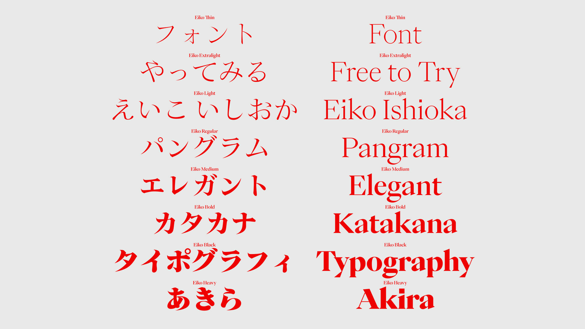
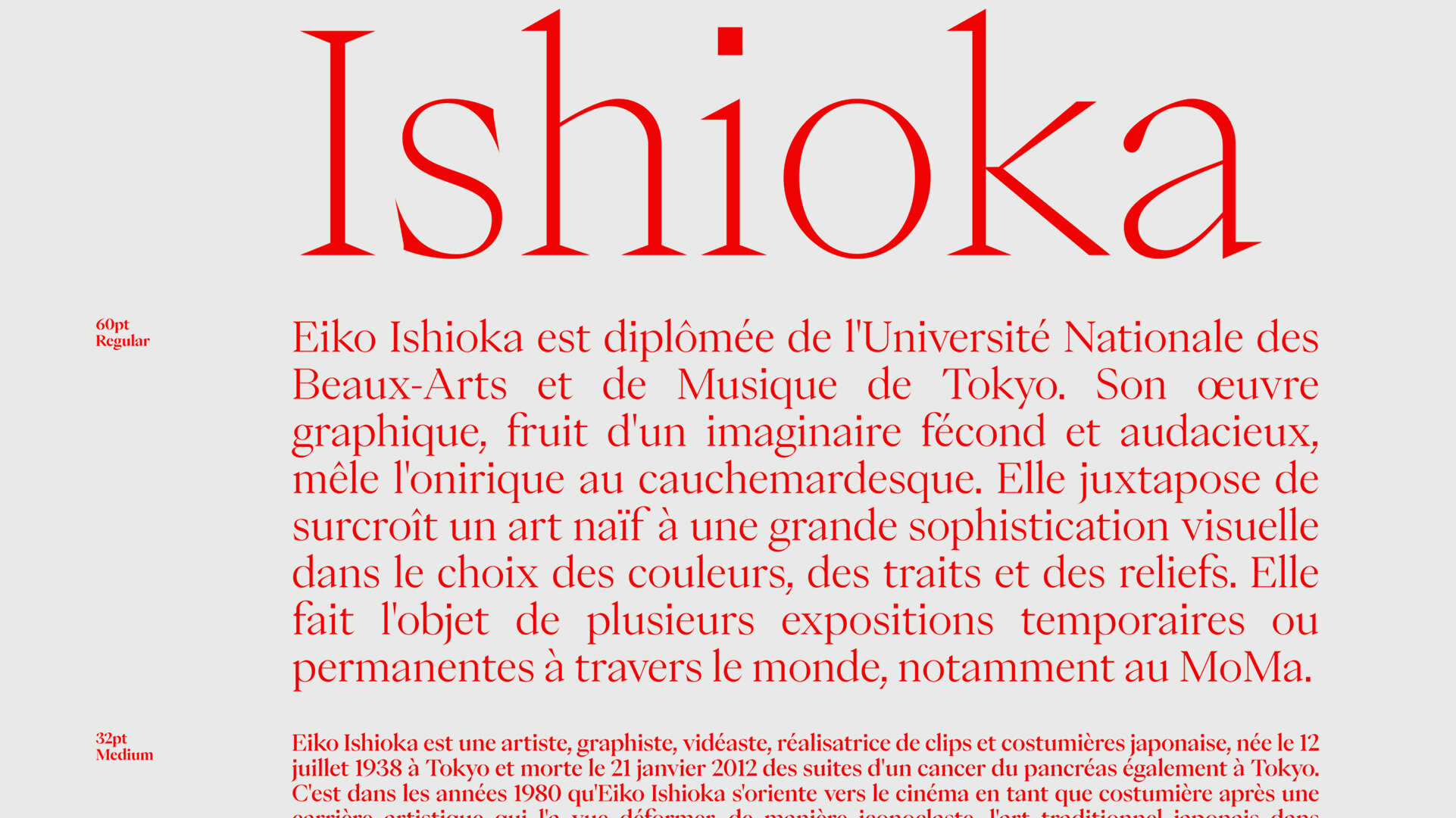
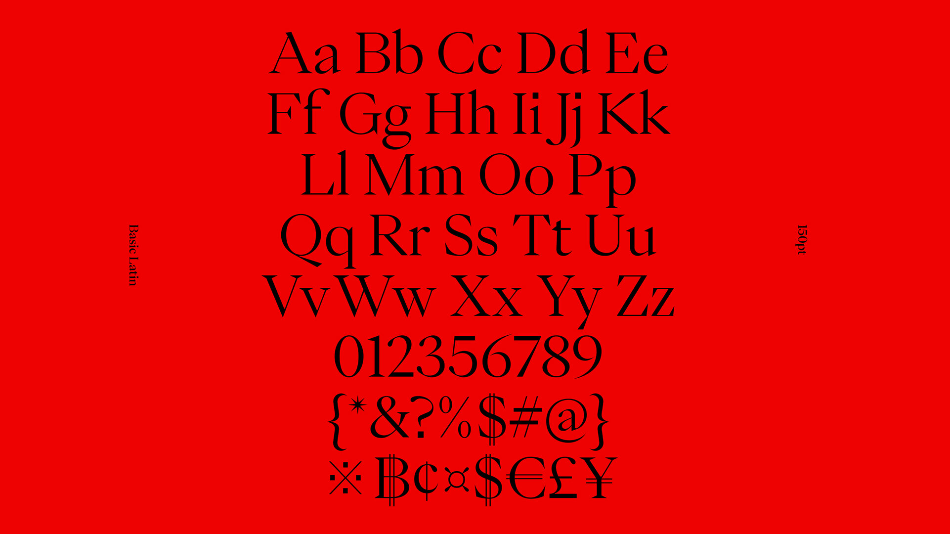
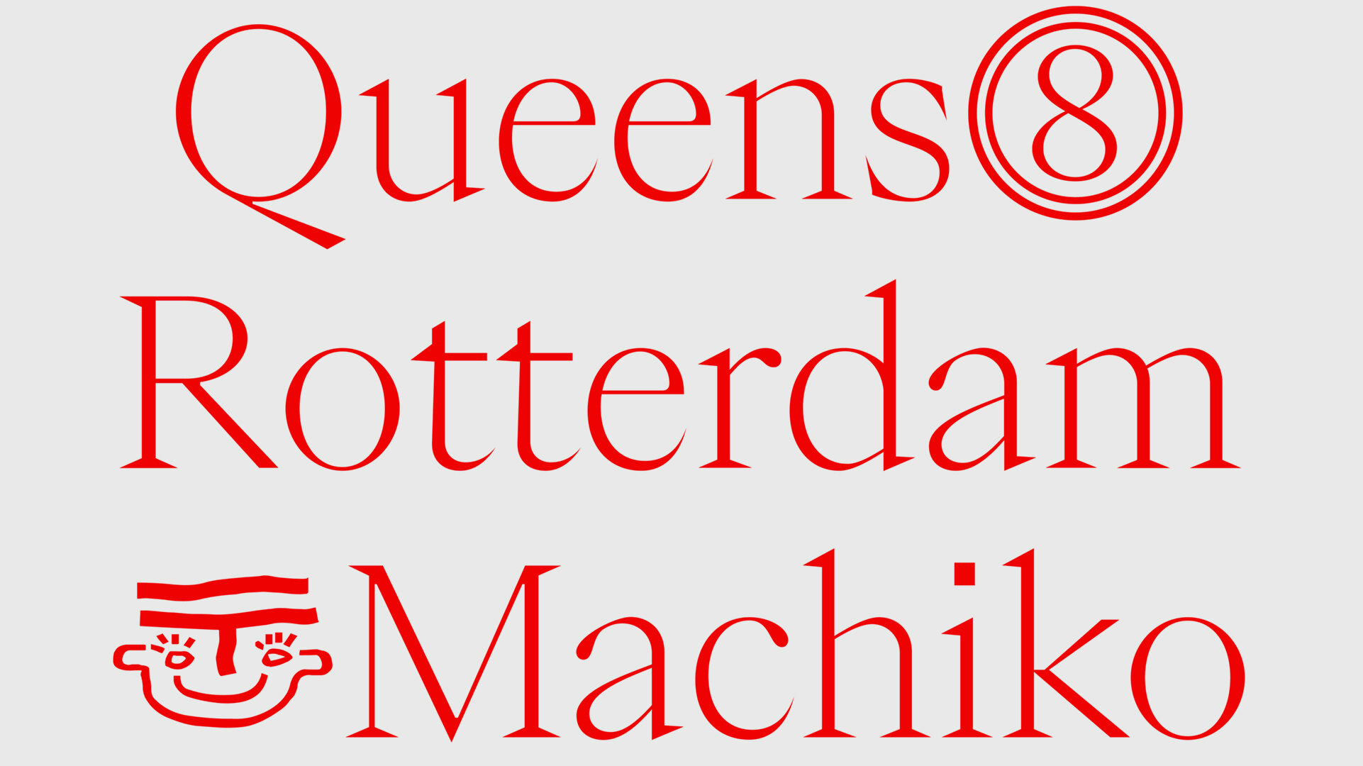
• An elegant and sharp high-contrast display serif family inspired by the work of Eiko Ishioka.
• Available as a family of 8 weights, supporting both Latin and Japanese languages.
LINKS:
From the Foundry:
“Eiko is an indisputable statement of elegance and refinement. Every curves and bezier points was applied with a sense of purpose. It is inspired by the work of Eiko Ishioka, a multitalented Japanese artist, this typeface seeks to convey the same aspect of her work in these typographic explorations.
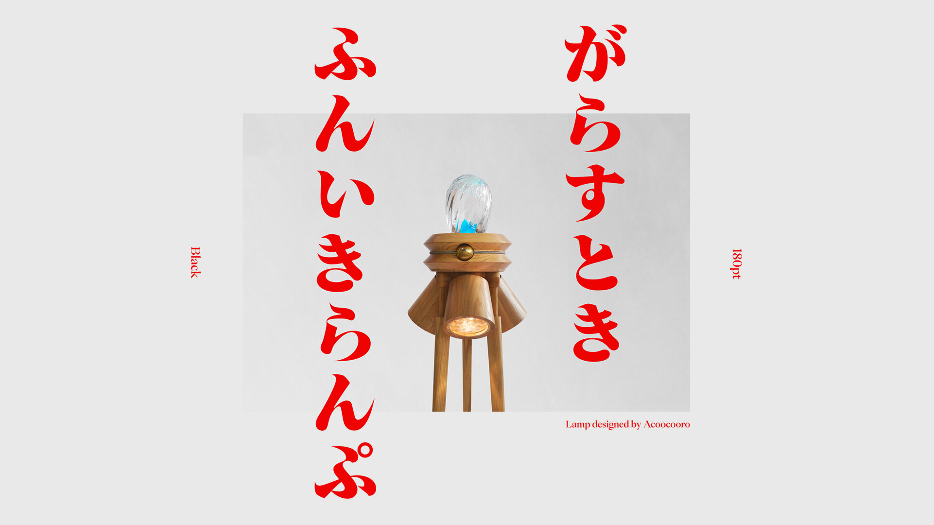
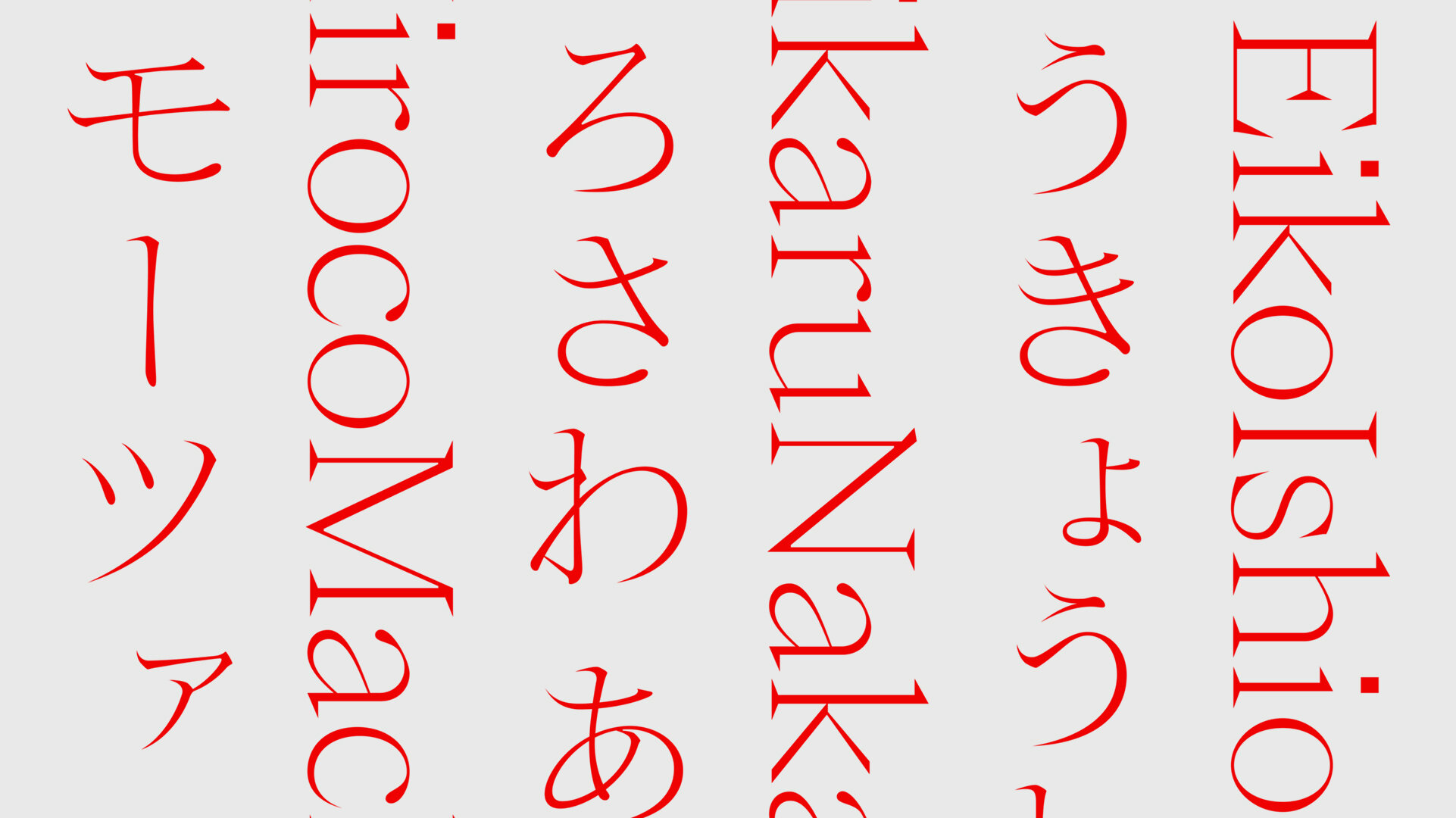
It is an original serif font with high contrast, including the syllable alphabet kana, hiragana + katakana, it is ideal to pair with other kanji fonts of the Japanese mincho style.
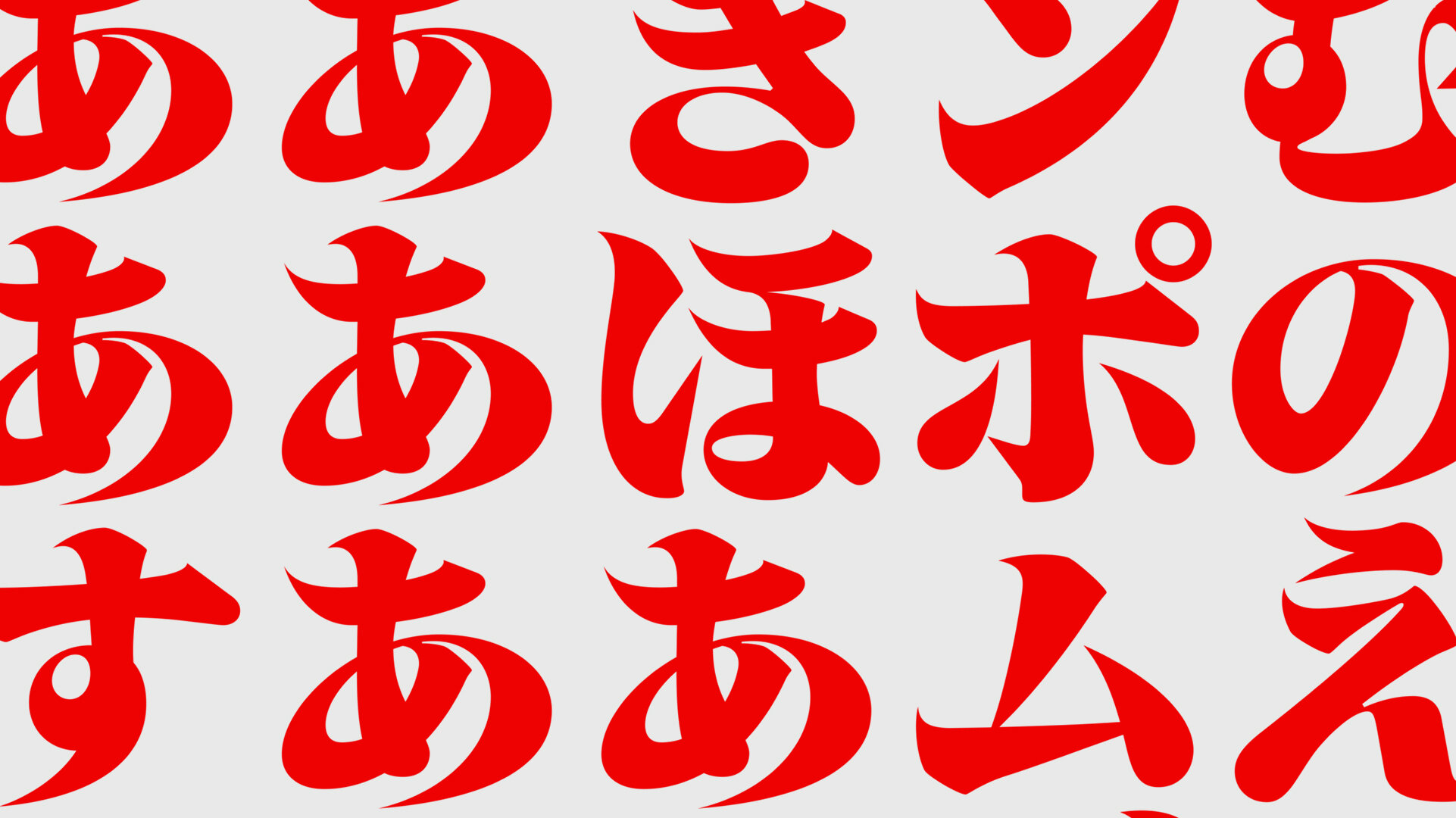
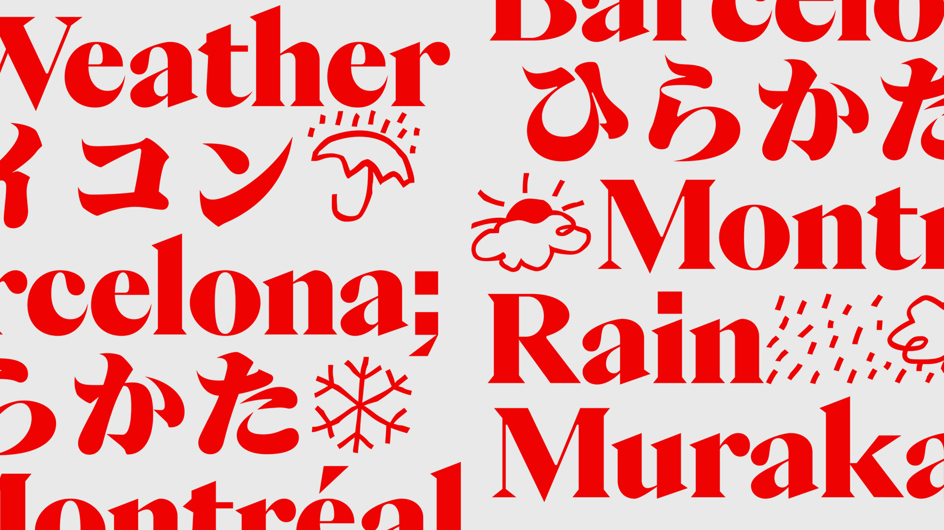
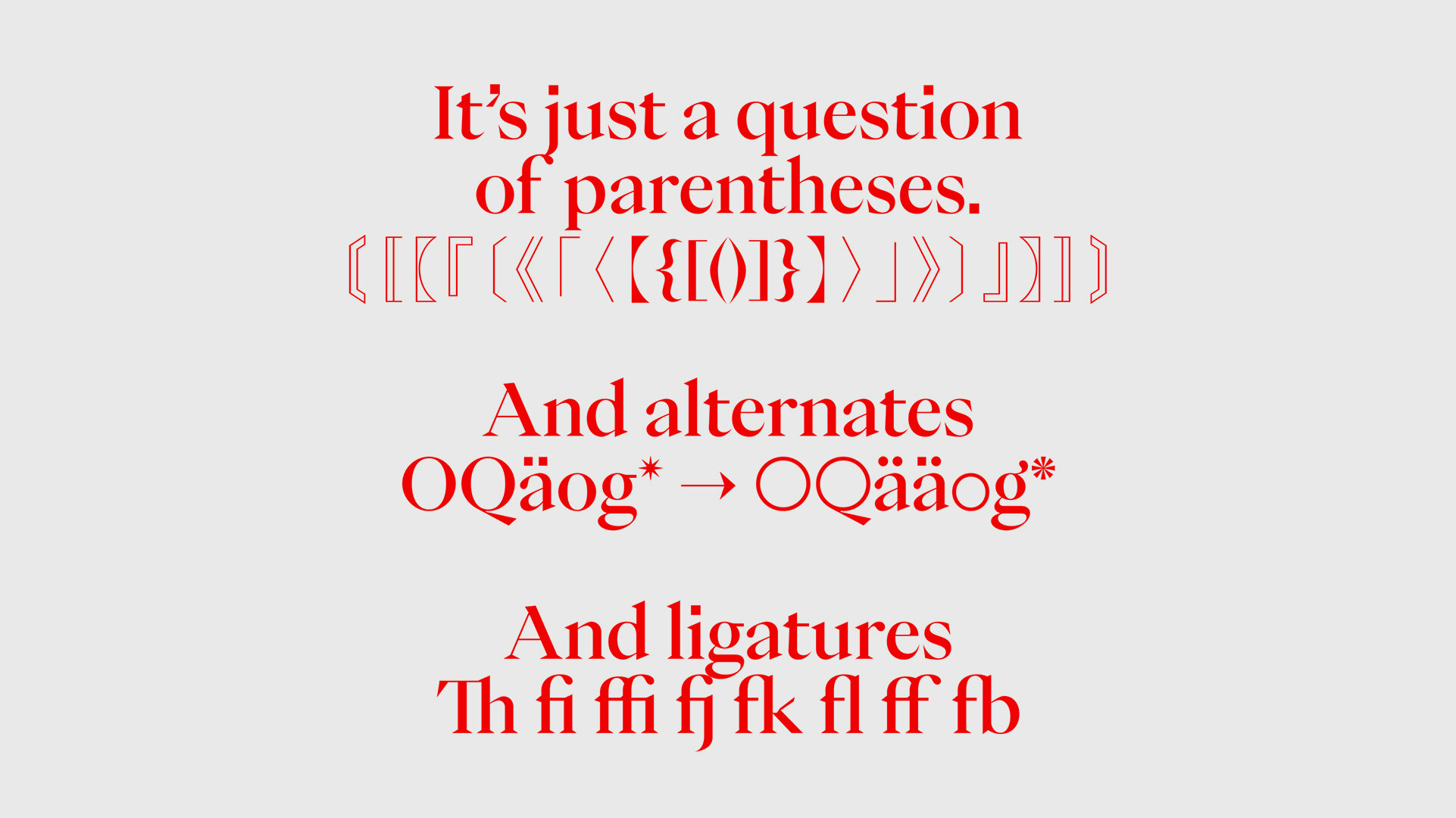
Its resources include a large repertoire of Japanese punctuations, stylistic sets with circular and square numbers, vertical written, subscript and superscript numbers, mathematical symbols, meteorological symbols, ligatures, arrows and many alternates.”
Foundry Images:
NOTES:
Eiko comes onto the scene at a very interesting time in the grand arc of time in the typographic world. The type design industrial complex is cranking out “do-it all” fonts and multi-faceted text & display families that are stylistically swinging for the fences, and the general design public is languishing under the weight of the immense number of geo-grotesk sans available and aching for the next comfortable and acceptable style to hit the shelves. Most fonts would get sucked into the marketing black hole at the center of this galaxy of new stars jockeying for position, but Eiko seems like it’s got the stuff to last past this initial fervor and shine bright for a long time to come. What is it that gives Eiko this prognosis? For me, its the authenticity of inspiration and source material, the sharp modern design stylings and letter construction, and the bilingual development it has so successfully navigated.
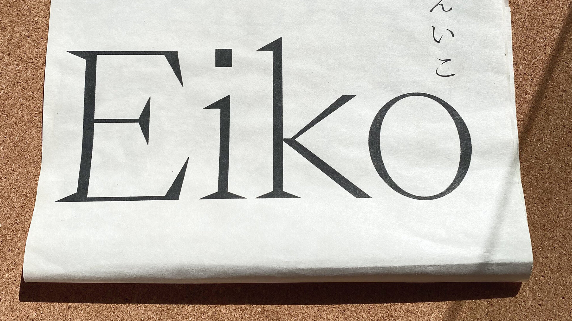
The inspiration for Eiko is a smart and focused starting place for a type family, and being rooted in such clarity, Eiko has a great story to tell. I love the translation of Ishioka’s work across several mediums into type, a medium I bet she herself would have loved to dabble in more. You really can see the influence of her style in the way the k’s kick out, the sharp serifs, and the swooping action-filled katakana characters. Caio Kondo has done a fantastic job pushing the rest of the font details to lift these quirky oddities up and achieve a very modern and very useable display serif. The tension between the blockier characters and the more calligraphic ones are masterfully done. Little things like the square tittles over the i’s, the teardrop c’s and e’s held in intense closeness to the pin prick bottom stroke endings as if they’re going to pop the ball terminal like a balloon, and the serif-less diagonal strokes…. very well done!
On a more general level, I can completely appreciate developing the latin display fonts alongside a fonts for the Japanese writing systems, bonding them together in style. It’s a move that will expand minds and bring new design possibilities closer to reality for many designers in a different way. I know lots of Japanese foundries have been doing this for decades, but it's good to see the practice capitalized on outside of the usual sources and exposing new people to the process.


