
Mantar
RELEASED BY:
Occupant Fonts ☞
DESIGNERS:
Cem Eskinazi
RELEASE DATE:
Week 19
DETAILS:
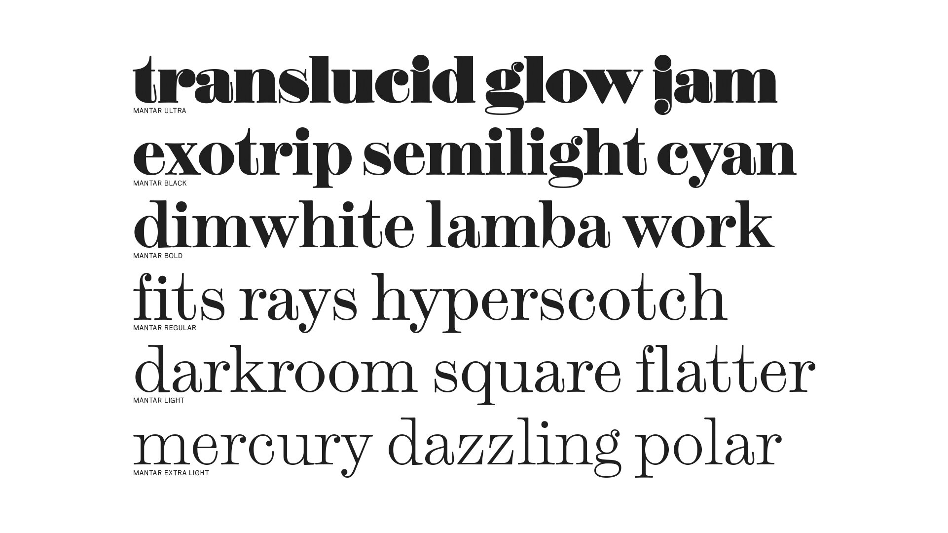
• A “psychedelic scotch roman” design that brings quirk and oddity back to a seemingly stodgy genre.
• Available as a family of 12 fonts of roman and italic styles across six weights.
LINKS:

From the Foundry:
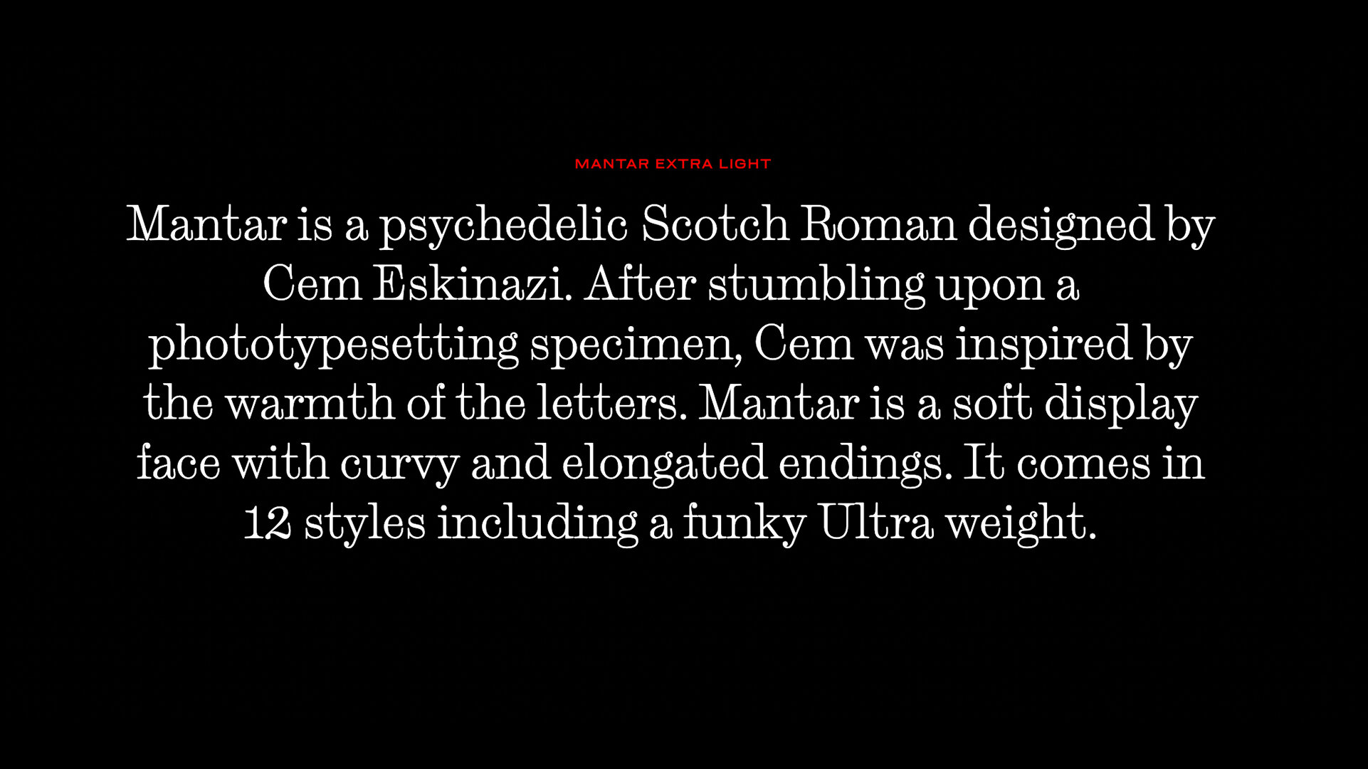
“Mantar is a psychedelic Scotch Roman designed by Cem Eskinazi. After stumbling upon a phototypesetting specimen, Cem was inspired by the warmth of the letters. Mantar is a soft display face with curvy and elongated endings. It comes in 12 styles including a funky Ultra weight.”

Foundry Specimens:


Minisite Specimens:


FAVORITE MOMENTS:


NOTES:
Mantar is an exemplary design coming out of Occupant—something that truly shows off the original perspective and unique eye of the studio. They’ve clearly done their homework with this one, as all type designers should do when approaching a design, and spun out something new.
Scotch Romans traditionally have been workhorse newspaper types, and then as digital type came through, were branded as a font style for the upper classes, perhaps considered fancy, stodgy, or snooty. Scotch Romans have had a few revivals that are true to form, bringing some modernity to the genre, but they’ve never been able to shake that cultural bias it was tagged with decades ago. I think Mantar is one of the first scotch roman inspired designs to break out of those shackles and deliver some personality again.
The little details present in Mantar are just great, and so very Occupant. The way the corners are all rounded (no squared off ink traps here!), this pinchy imperfection that is on show especially in the numerals, The nonchalant kicks of the terminals on a’s and u’s, and the confidence in leaning into what makes scotch romans unique: ball terminals, substantial contrast, and exaggerated straights and terminal features.
The italic is also quite beautiful, retaining the old-world charm while packing in an intense amount of personality. And the heavier weights hold a certain retro-ness to them too, like they were lifted from a Bernbach ad from 1964, or a Lubalin Poster. The weights, the straights, and the rounds are all in balance with each other in truly quirky ways, that it really does live up to the phrase “psychedelic scotch roman”. I think it’s a fantastic case study in what a little IMperfection can do for your design.