Extendomatic
Competitive Set:
—
From the Foundry:
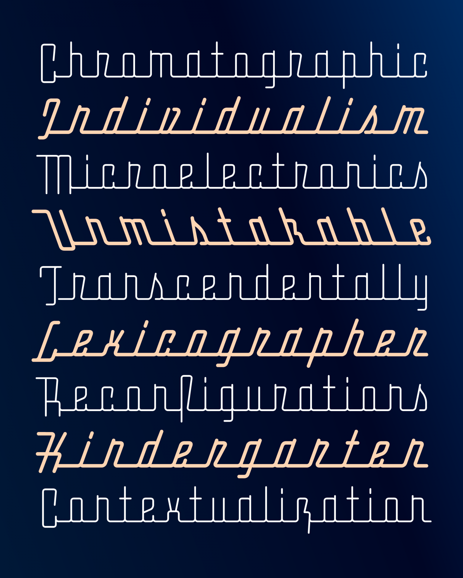
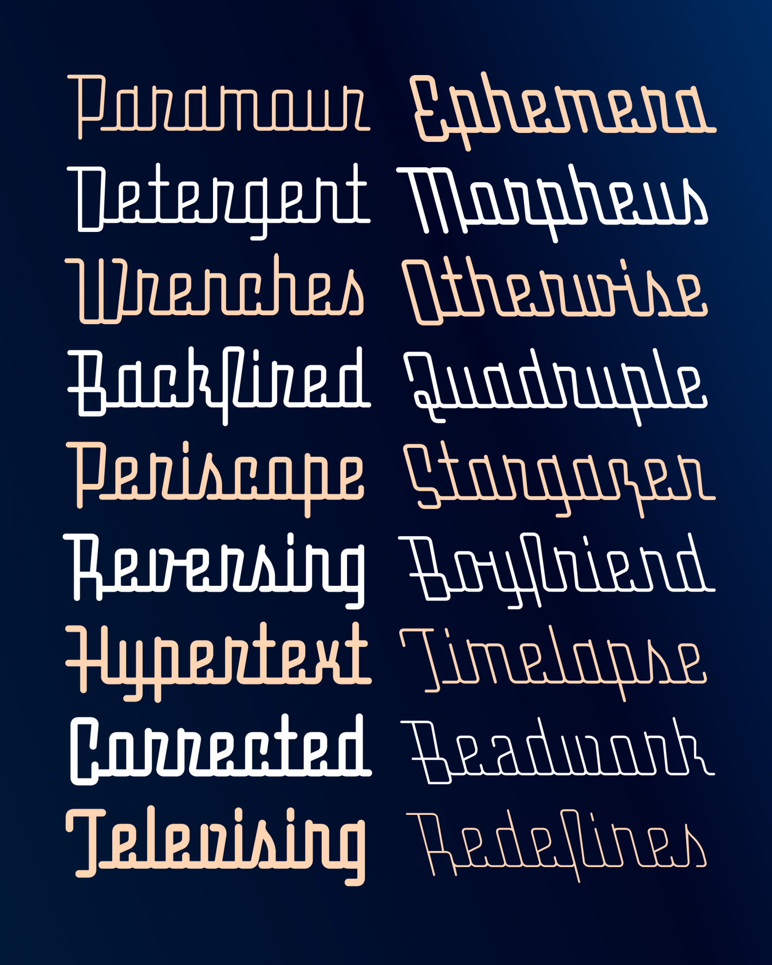
“Extendomatic is a monolinear connecting script based on the streamline lettering of the mid-20th century. The typeface juxtaposes flowing, cursive forms with a rigid rectangular skeleton, all connected by an ever-present baseline. In addition to its adjustable weight and slant, Extendomatic’s variable font features a tracking axis that extends the baseline as it spaces out the letters.”
Foundry Specimens:


NOTES:
DJR is at it again, (as he is every month I suppose) but this time with such a great story of personal experience with the source material. I feel all of us have seen the hastily drawn or naive apartment signage that this lettering is based on, and we’ve certainly all seen the retro-rific Johnny Rockets typefaces evoking chrome products and pastel palettes, so it seems a strange starting place to find something new. But, DJR has found a way through this nostalgia-filled mine field and discovered the simple joy laying at the core of all the history, and harnessed the power of variable fonts to bring it into its own.
Extendomatic is as delightful in style as it is efficient in technical specs. A true study in letter-shaping and skeletal construction, this typeface is more of a toy than tool. It drives at the spirit of a connected script with its pipeline sturdiness and flow while solving the core problem that all type designers hate: tracked out connected scripts in use. Each letterform is simplified to its minimum requirement, with some letters not really even being immediately decipherable until they’re in context with others.
I love the way the r and n are just barely differentiated, and the way the caps dip below the baseline for added style and legibility. I love the few stand out characters that take on life of their own like the lightning bolt z and the tv antenna x. All together, they capture the personality of those retro scripts while shedding the nostalgic baggage they come with. Not an easy task, and something to be applauded. Lastly, the variable font chassis this font is built upon empowers a new addition to the style, a backslant, and that’s just so fun—an added bonus in an already exemplary font.

