
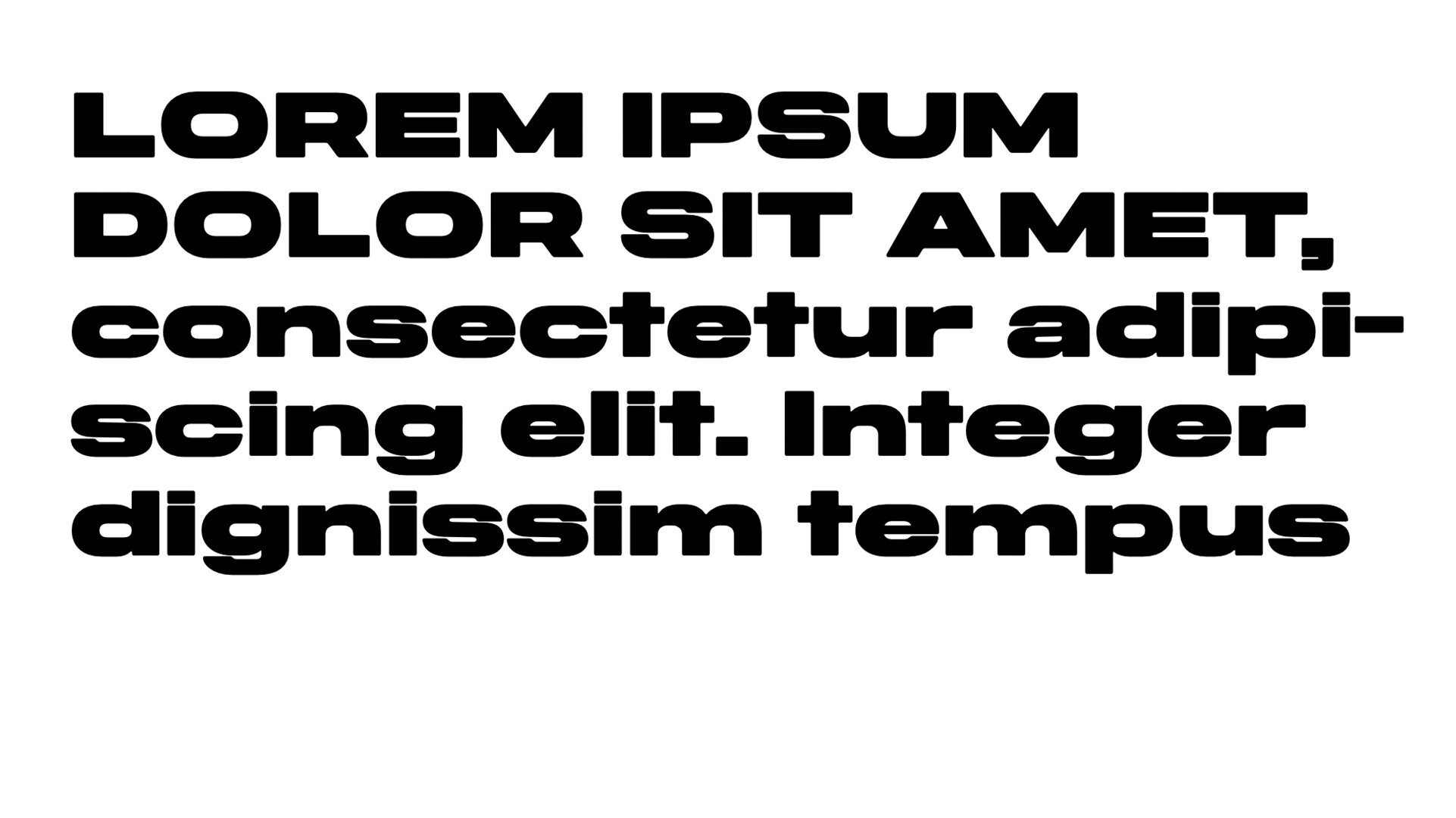
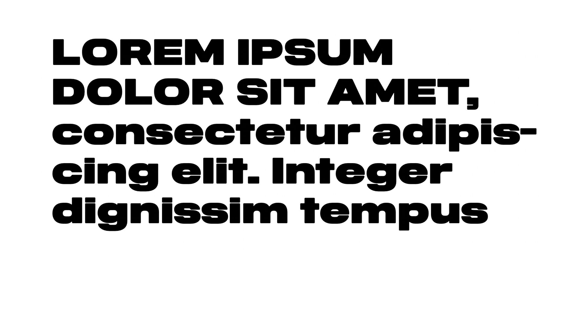
Midnight Sans

From the Foundry:
“Midnight Sans was initially drawn for Gary Green’s ‘When Midnight Comes Around’, published by our friends at STANLEY/BARKER in 2020. The Condensed-only style embodied a warm but idiosyncratic flavour: a reflection of the publication’s photographs, which document the burgeoning downtown alternative music scene of 1970s New York City.
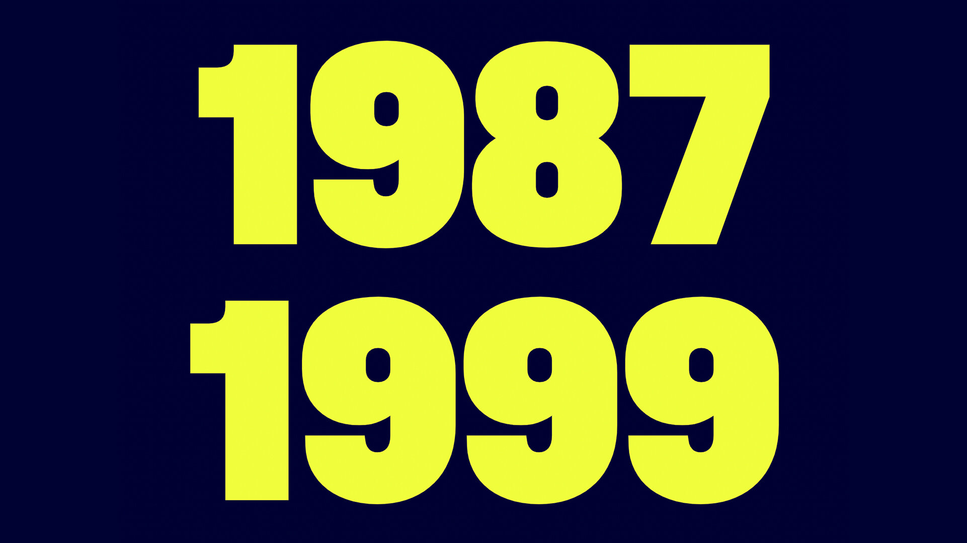
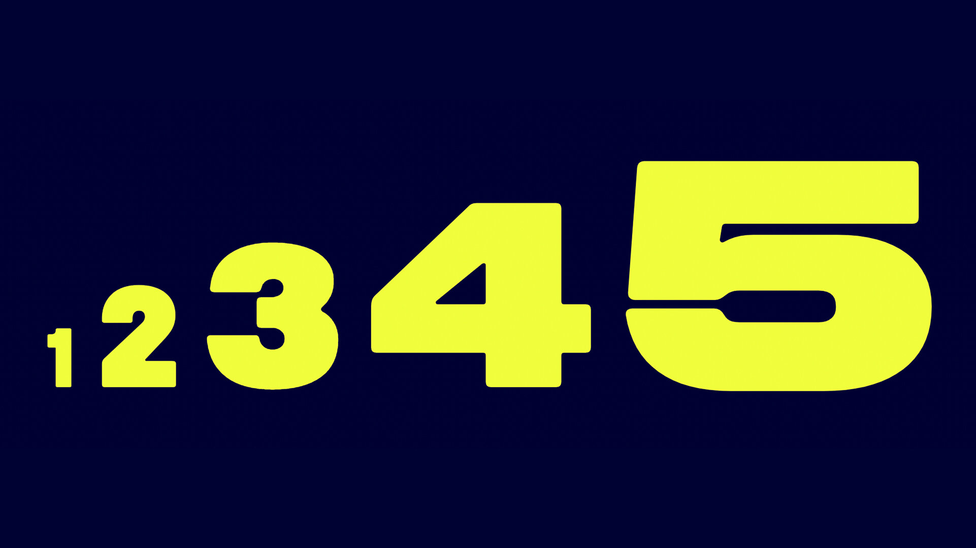
Developing Midnight into further widths, the type family began to emulate qualities found elsewhere in the variegated visual legacies of underground car culture, 1990s nostalgia, and DIY rave flyers. For example, the counter of the letter ‘O’ in the condensed style 12 Black subsequently tweens through the type family’s five widths to become elongated in the most expanded style, 60 Black. These changes in form allowed for the typeface to be drawn with variability in mind, enabling both freedom and constraint in equal measures. The details found in the expanded widths of Midnight Sans evoke qualities of Aldo Novarese’s Eurostile (1962), but behave more like cousins or second cousins as the width of the type fluctuates.”


FOUNDRY SPECIMENS:
NOTES:
[Barry White Voice] Hello, Ladies and gentlemen, its Midnight Sans, and we’ve got all the late night vibes for you…. Wait, it’s not that kind of midnight? I guess you can’t name a typeface midnight sans without evoking some kind of late night radio DJ…
Anywayyyy, We’ve got a well balanced and finely tuned sans here with Midnight sans, and although it might not evoke the dulcet tones of after dark, it does present some very sensitive and confident attributes that are worth taking note of! Midnight Sans lands in a category that has perhaps become a little misunderstood, a category fo fonts that are often perceived as basic, used in memes and bodega signs, or delivered with harsh or cold lines in its construction. Midnight Sans does a great job at breaking out of this mold to capitalize on the more dynamic and warm possibilities inherent in the bolder weights. To make a sports metaphor for a second, everyone is always drawn to the quarterbacks and receivers on the team, but the linemen, the big guys are really the ones you want to hang out with because of their personality, humility, and energy that often goes overlooked. Midnight Sans is an entire offensive line of fonts: rigorous, tough, robust, packed with personality, and cleans up well.
They say its a cousin to Eurostile which is pretty evident, however I think there’s a new-generation aspect to this so its more like cousins once or twice removed. They’ve taken the Eurostile vibe and done something fresh with it. They didn’t have to go crazy to get there either, the freshness comes form subtle changes and updates. I really enjoy the delivery of rounded or sharp options here—its a simple design addition that not only gives you two totally different feeling type collections, but basically 2x’s the extendability and marketability of the design. Sometimes I reach for typefaces that have the right posture, but they’re too sharp or wish they had a different level of softness to them. The ST/RT offering is a great solve that designers should respond well to.