Figure
RELEASED BY:
Fort Foundry ☞
DESIGNERS:
Brian Brubaker
Mattox Schuler
RELEASE DATE:
Week 24
DETAILS:
• A sturdy "quirkhorse" sans inspired by gothic wood type of the 19th century.
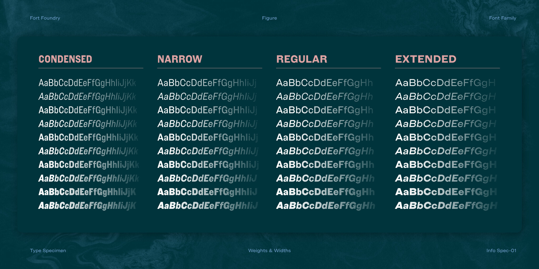
• Available as a family of 40 fonts of 5 weights across 4 widths including roman and italics.
LINKS:
From the Foundry:
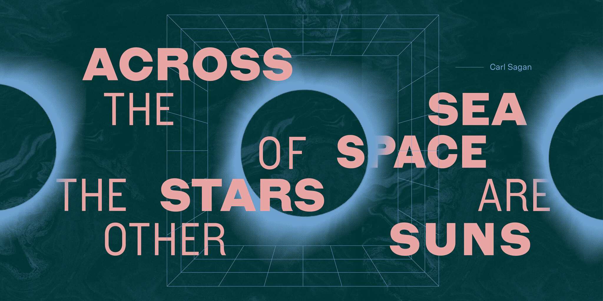
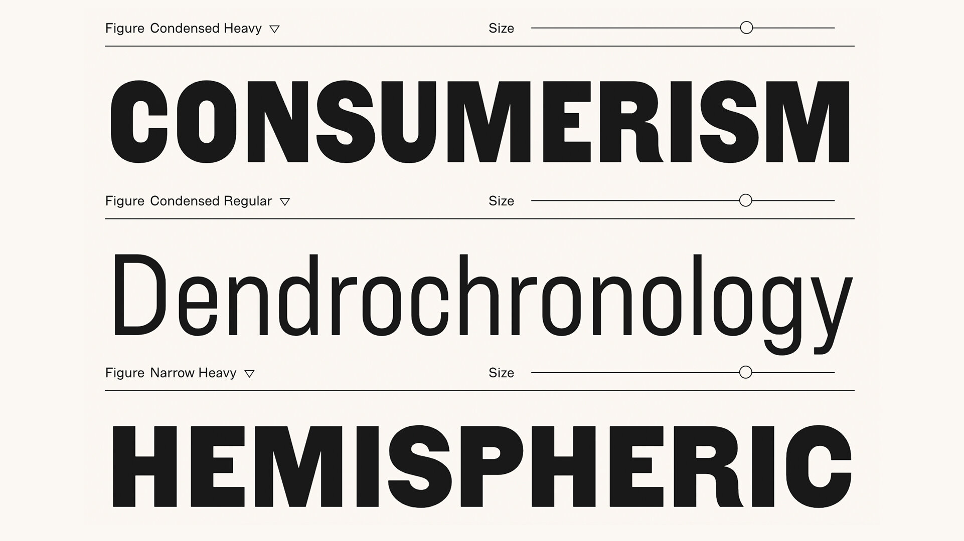
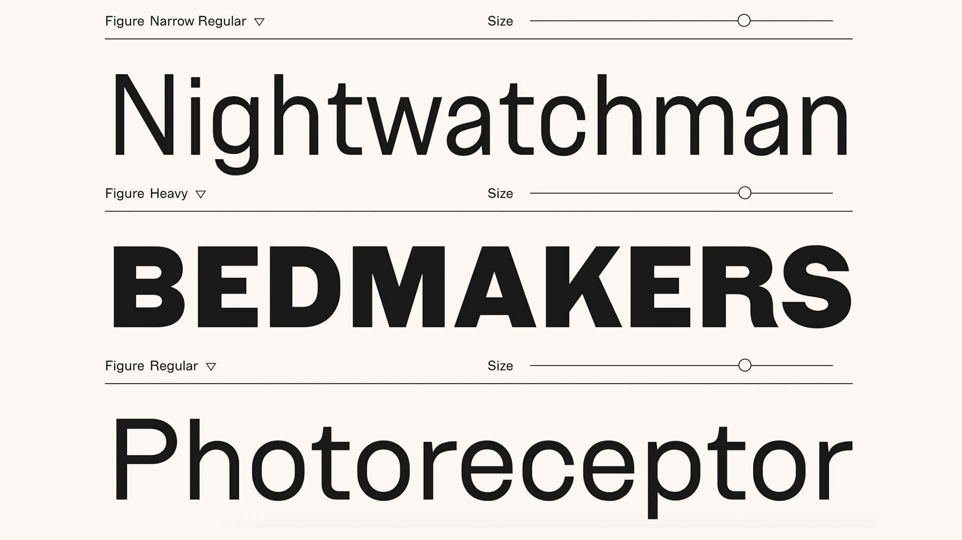
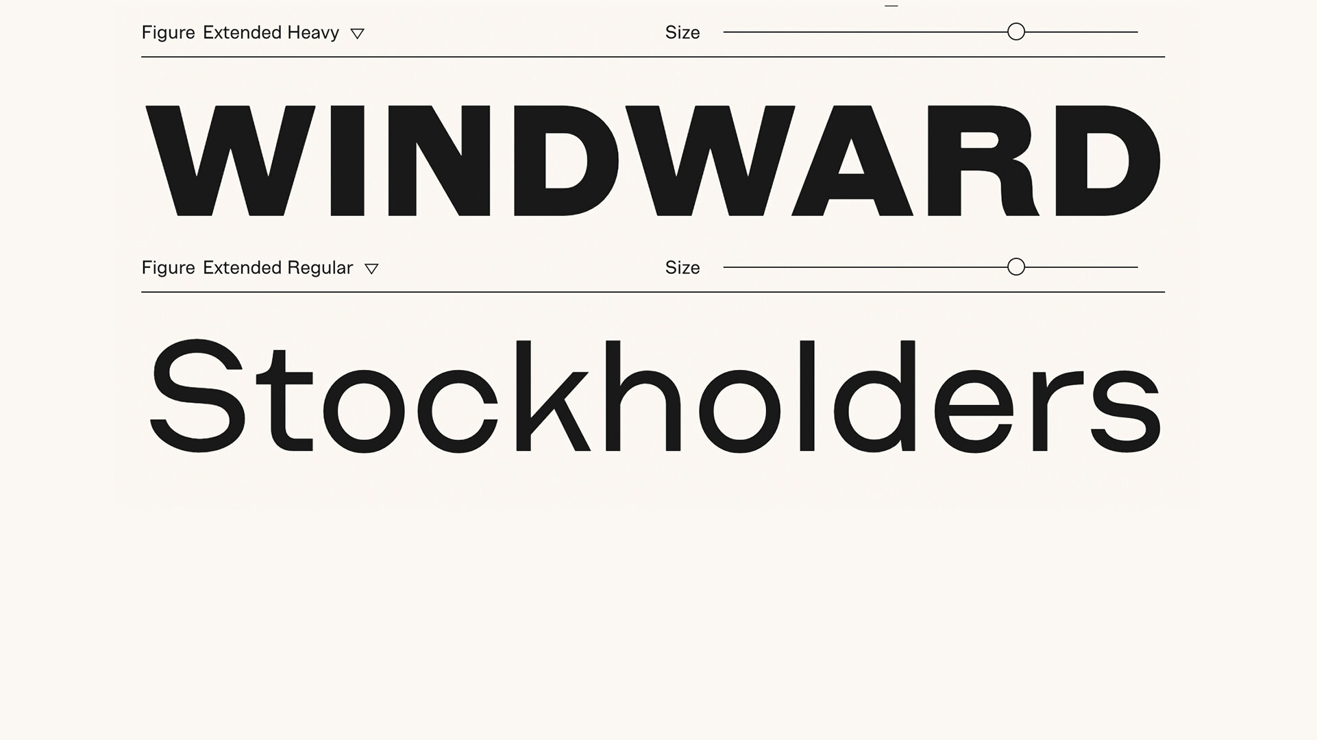
“We like to call Figure our “quirkhorse”. It’s got all the makings of a workhorse font family while still bringing the kind of quirks you’d want in a revival. With its roots in the character and idiosyncrasies of 19th century gothic wood type, Figure brings warmth and charm wherever it goes.”
Foundry Images:


NOTES:
Figure is a heartwarming design that offers up a welcome breath of fresh air in the workhorse sans category. Well, it’s technically a ‘quirkhorse’ family, and I think it lives up to the name. On its face its simple, but you can tell there is some engineering of personality underlying every glyph. It feels modern and old at the same time, and it fits right in with the series of banner sans families from foundries that try to recapture some sense of humanity back from the cold depths of neutrality. I would dare to say that figure does this the best that I’ve seen this year.
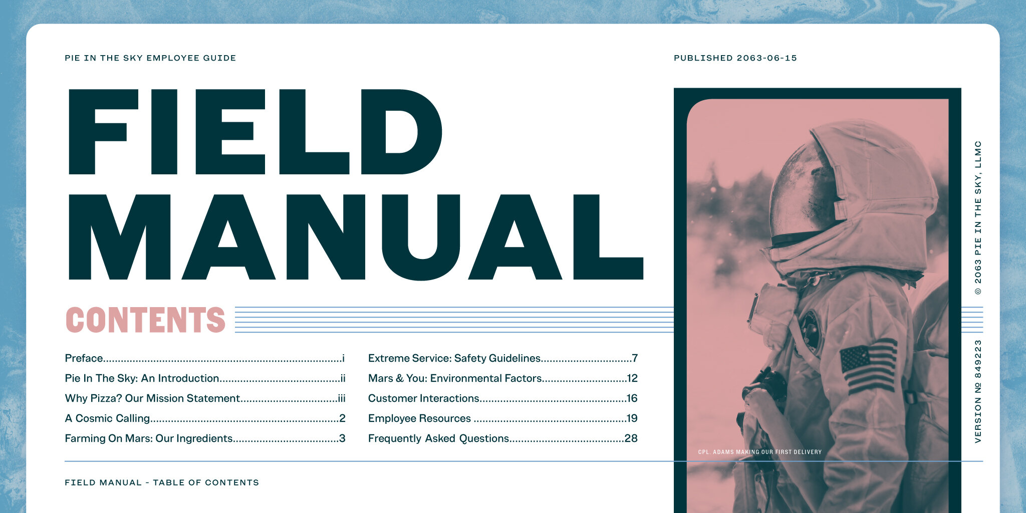
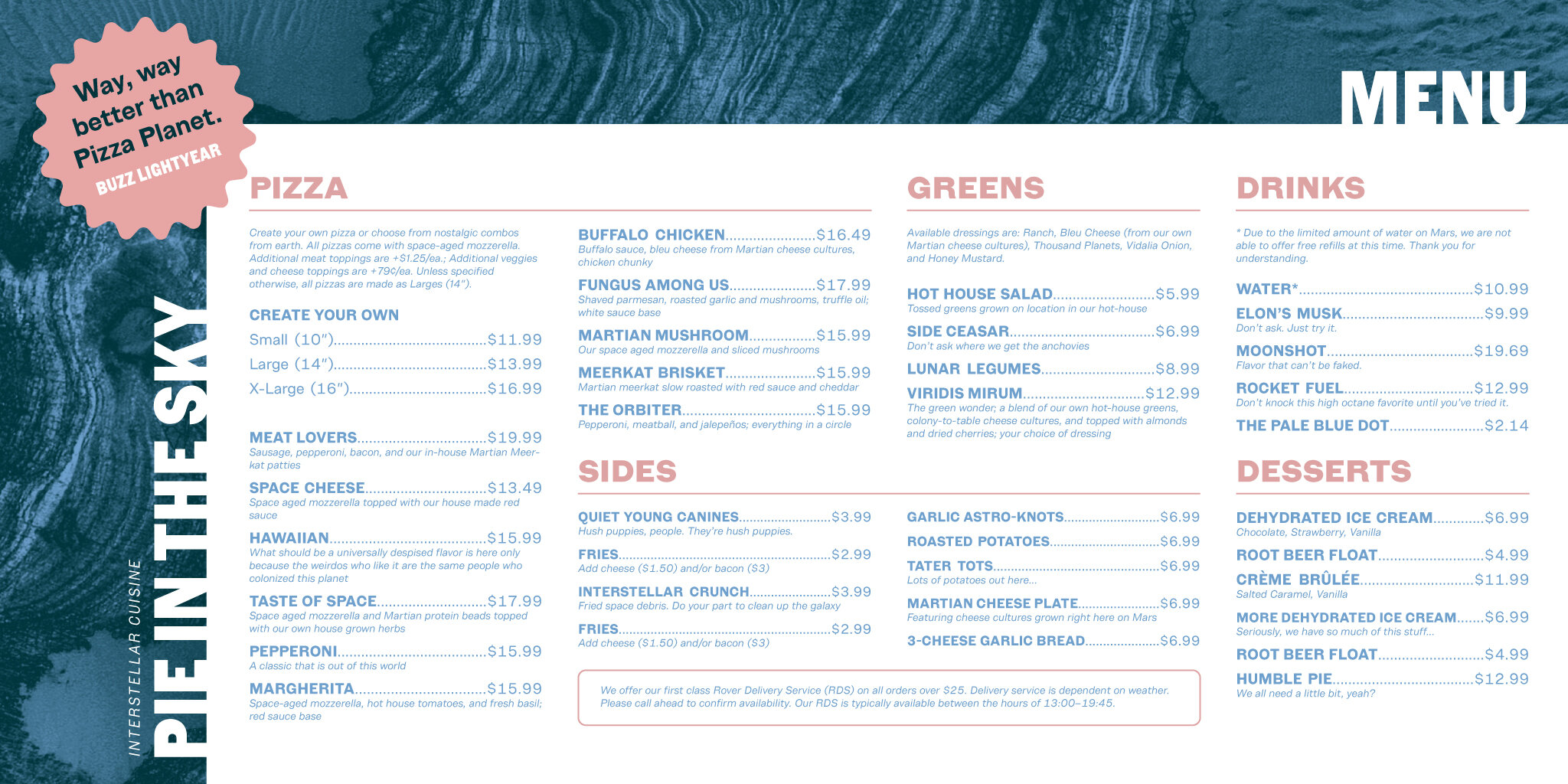
Fort credits early 19th century wood type specimens as a source of inspiration, and you can certainly get that feeling up front, particularly in the regular and extended widths — the high waisted cap r, the way the caps really hold their counters, or in the subtle weight shifts in the diagonal characters like the V, M, and K. The narrow and condensed widths show their wood type heritage in a different way, leaning into the high walled blocks and straight-edged rounds. You can get a sense for where the wood type begins and ends, especially in the caps. So, if you’re looking for that added bit of warmth and oddity in your titling sans types, Figure does an incredible job of delivering on personality on the page. But, I think Figure also finds itself right at home on the pixelated phone screen, not losing that analog charm in the digital realm.
As a foundry built on a reputation for well-executed personality fonts, this release from Fort is a stark move towards a deeper catalog of workhorse and more widely applicable fonts. Good to see Fort Foundry evolve in such a big way!


