Norbert
RELEASED BY:
TypeMates ☞
DESIGNERS:
Philipp Neumeyer
RELEASE DATE:
Week 13
DETAILS:
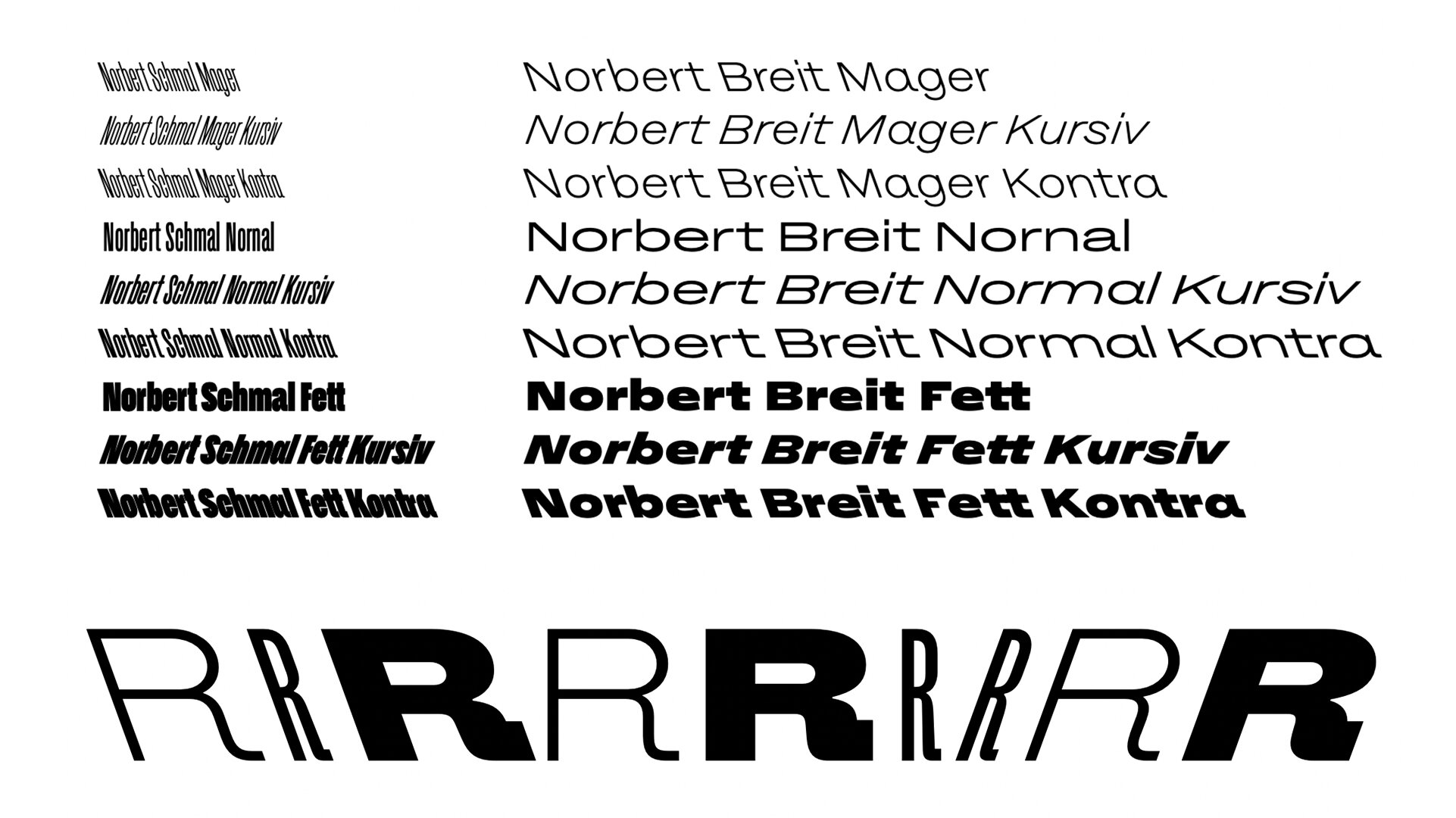
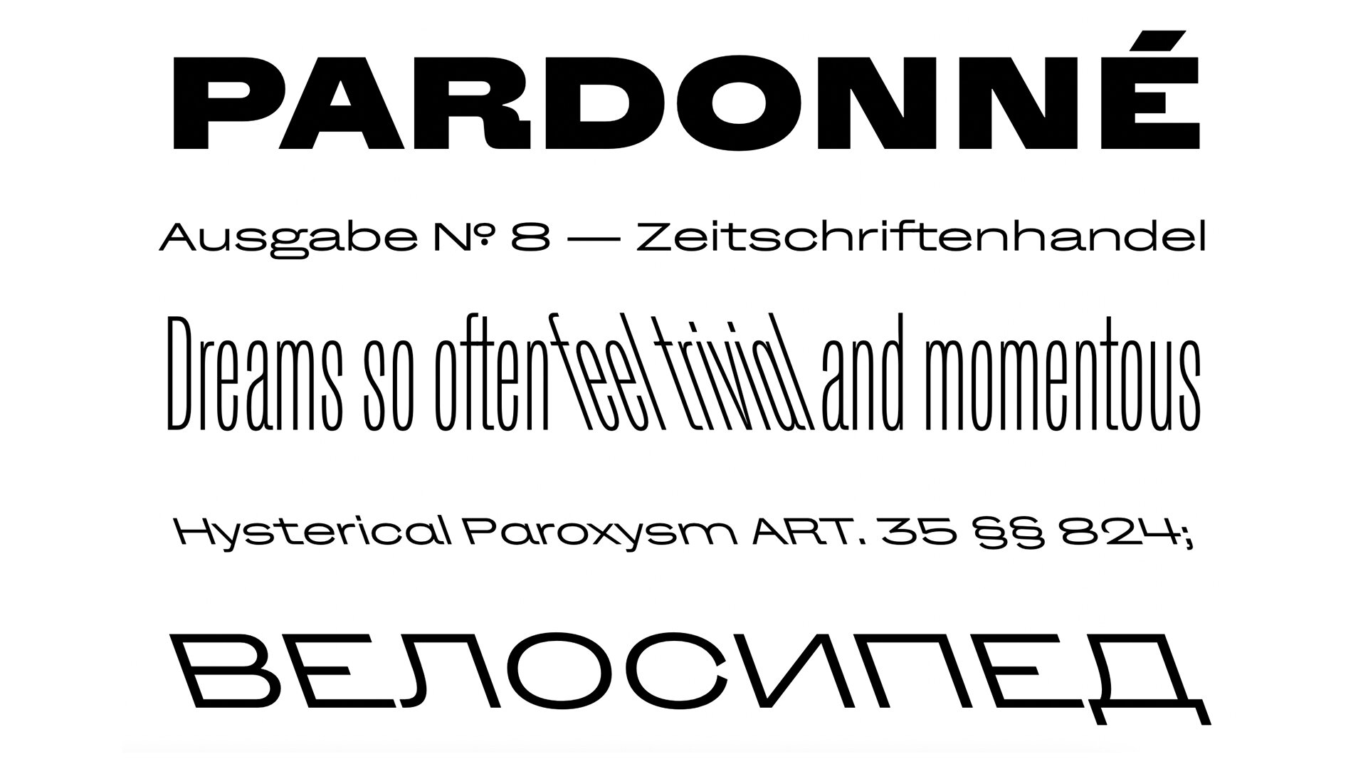
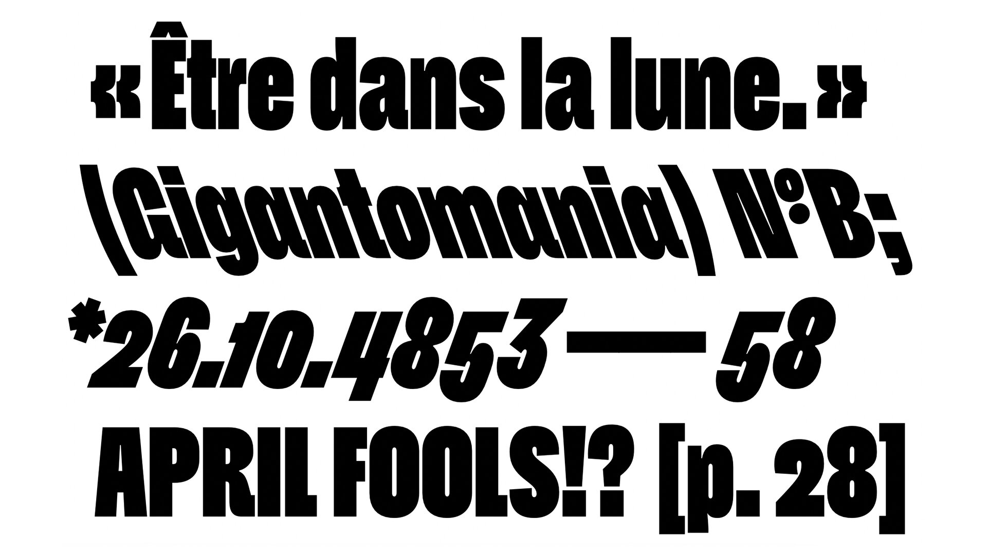
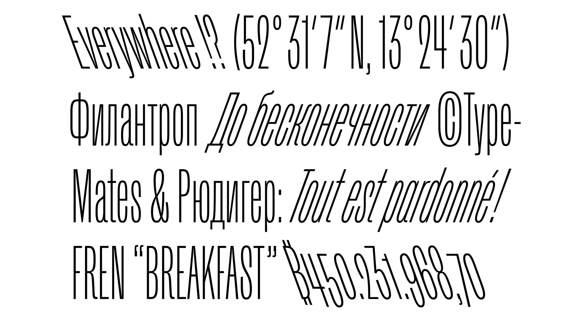
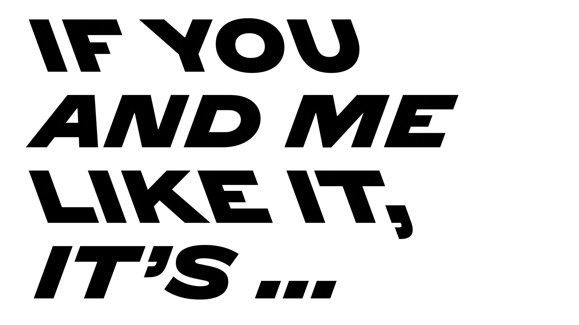
• Norbert is “a collection of extremes”, flaunting a diverse range of expression for a somewhat traditional printer’s grotesque.
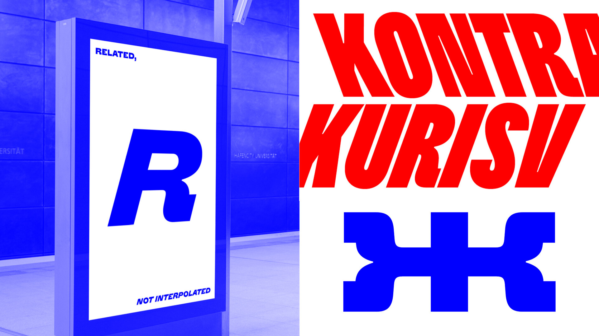
• Norbert is a family of 18 fonts across 3 weights, 3 widths, and including roman, oblique, and backslanted styles.
LINKS:

From the Foundry:
“Norbert is not as naive as Philipp Neumeyer expected. A collection of extremes, Norbert reflects on how the bundled-together styles of early hot metal type families were enriched by their contradictions and looks ahead. The result is an unaffected Grotesque and everything you never needed.
Harmonised without conformity, more familiar than family, Norbert’s three weights are in two widths: condensed (Schmal) and extended (Breit), each complemented by Kursiv and Kontra— backslanted—styles. Intentionally, Norbert has no regular width, variable font, or interpolated weights. Its character and versatility in identity and editorial work is a result of its styles being individually drawn, individually considered. It is what it is. Not a workhorse, but a typeface that can be delicate and rough for special occasions. As required, or not.”