Reply
RELEASED BY:
Optimo Foundry ☞
DESIGNERS:
Francois Rappo
RELEASE DATE:
Week 12
DETAILS:
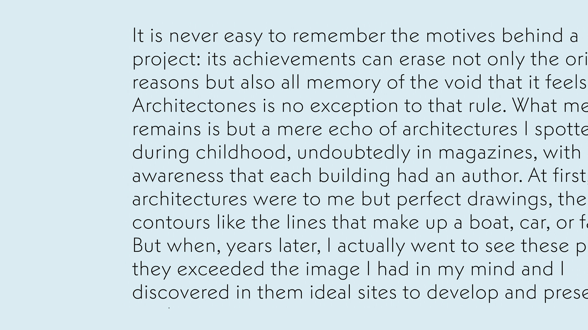
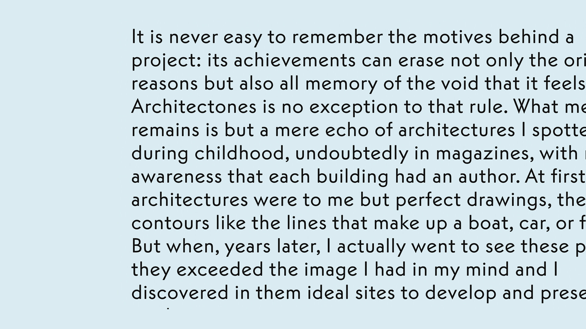
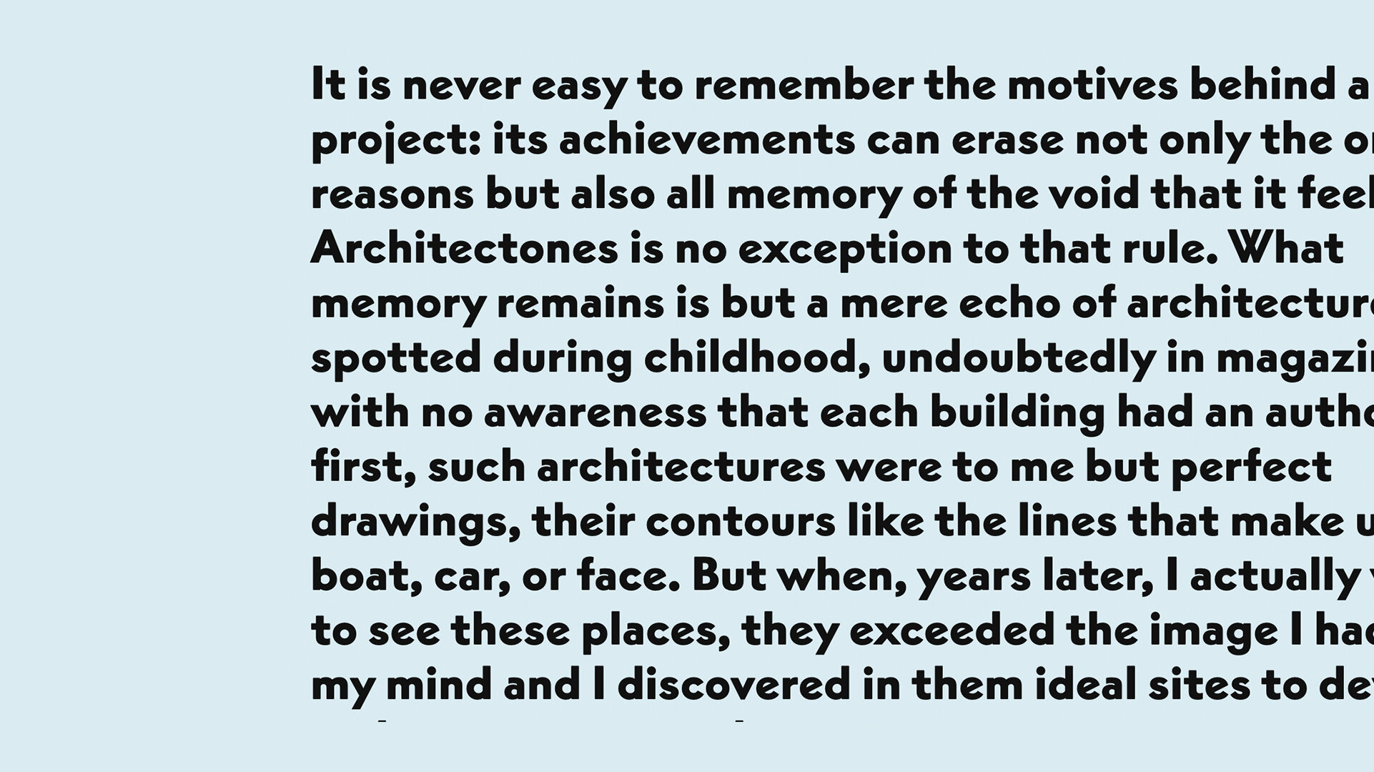
• Reply is a geometric typeface family inspired by a typewriter rendition of Vogue Intertype.
• The full family consists of 12 fonts— 6 weights from thin to black including italics.
LINKS:
From the Foundry:
“While researching American ephemera from the 1950s, François Rappo discovered that architect Frank Lloyd Wright’s preferred typeface for correspondences was a typewriter version of Vogue Intertype. Loosely inspired by the graceful texture of Wright’s correspondences, Rappo drew a new geometric typeface. With its contemporary aesthetic, Reply has a colorful personality that references a pivotal phase in the development of modern American design.
An American sans-serif typeface cut in the early 1930s, Vogue Intertype was the direct outcome of the migration of European designers to America who brought Art Deco and Constructivism with them across the Atlantic Ocean. The version of the typeface used by Wright had a more linear and simplified drawing but managed to achieve a certain level of refinement within the limitations of the typewriter. With Reply, Rappo brings together geometric timelessness and mechanical writing in a proportional drawing. By reinvigorating distinctive characters like the “K” and the “R” and adding beveled terminals, Rappo creates both a warm and distinctive typeface that is exceptionally legible at smaller sizes. While Reply has its roots in early twentieth-century European geometric design and American modernism, it is nonetheless a contemporary typeface conceived of for the digital era.”


