Numera
From the Foundry:
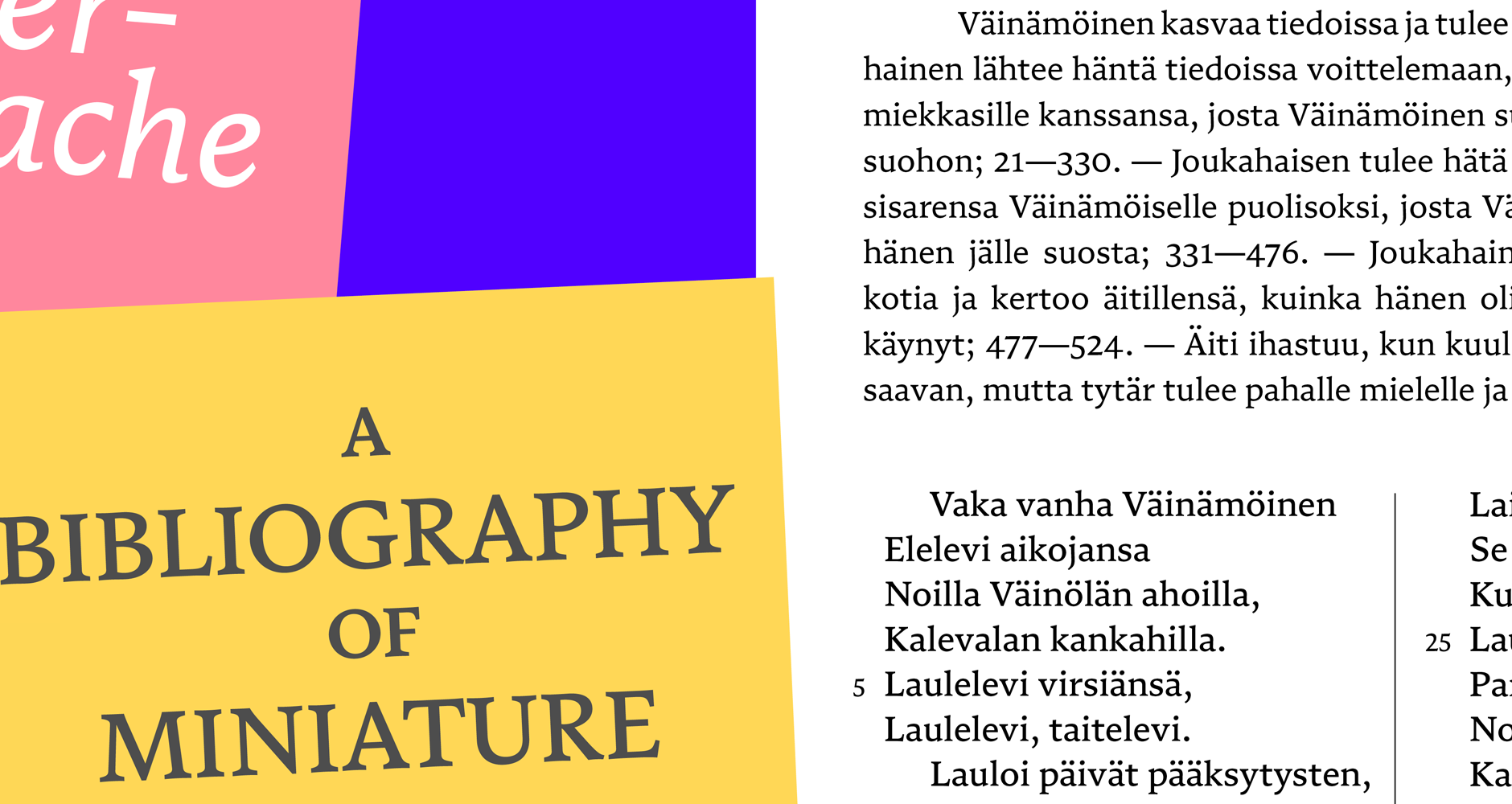
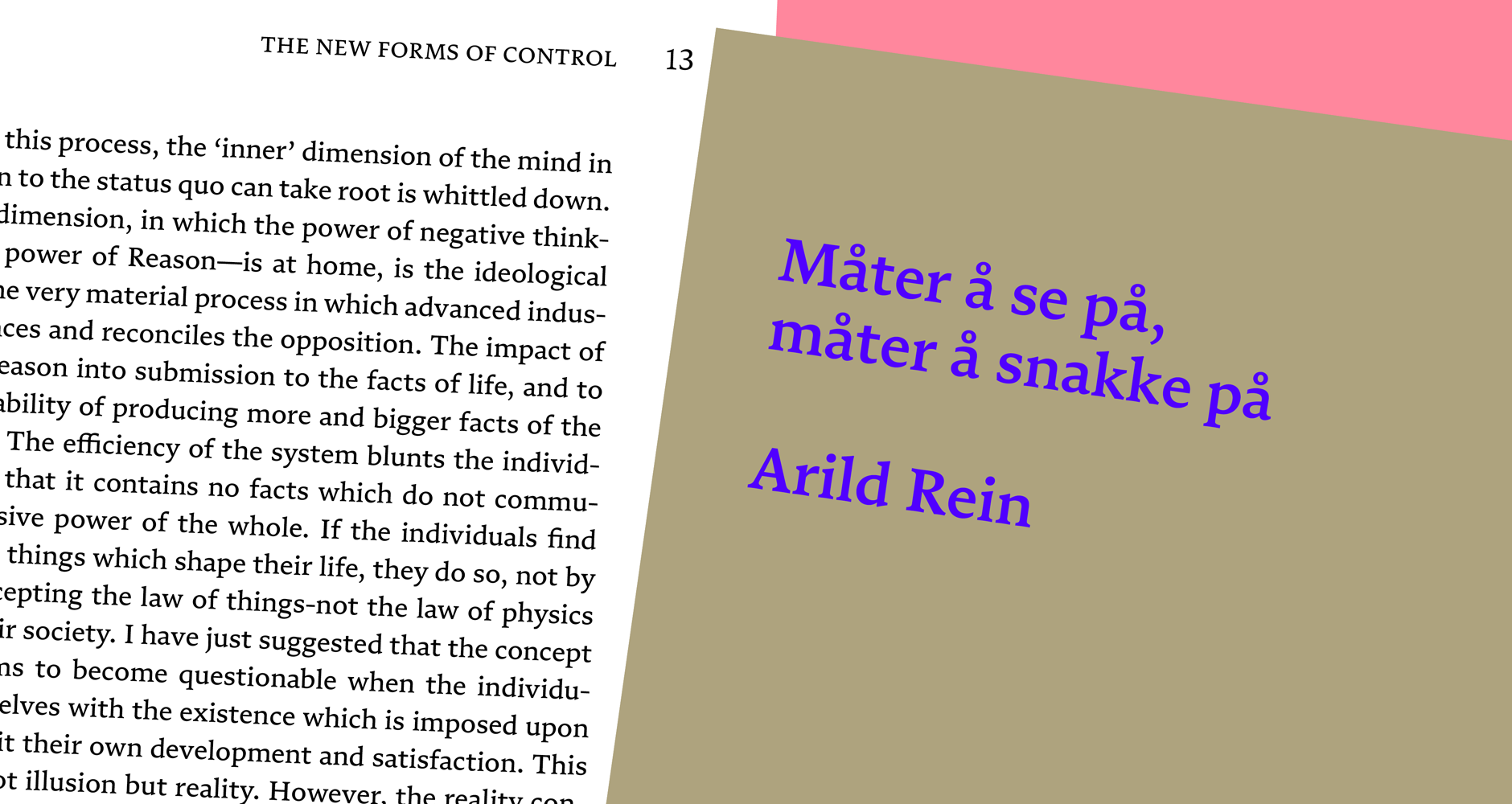
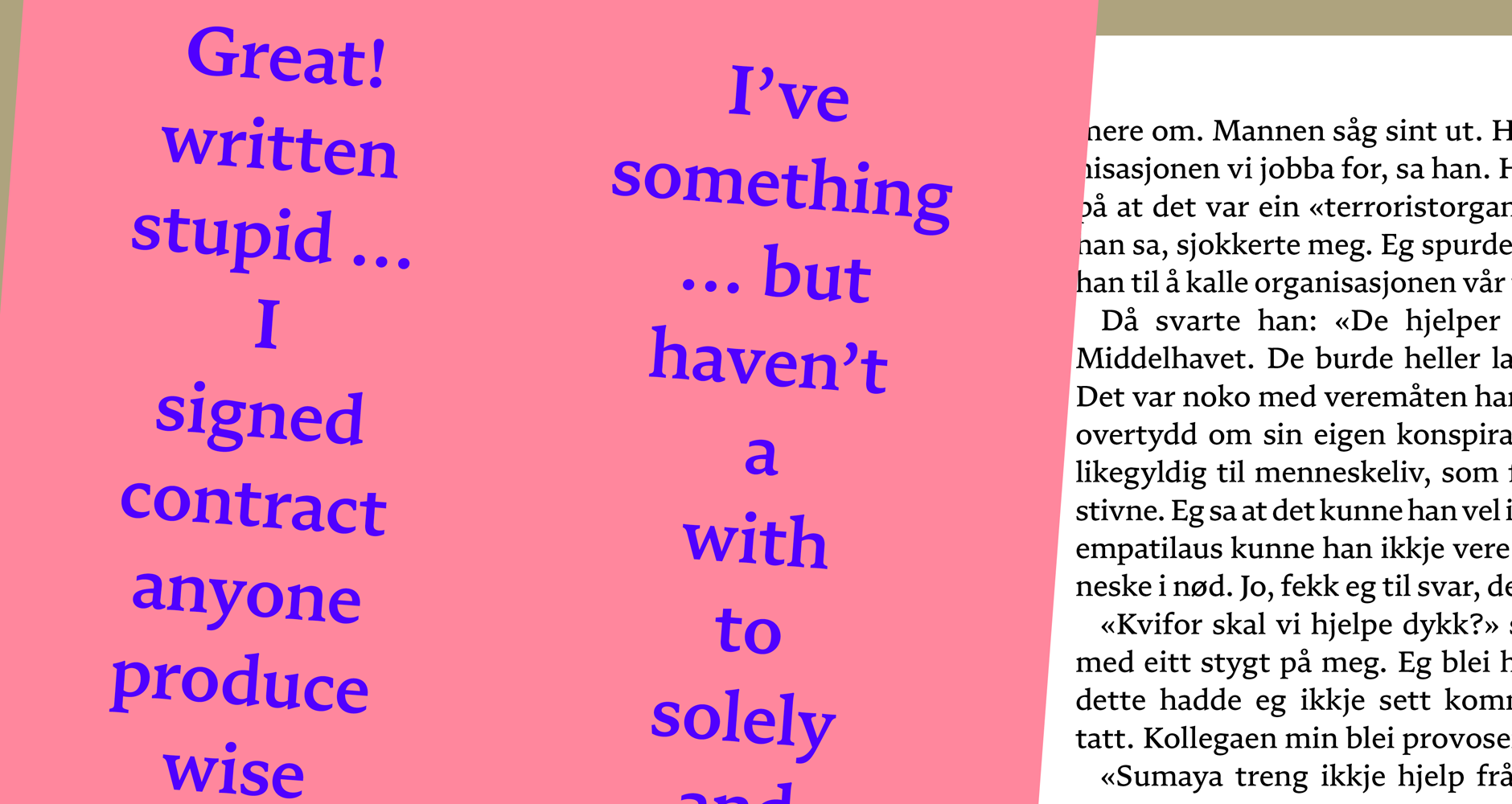
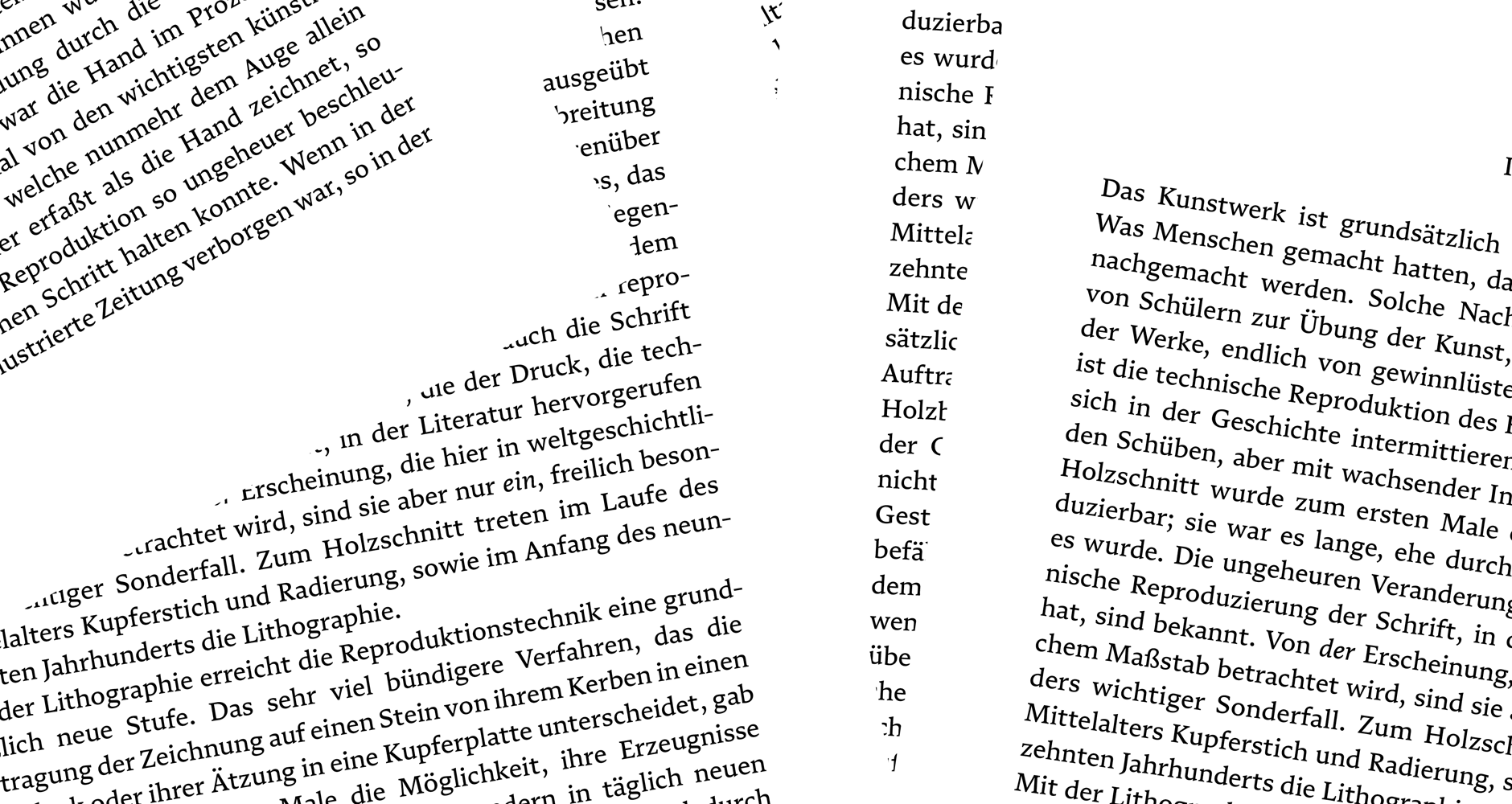
“Numera is a brand new take on a traditional recipe – a sourdough Brotschrift, grown out of centuries of craft and culture, but with a new distinct flavour. It comes in five weights plus italics, and is carefully balanced in the middle range for refined text setting. It is designed for book typography, but can carry that reliability easily into other purposes.
Numera is grounded in the tradition of literary typesetting, which is among the greatest challenges for a type designer. Still, it does not feel old or, in fact, traditional. This is the paradox of good type: familiarity and originality are constantly at odds, and some of these qualities are cultural, some are technical, and some are fashionable. What is expected of a text typeface is in itself a question without a clear answer.”
Foundry Images:
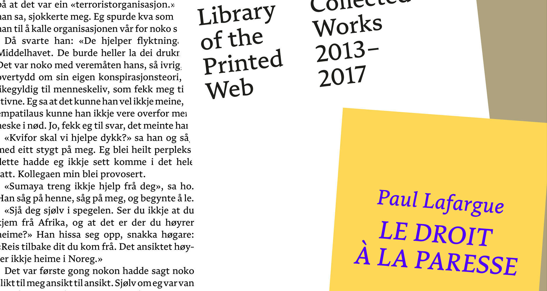
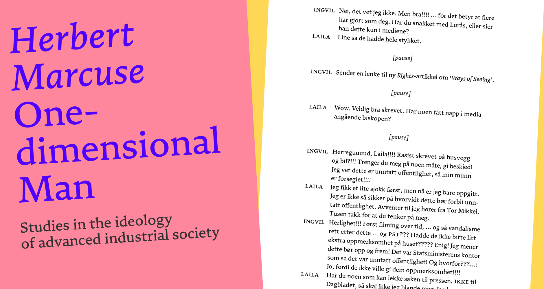
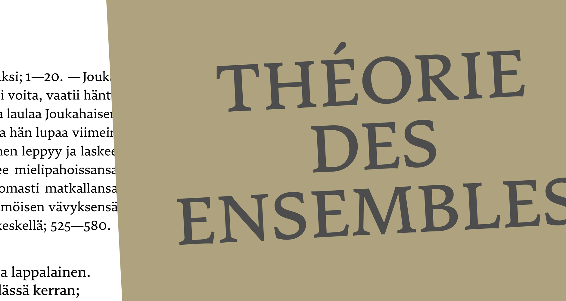
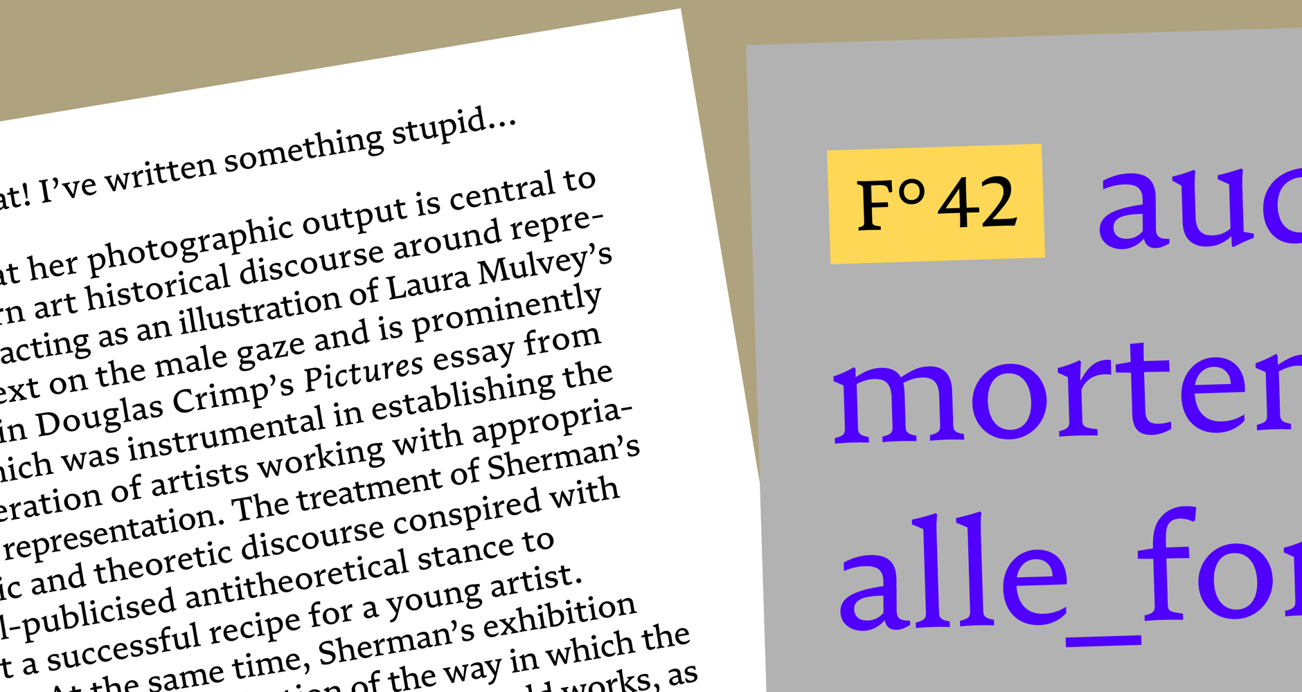
NOTES:
When you look at Numera, it’s hard to find fault. Numera is a pretty straight forward text serif family that was clearly designed for one purpose: to be read. I love that.
In today’s high-paced marketplace of display fonts and corporate serifs, there hasn’t been much attention paid to one of the most important corners of the type landscape: typefaces for long reading! Sure, you can argue that since phones are the main way people interact with long reading settings these days we don’t need too many text serifs, or you could argue that since resolutions on screens in general have improved so much that there’s little need for a highly-tailored text serif for paragraph settings. To all these excellent points I say that Numera is a perfect rebuttal.
Numera is a great example of the *modern* craft of designing types for typesetting, pulling all the experience and knowledge derived from centuries of designing serifs for the page, and deploying it into the digital world. Yes, there are lots of other text serifs that also do this, Numera is not alone. However it is one of the few standalone text serifs we’ve seen released this year. I particularly enjoy the subtle contrast in the letterforms, the solidly cut terminal serifs on the C, G, and r, and the texture color on page. Clearly, there has been some homework completed, some research logged, and some perspective pulled in from a talented type design mind to bring Numera to life. You can see the influence of a century or two of masters at work.


