Irregardless
RELEASED BY:
Ohno Type Co. ☞
DESIGNERS:
James Edmondson
RELEASE DATE:
Week 20
DETAILS:
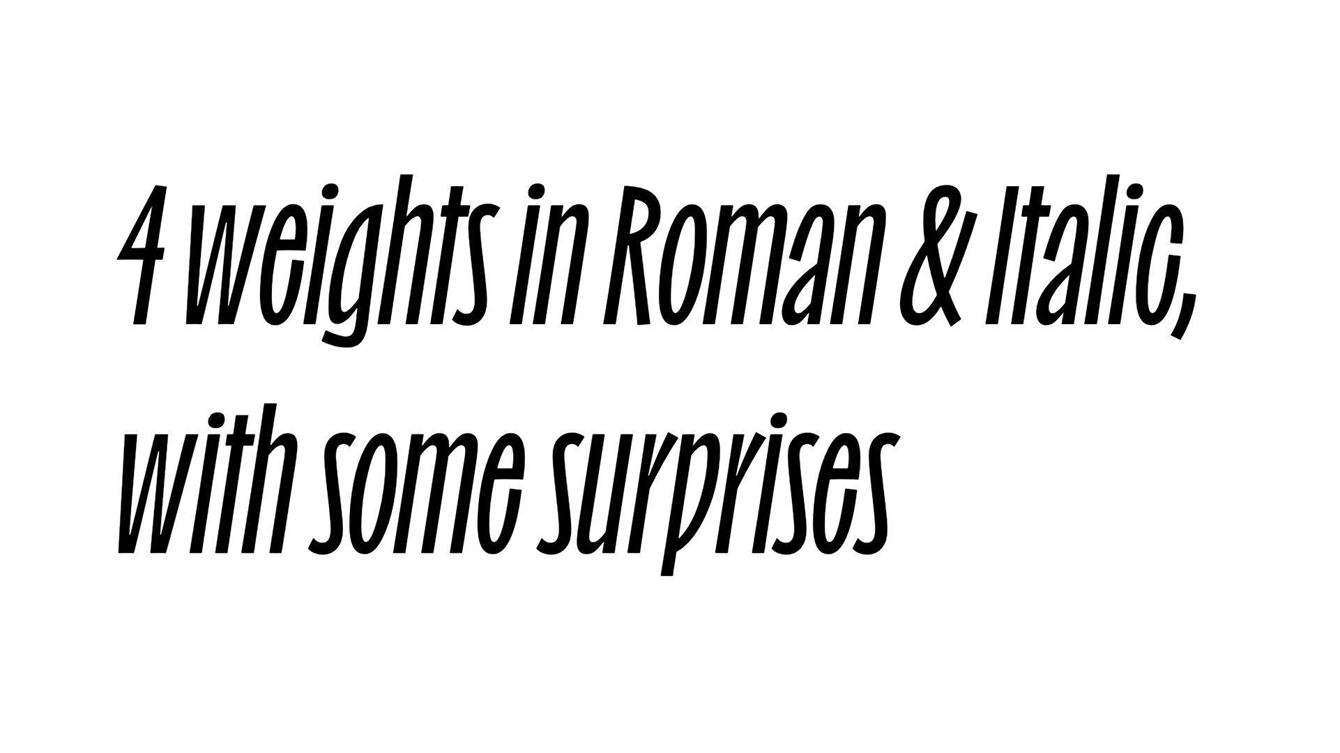
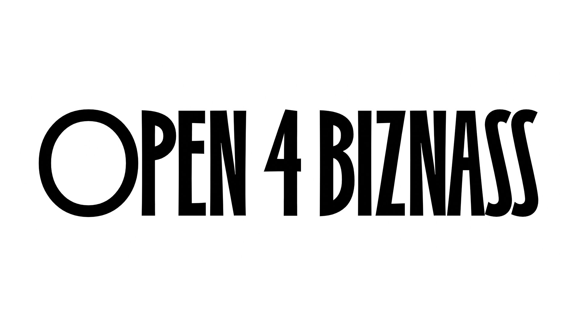
• A spunky, charming sans family rooted in hand-drawn letterforms and expressively animated features.
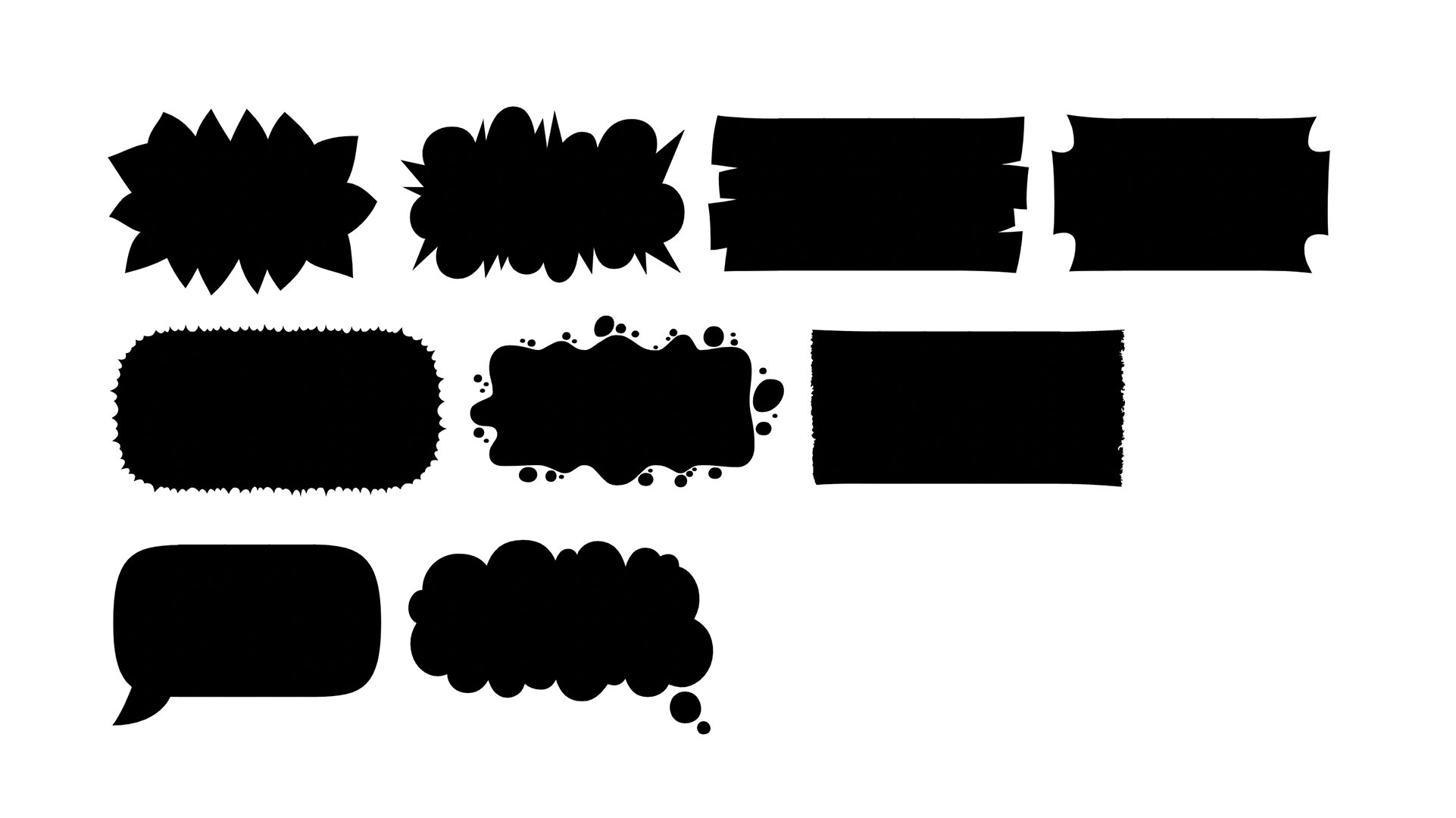
• Available as a family of 9 styles: 4 weights of roman and italics, plus a cartoon-cloud-inspired Containers style.
LINKS:
Competitive Set:
—
From the Foundry:
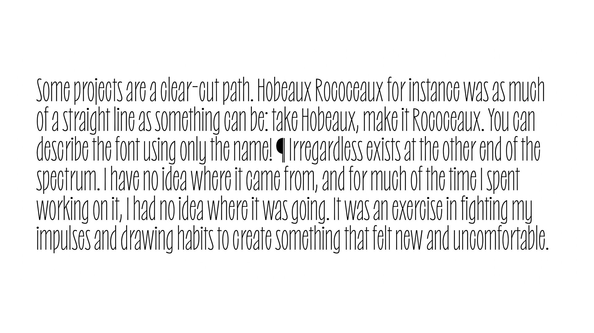
“Some projects are a clear-cut path. Hobeaux Rococeaux for instance was as much of a straight line as something can be: take Hobeaux, make it Rococeaux. You can describe the font using only the name!
Irregardless exists at the other end of the spectrum. I have no idea where it came from, and for much of the time I spent working on it, I had no idea where it was going. It was an exercise in fighting my impulses and drawing habits to create something that felt new and uncomfortable.”
FOUNDRY SPECIMENS:
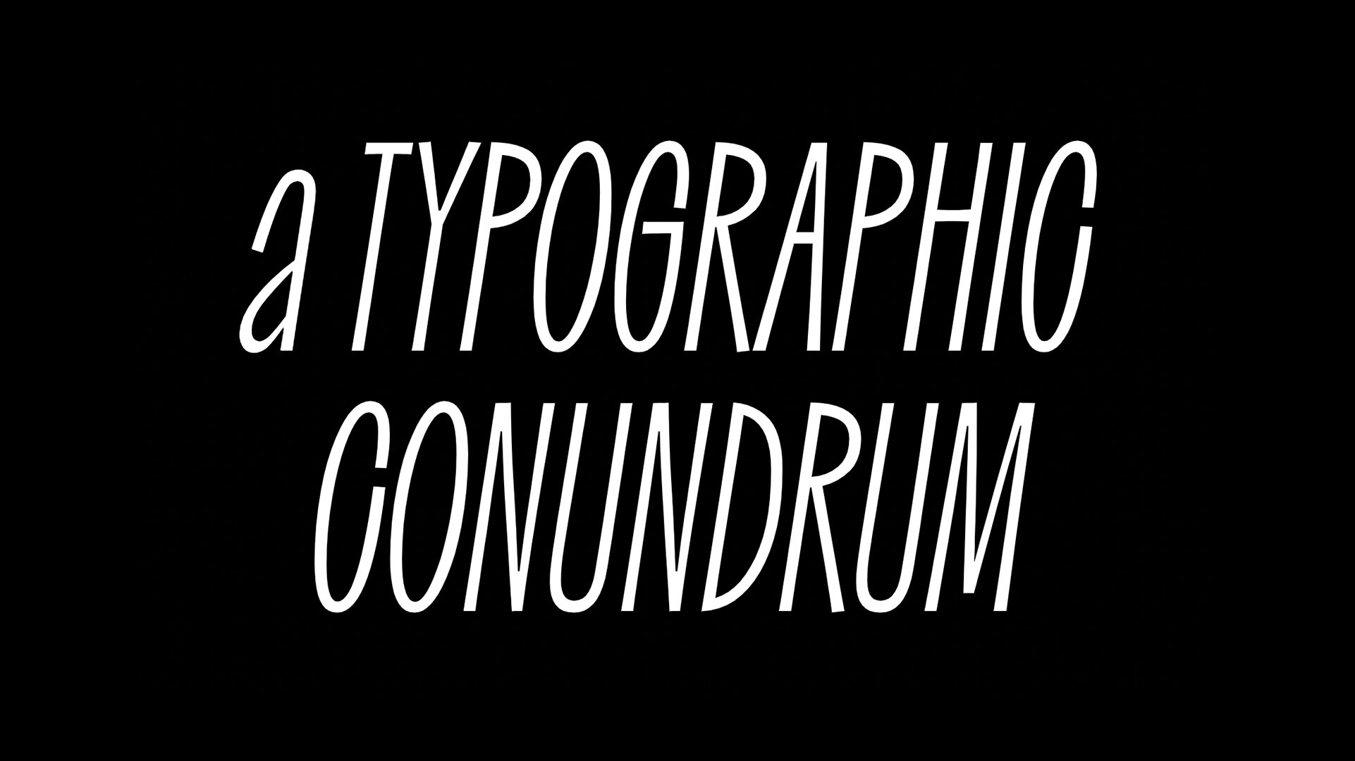
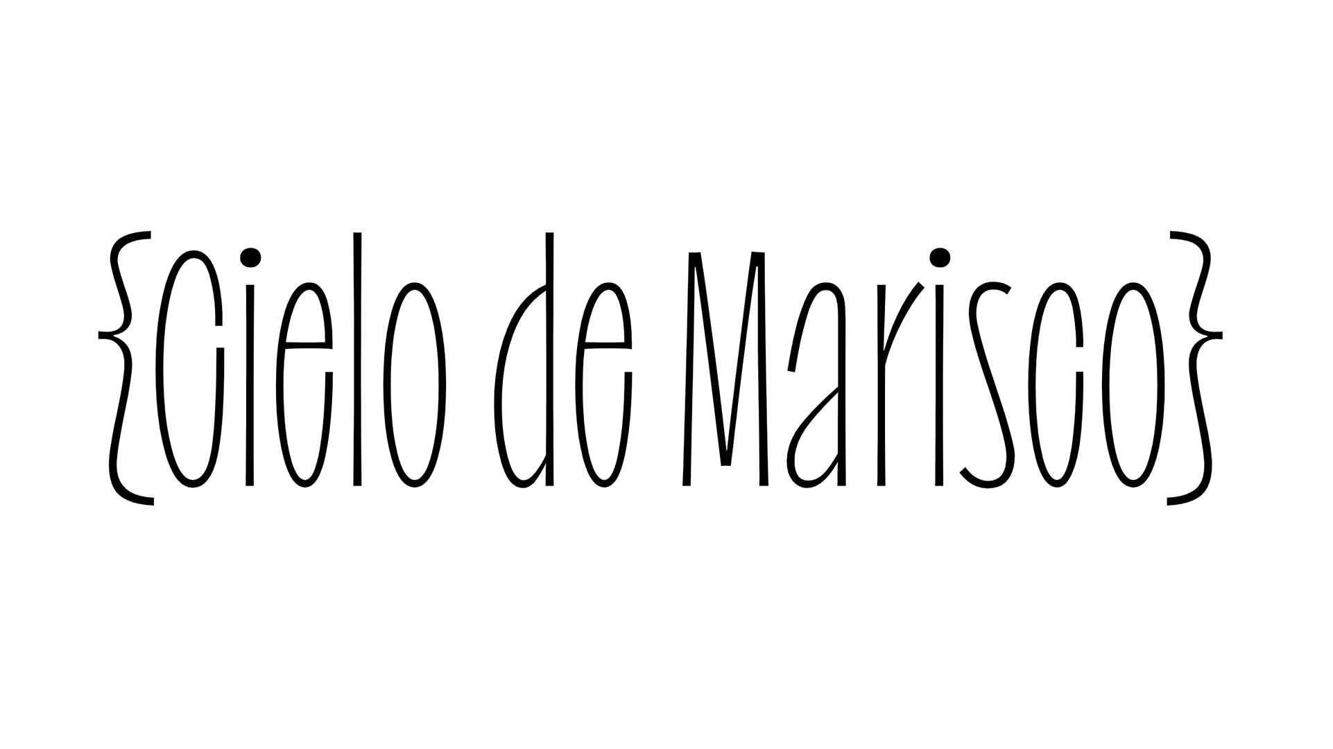
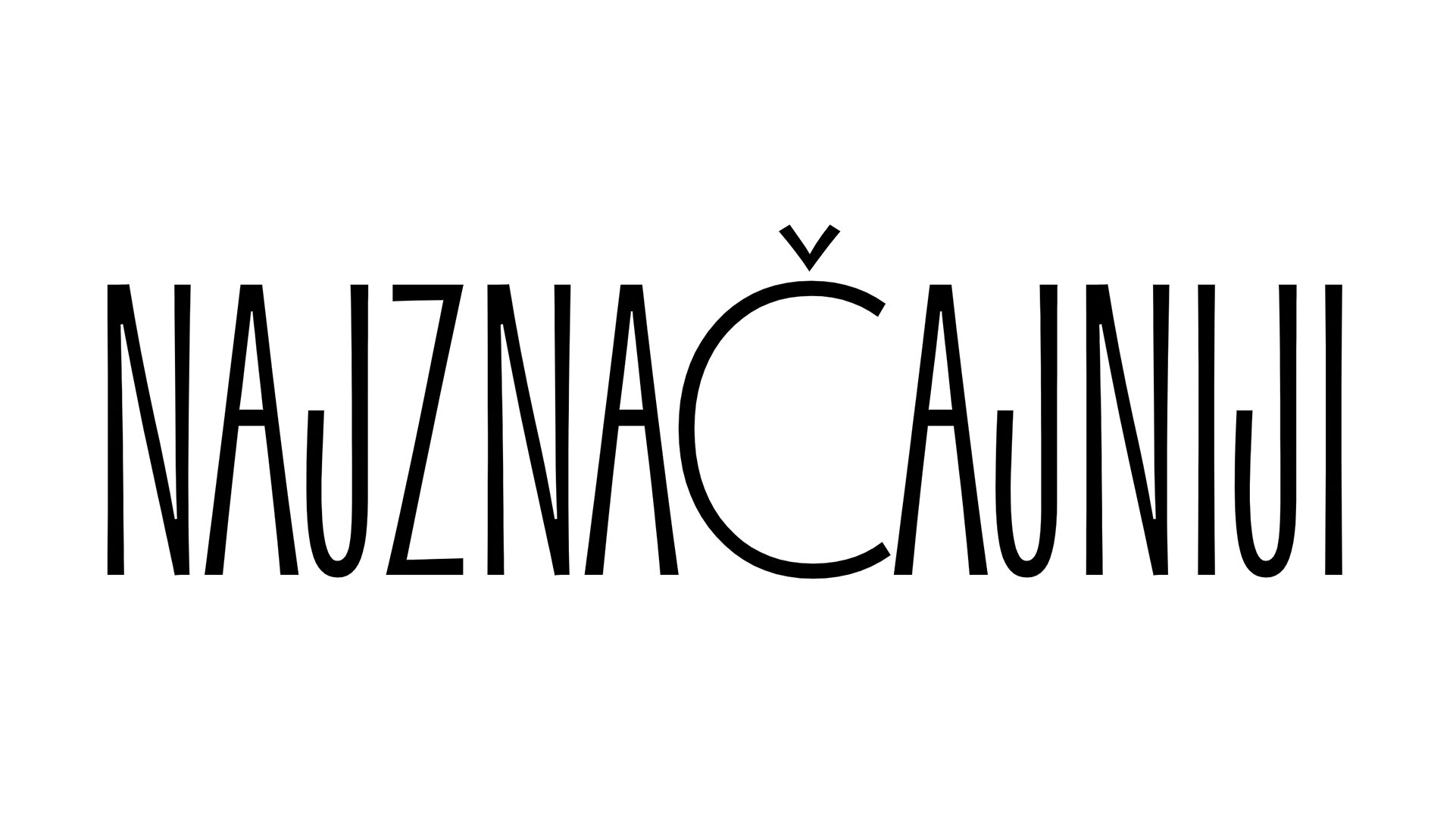
Irregardless Containers:
NOTES:
I mean, you’ve gotta get excited when Ohno releases something, right? It’s hard not to, after several successful releases leading up to this one, and with a spectacularly simple voicemail release video. I don’t say this to simply gush about Ohno’s marketing, but to highlight the relatively simple effectiveness behind it: Ohno Type Co. has found a way to publish typefaces in a manner that aligns perfectly with the conceptual basis of the typefaces that are being released. Particularly, with Irregardless, the naiveté, the honesty, the no-frills aw-shucks absolutely unpretentious way it was released reflects the process of Irregardless’s creation.
Irregardless is a result of ‘fighting impulses’ in search of something new for a designer who has been very giving of their creativity and perspective already. I can really appreciate this effort, as type design in general is a difficult and often exhausting pursuit that finds designers feeling increasingly constricted as their typefaces grow from an idea to pixels to polished pieces of software. Edmondson’s journey and attitudes as a type designer are on full show with irregardless, which is why I believe it has yet to fail to make everyone smile.
The typeface itself is youthful, it’s energetic, it has donned an attitude that goes beyond casual to become more just hilarious familiarity, like you would have with a lifelong or childhood friend. Proof&Co’s Josh on the latest episode of the Interrogang Podcast describes Irregardless as looking like its “constantly shrugging”, which I love. This is really hard for a typeface to do, mainly because modern type designers are taught to refine away until there’s a nearly machined-like collection of letters. Irregardless shows what can happen when you go the opposite route and embrace the imperfections and add in as much personality until you can’t stuff anymore in.
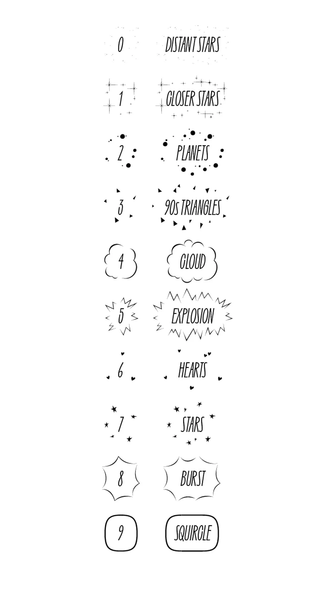
This notion is particularly evident in the Stylistic alternate sets: Wide O’s, a unicase, and heart dots. I’m glad Irregardless comes with roman AND italic styles here, as the nuanced skill starts to shine through. It’s the fundamentals for me. Playing with letter widths, spacing, weight placement, and proportion have earned Irregardless a whimsy and entirely unique evaluation. Also, I’d like to simply stand back and admire the container styles included in this release. Somehow, in what must have felt like a futile exercise at times, James built more than two dozen container styles for the sole reason of making Irregardless a completely wild tool for expression. (I could go on and on about how rules and borders are a very forgotten arena in type design that not enough designers jump at these days, but I won’t because James is one of the few that is making containers and decorative font features shine.)
Ultimately, James sums it up best: “There are deliberately obtuse aspects of this design that are maybe unnecessary but are enthusiastic expressions of a feeling that I’m searching for; Naïve, silly, with unwarranted confidence.” Its the gaul to commit to this strategy and honor the unglamorous process that earns Irregardless such high regard… the love and honesty is right there in the letters.


