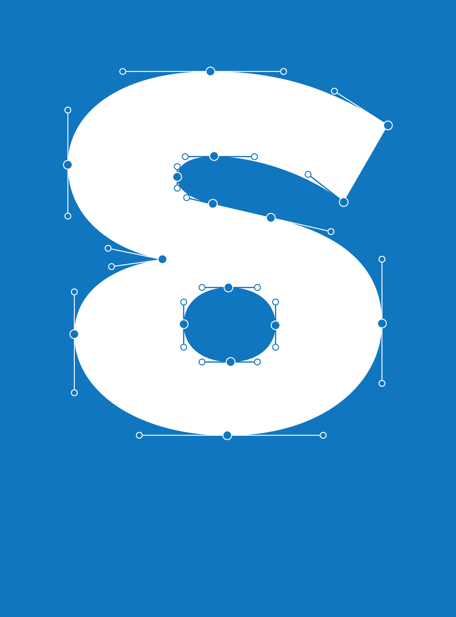
Pleasure
From the Foundry:
“The Pleasure font is almost a running grotesque font. However, its geometric shapes did not resist the urge to be led, for certain letters, to an extrapolation of the terminals by converting them into loops. A characteristic that gives Pleasure an original taste and a certain irony in the rolling of the eyes.”
Mini-Site Screenshots:
MINI-SITE SPECIMENS:
NOTES:
It’s easy for me to see type and dismiss it for bearing some resemblance to something I’ve seen before, but here ye, hear ye, you are NOT to let this happen with Pleasure. Sure, on first glance, you might see a grot family that resembles the countless others out there, but it doesn’t take that long of a second/deeper glance to realize that there are truly things going on here that I have never seen before.
For one, the experimentation that has gone into this family is vast, featuring lots of wild alternate characters across roman and italic styles, three grades of expression from default neutrality to an ‘unspin’ set, to a more geometric feel, and end strokes that double back to make full-on loop-de-loops. Pleasure has found a way to nestle itself snuggly between a workhorse text sans and a show pony display sans. Not a bad bit of versatility to bring into your font collection.


