
Postea
RELEASED BY:
Type Together ☞
DESIGNERS:
José Scaglione
Veronika Burian
RELEASE DATE:
Week 17
DETAILS:
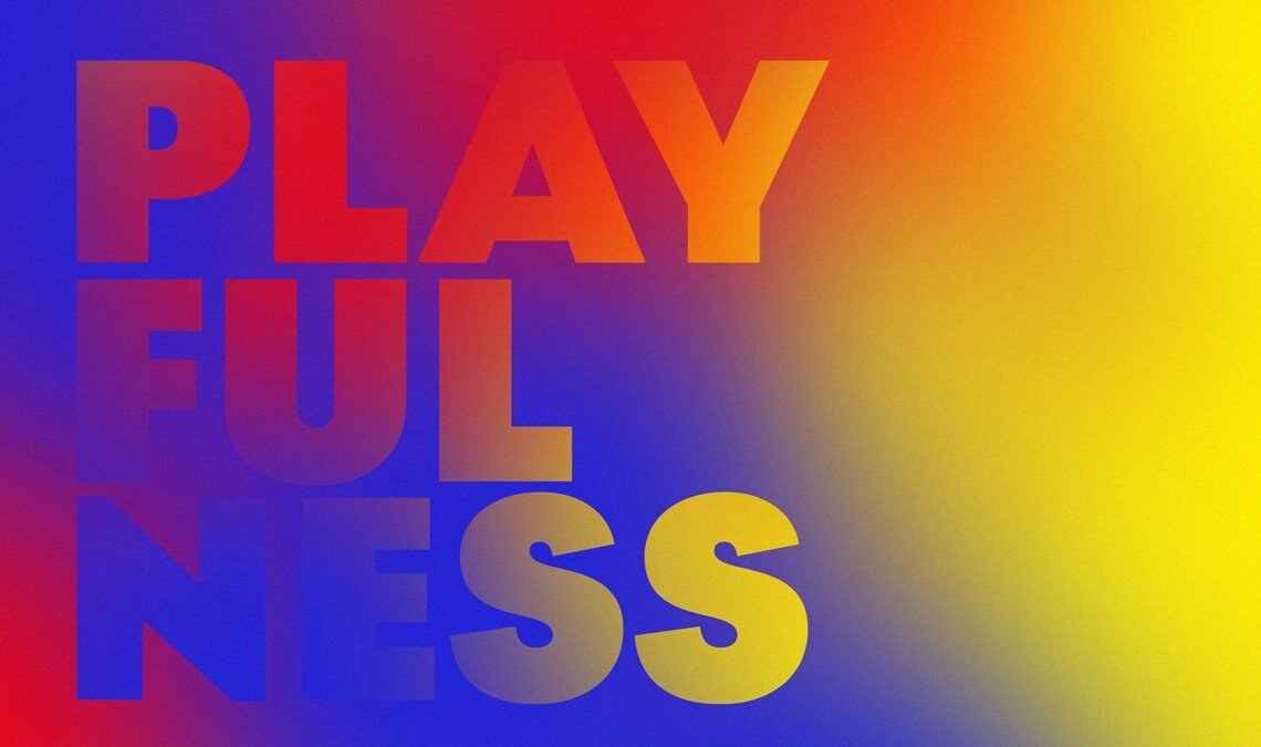
• A geometric sans family inspired by the geometric sans signage prevalent in Germany.
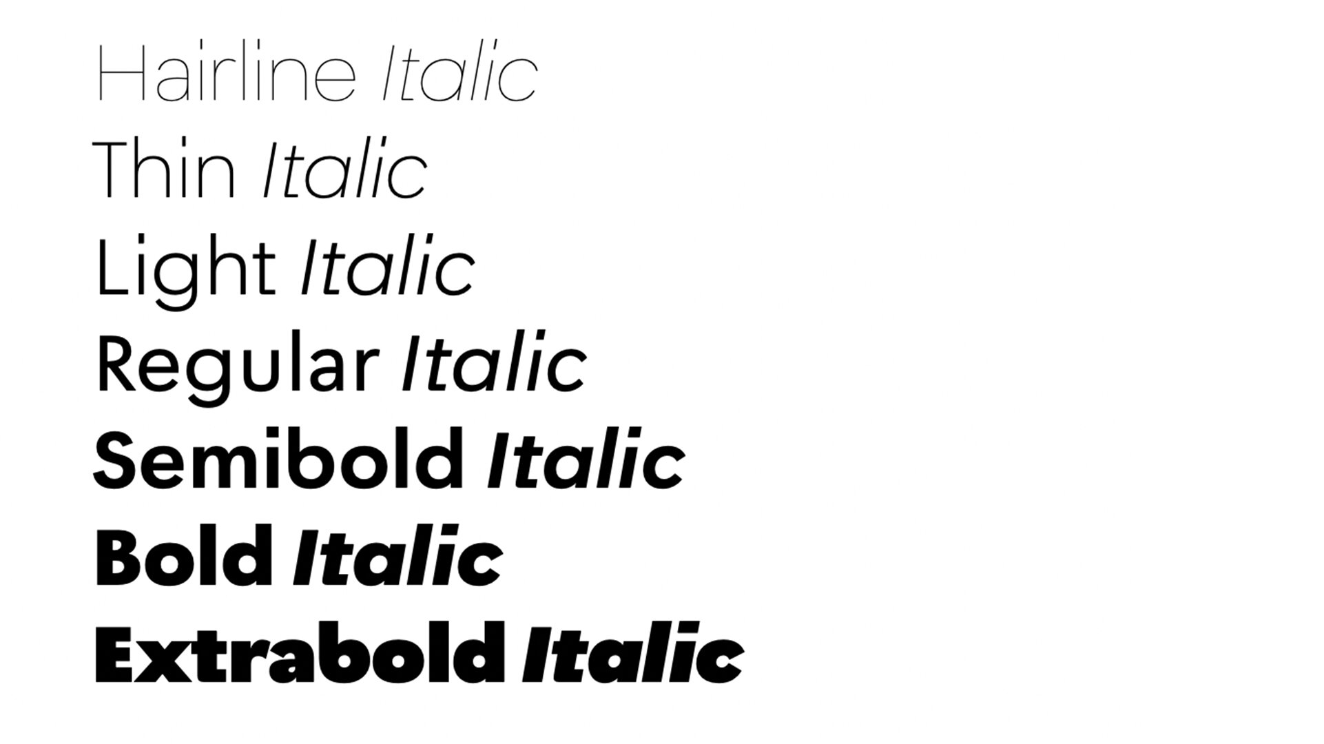
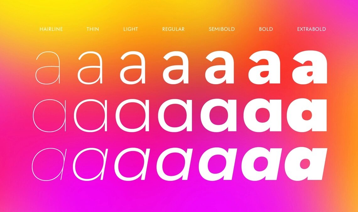
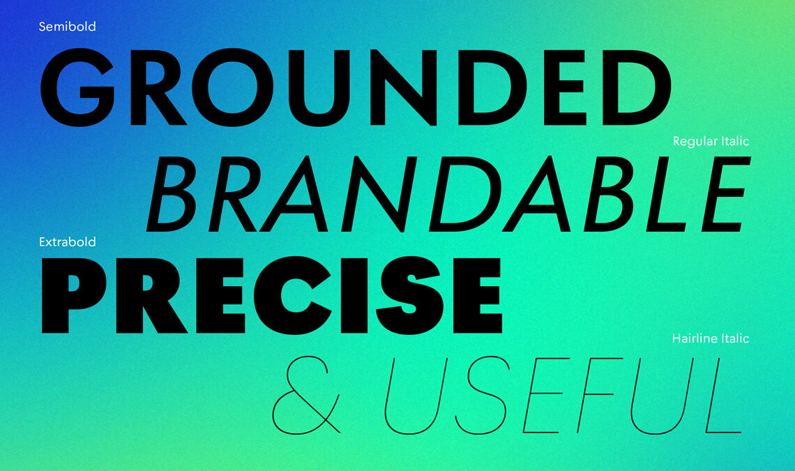
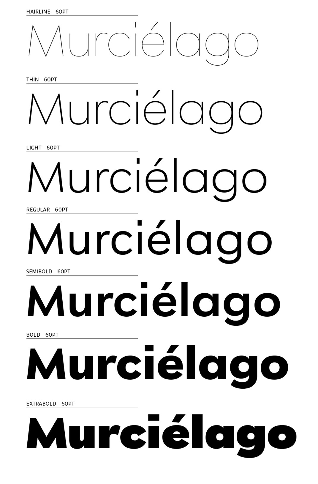
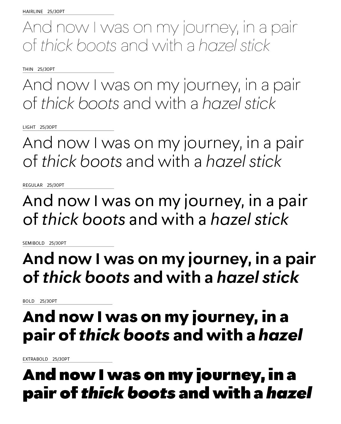
• Available as a family of 14 fonts of seven weights across roman and italics.
LINKS:

From the Foundry:
“Beginning with midcentury virtues, Postea is the rational response for pixel or paper text — a lyrical take on geometric sans serifs. Classic curves and purposeful details make it ideal for branding, signage, corporate typefaces, and magazines.
Some typefaces are a rough tool, like a pumice rock: abrasive to the senses, unforgiving, and unhelpful for most reading situations. Postea is an obsidian: smooth and classy, with attractive nuances in any light. The classic curves and purposeful details keep its individuality intact while allowing it to fit an incredible range of geometric font needs. Because of these qualities, Postea makes normal reading in paragraphs a cinch and your branding memorable.
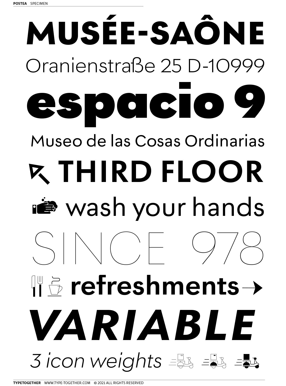
Compared to midcentury attributes of restraint and a sparse appearance, Postea’s deliberate play between character widths injects life and distinctiveness into its personality. The default ‘t, f’ have lyrical doses akin to a robust evening drink and are rounded out with a serpentine ‘s’ and rotund ‘o, g, b’. Another nice surprise awaits: spacing for the Hairline weight is tighter for optimal use in large headings and titles, while the regular weights have the expected, slightly looser spacing for text. Setting the test word ‘bogarts’ brings all this together nicely, invoking a balance between a constructed and human feel while brushing away the dust from a century of derivatives.”
Specimens from the Foundry:
NOTES:
Type Together have put together a project here that combines so many things, and I am here for it. Postea combines local inspiration with a globally recognized style. It combines geometric and humanist ideologies. It combines traditional tropes with experimental new quirks. Postea to me is a modern mash-up — a study in combination without compromise.
There are so many little quirks in this type system to find delightful, like the missing bottom stem on the b, the 90 degree corner on the f, or the plumb vertical stem on the y. José Scaglione, Veronika Burian, and their team have put lots of time and consideration into this power-packed family of only 14 fonts, and it shows. I’d say there’s more personality in here than your average geometric sans, and if its quirks you’re looking for, well, you can stop looking. Are there a few awkward moments in the design? sure. But I have a feeling those aren’t oversights, they’re intentional eccentricities consciously left in by deft type minds.
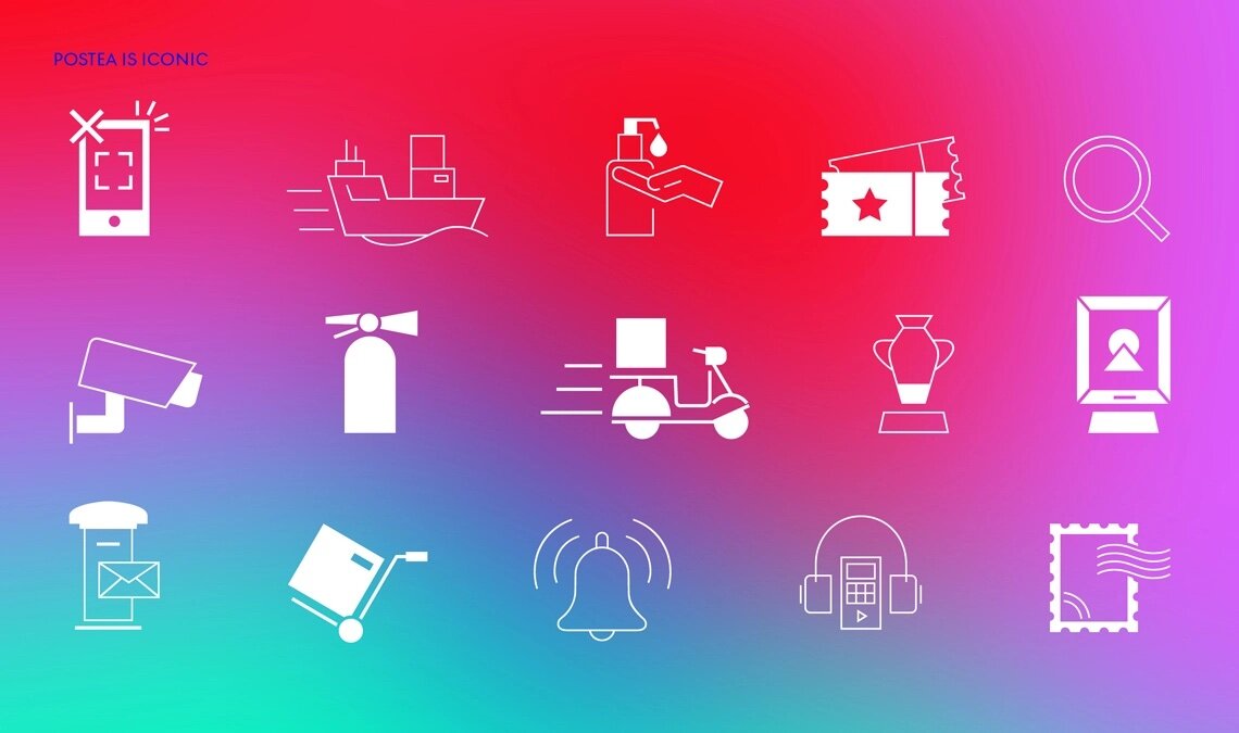
You’ve also gotta love the symbols/emoji in Postea, in this case accessed through extensive Open Type wizardry, rather than being delivered as a separate font — another deliberate choice. (Just look at all those symbols in the PDF!) These symbols make Postea a pretty incredible value if you’re one of the organizations or work in one of the industrial sectors the marketing for this font so vehemently addresses. You not only get a typeface that’s derived from public signage and the mind of engineers, but you get an extensive additional vocabulary in the symbols with which to communicate. Postea truly expands the scope of what a modern font can do for you.