Tatras
RELEASED BY:
Future Fonts ☞
DESIGNERS:
Love Letters
RELEASE DATE:
Week 17
DETAILS:
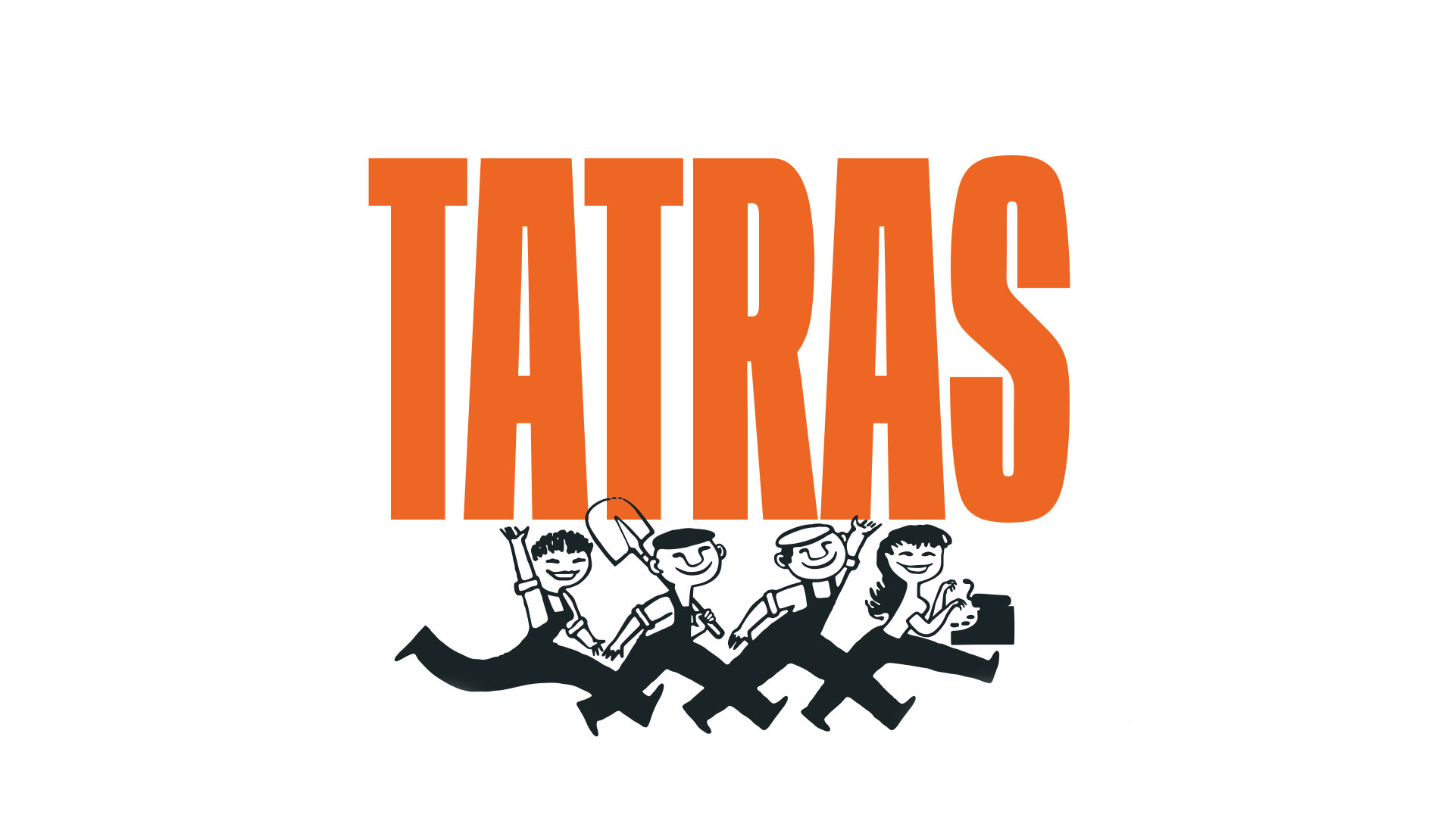
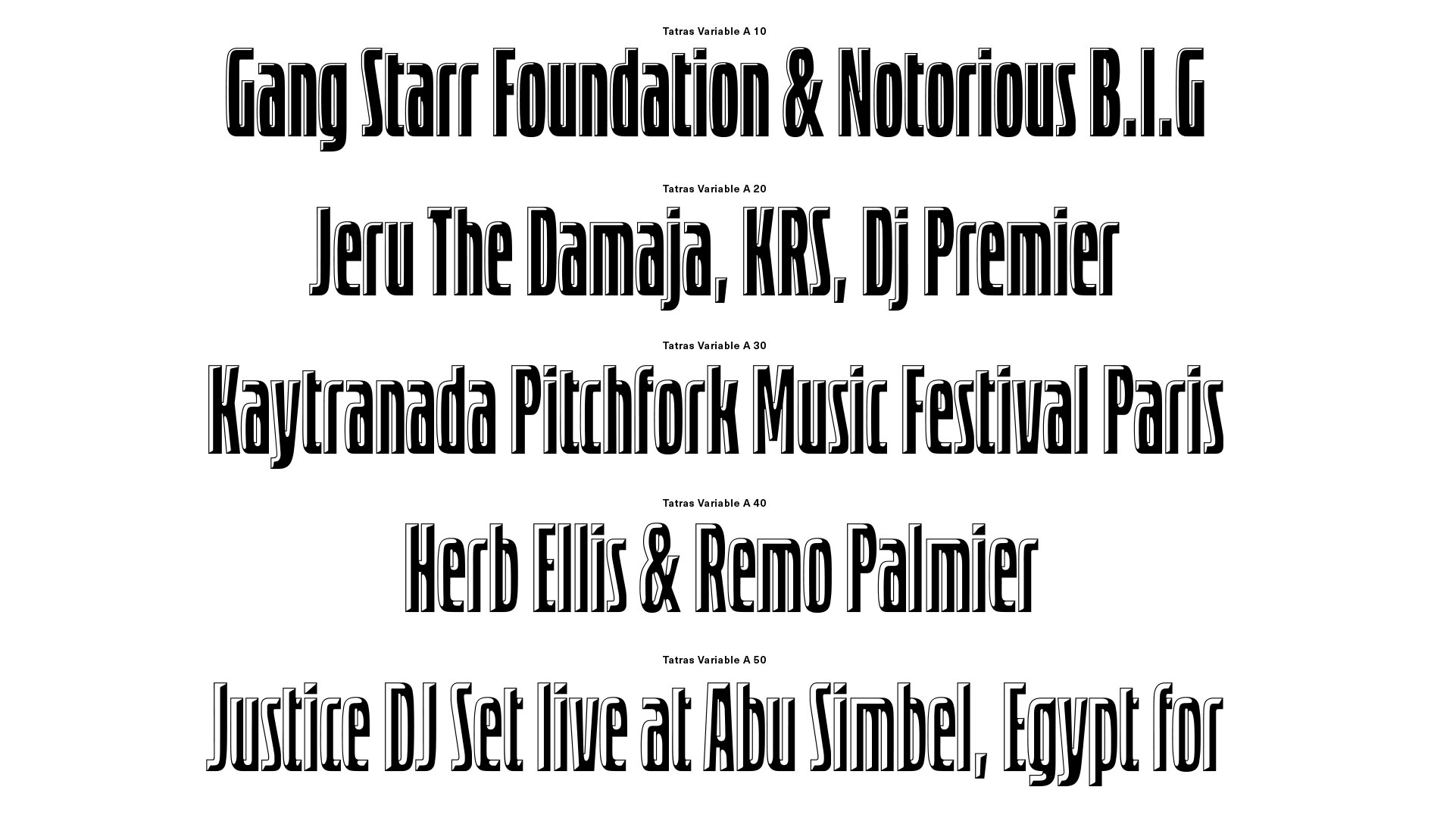
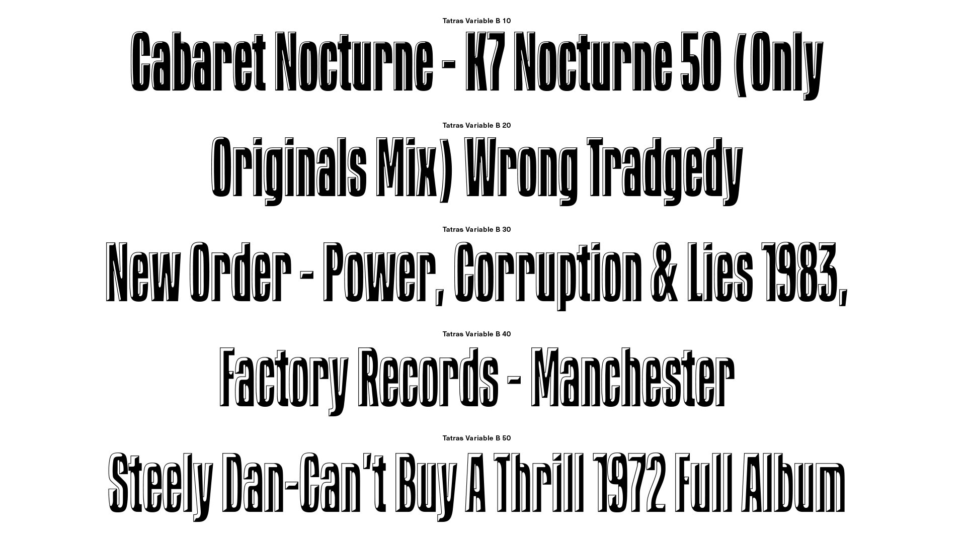
• Tatras. and accompanying family Tatras Shaded, is a homage to Eastern European design and its socialist heritage.
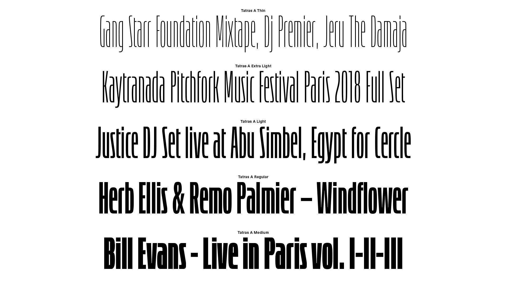
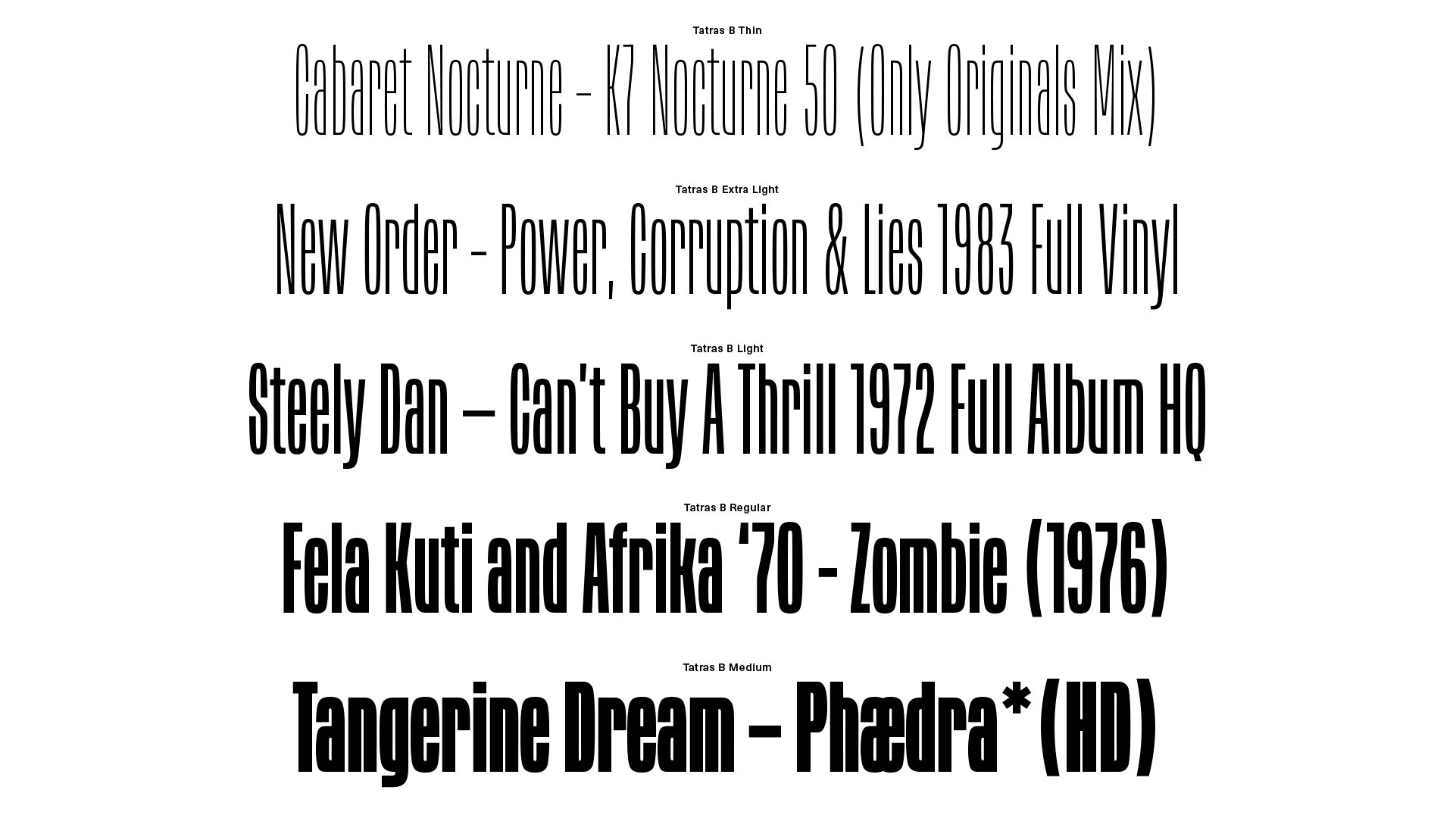
• Tatras is available in 5 weights and two styles A & B.
•Tatras Shaded is also available in 5 weights accessed through one variable font.
• This is a v0.1 release through Future Fonts.
LINKS:
Release Information ☞
Try & Buy ☞
Tatras PDF Specimen ☞
Tatras Shaded PDF Specimen ☞
Competitive Set:
…
From the Foundry:
“Tatras and its companion Tatras Shaded is a homage to eastern European design and its socialist heritage. The typeface takes its inspiration from the lettering that is emblematic of mid-century design from Hungary, Poland, Czechia, Slovakia and the Balkans. The name ‘Tatras’ itself makes reference to the Carpathian Mountains, a chain of mountains that passes through eastern Europe.
Although It’s a no frills rational design it packs a strong personality thanks to its sensuous 50’s retro-futuristic lines. At the heart of the design are the two different styles, Tatras A and Tatras B. These allow you to create two distinctive typographic impressions. It’s literally two typefaces rolled into one.”
Tatras:
Tatras Shaded:
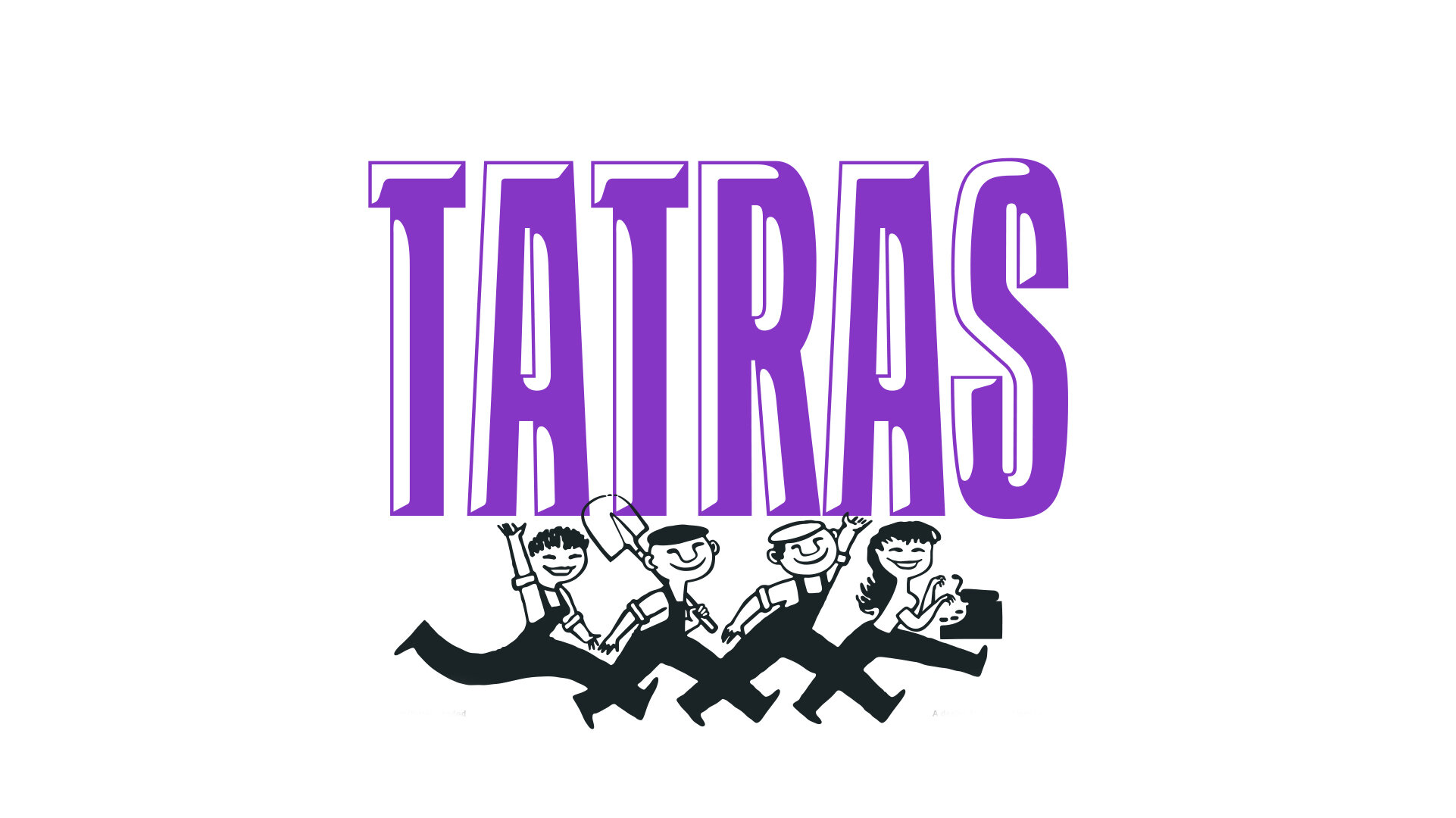
NOTES:
Tatras & Shaded are a great example of committing to a typographic idea. There’s a simplicity and efficiency to these letters that I like very much, even amongst the separate A & B styles, the illustrative shading, and the subtle and not-so-subtle design quirks. In the regular styles, the tapered north and south poles in the round characters like O, S, and C are a nice touch, and the way the letterforms handle the ultra-condensed-ness are nice in places that could likely get clogged like the K, a, and &. In the shaded styles, there’s more at work than just putting in the same negative space in the upper left corners of the letters — there’s thought given to the dimension and volume created by this alteration.
By offering a few stylistic alternatives to the default condensed sans here, the Tatras world is right in home with Milton Glaser’s 3D fonts from P22, the additional arcade and bitmap styles, and several layerable fonts released this year. Eager to see where this goes.


