
Staff Grotesk

From the Foundry:
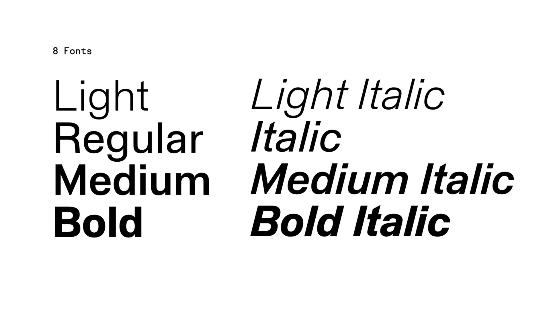
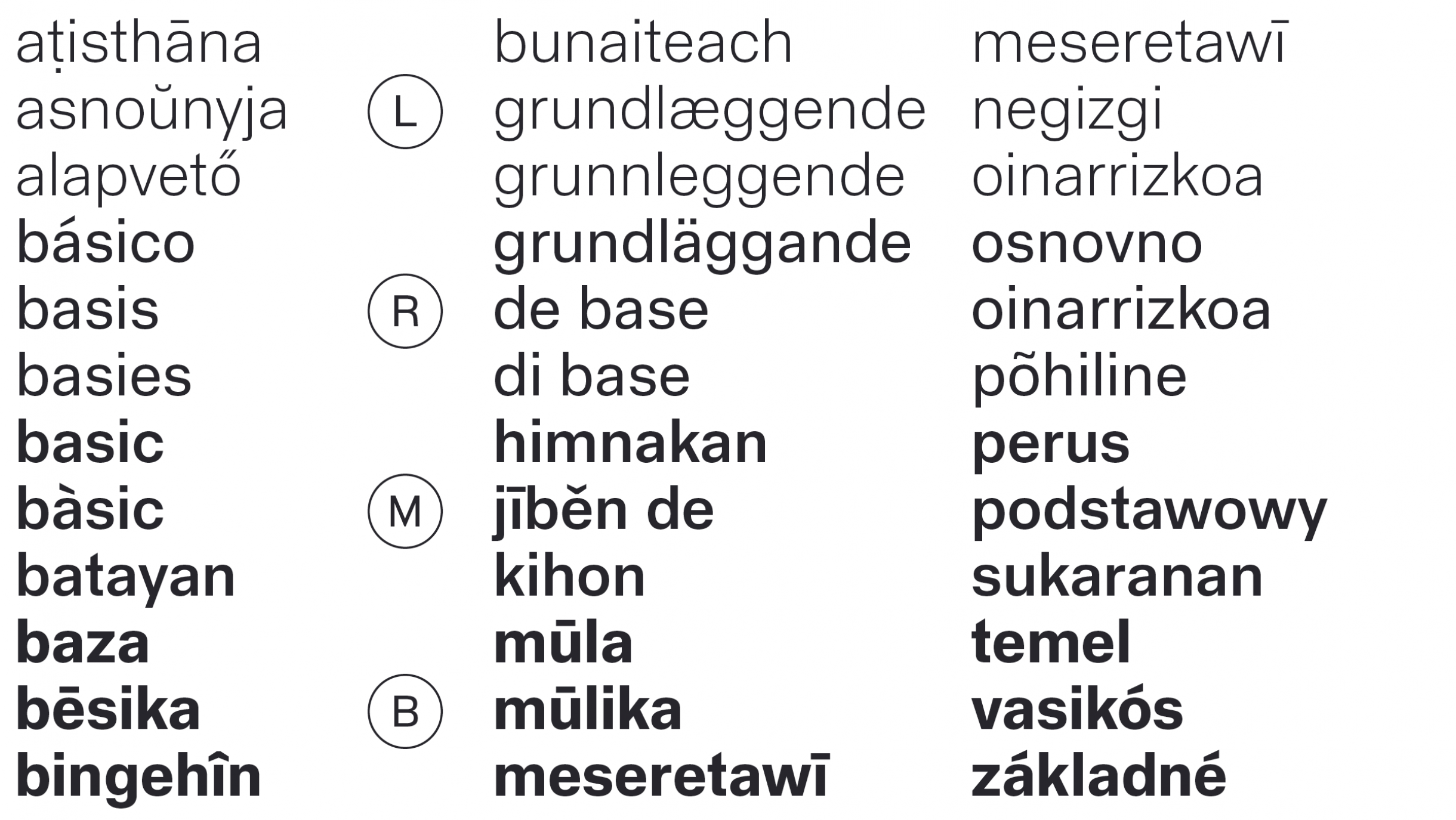
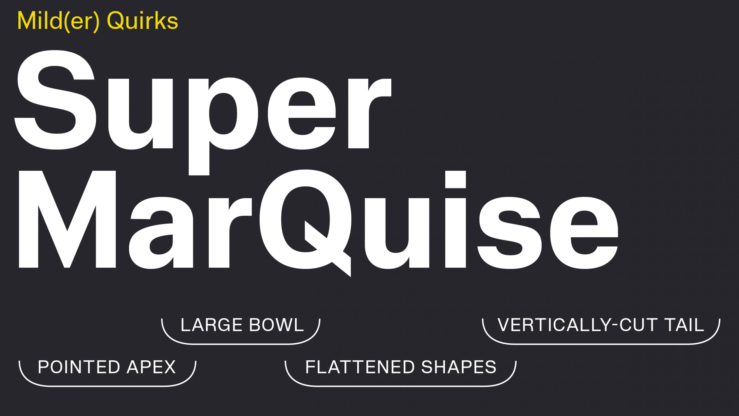
“Staff Grotesk is a new text-oriented take on the multi-width Staff family. Its focus is readability in small sizes and longer passages of text. Designed separately from the original Staff published in 2019, Staff Grotesk has a seemingly low-key presence, slightly more attuned to the European sans serif tradition, but is subtly dotted with reminiscences of the original quirks of Staff’s large-size letterforms. The lowercase ‘a’ still has a large bowl, the capital M has a pointed apex, the Q kept its vertically-cut tail, but all are much more bound by conventionality. Compared with the original seven subfamilies of the Staff system, Staff Grotesk features wider spacing, open counters and a smaller range of four text-oriented weights, from Light to Bold.”
Foundry Images:
NOTES:
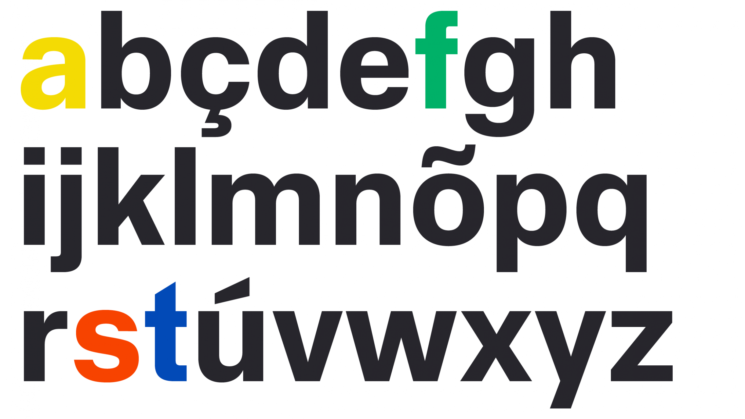
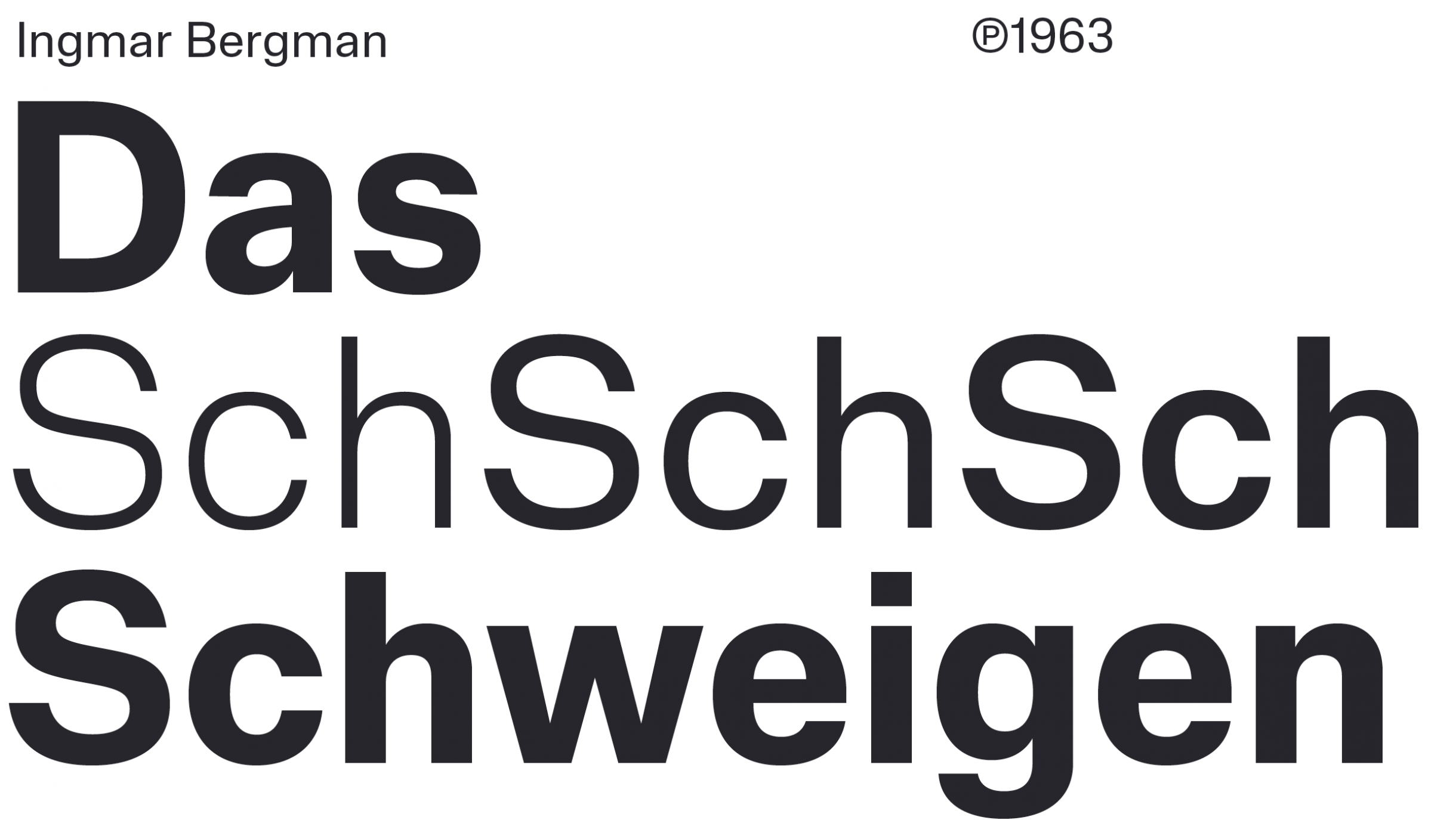
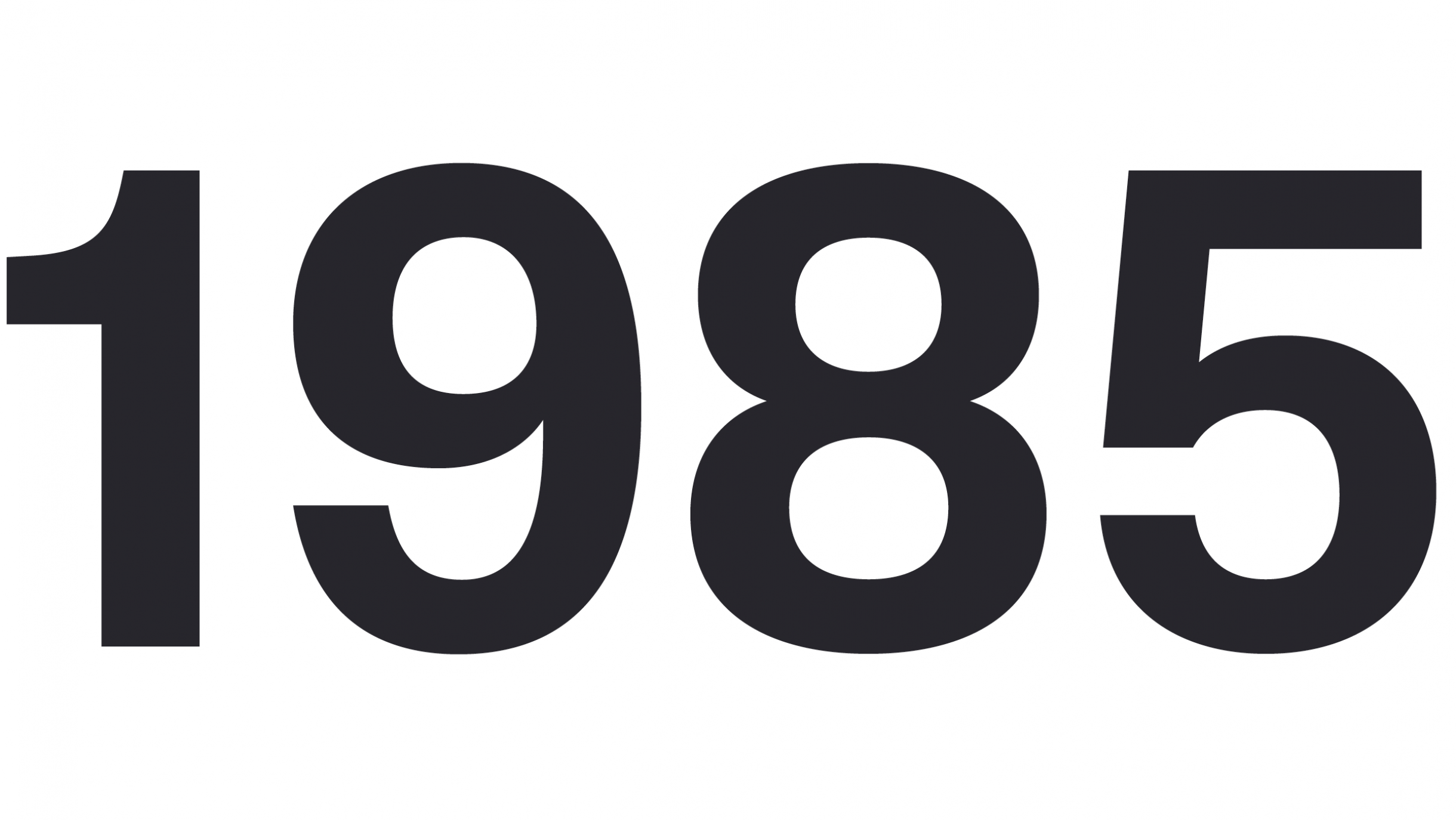
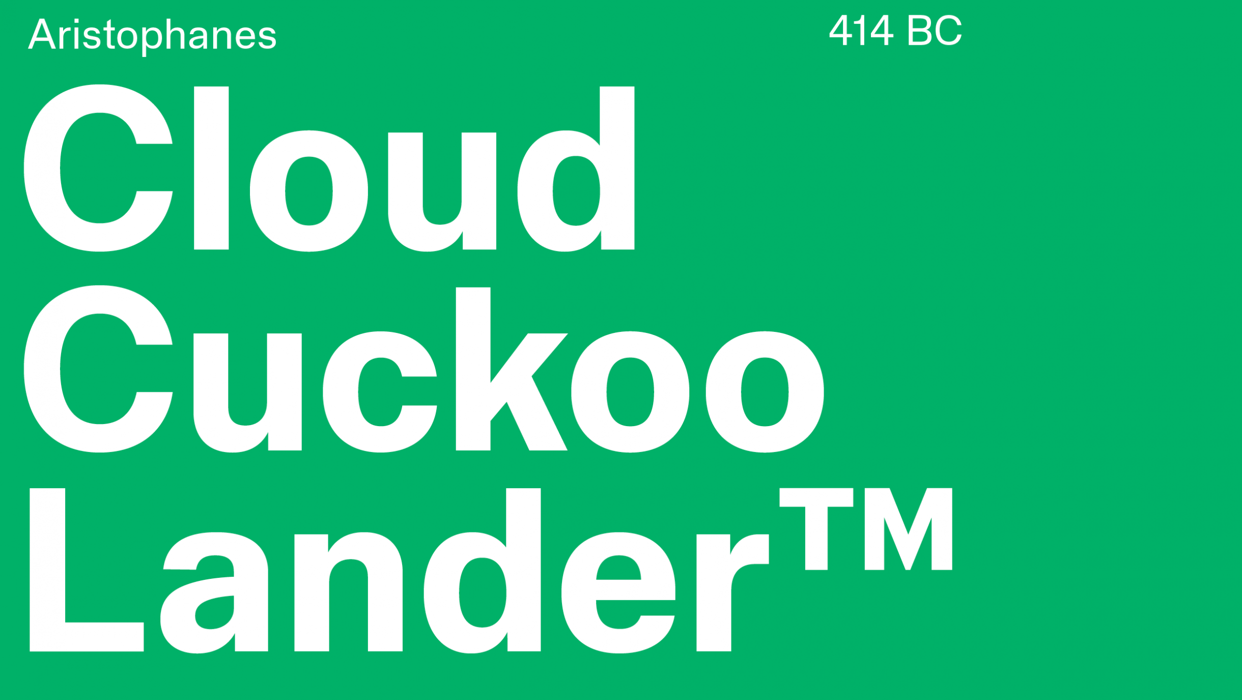
Staff Grotesk is clean, basic, and simple. That’s not exactly revolutionary critique or insight, it really does sum up the family. And that kind of seeming uneventfulness is actually the point: Staff Grotesk a sans with a specific mission… more legible text reading. I think it accomplishes this. The horizontally cut terminals and square tittles draw back to some of the most neutral typefaces in history, but this font is not without its moments. I like the sharply cut top of the t, the aggressively slanted stoke of the Q, and the more pipe-bended corners of some lowercase letterforms like the f’s. Staff Grotesk does a good job of carrying these small features across weights too, while keeping the ultimate mission of legibility and consistency top of mind.
This release is very close to just being a font update. But I think its more than just another style extension of the foundry’s Staff collection. The original Staff is certainly suited to display, with lots of width styles that break some of the rules it sets out for itself in order to make each width work. Staff Grotesk feels like a return to the original spirit of that display family, with even more attention to the cleanliness and consistency.
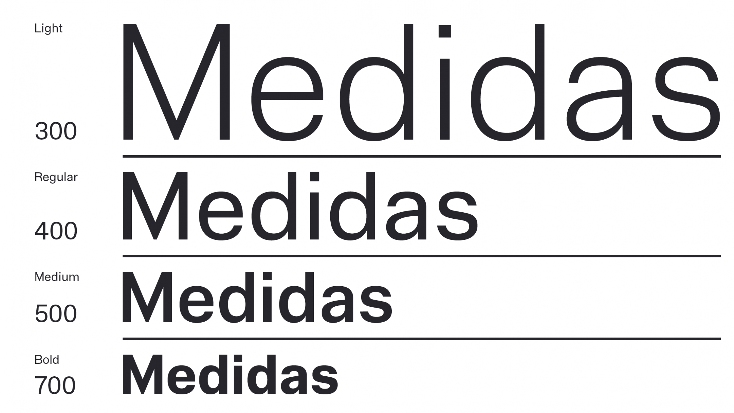
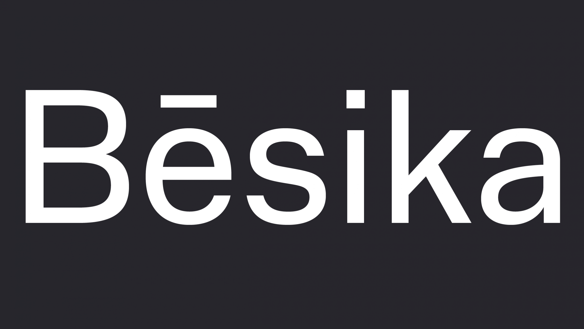
And I’ve gotta say, the light weight is really handsome. On a personal note, it’s interesting to see myself write that because I feel just yesterday I wrote that the heavy weight of MD Primer was particularly really nice. Which makes me wonder, when type designers approach a grotesque sans, do they have an ideal in their heads of what makes a grotesk a grotesk? My thinking is that in the end, one weight will likely exemplify that ideal more than the others because that’s the style they poured their design momentum into at the start. I’m not saying thats what Rui Abreu has done here, but its the start of a working theory.
Anyway, Staff Grotesk is a great release from a foundry in a phase of its development where it is building out as much as its building up. I’m glad to see fonts being added to already released families over time, too. It hopefully will bring more return-customers for the foundry.