
Maro
RELEASED BY:
Typotheque ☞
DESIGNERS:
Nikola Djurek
RELEASE DATE:
Week 24
DETAILS:
• A stencil typeface that follows the logical contrast principles of letter construction until the shape is fractured at its narrowest point.
• Available as a family of 8 fonts — 4 weights of roman and italic stencils.
LINKS:

From the Foundry:
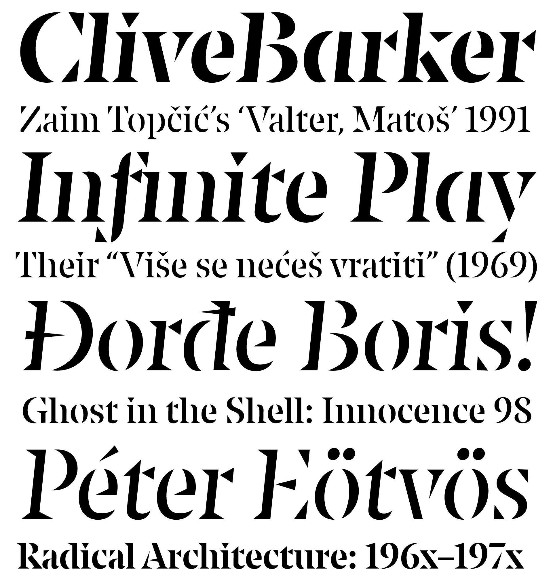
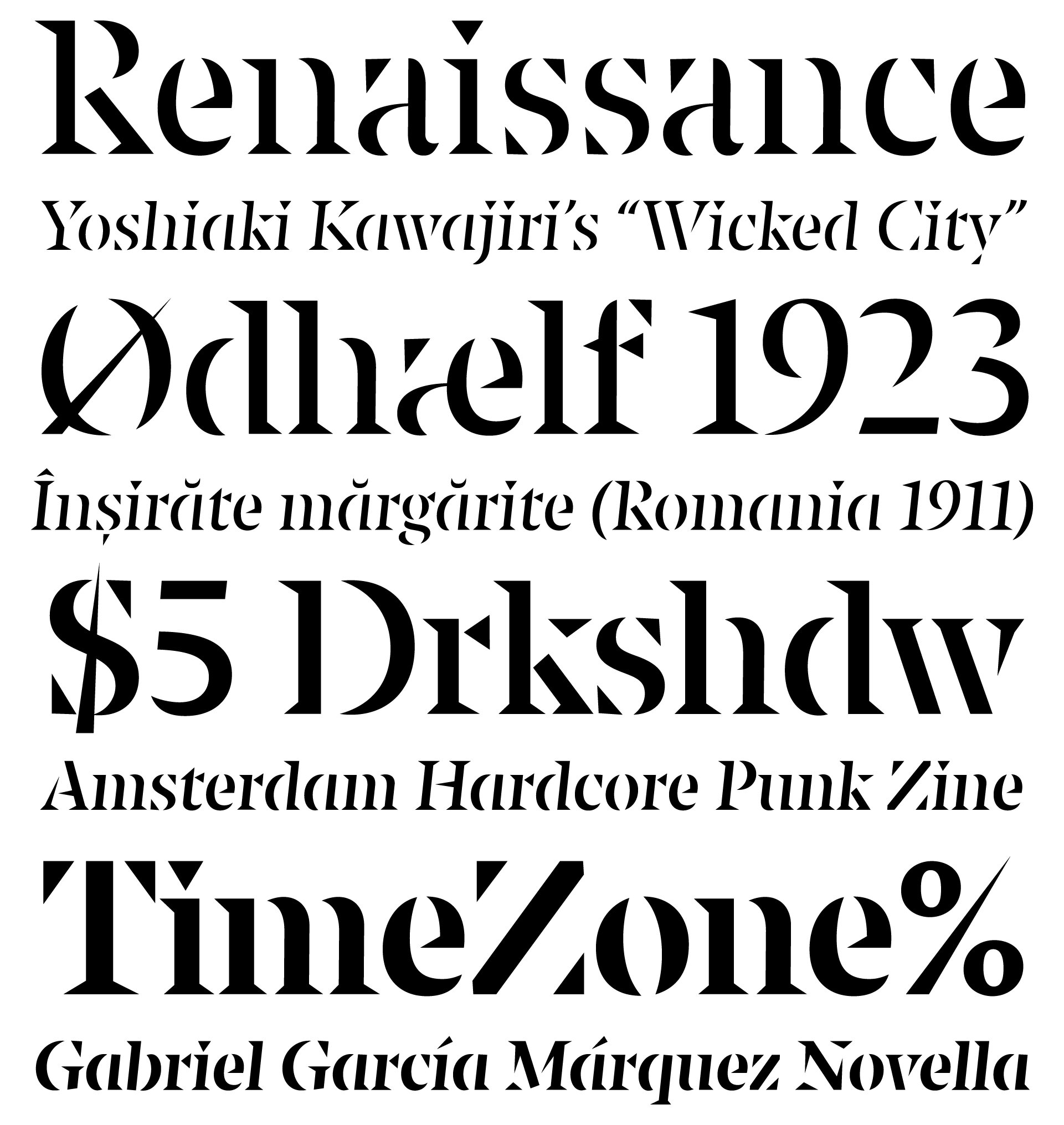
“An organically created stencil typeface that follows the logical contrast principles of letter construction until the shape is fractured at its narrowest point.
Maro, the latest typeface by the prolific type designer Nikola Djurek, is a continuation of Djurek's investigation into the structure of letterforms. Maro is an unusual stencil typeface that, rather than slicing letters into parts, increases the contrast between the stick and thin to the point that the continuity of the letter construction is fractured.
Maro has very large x-height, flat curves and triangular serifs that give the typeface sharpness and urgency. Maro is designed for large spacial applications, posters or book covers, or any medium whose visual identity would benefit from assertive expression or voice.”

Foundry Images:
NOTES:
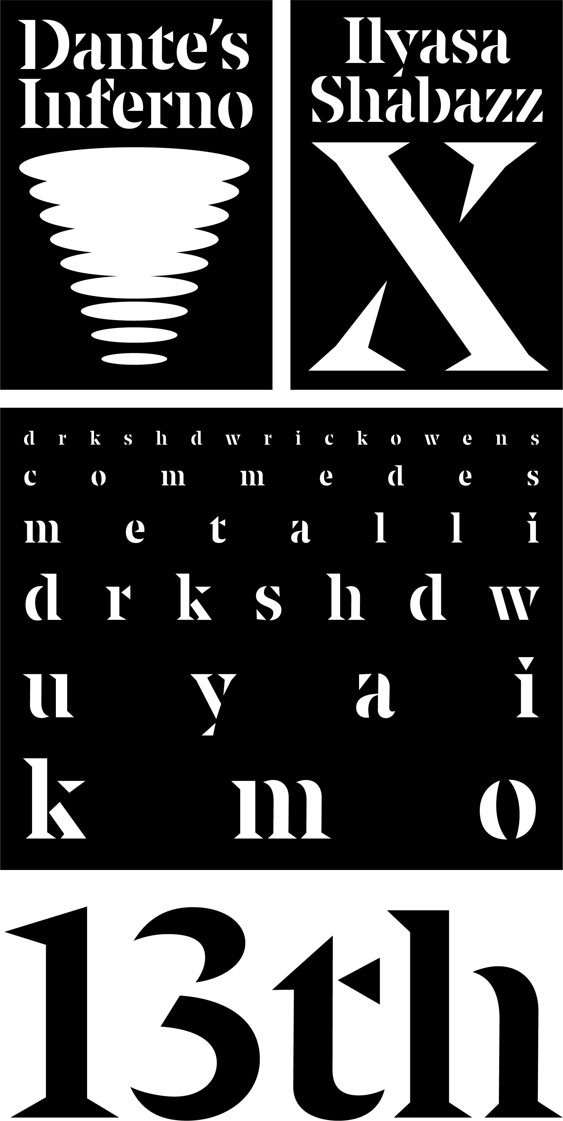
Typotheque has taken a rather fascinating approach to creating a stencil typeface here. I think a majority of stencil types out there cut their stencil forms in a way that graffiti artists or road pavers would: as few breaks as possible, and kind of in standard or unthoughtful places like north and south or something. Maro is a different beast that basically takes the stress and contrast of the typeface to a logical conclusion, putting breaks in where optically the type would be at its thinnest anyway. It makes for a rather natural feeling yet new and fresh look at the same time. I appreciate Typotheque diving into Stencil fonts in this refreshed approach.
It’s also fascinating to see how this technique unfolds across several weights. Granted there’s not a HUGE contrast between the thinnest and the boldest of 4 weights, there’s still a commendable amount of masterful and subtle decision making to admire. The real feat is probably in the italics here. The angle isn’t aggressive as one might expect for a type system with so much angularity to it, but the italics seem to get an even more deft hand in how its built. I love the left side curved rounds in the a, d, c, and e compared to the right side curved rounds of the p, b, and O. The suggested connection effect is even more impactful in the italics. The N, y, w, k, and v all just have that little bit more motion to showcase the optical trickery.