A Deeper Look at the World of Independent Typography
Releases — Week 03, 2023
A faithful take on the 19th century Egyptian from Commercial Classics amalgamating the style of the genre’s pioneers.
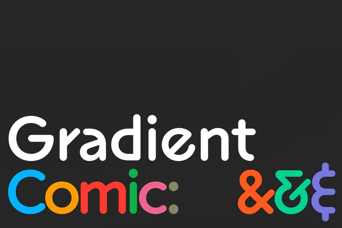
A rounded sans iteration of Superior Type’s larger Gradient Collection boasting plasticine forms, striking diagonal strokes, and a delightful sensibility.
LAST WEEK’s Releases — Week 02, 2023
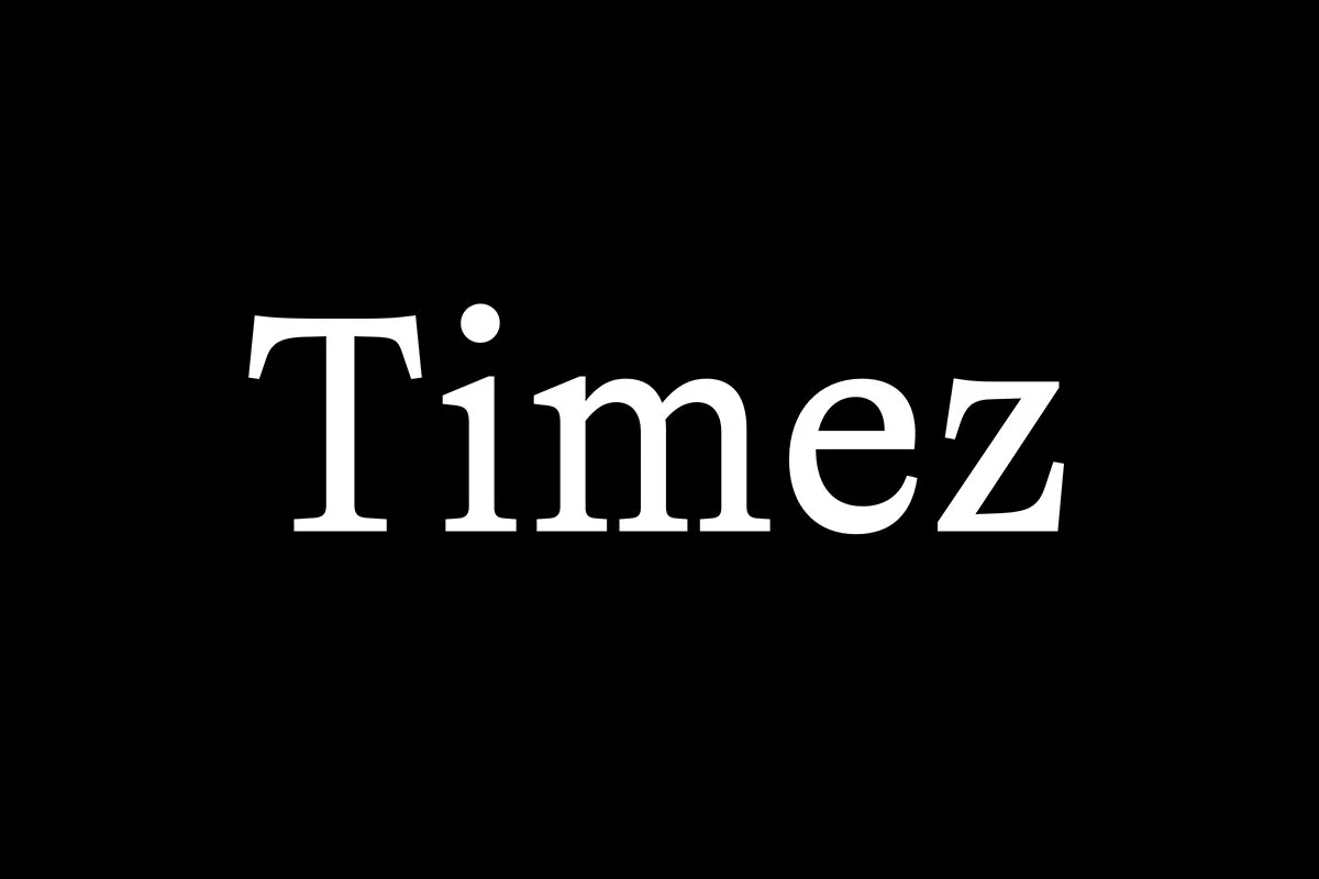
A contemporary translation of the Times New Roman model from La Bolde Vita across three unique subfamilies.
A nod to Morris Fuller Benton’s Clearface, but with more tension and edge across three optical sizes from DSType.
An elegant and sharp editorial display family from Nova Type Foundry bringing fresh air and smart dimension to the digital type landscape.
A gorgeous and swarthy script type family from Simonson Studio referencing baseball scripts and script styles popular during the first few decades of the 20th century.
A modern interpretation of Paul Renner’s Futura from Studio Rene Bieder, drawn with grace and tact.
Subscribe to the Weekly
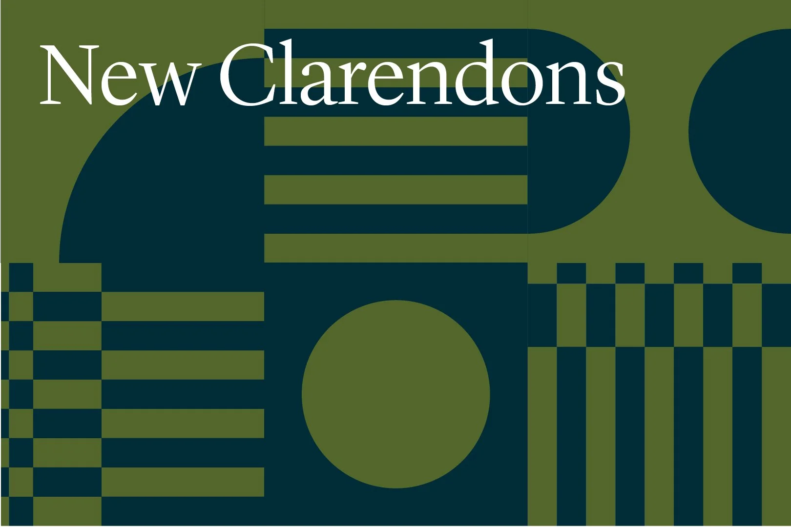
So… Clarendons… These days, they tend to get overlooked. Let’s change that. What’s up with this slabby favorite of yore?
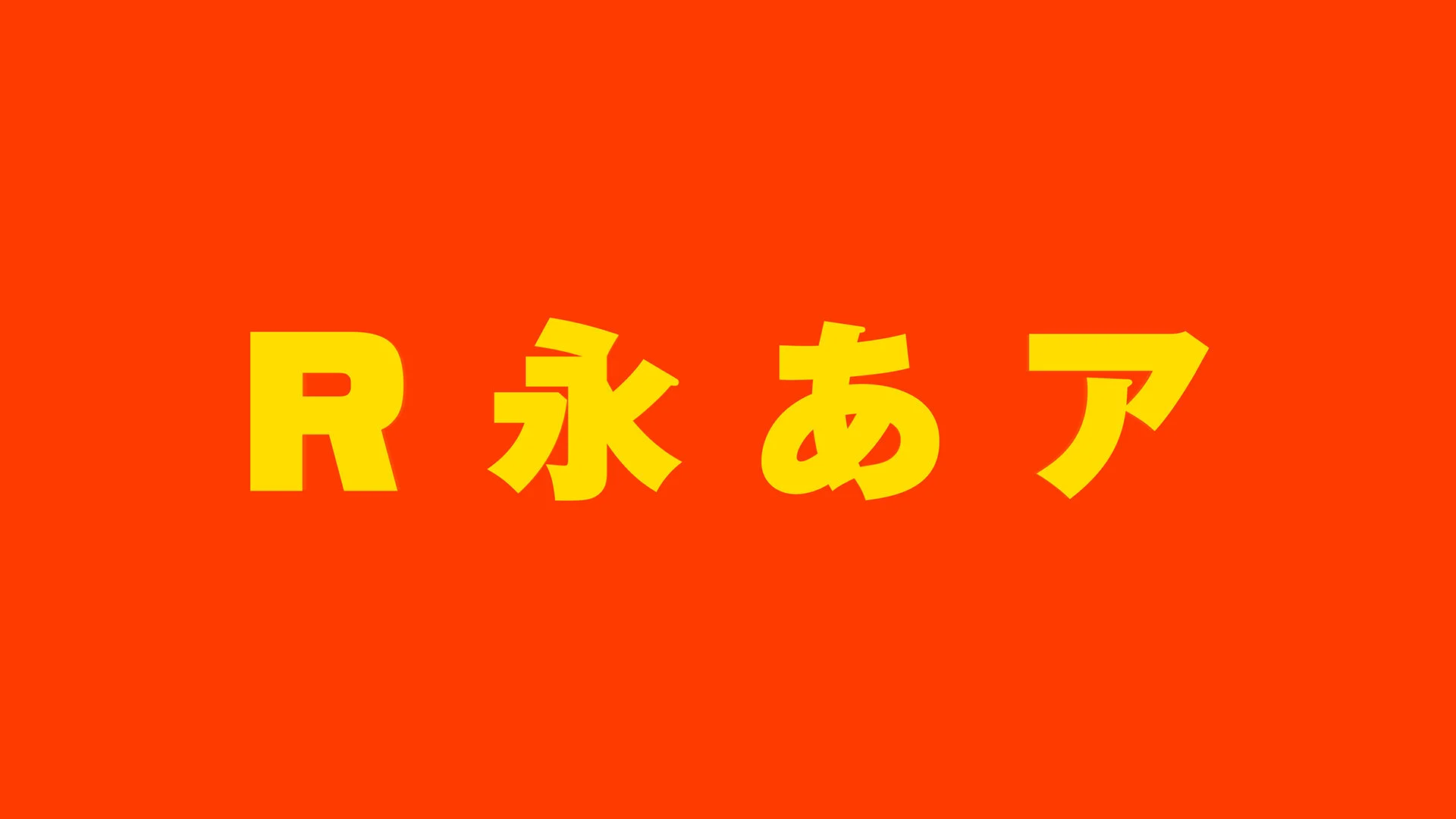
A globally conscious sans family with multiple widths and Japanese spirit from Occupant Fonts.
Traditionally, ‘good’ typefaces are ones with ample spacing, but what would happen if you made the type as tightly spaced as possible? Well, it’s certainly a look. This bubble is about the types that are bringing everything just a little closer together.
Typography and Calligraphy have always had an interesting relationship, but somewhere along the way, type and calligraphy became estranged. In the last few years, that relationship has been rekindled. These are the Calligrafans.
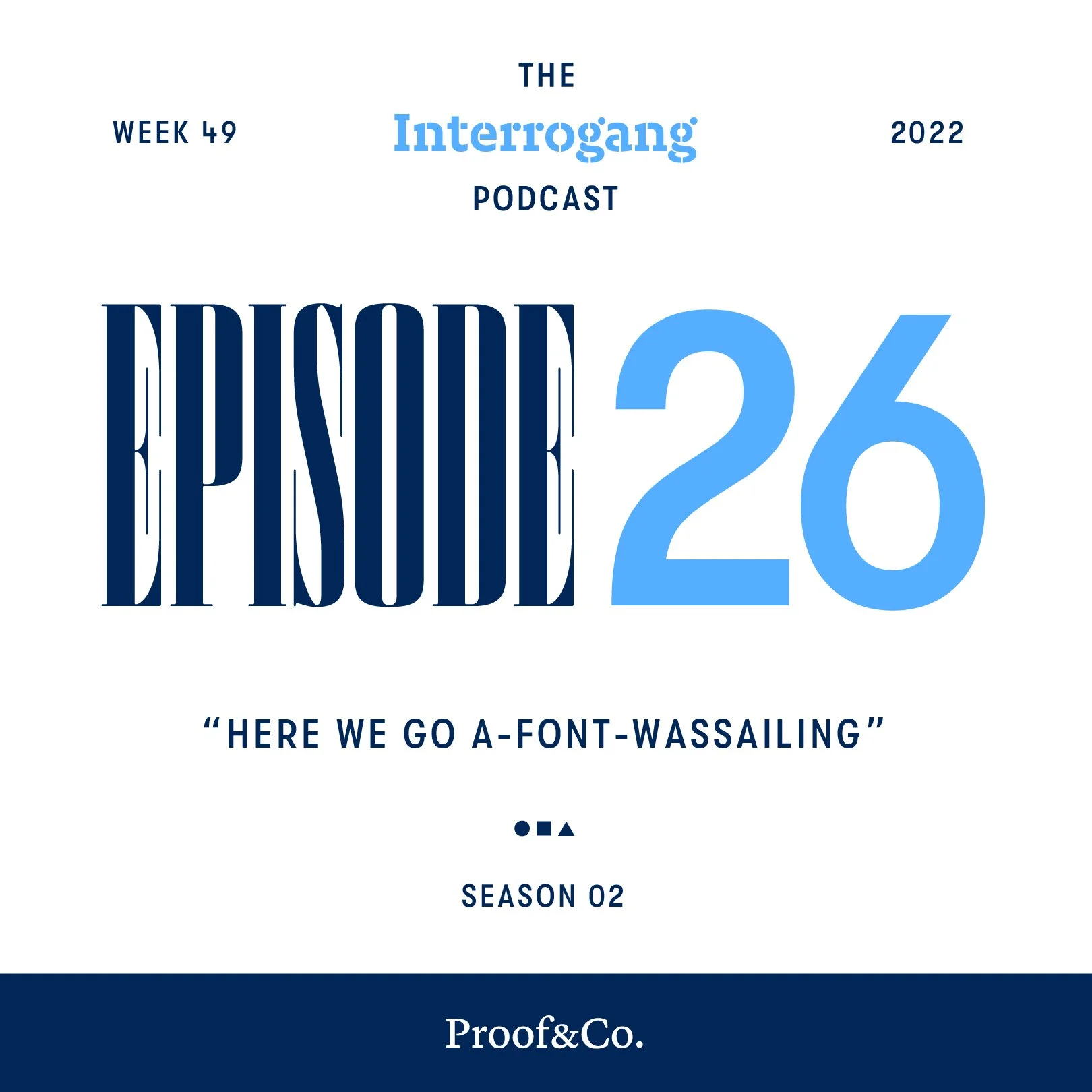
The Interrogang Podcast presents a weekly shot of typography news and notes, chock full of friendly conversation on a range of topics that go far beyond type. Perfect for anyone interested in type, graphic design, branding, art, creativity, or friendly conversations. Co-hosted by Joshua Dick and Kyle Read.
How will you look back on 2022‽ It's been a bonkers year, but from the best font names to the best single-style release to what new fonts blew minds into the stratosphere, Josh and Kyle have some awards to hand out for the year that was in type.
Is Santa ready to deliver all the type gifts this year‽ The independent type world has him covered if not! There may be a “Bah, Humbug!” or two in this episode, but we tried to keep it festive…
Can good design be made by committee‽ Collaboration and constructive criticism are supposed to make our creations better, but that can get out of hand when experts aren’t allowed to be experts.
What are you bringing to Typography Thanksgiving‽ Josh and Kyle set the podcasting table, loosen their belts, and bring you the most belly-filling spread of fonts you could possibly imagine.
Resources
The type-internet is a huge place, but there are ways to make it a little bit easier to navigate. Whether you’re a student, just starting your career, or a seasoned professional, make this your home base for finding what you need to know. This is our handy guide, full of more lists, people, places, and things.
Let’s Go ☞
FAQ’s
Looking for answers? We know the feeling. Our FAQ Section is still in the works, but we’ll have all the questions, at at least a few of their answers, coming up soon.
There's a retro wave sweeping type design, epitomized by this one particular detail: a simple circle counter. This bubble is all about the recent fonts that have been putting a hole in the middle of their letters.